
When Robert Mueller submitted his report a few weeks ago, some interested parties declared it a witch hunt that had wasted time and money. Except, it had done the opposite of that. It had laid bare Russia’s interference in our elections and the contacts between Russian government and quasi-government officials and Trump campaign officials. Said officials then lied about their contacts and, along with other crimes discovered during the course of the investigation, either pleaded guilty or were convicted. And while a few trials are still underway, we also now know 12 other cases have been referred to prosecutors but they remain under wraps.
At the time of submission, the New York Times was able to create this front page graphic.
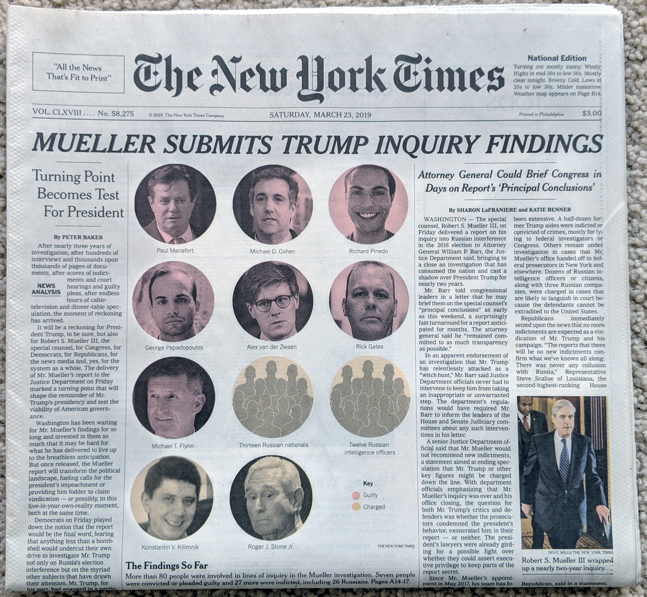
It highlighted the key figures in the report’s investigation and identified their current status. Many of those charged, essentially all the Russians, are unlikely to ever stand trial because Russia will not extradite them.
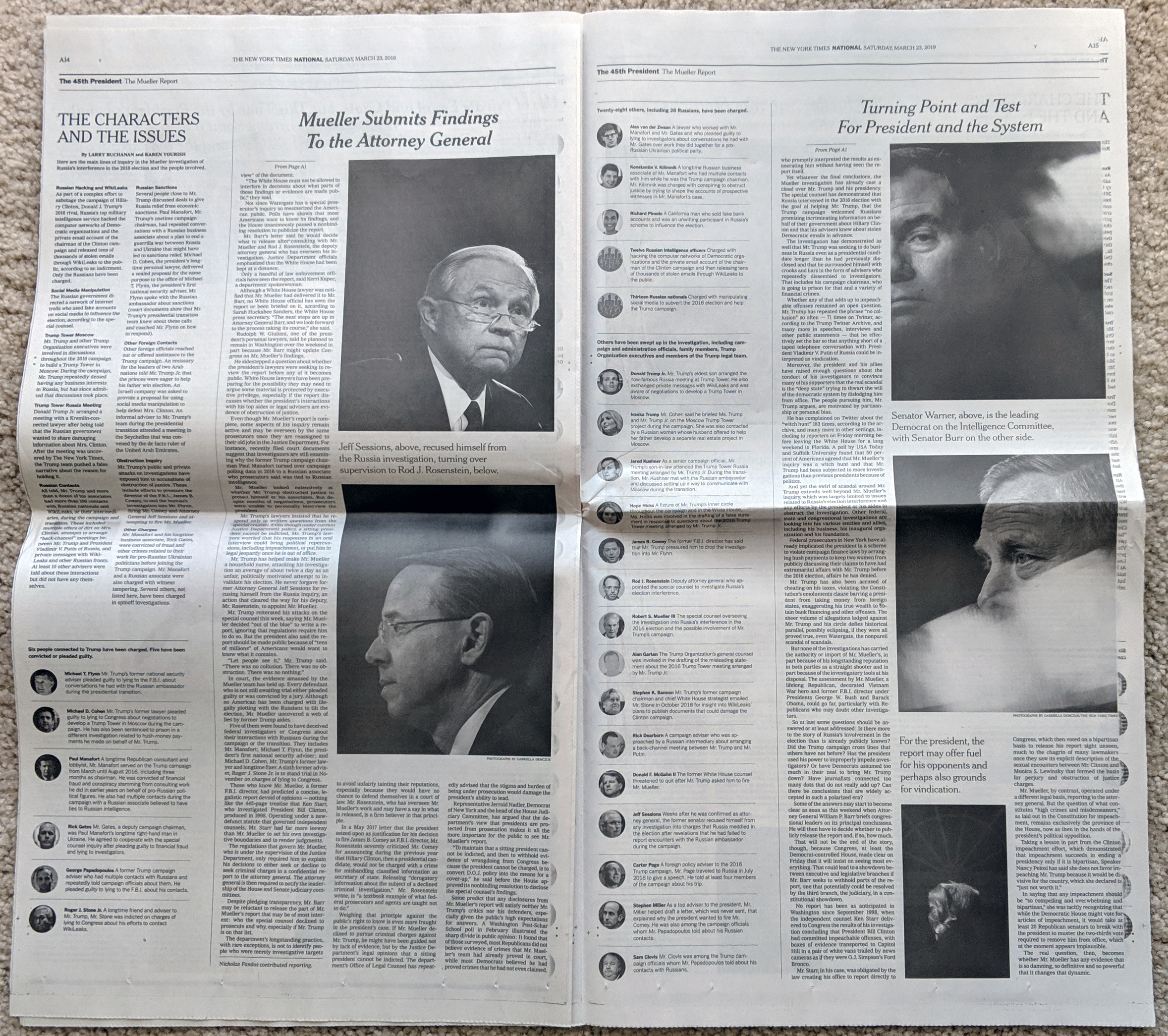
Inside the piece we had two full pages covering the report. The graphics were rather simple, like this, although as these were black and white pages, colouring the photographs was not an option. Instead, the designers simply used headers and titles to separate out the rogues’ gallery.
This wasn’t a complicated piece, but it made sense as one of the first pieces. For months we had been told the investigation was “wrapping up soon”, or words to that effect. Then, out of nowhere, it finally did. In one day, and crucially without the actual report yet, work like this reminded us that the report had, in fact, achieved its purpose.
Credit for the piece goes to the New York Times graphics department.