
Last weekend was not only the Game of Thrones finale, but also the Eurovision final. For the Americans not familiar with it, it’s a part music, part theatrics competition between all European countries and then sometimes guest countries like Australia or Israel. The winner is chosen by the total number of points their act receives. The UK, as one of the largest countries in Europe, is one of the few countries that is guaranteed a spot.
But that doesn’t mean the UK performs well. Last weekend, the UK bombed. The winner, the Netherlands, scored 498 points. The UK? 11. But the UK has been terrible for years now. And unlike in American baseball, it’s not because tanking gets you coveted draft picks for new talent. The BBC charted the placement of the British entries since its last win in 1997, the height of Cool Britannia.
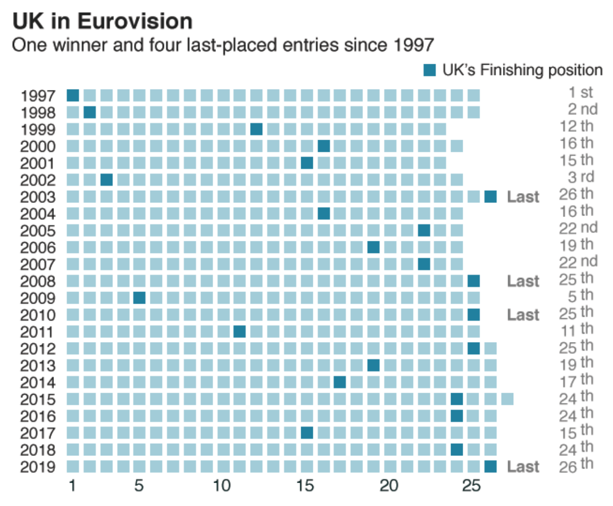
Design wise, I wonder about the horizontal movement of places. A top-to-bottom movement might make more sense. The labelling here is also a bit too much. My eye immediately settles on the black text for the years, as their tight spacing creates a dark field that overpowers the otherwise nice light blue–dark blue contrast in the graphic. Maybe the beginning and end years could have been labelled with some key intervals, say every five years?
Similarly, the use of the ordinal number over the cardinal on the right hand side puts more emphasis on the labelling than the graphic itself. Here, however, the designers wisely chose a grey for the text so as not to overpower the graphic. But I wonder if the use of a cardinal number could have reduced the extra bits of text at the end and drive more focus to the graphic.
Overall, it’s a neat graphic. But I think a few small tweaks could improve the design. Unfortunately for the UK, they are more than just a few small tweaks away from winning Eurovision 2020.
Credit for the piece goes to the BBC graphics department.