
Last week I had three different discussions with people about some of the impact of climate change upon the United States. However, what did not really come up in those conversations was the environmental changes set to befall the United States. And by environment, I explicitly mean how the flora of the US will change.
Why? Well, as warmer climates spread north, that means tropical and subtropical plants can follow warmer temperatures northward into lands previously too cold. And they could replace the species native to those lands, who evolved adaptations for their particular climate.
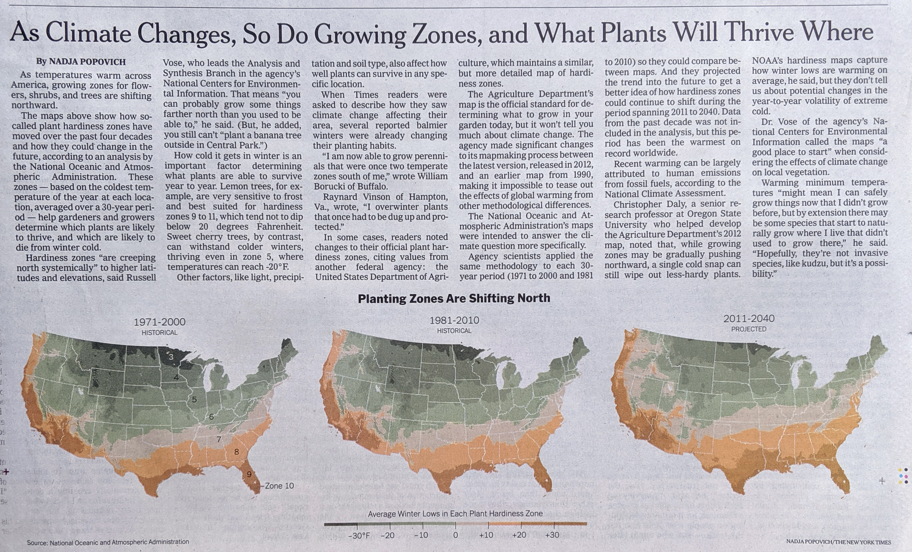
Thankfully, last week the New York Times published a piece that explored how those impacts could be felt. Hardiness zones are a concept designed to tell gardeners when and where to plant certain crops. And while the US Department of Agriculture has a detailed version useful to horticulturists, the National Oceanic and Atmospheric Administration produces a very similar version for the purpose of climate studies. And when you group those hardiness levels by the forecast lowest temperatures in an area, you get this.
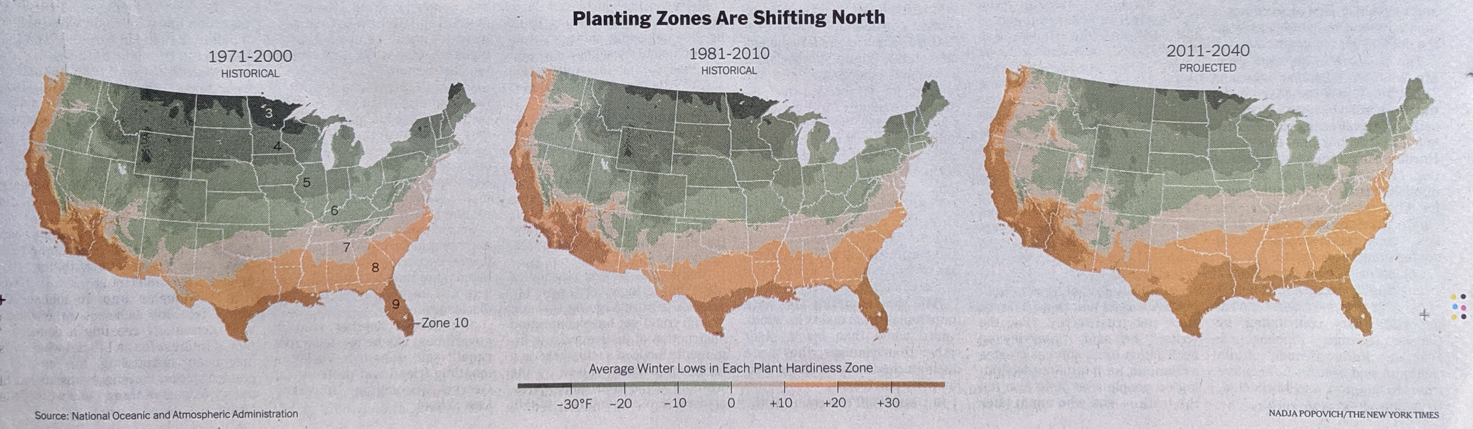
There you have it, the forecast change to plant zones.
From a design standpoint, I like the idea of the colour shift here. However, where it breaks seems odd. Though it could be more influenced by the underlying classifications than I understand. The split occurs at 0ºF, which is well below freezing. I wonder if the freezing point, 32ºF could have been used instead. I also wonder if adding Celsius units above the same legend could be done to make the piece more accessible to a broader audience.
Otherwise, it’s a nice use of small multiples. And from the editorial design standpoint, I like how the article’s text above the graphic makes use of a six-column layout to add some dynamic contrast to what is essentially a three-column layout for the graphics.
Credit for the piece goes to Nadja Popovich.