
This piece was published Monday, so it’s one round out of date, but it still holds true. It looks at the betting odds of each of the candidates looking to enter No. 10 Downing Street. And yeah, it’s going to be Boris.
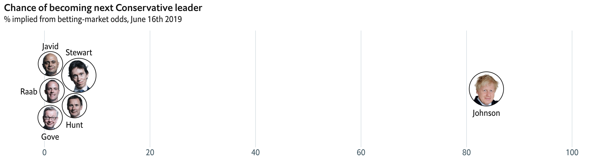
The thing that strikes me as odd about this piece however, is note the size of the circles. Why are they larger for Boris Johnson and Rory Stewart? It cannot be proportional to their odds of victory or else Boris’ head would be…even bigger. Is that even possible? Maybe it relates to their predicted placement of first and second, the two of which go to the broader Tory party for a vote. It’s really unclear and deserves some explanation.
The graphic also includes a standard line chart. It falls down because of spaghettification in that all those also rans have about the same odds, i.e. slim, to beat Boris.
Perhaps the most interesting thing to follow is who will be the other person on the ballot. But then who remembers Andrea Leadsom was the runner up to Theresa May?
Credit for the piece goes to the Economist graphics department.