
Last week the Philadelphia area experienced a mini tornado outbreak with three straight days of watches and warnings. Of course further west in the traditional Tornado Alley, far more storms of far greater intensity were wreaking havoc. But with tornado warnings going off every few minutes just outside the city of Philadelphia, it was hard to concentrate on storms in, say, Oklahoma.
But the New York Times did. And they put together a nice graphic showing the timeline of the outbreak using small multiples to show where the tornado reports were located on 12 consecutive days.
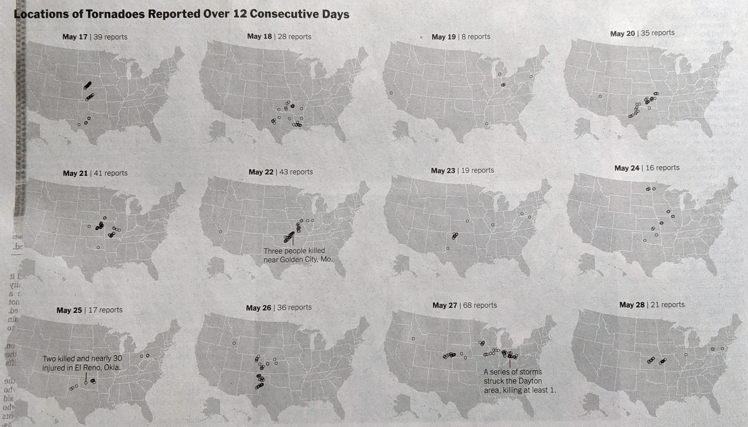
Of course the day of that publication, 29 May, would see another few dozen, even in and around Philadelphia. Consequently, the graphic could have been extended to a day 13. But that would have been rather unlucky.
From a design standpoint, the really nice element of this graphic is that it works so well in black and white. The graphic serves as a reminder that good graphics need not be super colourful and flashy to have impact.
Credit for the piece goes to Weiyi Cai and Jason Kao.