
Two weeks ago the Washington Post published a fascinating article detailing the prescription painkiller market in the United States. The Drug Enforcement Administration made the database available to the public and the Post created graphics to explore the top-line data. But the Post then went further and provided a tool allowing users to explore the data for their own home counties.
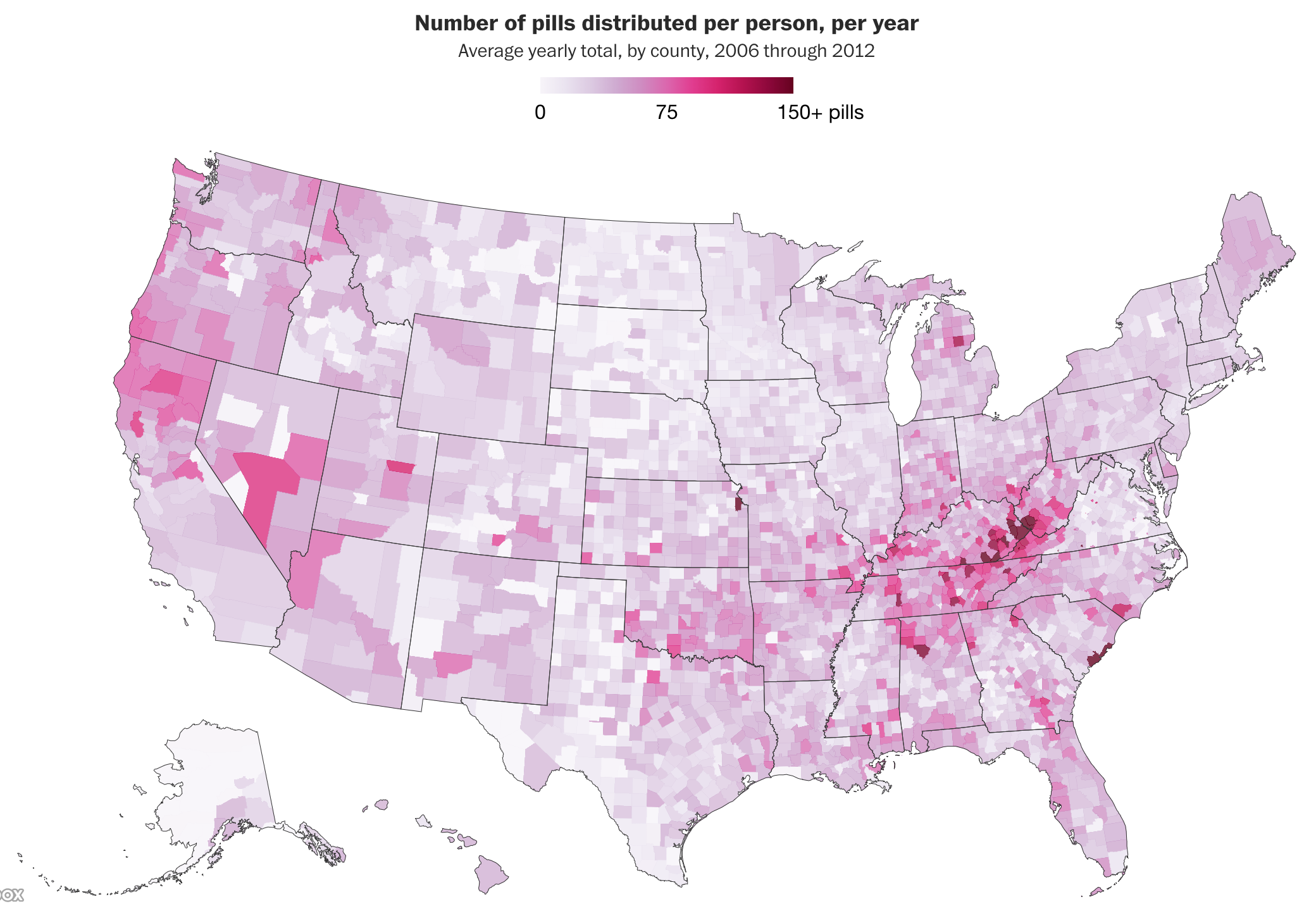
The top line data visualisation is what you would expect: choropleth maps showing the prescription and death rates. This article is a great example of when maps tell stories. Here you can clearly see that the heaviest hit areas of the crisis were Appalachia. Though that is not to say other states were not ravaged by the crisis.
For me, however, the true gem in this piece is the tool allowing you the user to find information on your county. Because the data is granular down to county-level information on things like pill shipments from manufacturer to distributor, we can see which pharmacies were receiving the most pills. And, crucially, which manufacturers were flooding the markets. For this screenshot I looked at Philadelphia, though I only moved here in 2016, well after the date range for this data set.
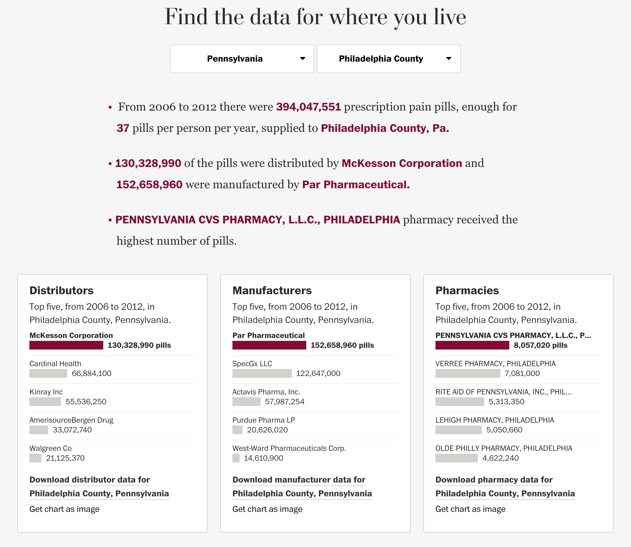
You can clearly see, however, the designers chose simple bar charts to show the top-five. I don’t know if the exact numbers are helpful next to the bars. Visually, it becomes a quick mess of greys, blacks, and burgundies. A quieter approach may have allowed the bars to really shine while leaving the numbers, seemingly down to the tens, for tables. I also cannot figure out why, typographically, the pharmacies are listed in all capitals.
But the because I lived in Chicago for most of the crisis, here is the screenshot for Cook County. Of course, for those not from Chicago, it should be pointed out that Chicago is only a portion of Cook County, there are other small towns there. And some of Chicago is within DuPage County. But, still, this is pretty close.
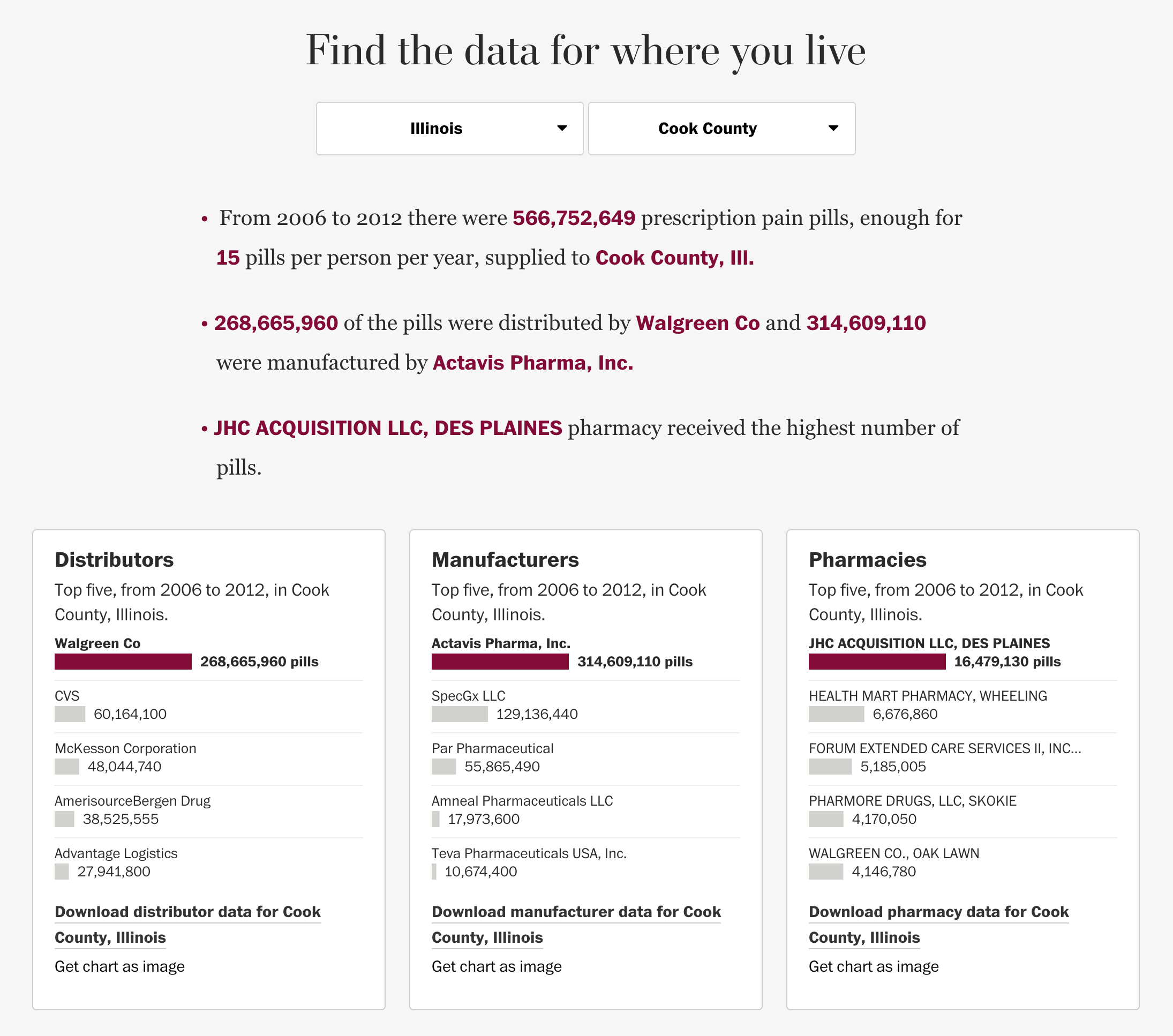
In an unrelated note, the bar charts here do a nice job of showing the market concentration or market power of particular companies. Compare the dominance of Walgreens as a distributor in Cook County compared to McKesson in Philadelphia. Though that same chart also shows how corporate structures can obscure information. I was never far from a big Walgreens sign in Chicago, but I have never seen a McKesson Corporation logo flying outside a pharmacy here in Philadelphia.
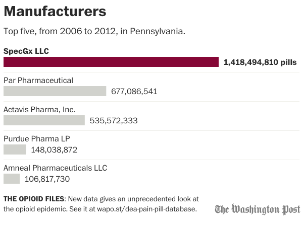
Lastly, the neat thing about this tool is that the user can opt to download an image of the top-five chart. I am not sure how useful that bit is. But as a designer, I do like having that functionality available. This is for Pennsylvania as a whole.
Credit for the piece goes to Armand Emamdjomeh, Kevin Schaul, Jake Crump and Chris Alcantara.