
In a recent Washington Post piece, I came across a graphic style that I am not sure I can embrace. The article looked at the political trifecta at state levels, i.e. single political party control over the government (executive, lower legislative chamber, and upper legislative chamber). As a side note, I do like how they excluded Nebraska because of its unicameral legislature. It’s also theoretically non-partisan (though everybody knows who belongs to which party, so you could argue it’s as partisan as any other legislature).
At the outset, the piece uses a really nice stacked bar chart. It shows how control over the levers of state government have ebbed and flowed.
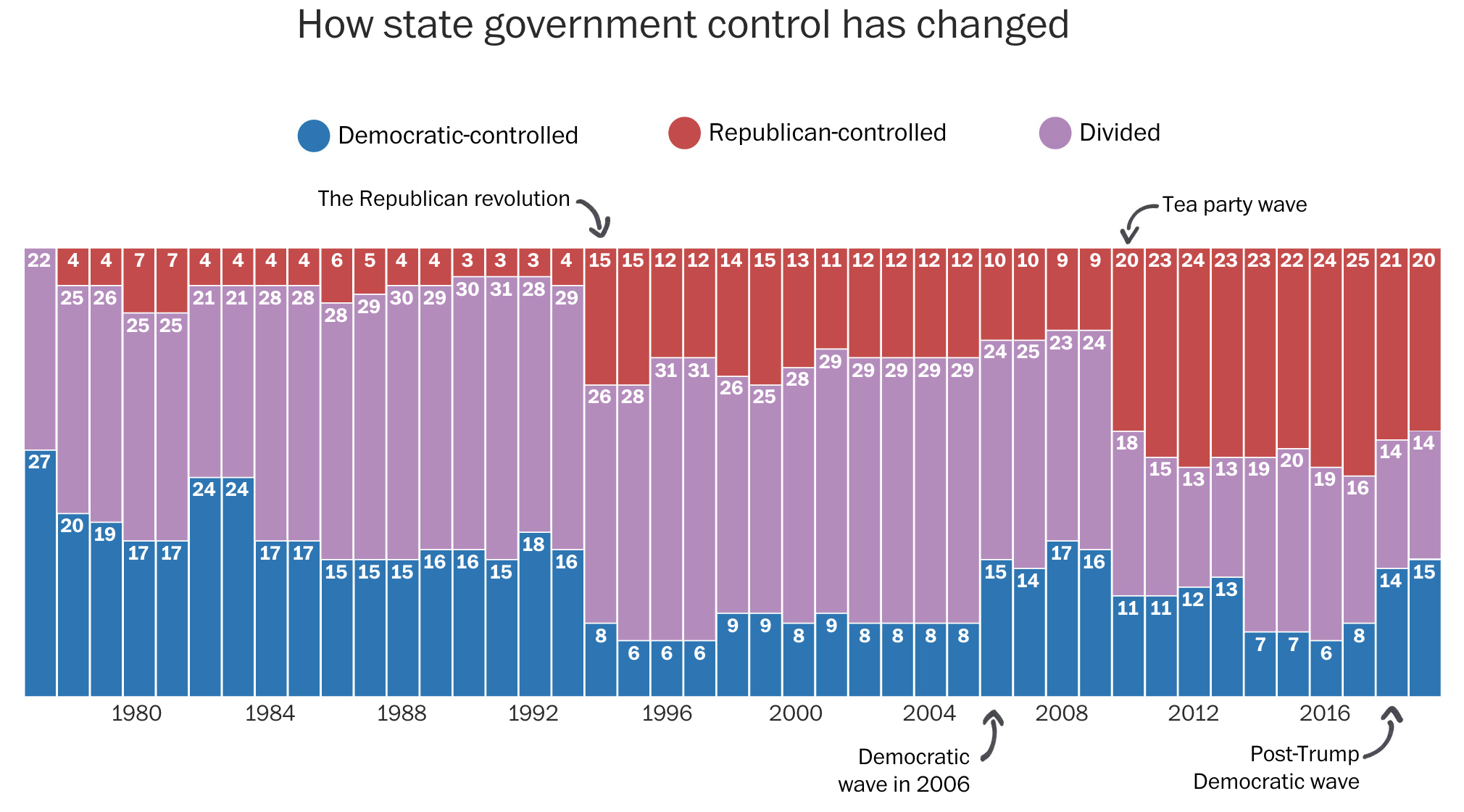
It also uses little black lines with almost cartoonish arrowheads to point to particular years. The annotations are themselves important to the context—pointing out the various swing years. But from an aesthetic standpoint, I have to wonder if the casualness of the marks detracts from the seriousness of the content.
Sometimes the whimsical works. Pie charts about pizza pies or pie toppings can be whimsical. A graphic about political control over government is a different subject matter. Bloomberg used to tackle annotations with a subtler and more serious, but still rounded curve type of approach. Notably, however, Bloomberg at that time went for an against the grain, design forward, stoic business serious second approach.
Then we get to a choropleth map. It shows the current state of control for each state.
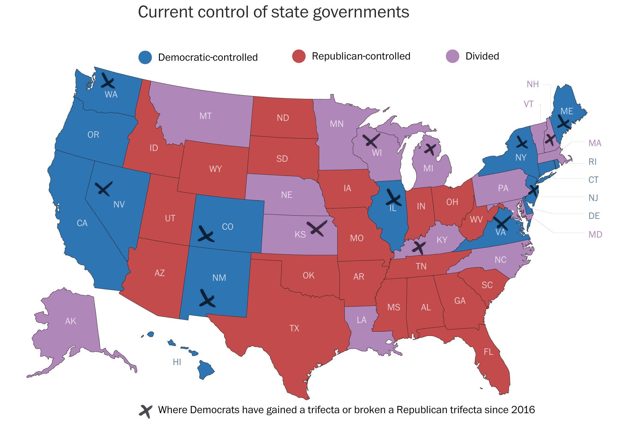
X marks the spot?However, here the indicator for recent party switches is a set of x’s. These have the same casual approach as the arrows above. But in this case, a careful examination of the x’s indicates they are not unique, like a person drawing a curve with a pen tool. Instead these come from a pre-determined set as the x’s share the exact same shape, stroke lengths and directions.
In years past we probably would have seen the indicator represented by an outline of the state border or a pattern cross-hatching. After all, with the purple being lighter than the blue, the x’s appear more clearly against purple states than blue. I have to admit I did not see New Jersey at first.
Of course, in an ideal world, a box map would probably be clearer still. But the curious part is that the very next map does a great job of focusing the user’s attention on the datapoint that matters: states set for potential changes next November.
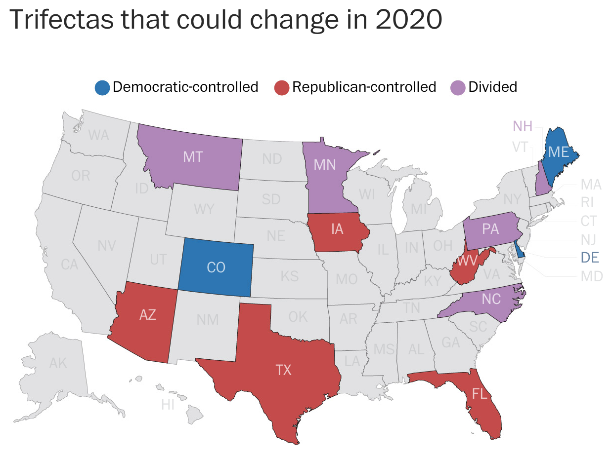
Here the states of little interest are greyed out. The designers use colour to display the current status of the potential trifecta states. And so I am left curious why the designers did not choose to take a similar approach with the remaining graphics in the piece.
Overall, I should say the piece is strong. The graphics generally work very well. My quibbles are with the aesthetic stylings, which seem out of place for a straight news article. Something like this could work for an opinion piece or for a different subject matter. But for politics it just struck a loud dissonant chord when I first read the piece.
Credit for the piece goes to Kate Rabinowitz and Ashlyn Still.