
A few weeks ago we said farewell to John Bercow as Speaker of the House (UK). Whilst I covered the election for the new speaker, I missed the opportunity to post this piece from the BBC. It looked at Bercow’s time in office from a data perspective.
The piece did not look at him per se, but that era for the House of Commons. The graphic below was a look at what constituted debates in the chamber using words in speeches as a proxy. Shockingly, Brexit has consumed the House over the last few years.
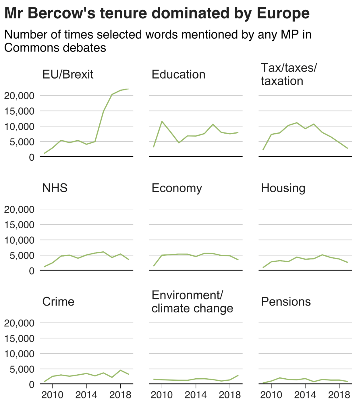
I love the graphic, as it uses small multiples and fixes the axes for each row and column. It is clean, clear, and concise—just what a graphic should be.
And the rest of the piece makes smart use of graphical forms. Mostly. Smart line charts with background shading, some bar charts, and the only questionable one is where it uses emoji handclaps to represent instances of people clapping the chamber—not traditionally a thing that happens.
Content wise it also nailed a few important things, chiefly Bercow’s penchant for big words. The piece did not, however, cover his amazing sense of sartorial style vis-a-vis neckties.
Overall a solid piece with which to begin the weekend.
Credit for the piece goes to Ed Lowther & Will Dahlgreen.