
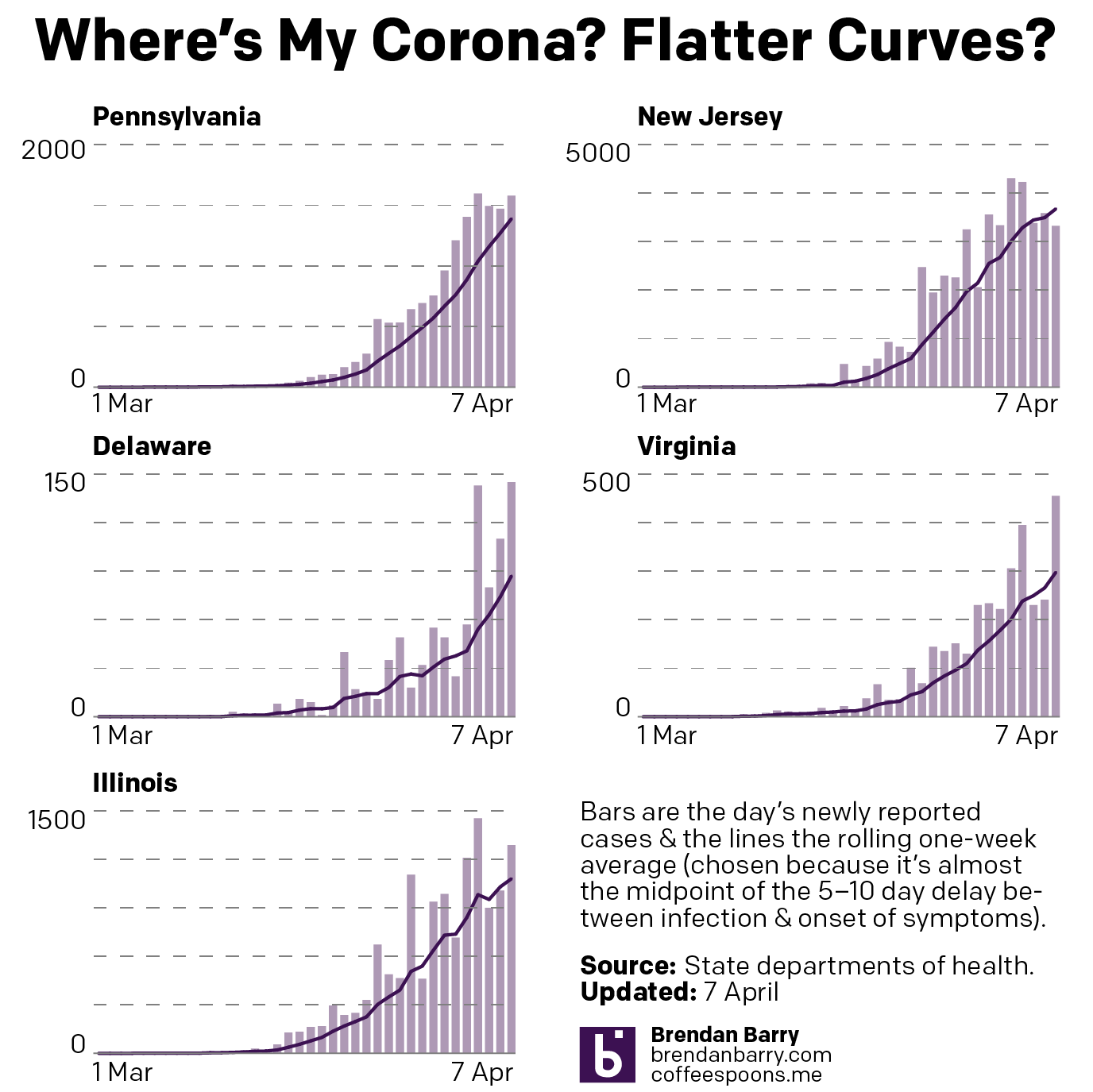
Here are the Tuesday figures for Pennsylvania, New Jersey, Delaware, Virginia, and Illinois. At the end is an updated version of the flattening curves chart as well. Given the value of these graphics that people have been texting, emailing, and DMing me on social media, I might consider making these a regular staple here on my blog as well. I would probably slowly write about other graphics covering the outbreak as well.
Any feedback is welcome on how to make the graphics more useful to you, the public.
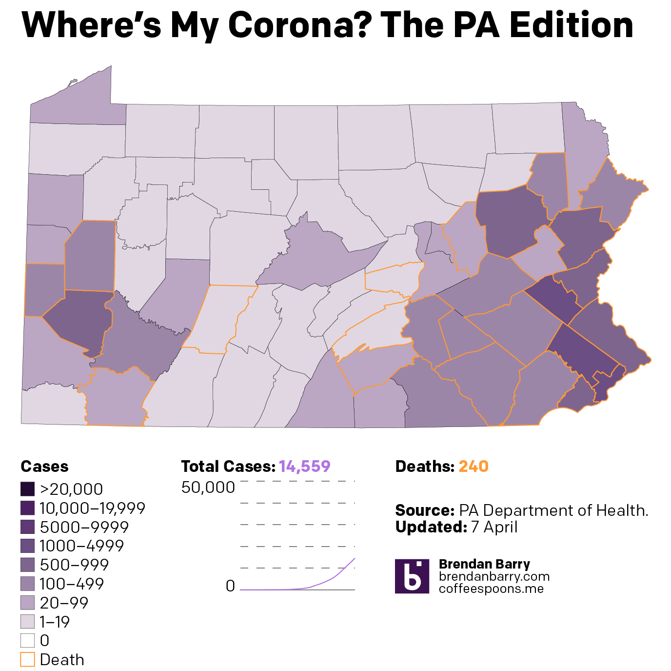
Pennsylvania has finally reached the point where the virus has infected at least one person in every county. Now, if we shift our attention a wee bit to the deaths, we can see those are still largely confined to the eastern third of the state.
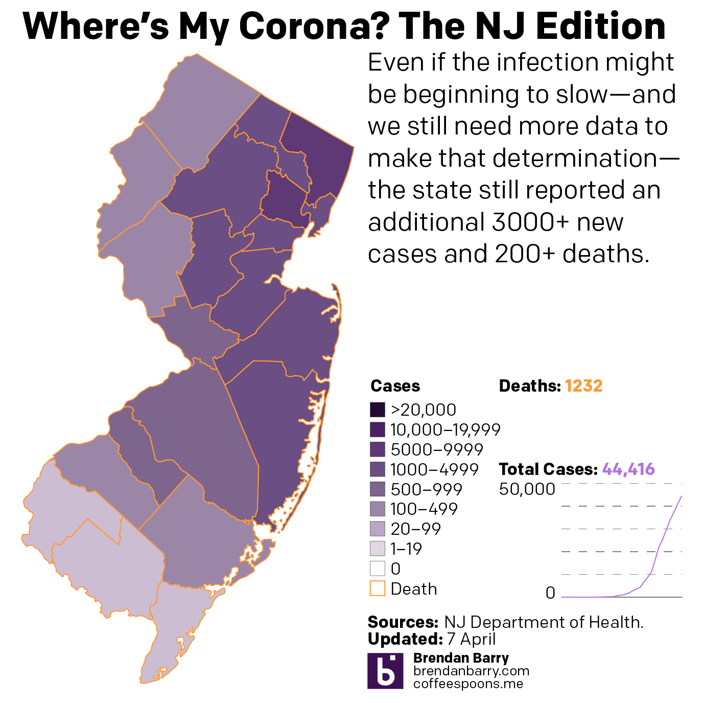
New Jersey continues to suffer greatly. But a sharp increase in new cases could be a blip, or it could mean the curve isn’t flattening. We need more data to see a longer trend. Regardless, over 3000 more people were reported infected and over 200 more died.
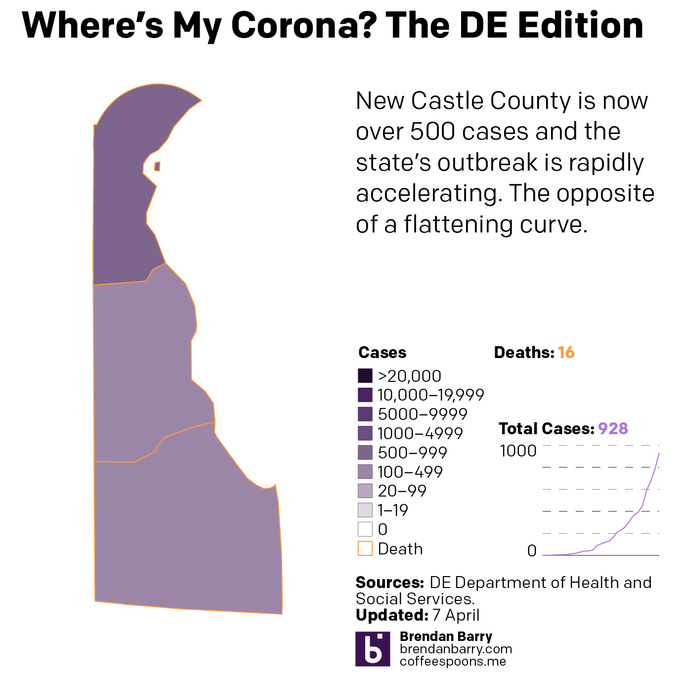
Delaware worsened significantly. As a small state, it has a lower captive population. But it is rapidly approaching 1000 cases. In fact, I would not be surprised if that is the headline from Wednesday.
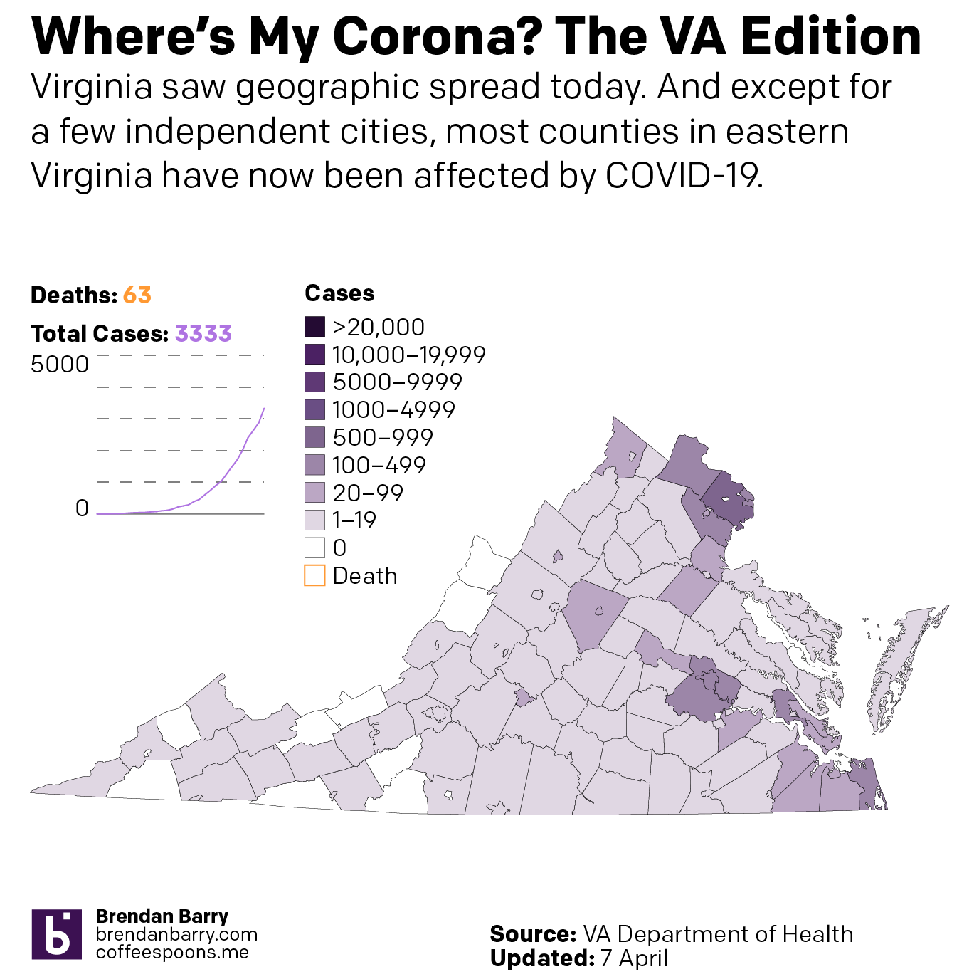
Virginia also saw a significant uptick in cases. And most counties and independent cities in eastern Virginia now report cases. But the rural, mountainous counties in the west and southwest are not uniformly infected. At least not yet.
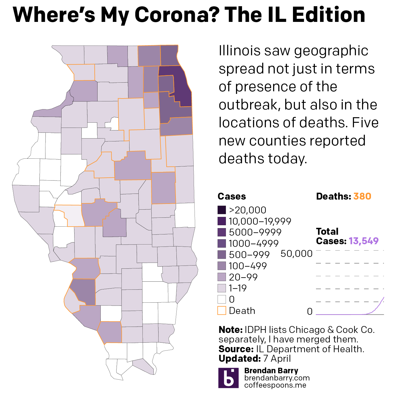
Illinois saw some geographic spread, but again, compared to a state like Pennsylvania, the worst in Illinois is disproportionately concentrated in the Chicago metropolitan area.
Lastly, the curves are not flattening in all the states but maybe New Jersey. But as I noted above, the higher daily cases there might be a blip.
Credit for the pieces goes to me.