
Yesterday Pew Research released the results of a survey of how the rest of the world views select countries throughout the world. The Washington Post covered it in an article and created some graphics to support the text. The text, of course, was no big surprise in that the rest of the world views the United States poorly compared to just several years ago and that, in particular, President Trump is a leader in whom the world has no confidence.
But that’s not what I want to talk about. Instead, I want to address a design element in the one of their graphics. (But you should go ahead and read about the survey results.)
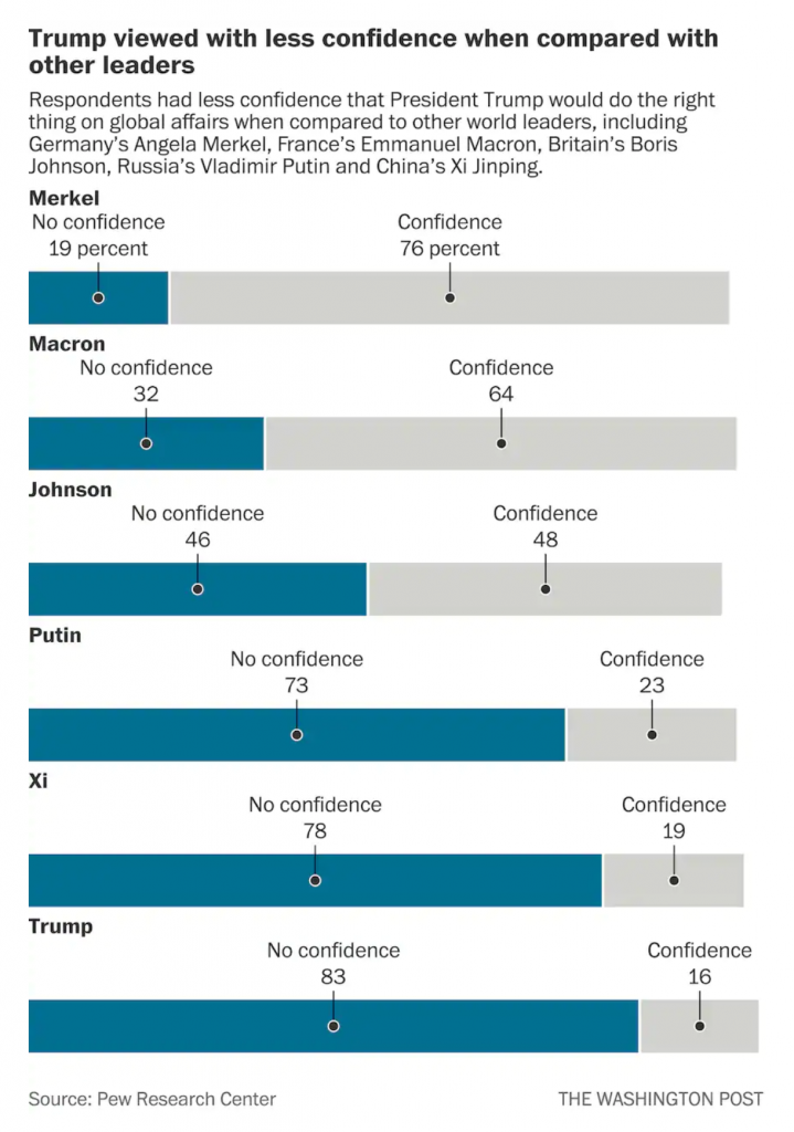
The issue here is the positioning of the labels for each bar, representing a world leader. At the very top of the graphic, things are in a good way. We have Merkel with a small space beneath that text then another label, “No confidence, 19 percent”, and then a connecting line to a dot to the blue bar. We then have a small space and the label Macron, meaning we have moved on and are on the next world leader.
But what if the reader sees the title and starts towards the bottom? They want to see the leaders in whom the world has no confidence. Now look at the bottom of the chart and the positioning of the labels for Trump, and above him, Xi, Putin, and maybe even Johnson. Because the “No confidence, x percent” labels have moved further to the right, there is an enormous space between the leader’s name and their coloured bar. Visually, this creates a link between the leader’s name and the preceding bar. For example, Trump appears to have a no confidence value of 78 with an unlabelled bar chart beneath him.
I suggest that there are two easy fixes to better link the labels to the data. The first is to move the leaders’ labels down, once the “No confidence” label has moved sufficiently far to the right. Like so.

The leader is now very clearly attached to his or her data with little confusion.
My second option is to fix the “No confidence” labels permanently to the left of the chart so as not to create that visual space in the first place, like so.
Here, after seeing the first option, I wonder if there is enough visual space at all between the leaders. But, this is only a quick Photoshop exercise. If I wanted to really tweak this, I would consider putting the data point or number in bold to the right of the label.That would eliminate an entire line of type that could be repurposed as a visual buffer between leaders.
I think either option would be preferable because of increased clarity for the reader.
Credit for the piece goes to the Washington Post graphics department.