
One story I’m following on Tuesday night is Texas. The state’s early voting—still with Monday to go—has surpassed the state’s total 2016 vote. Polling suggests that early votes lean Biden due to President Trump’s insistence that his supporters vote in person on Election Day as he lies about the integrity of early and mail-in voting.
The Texas Tribune looked at what we know about that turnout and what it may portend for Tuesday’s results. And, to be honest, we don’t—and won’t—really know until the votes are counted. They put together a great piece that divided Texas counties into four groups (their terminology): big blue cities, fast-changing counties, solidly red territory, and border counties. They then looked at the growth in registered voters in those counties from 2016, and looked at how they voted in the 2016 presidential election (Hillary Clinton vs. Donald Trump) and the 2018 US Senate election (Beto O’Rourke vs. Ted Cruz).
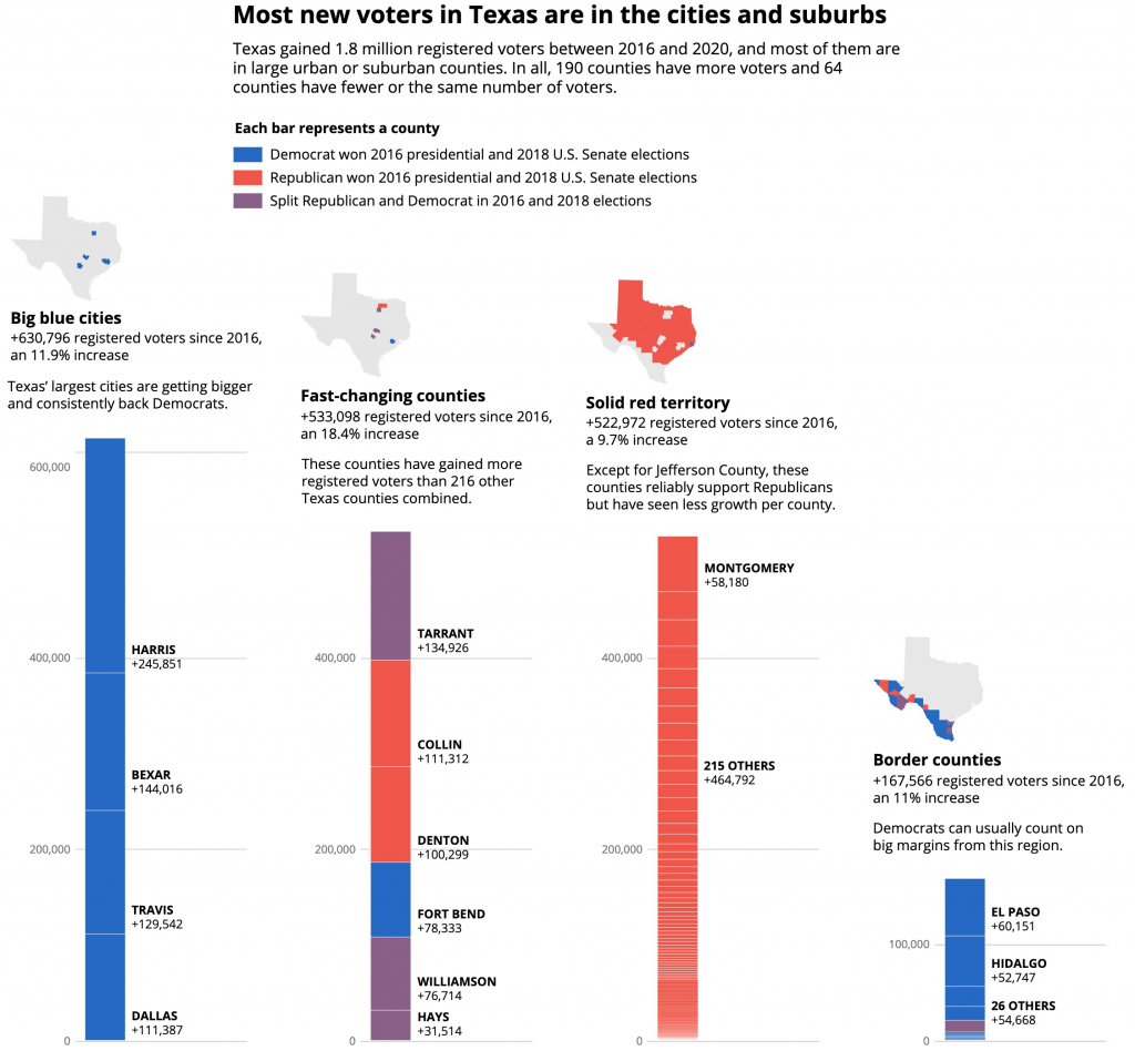
The piece uses the above stacked bar chart to show that Texas’ 1.8 million new registered voters’ largest share belongs to the big blue cities. The second largest group is the competitive suburbs in the fast-changing counties. The third largest, though quite close to second, was the solidly red territory. The border counties, still important for the margins, ranks a distant fourth.
I’m not normally a fan of stacked bar charts, because they do not allow for great comparisons of the constituent elements. For example, try comparing any of of those solidly red territory counties to one another. But here, the value is more in the stacked set as a group rather than the decomposition of the set, because you can see how the big blue cities have, as a group, a greater number of those 1.8 million new voters.
Those fast-changing counties include a lot of the suburbs for Texas’ largest cities. And those are areas where, across the country, Republicans are losing voters by the tens of thousands to the Democrats. As battlegrounds, these presented a challenge, because as swing counties, they split their votes between Clinton and Cruz and Trump and Beto. And so the designers chose purple to represent them in the stacked design. I think it’s a solid choice and works really well here.
But in terms of the story, I’ll add that in 2016, Trump won Texas by 807,000 votes. Texas added 1,800,000 new voters since then. And turnout before Election Day is already greater than it was in 2016.
It’s still a state likely to go for Trump on Tuesday. But, if Biden has a good night, it’s not inconceivable that Texas flips. FiveThirtyEight’s polling average has Trump with only a 1.2 point lead.
Credit for the piece goes to Mandi Cai, Darla Cameron and Anna Novak.