
Yesterday we looked at an article from the Inquirer about the 2020 election and how Biden won because of increased margins in the suburbs. Specifically we looked at an interactive scatter plot.
Today I want to talk a bit about another interactive graphic from the same article. This one is a map, but instead of the usual choropleth—a form the article uses in a few other graphics—here we’re looking at three-dimensional pyramids.
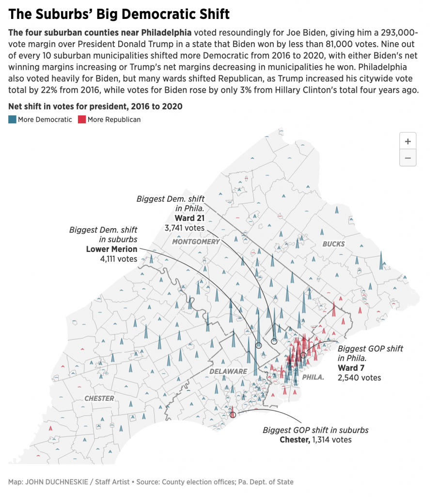
Yesterday we talked about the explorative vs. narrative concept. Here we can see something a bit more narrative in the annotations included in the graphic. These, however, are only a partial win, though. They call out the greatest shifts, which are indeed mentioned in the text. But then in another paragraph the author writes about Bensalem and its rightward swing. But there’s no callout of Bensalem on the map.
But the biggest things here, pun intended, are those pyramids. Unlike the choropleth maps used elsewhere in the article, the first thing this map fails to communicate is scale. We know the colour means a county’s net shift was either Democratic or Republican. But what about the magnitude? A big pyramid likely means a big shift, but is that big shift hundreds of votes? Thousands of votes? How many thousands? There’s no way to tell.
Secondly, when we are looking at rural parts of Bucks, Chester, and Montgomery Counties, the pyramids are fine. They remain small and contained within their municipality boundaries. Intuitively this makes sense. Broadly speaking, population decreases the further you move from the urban core. (Unless there’s a secondary city, e.g. Minneapolis has St. Paul.) But nearer the city, we have more population, and we have geographically smaller municipalities. Compare Colwyn, Delaware County to Springfield, Bucks County. Tiny vs. huge.
In choropleth maps we face this problem all the time. Look at a classic election map at the county level from 2016.
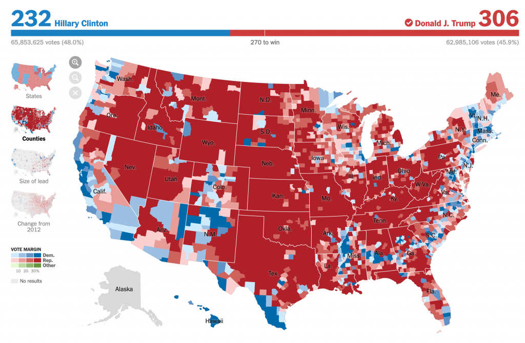
You can see that there is a lot more red on that map. But Hillary Clinton won the popular vote by more then 3,000,000 votes. (No, I won’t rehash the Electoral College here and now.) More people are crowded into smaller counties than there are in those big, expansive red counties with far, far fewer people.
And that pattern holds true in the Philadelphia region. But instead of using the colour fill of an area as above, this map from the Inquirer uses pyramids. But we face the same problem, we see lots of pyramids in a small space. And the problem with the pyramids is that they overlap each other.
At a glance, you cannot see one pyramid beind another. At least in the choropleth, we see a tiny field of colour, but that colour is not hidden behind another.
Additionally, the way this is constructed, what happens if in a municipality there was a small net shift? The pyramid’s height will be minimal. But to determine the direction of the shift we need to see the colour, and if the area under the line creating the pyramid is small, we may be unable to see the colour. Again, compare that to a choropleth where there would at least be a difference between, say, a light blue and light red. (Though you could also bin the small differences into a single neutral bin collecting all small shifts be them one way or the other.)
I really think that a more straight forward choropleth would more clearly show the net shifts here. And even then, we would still need a legend.
The article overall, though, is quite strong and a great read on the electoral dynamics of the Philadelphia region a month ago.
Credit for the piece goes to John Duchneskie.