
For years, one issue with the American economy had been that we did not save enough. It’s understandable, as it’s hard to keep up with the image of the carefree American without profligate spending. But that’s also not great long-term. But thanks to Covid-19, we’ve now swung to the other side of the spectrum: Americans may be saving too much.
Saying that sounds callous to the devastation the pandemic has wrought upon large swathes of the economy. But it’s true in the aggregate as this New York Times piece explains. In particular, the authors highlight one example. Consider a corporate CEO who earned a $100,000 bonus for keeping the company he runs afloat during the recession. He adds $100k to the aggregate American income. But at a restaurant shuttered by the pandemic, owners lay off a hostess, a server, a bartender, and a dishwasher, each earning $25,000. Their collective lost income is $100,000 and so balances out that one CEO. And as CEOs are more able to work remotely than servers, it’s not hard to see how the upper-income earning cohorts of the economy have done well. In human-terms, four unemployed service industry people is terrible. But statistically, it’s a wash. Once we understand that, it makes the piece sensible.
It uses decomposition charts, basically stacked bar charts broken apart, to show what constitutes the two sides of the American household budget: earning and spending. I’ve taken a screenshot of the spending side of the ledger.
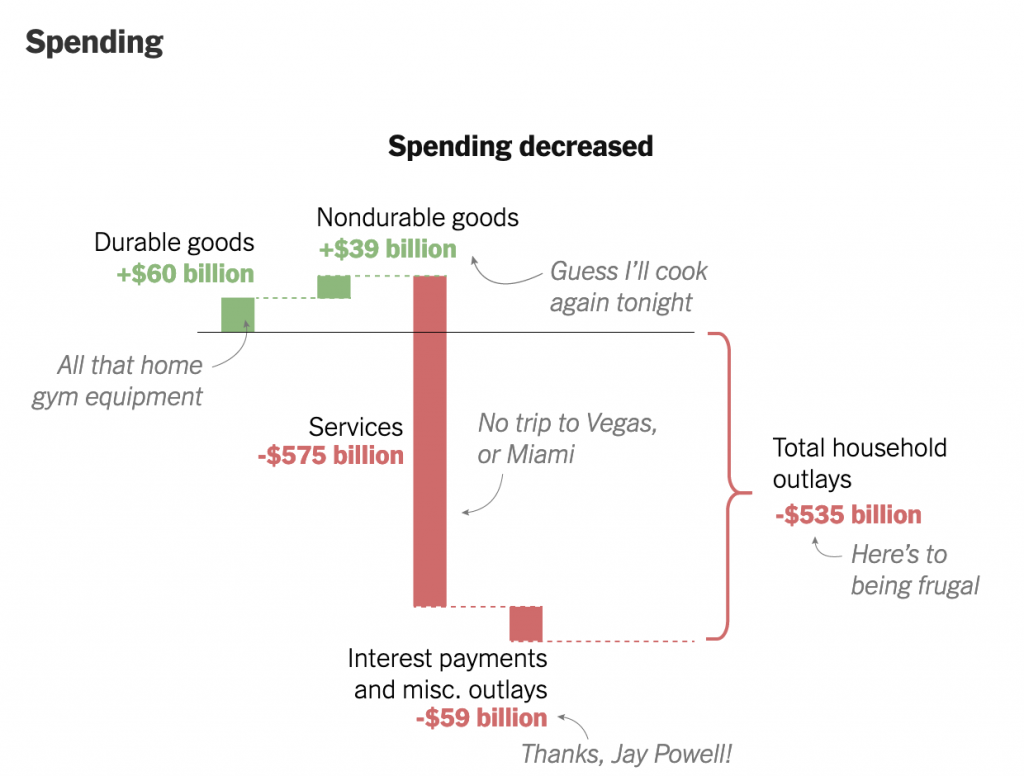
We see that starting from the baseline, the solid line, American households spent more money this year on durable goods. A dotted line then carries that adjusted baseline to the right for the next component of the ledger: nondurable goods. We spent more on those too, so the baseline moves up. The designers annotated the graphic, adding descriptions of what each bar represents in a casual, lighthearted tone. I’ve definitely been cooking for myself a lot more.
Here I wish we had some more traditional charting elements, e.g. axis lines and labels. Now this piece is published under the Upshot, a more conversational and less formal brand than the Times as a whole. That probably explains the casual annotations. But I think some basic axis labels, e.g. spending more vs. spending less, could add some context without the need for the annotations.
Where the piece might lose people is what happens after durable goods. Americans stopped spending on services, a decline of over half a trillion dollars. That’s a lot of money. And so the adjusted baseline shifts to well below where we started. Add on savings from things like interest rates (Jay Powell is the chair of the Federal Reserve, for whose Philadelphia bank I work in full disclosure) and Americans have spent more than half a trillion dollars less. And as the article explains, we’ve also saved an enormous amount, to the tune of $1 trillion. Add it together and you’ve got America saving $1.5 trillion in 2020.
That money has to go somewhere. And you can see where some of it went when you look at surging prices in GameStop. Longer term, when the pandemic begins to end, we are going to have a pent up demand from people who have had their lives on hold for a year or more. And if there is insufficient supply for whatever’s in demand, prices will rise and we could see a sharp jump in inflation. But that’s a post for another day.
Back to this graphic, as a statistical graphic, it works. But without axis labels and data definitions, barely so. However, I think it’s meant to be more casual and illustrative than data-driven. If I look at this piece through that lens, I do think it works.
Credit for the piece goes to Neil Irwin and Weiyi Cai.
One thought on “Making America Save Again”