
It’s no secret that Americans—and likely at least Western communities more broadly—live in bubbles, one of which being our political bubbles. And so I want to thank one of my mates for sending me the link to this opinion piece about political bubbles from the New York Times.
The piece is fairly short, but begins with an interactive piece that allows you to plot your address and examine whether or not you live in a political bubble. Using my flat in Philadelphia, the map shows lots of little blue dots, representing Democratic voters, near the marker for my address and comparatively few red dots for Republicans.
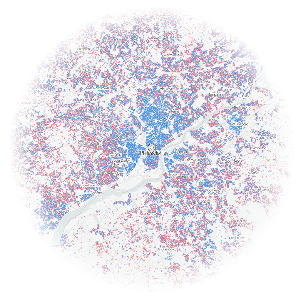
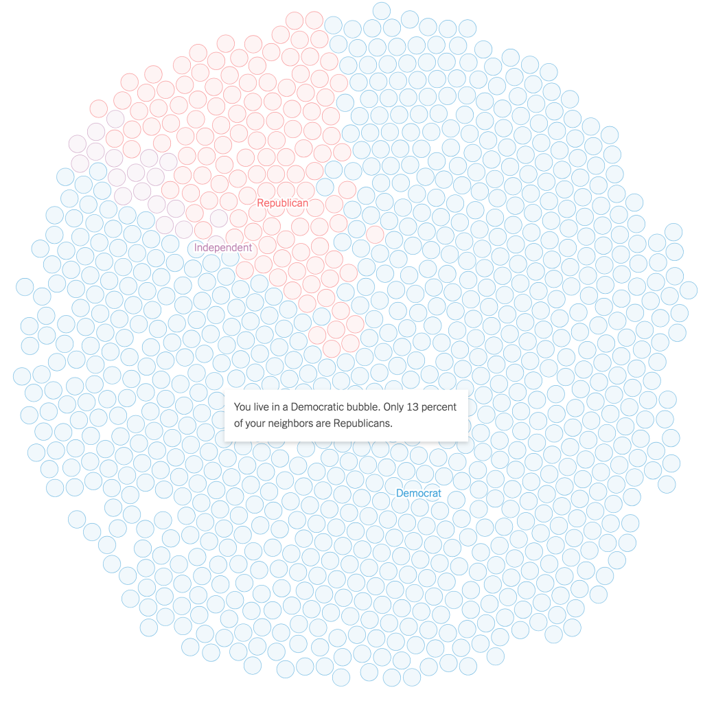
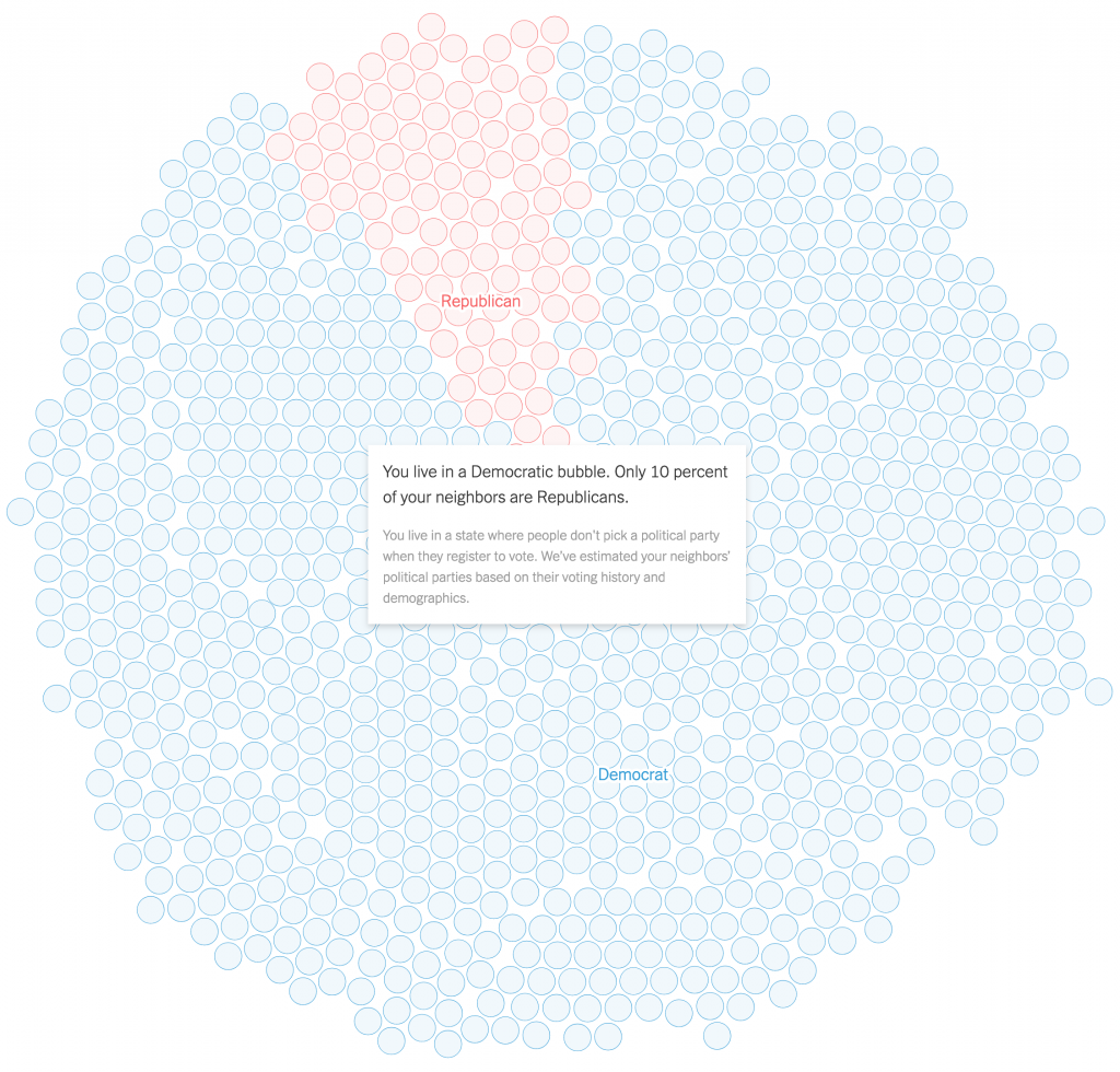
If you then look a bit more broadly, you can see that by summing up the dots, my geographic bubble is largely a political bubble, as only 13% of my neighbours are Republicans. Not terribly surprising for a Democratic city.
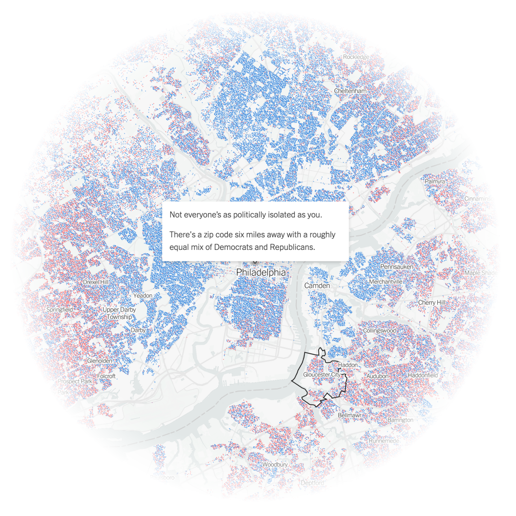
And while the piece does then zoom back out a wee bit, it tries to show me that I don’t live too far from a politically integrated bubble. Except in this case, it’s across a decent sized river and getting there isn’t the easiest thing in the world. I’m not headed to Gloucester anytime soon.
These interactives serve the purpose of drawing the user into the article, which continues explaining some of the causes of this political segregation, by both policy, redlining, and personal choice, lifestyle. The approach works, because it gives us the most relatable story in a large dataset, ourselves. We’re now emotionally or intellectually invested in the idea, in this case political bubbles, and want to learn all about it. Because the more you know…
The piece uses the same type of map to showcase the bubbles more broadly from the Bay Area to the plains of Wyoming. (No surprises in the nature of those political bubbles.) It wraps up by showing how politicians can use the geography of our political bubbles to create political geographies via gerrymandering that shore up their political careers by creating safe districts. The authors use a gerrymandered northeastern Ohio district that encompasses two cities, Cleveland and Akron, to make that point.
That’s in part why I’m in favour of apolitical, independent boundary commissions to create more competitive congressional districts. Personally, I would have been fascinated to see how Pennsylvania’s congressional districts, redrawn in 2018 by the Pennsylvania Supreme Court, after the court found the gerrymandered districts of 2011 unconstitutional, created political competition between parties instead of within parties. But I digress.
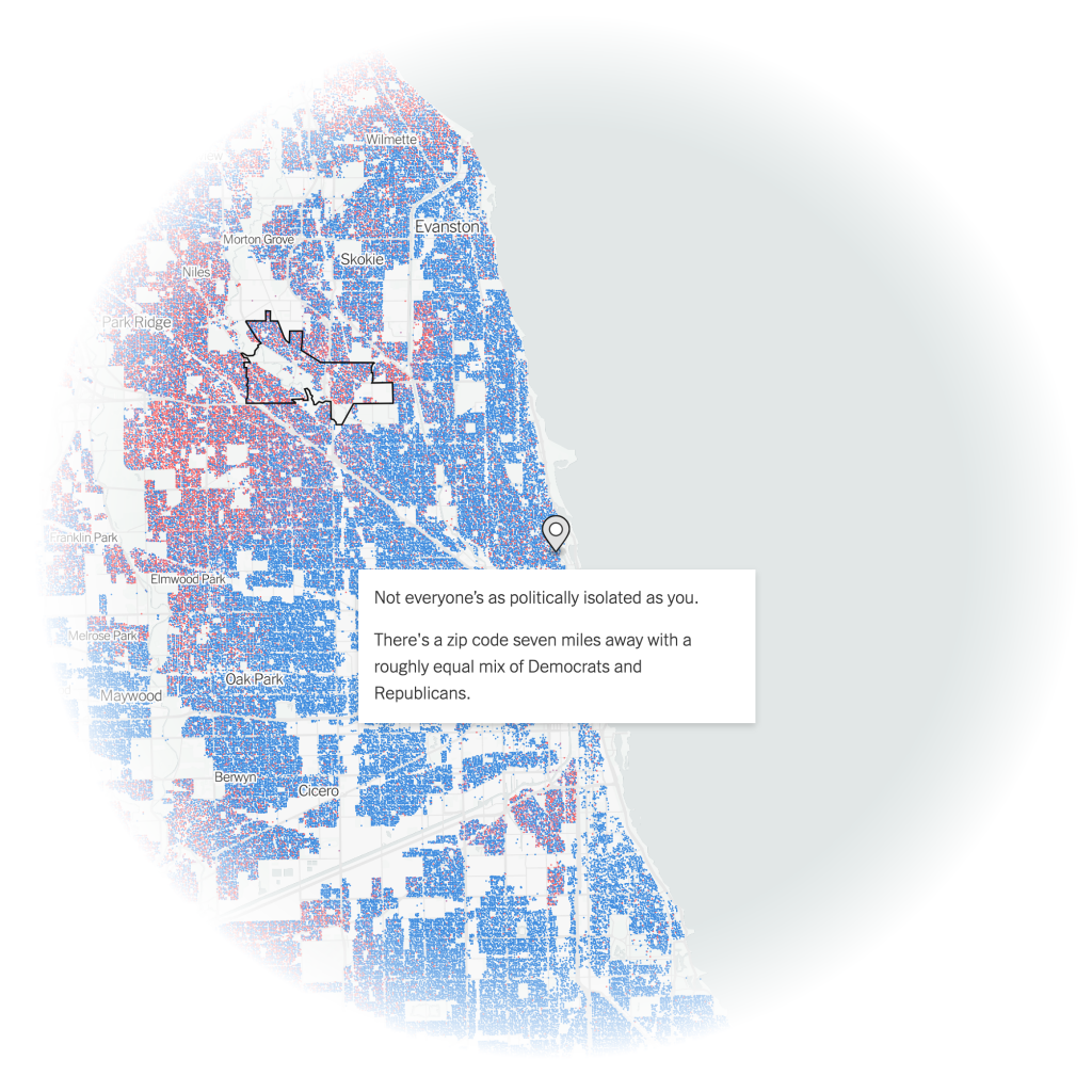
And then for kicks, I looked at how my flat in Chicago compared.
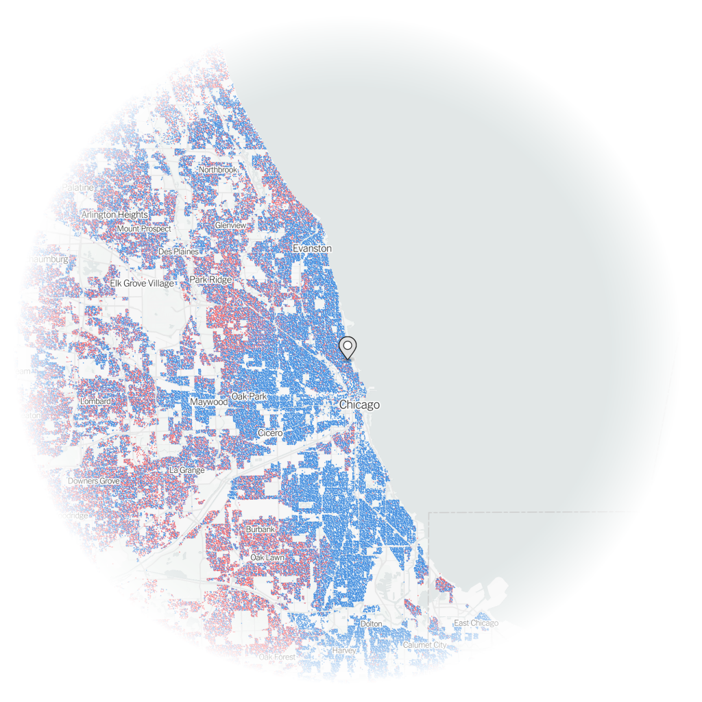
Not surprisingly, my neighbourhood in Lakeview was another political bubble, though this one even more Democratic than my current one.
But if I had wanted to move to an integrated political bubble, instead of Philadelphia, I could have moved to…Jefferson Park.
Credit for the piece goes to Gus Wezerek, Ryan D. Enos and Jacob Brown.