The European debt crisis affects all of us. Shares fall on the exchanges in Frankfurt, Paris and London and then ripple westward to New York before finally reaching Hong Kong and Tokyo. But does anyone understand actually understand who owes whom what?
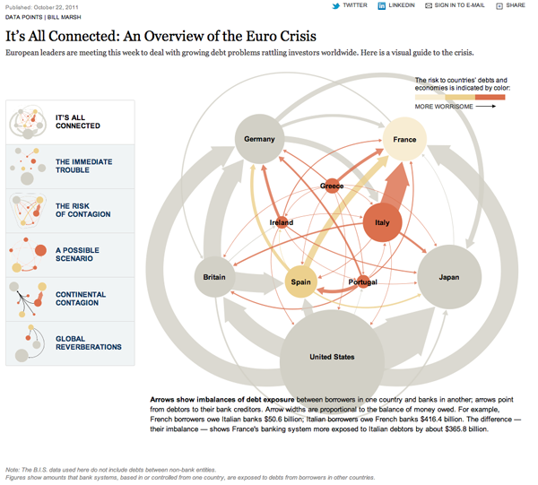
This interactive piece is yet another from the New York Times and is an online version of a print graphic that appeared in Sunday’s paper. Online, interactivity is used to focus attention on particular elements of the story, highlighting key components of the tangled debt web that anchors the whole piece. The width of the lines relate the difference between borrowers and lenders.

Hidden in the width of the arrows, however, is the gross lending. The lending may appear to cancel itself out, but the banks and other sources of the loans may not all be lending to each other, i.e., some big players could still take a hit if the crisis worsens.
The colours reflect the level of ‘worry’ in the country—though how worry is defined is left unstated.
Different parts of the story and potential scenarios are revealed by clicking buttons on the left-hand side of the piece. Elements of the large graphic that are not needed to tell that part of the story, though remaining pieces remain in place. This is an effective means of reminding the audience where they are situated in the overall web, but I wonder if not a slight shadow or faint trace of the web in the background could have been used instead of losing all the information entirely.
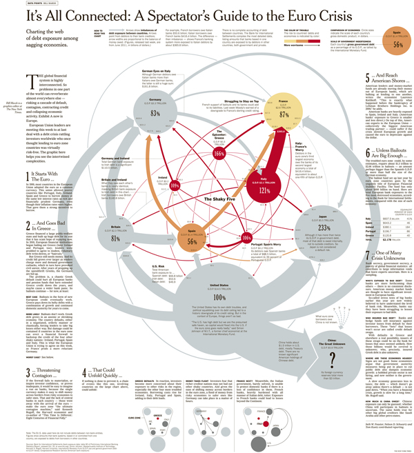
Overall, the interactive piece is quite effective in telling the story. But, because this was in the Sunday paper, the lazy afternoon paper, we also have a large-scale printed infographic that the interactive piece accompanied.

This has a lot more text—dreaded words—to further explain just what is happening. In my mind this adds to the story. For example, what I noted above about the net loans between two parties obscures the gross loans of both sides. This point is explicitly made about Britain and Ireland, which have enjoyed a very strong bilateral trade arrangement for a number of years. This context is added by a little text blurb crafted into the overall design of the piece.
Different scenarios are highlighted at the bottom with a reduction of the main piece creating small multiples of the diagram instead of how the interactive piece removed unnecessary elements. I think this is an equally effective means of solving that problem.
The New York Times created two separate but very much related pieces to explain a story that affects us all. The first media, the interactive piece, takes advantage of the ability to replace on the screen what is not necessary with what is necessary. Further, it allows some data that is not so relevant at first glance to be hidden. Mouse over the various lines and countries to reveal the data behind the problem for each. Do we need this information at first? No. Our first order is to try and work out the web we weaved. Well, that the bankers weaved.
That is very different than the print edition, which cannot be changed. All the content must be available at once. But, the data is made smaller because the print resolution is finer than that of a screen. Small text that might not be legible on a screen can be printed and read just fine. The printed edition also allows more space and thus more text for context. And this is okay knowing that the Sunday paper is likely to be read while relaxing with a fine cup of tea or coffee.
Credit for the piece goes to Bill Marsh.

One thought on “European Debt Crisis Explained”