I am a graphic designer who focuses on information design. My day job? Well, they asked me not to say. But to be clear, this blog is my something I do on my own time and does not represent the views of…my employers. I think what I can say is that given my interest in information design—be it in the shape of clear charts, maps, diagrams, or wayfinding systems—I am fortunate that my day job focuses on data visualisation. Outside of work, I try to stay busy with personal design work. Away from the world of design, I have become an amateur genealogist and family historian. You will sometimes see that area of work bleed into my posts.
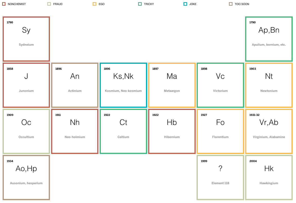
Science is great. But science is also a process and scientific progress goes boink. Some of the mis-steps in chemistry have been erroneous elements. Thankfully the Boston Globe built a small periodic table of non-elements with short anecdotes about the selected few.
Table of non-elements
Credit for the piece goes to Mary Virginia Orna and Marco Fontani.
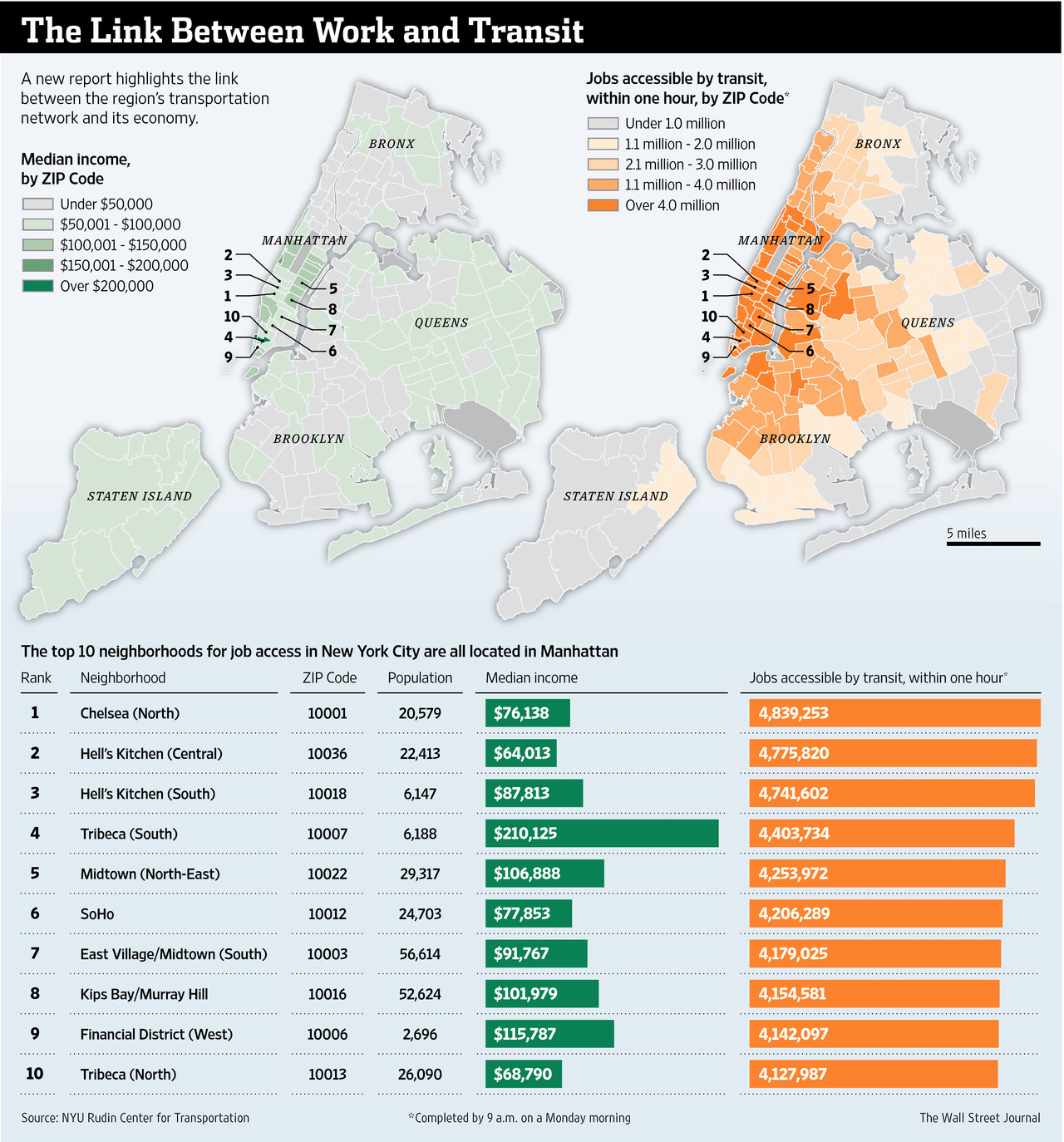
The Wall Street Journal recently published an interesting article about the link between work and access to transit. They included a graphic that looked at the link between the two.
Linking the two together
Credit for the piece goes to the Wall Street Journal graphics department.
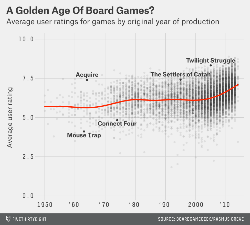
On New Year’s Eve, well technically in the wee hours of New Year’s Day, the group with which I was spending the holiday broke out Settlers of Catan. We played that game—and drank a few bottles of champagne—until 04.00. My experience of playing the game—not necessarily the part about being inebriated on New Year’s Eve—bears out the increasing popularity of board games. This article from FiveThirtyEight seeks to understand what makes particular board games popular. And, because I am mentioning it on this blog, it has a few charts worth noting.
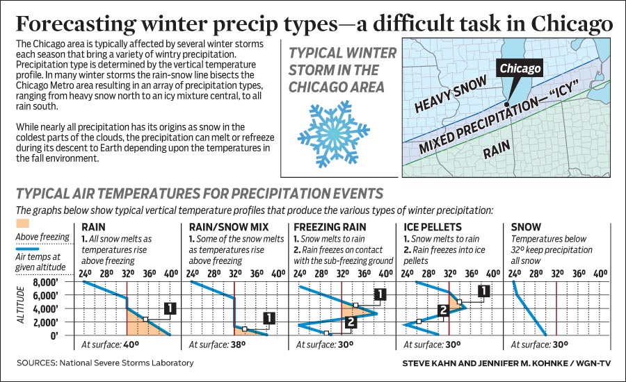
I apologise for the lack of posts over the last two weeks, but I was on holiday. Naturally, I have returned just in time for some snowstorms in the Midwest. But today’s piece comes from WGN and it explains how the type of winter precipitation that falls depends not solely on ground temperatures. Rather, temperature profiles in the upper atmosphere can make all the difference between rain, sleet, and snow.
How temperatures create different precipitation types
Credit for the piece goes to Steve Kahn and Jennifer Kohnke.
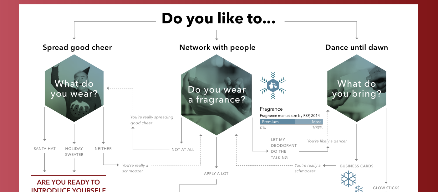
The Christmas holidays are known for many things. One of them is the office holiday party. Today’s post looks at a flow chart put together by the company for which I work, Euromonitor International. As it was put together by the design team, you might very well think that I had something to do with it. But I couldn’t possibly comment.
The beginning of the flow chart
Credit for the piece goes to the Euromonitor design team.
Today’s piece is a photo I snapped of the cover of a relatively recent edition of the RedEye, a free, daily tabloid distributed in Chicago. The city of Chicago decided to raise the minimum wage in the city. And this photo of a stack of quarters depicts just how many quarters that increase will be over the next five years.
The minimum wage in Chicago
I find I usually do not enjoy data photos, for want of a better term. But here we have an obviously editorially driven graphic, but one that uses real materials to represent the data. In other words, we are not taking one quarter to represent one dollar per hour. One quarter means one quarter per hour. And the segmentations merely break out how much that will increase over the years. With minimal annotation, the photo is clear and direct.
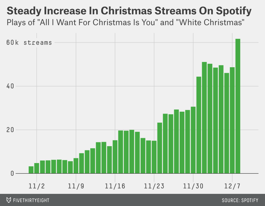
I get that a lot of you like Christmas. That’s great. But for those of not terribly attached to it for more than the days off work, listening to music can switch from being relaxing to aggravating right quick. Thankfully we have FiveThirtyEight to examine just how ridiculous this all-Christmas-all-the-time trend has become.
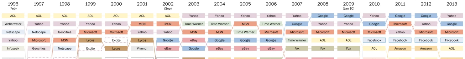
I remember the internet from some of the earlier days. So when the Washington Post published this chart in a piece looking at the history of the popular sites on the Internet, well I felt old. Remember Geocities? Looking at this chart, how many of the old web companies can you recall? Does that make you feel old?
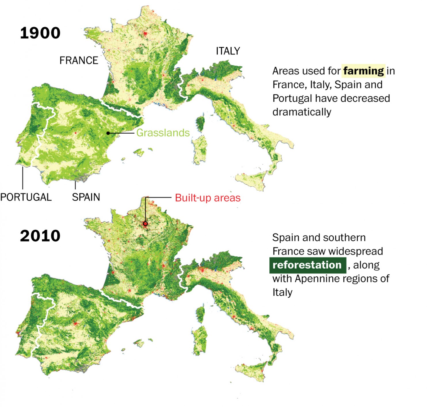
We hear a lot about deforestation around the world. But, in this piece from the Washington Post, we see how over the last century, Europe has actually managed to reverse that trend and reforest parts of the continent.