The Distribution of Debt in the United States

In a good example of comparing share versus actuals, the National Journal looks at the state of debt across the United States. The choropleth map shows adult share of debt while the bar charts show the regional value of said debt. While the south holds more debt, the west and east coasts have more debt. They also, however, have higher incomes that make servicing or paying off said debt easier than lower income adults in the south.

The South's victory is debt
The South’s victory is debt

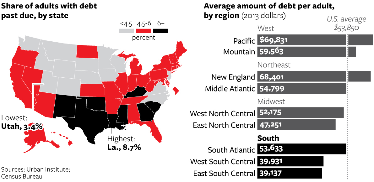
Credit for the piece goes to Nancy Cook and Stephanie Stamm.

The Liberal to Conservative Spectrum of American Cities

Yesterday we looked at the growth of inland cities. Today, we follow up with a piece from the Economist that examines the political leanings of America’s larger cities. As one might imagine, the larger cities generally trend liberal. But the most conservative American cities are actually not very conservative. They are better described as centre-right.

The liberal/conservative nature of American cities

Credit for the piece goes to K.N.C. and L.P.

Growth of Inland Cities

Some of the nation’s fastest growing cities are inland, away from the coast where housing prices are high. To support an article about the demographic shift, the New York Times created this map. Circle size represents growth over a six-year period while the colour of the bubble represents housing prices.

Fastest growing cities

Credit for the piece goes to the New York Times graphics department.

Coal vs. the Great Barrier Reef

Your humble author is away this week. But the Great Barrier Reef in Australia is still here. For now. The Guardian takes a look at the growing threat to the World Heritage site from the coal industry in Queensland, Australia. The author takes you through the narrative in a chapter format, using charts and maps to illustrate the points in the brief bit of text. A really nice job altogether.

Major ports and their volume

Credit for the piece goes to Nick Evershed.

Borehole Graphics

Long articles often mean lots of vertical space. But it is only every so often when an item can complement itself with a narrow, vertical graphic. The Los Angeles Times has just that in today’s piece, looking at the layers of sedimentation from a borehole.

What's in the borehole?
What’s in the borehole?

Credit for the piece goes to Thomas Curwen, Lorena Elebee, and Javier Zarracina.

Scrabble Scores

Turns out that a large vocabulary is not necessarily what wins you games of Scrabble. Instead it has more to do with probabilities and statistics of values assigned to letters. Five Thirty Eight has a nice piece that charts the high scores of Scrabble games.

Scrabble scores of the 2013 championship

Credit for the piece goes to Oliver Roeder.

The Siege of Sinjar

For those of you unaware, the United States became involved yet again in Iraq. This time, air dropping humanitarian supplies to Yazidi refugees near Mount Sinjar in northern Iraq. (Also, we have started bombing ISIS positions near Irbil, a large city in Kurdish-controlled Iraq.) In today’s post we have the Washington Post and its look at just what is going on around Sinjar.

Siege of Sinjar

Credit for the piece goes to Loveday Morris and Richard Johnson.

Do You Know Africa?

Beyond the fact that it isn’t a country? This week the White House hosted the US–Africa Summit. The Washington Post took the opportunity to quiz readers on their knowledge of African countries’ locations on a blank map. So this Friday, you get to take the quiz and post your results if you dare. A nice touch is that the map colours the countries by the number of guesses and then provides different colour outlines for your selection and the correct one—should you err.

Sierra Leone
Sierra Leone

I messed up Burundi—I always confuse it and Rwanda—and only got a 98%. /humblebrag

Credit for the piece goes to Kevin Schaul.