
Springfield from the Simpsons, of course. Happy Friday, and have fun visiting the Ethnictown station. The article comes from Atlantic Cities.
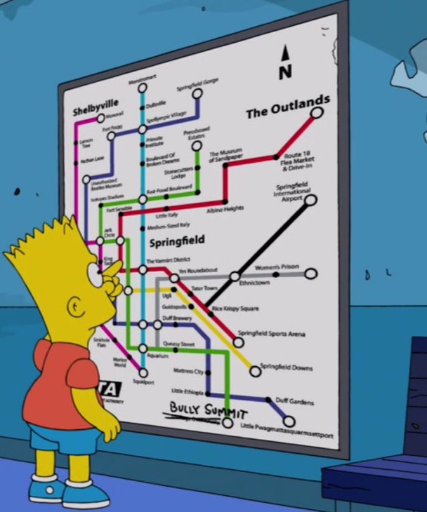
Credit for the piece goes to the designers of the Simpsons.
Springfield from the Simpsons, of course. Happy Friday, and have fun visiting the Ethnictown station. The article comes from Atlantic Cities.
Credit for the piece goes to the designers of the Simpsons.
Yesterday we looked at the USA Today’s piece on the search for MH 370. Today we look at the New York Times, which has been running a series of maps that offer increasing amounts of detail on the context for the search.
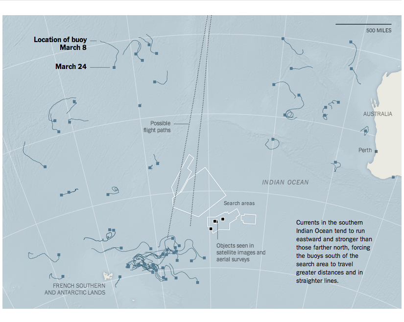
Credit for the piece goes to Josh Keller, Sergio PeÇanha, Shreeya Sinha, Archie Tse, Matthew L. Wald, Tim Wallace, Derek Watkins, and Karen Yourish.
Today’s piece comes from USA Today via a colleague. The piece is part of a larger article about the increasingly all-but-certain crash of MH 370. In step-by-step fashion, it guides the user through several facets of the flight and the investigation as well as the human impact.
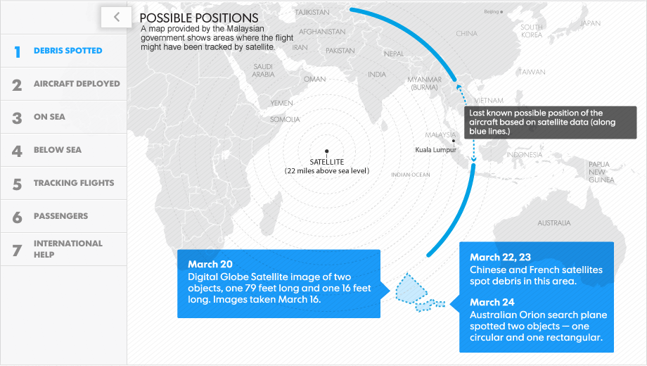
Credit for the piece goes to Frank Pompa, Janet Loehrke, Jeff Dionise, Anne R. Carey and Denny Gainer, Alejandro Gonzalez, and Kevin A. Kepple.
Today’s piece comes from the New York Times. It fits within a broader article about smoking in the United States. The map is a choropleth that compares the smoking rate across counties and states in 1996 and 2012. However, as the article talks about how difficult it has been to decrease the smoking rates among the poor, I wonder if even just a third map would be useful. This map could have shown the actual decline, perhaps in percentage points, of counties between 1996 and 2012. Or another related graphic could have tried to correlate income and said change.

Credit for the piece goes to the New York Times graphics department.
Search authorities may have finally found the missing Malaysian Airlines flight in the southern Indian Ocean. The Washington Post created this great interactive piece to give you a sense of scale of just how difficult it has been to find the aircraft.
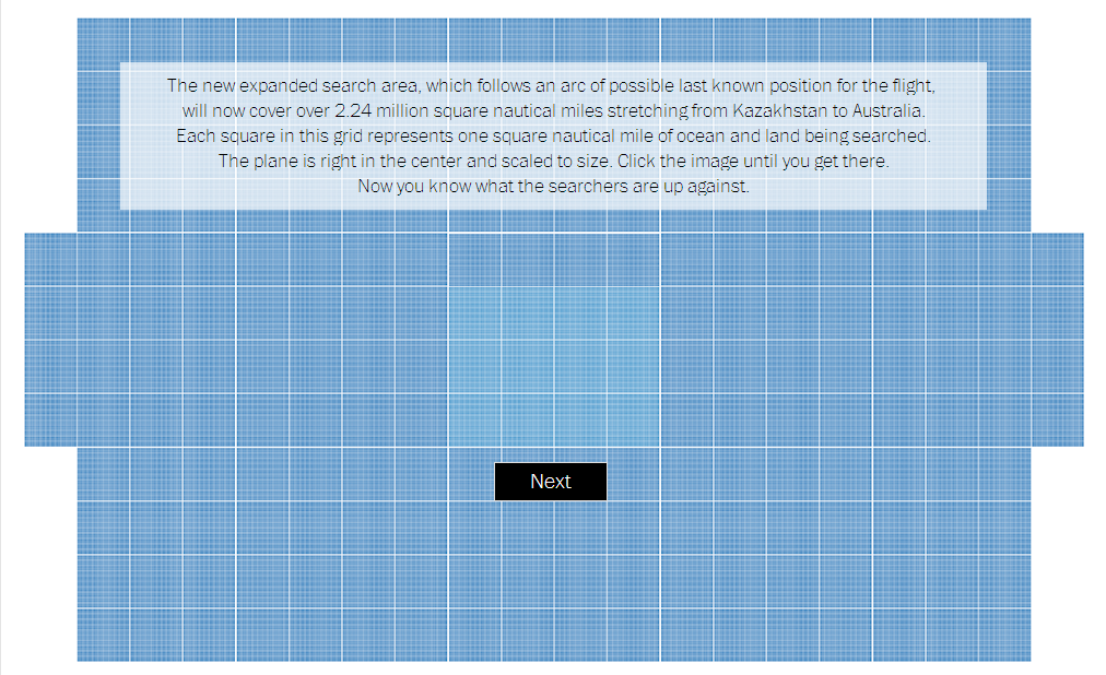
Credit for the piece goes to Richard Johnson and Denise Lu.
This Friday’s post comes from Business Insider. And it looks at the distinctive artists by state.
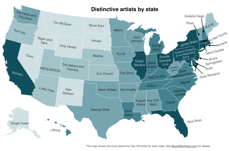
And no, I have no idea who Edward Sharpe and the Magnetic Zeros are.
Credit for the piece goes to Paul Lamere.
One of the possible set of sanctions against Russia by the United States and European Union would impact the country’s defence industries. This chart by the Economist shows how that might not have the most impact. Most of Russia’s arms exports go to China, India, and Algeria. None of whom are the United States or European Union.
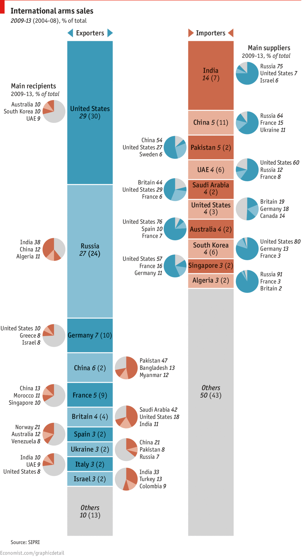
Clearly I don’t love the pie charts. I would much rather have seen segmentation within the bars. Or a full-on Sankey diagram. But, the story is still worth telling.
Credit for the piece goes to R.L.W. and L.P.
Today’s post comes via the New York Times. It’s a simple concept, but shown clearly in this collection of scatter plots. Growth in income for many counties has meant a growth in life expectancy. Unfortunately, not all counties are prospering and so the gap between rich and poor, and therefore the long-lived and shorter-lived, has grown.
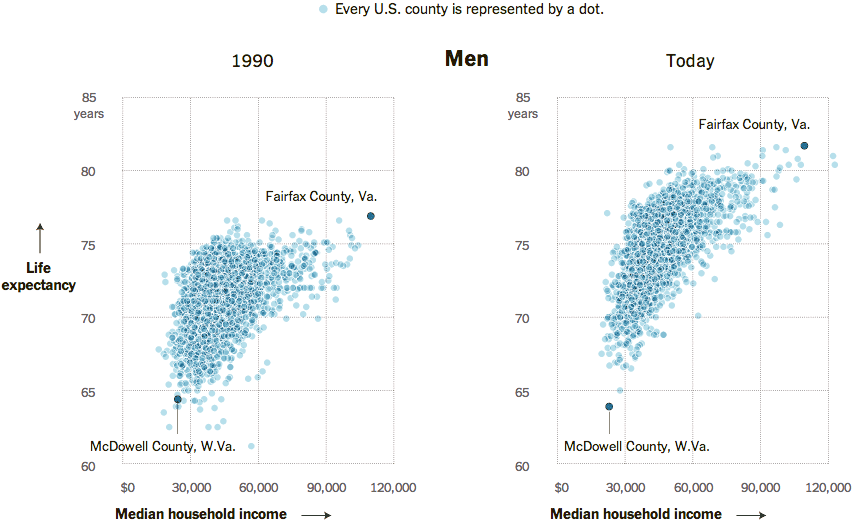
Perhaps the only criticism I have about this piece is that for the highlighting of Fairfax County, Virginia and McDowell Country, West Virginia, an additional component could have summarised the growing gap between the two. For example, a bar chart along the axes of each could measure the growth in income disparity and the growth in life expectancy disparity.
Credit for the piece goes to Alicia Parlapiano.
In December, China landed a rover named Jade Rabbit on the Moon. The South China Morning Post created a nice infographic to explain the lunar landing and place it in the context of other missions to the Moon.
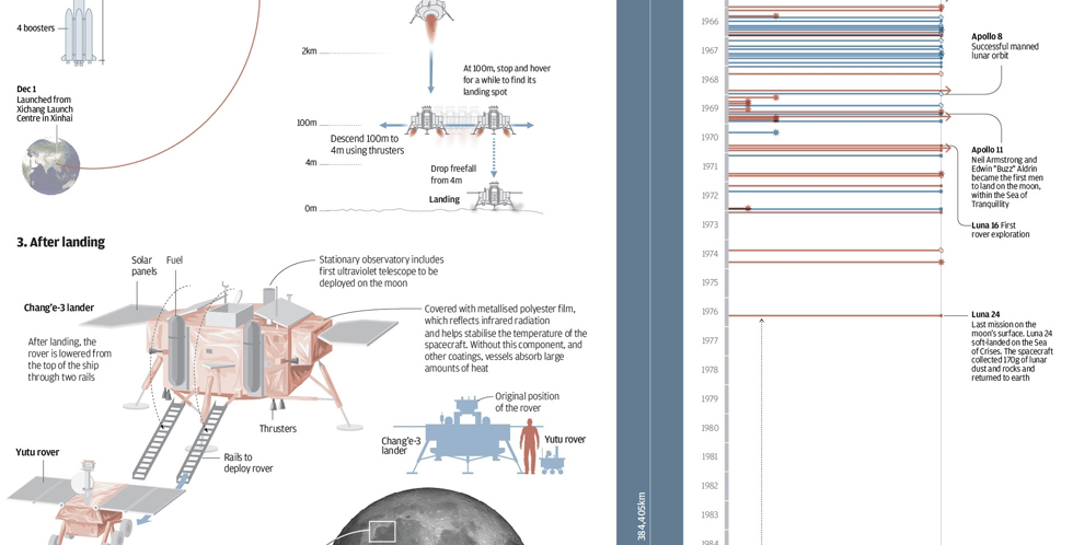
Credit for the piece goes to Adolfo Arranz.
Republican congressman Dave Camp, Chairman of the House Ways and Means Committee (basically responsible for the tax code), wants to simplify the tax code. This nice graphic by the Washington Post basically sums up the changes.
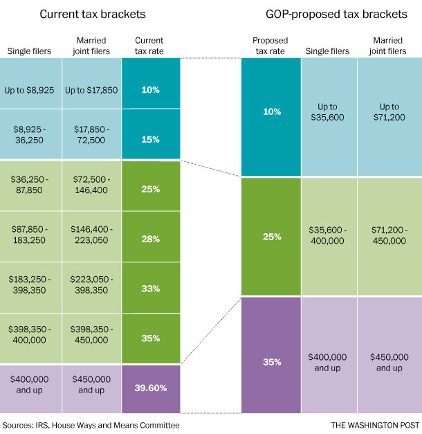
Credit for the piece goes to the Washington Post graphics department.