I am a graphic designer who focuses on information design. My day job? Well, they asked me not to say. But to be clear, this blog is my something I do on my own time and does not represent the views of…my employers. I think what I can say is that given my interest in information design—be it in the shape of clear charts, maps, diagrams, or wayfinding systems—I am fortunate that my day job focuses on data visualisation. Outside of work, I try to stay busy with personal design work. Away from the world of design, I have become an amateur genealogist and family historian. You will sometimes see that area of work bleed into my posts.
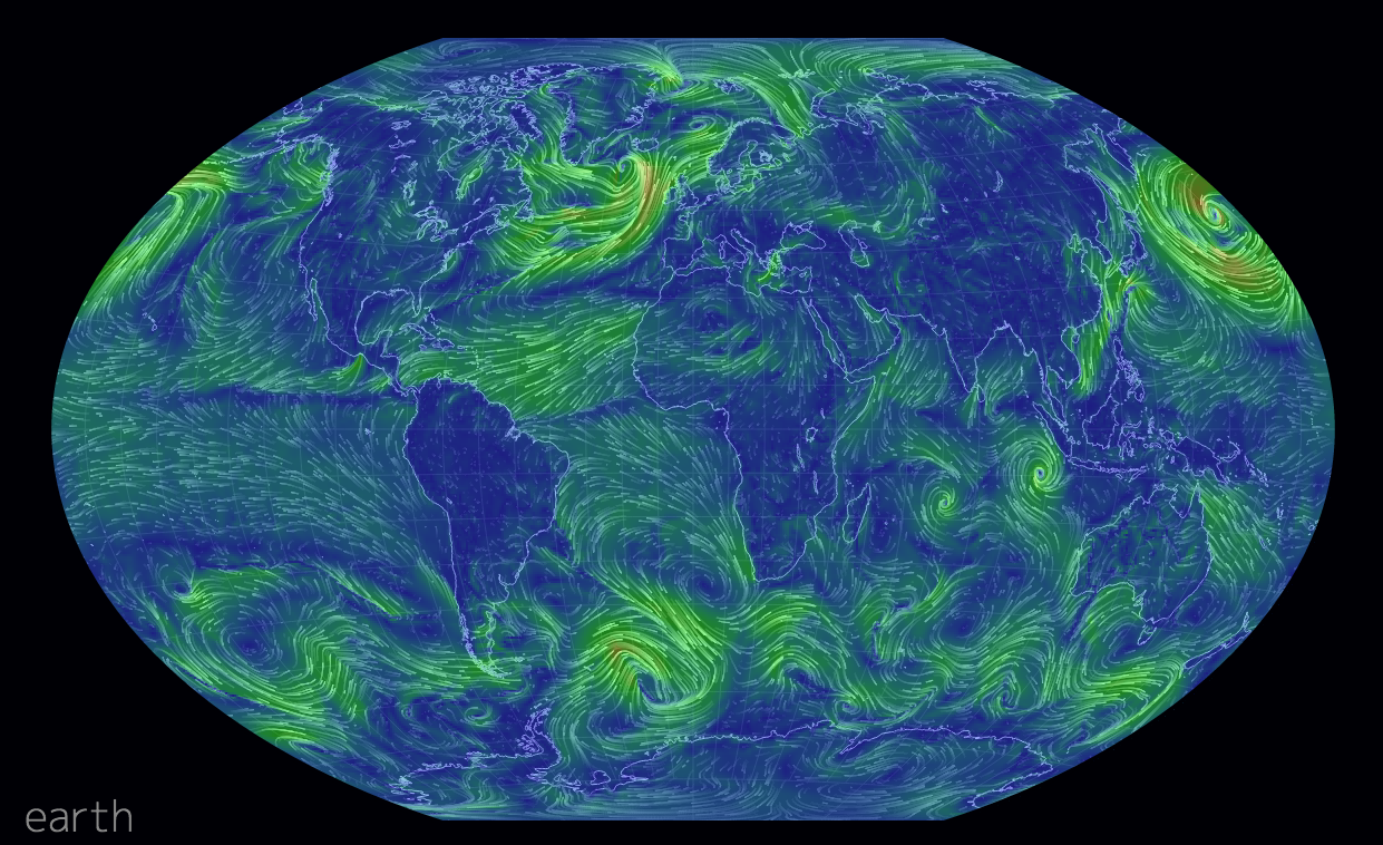
Most of us have likely seen the wind map by Fernanda Viegas and Martin Wattenberg. However, this new wind map takes the idea and makes it a bit more useful. It offers the user the opportunity to look at winds at different levels of the atmosphere. Or you can look at different projections. Some projections show wind patterns better than others. You can also see wind across the world, not just the United States.
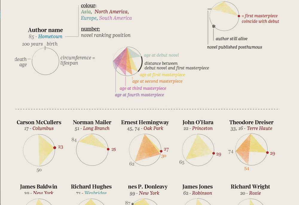
This is an interesting piece from Brain Pickings that looks at the literary careers of some of the 20th century’s greatest authors. Naturally, much debate will centre upon what is exactly a masterpiece, but if you take the subjectivity out of the graphic, you are left with an interesting piece. And I say interesting because in this case, I am not quite clear how I feel about this particular piece. But if I had the time I would love to be able to take a stab at it.
Literary careers
Credit for the original piece goes to La Lettura, I am unclear on who deserves the credit for translation.
Today’s post comes from the Washington Post, which looks at further revelations about the NSA surveillance programme. Specifically, the Post details how the NSA tracks Americans by what is called co-traveler analytics. The piece does a really nice job of explaining how the tracking works through illustrative examples.
Tracking via co-traveler analytics
Credit for the piece goes to the Washington Post graphics department.
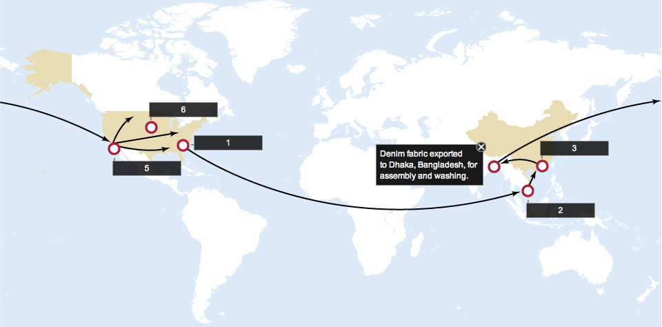
Today’s piece is straightforward, but I felt very good at detailing its story. The Wall Street Journal mapped out the path cotton takes on its way from the fields to the denim in your jeans.
Cotton’s path to market
Credit for the piece goes to the Wall Street Journal graphics department.
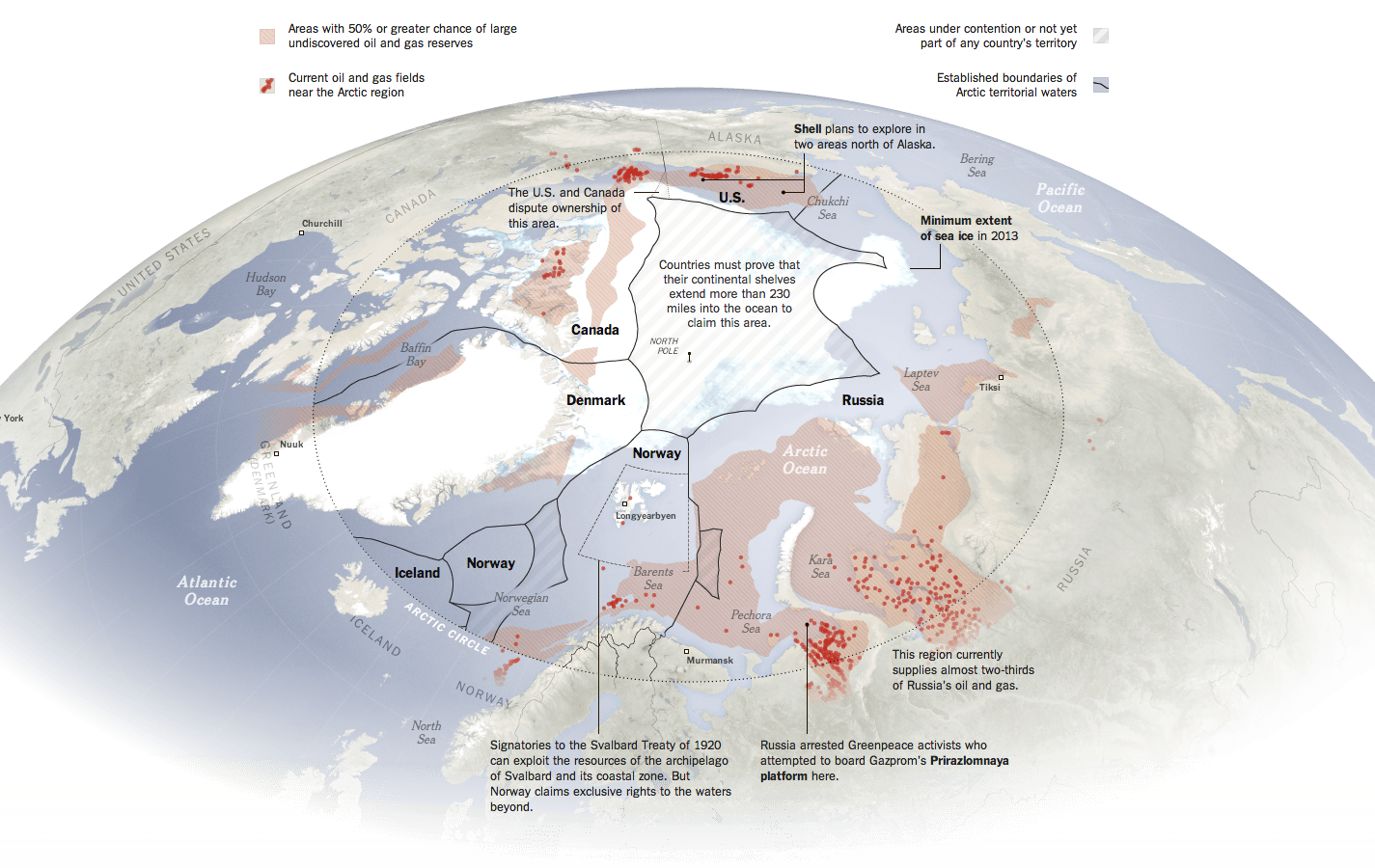
The New York Times has a nice piece about the Arctic, which is increasingly fought over by the nations north of the Arctic Circle. Maps like these are always opportunities I enjoy to see the world in an infographic that is not a standard projection, e.g. Mercator or Robinson. The slight change in fill or opacity also serves to highlight the focus of the piece on the area north of the Arctic Circle while areas even more distant slowly fade to white.
Map of the Arctic
Credit for the piece goes to Baden Copeland and Derek Watkins.
Let’s start this week off with cartograms. Sometimes I like the idea, sometimes not so much. Here is a case where I really do not care for the New York Times’ visualisation of the data. Probably because the two cartograms, a before and after of health policy renewals, do not really allow for a great side-by-side comparison. I imagine there is probably a way of condensing all of that information into a single chart or graphic component.
The before map
Credit for the piece goes to Keith Collins, Josh Katz, Katie Thomas, Archie Tse, and Karen Yourish.
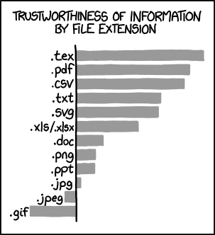
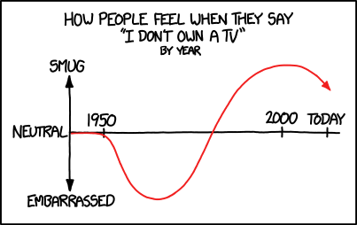
Another from xkcd, this time on television ownership. If you are among those trending towards the embarrassed. Well, it’s Christmas season. So get ready to go buy one.
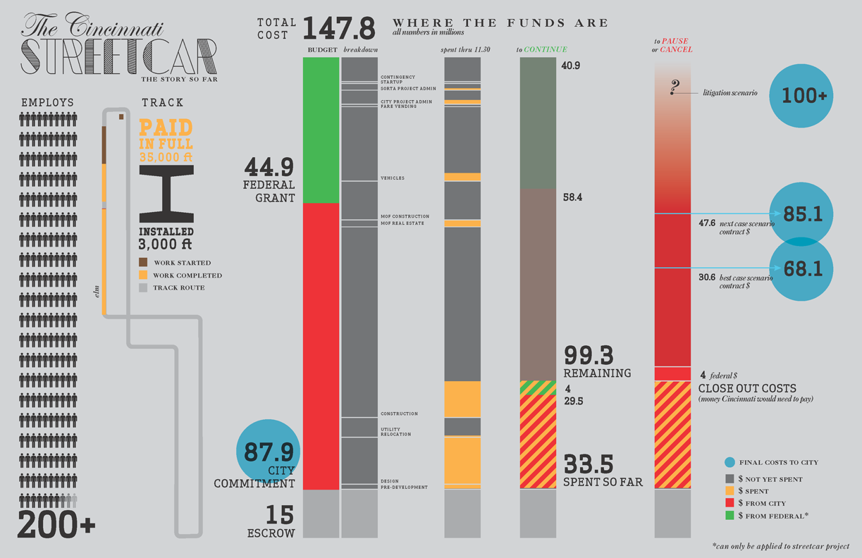
So Cincinnati was going to have a streetcar. Now it won’t because the recently elected mayor, John Cranley, campaigned on killing the streetcar. I won’t get into the whys and the why nots mostly because I’m not from Cincinnati and others can do it better. Suffice it to say that costs and budget battles played a part. Yesterday the city council opted to pause the project. This will likely suspend federal grant payments, meaning contractors don’t get paid, which means the city faces lawsuits for being in breach of contract, which potentially means the city spends almost as much money cancelling the project as they would completing it.
Ordinarily I would post something from a local newspaper or media outlet covering the story. But today I have the pleasure of sharing some work that my former professor made. His infographic explores the fiscal details of the streetcar project and how much Cincinnati owes if they opt to cancel it in the end.
Funding the Cincinnati Streetcar project
Credit for the piece goes to Giacomo Ciminello. You can download the original here. And you can visit his site here.
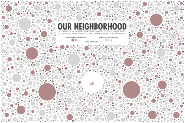
Earlier this week xkcd looked at the planets near Earth (within 60 light years) within their respective star system’s habitable zone. Turns out there are quite a few.