I am a graphic designer who focuses on information design. My day job? Well, they asked me not to say. But to be clear, this blog is my something I do on my own time and does not represent the views of…my employers. I think what I can say is that given my interest in information design—be it in the shape of clear charts, maps, diagrams, or wayfinding systems—I am fortunate that my day job focuses on data visualisation. Outside of work, I try to stay busy with personal design work. Away from the world of design, I have become an amateur genealogist and family historian. You will sometimes see that area of work bleed into my posts.
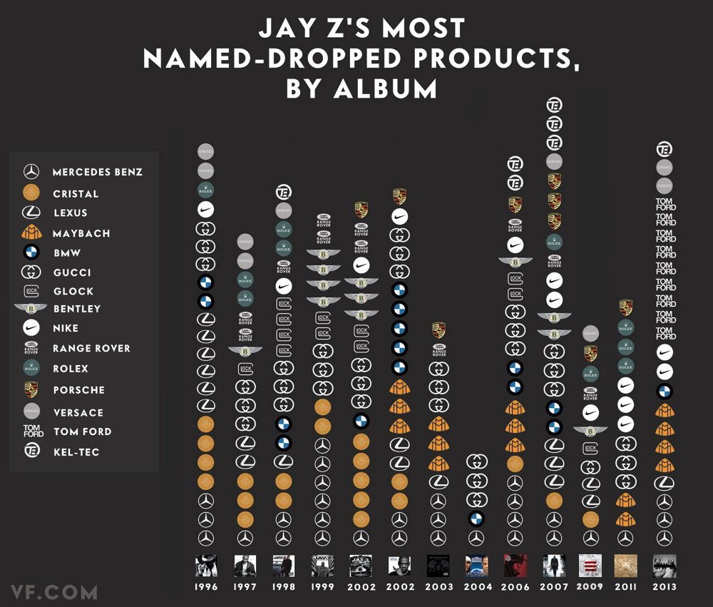
Happy Friday, everybody. Today’s post is a graphic from Vanity Fair that looks at the rapper Jay Z. (And for all those wondering, no, I have never intentionally listened to any of his music.) Specifically, this kind-of-stacked-bar-but-more-icon chart indicates how many times he name drops specific luxury brands in his albums.
Jay Z Brand Mentions
You can also file this under the graphics to which I cannot relate. Although maybe, just maybe, I once had a pair of Nike trainers. So at least Jay Z and I have that in common.
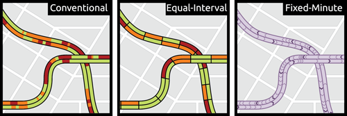
This small graphic is one of several from a very smart piece on redesigning the traffic map. Have you ever looked at a Google or an Apple traffic map to find the quickest route home or to get an idea of how long it will take you to get to the ballpark? According to Josh Stevens, your traffic map is lying to you.
Potential solutions
The article is a summary or overview of a research paper not-yet-published. When you have a few moments, the whole thing is worth the read for its analysis of popular transit map designs and the five big lies.
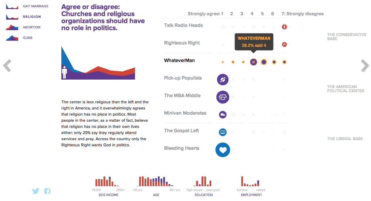
NBC News and Esquire magazine published results from their August survey of some 2000+ respondents that attempted to define the New American Center, i.e. the political persuasions of the majority of the country excepting the radical right and the loony left. For the purposes of Coffee Spoons, I am most interested in looking at the data visualisation and the infographics that result.
Both NBC News and Esquire visualised the results. While I could write two long blog posts looking at both of them, for today, it is more important to look more at the fundamental design difference between the two.
NBC News opted for a design direction emphasising data first. Perhaps because NBC is a news platform, their focus was on the clean communication of the data. Looking
NBC News results
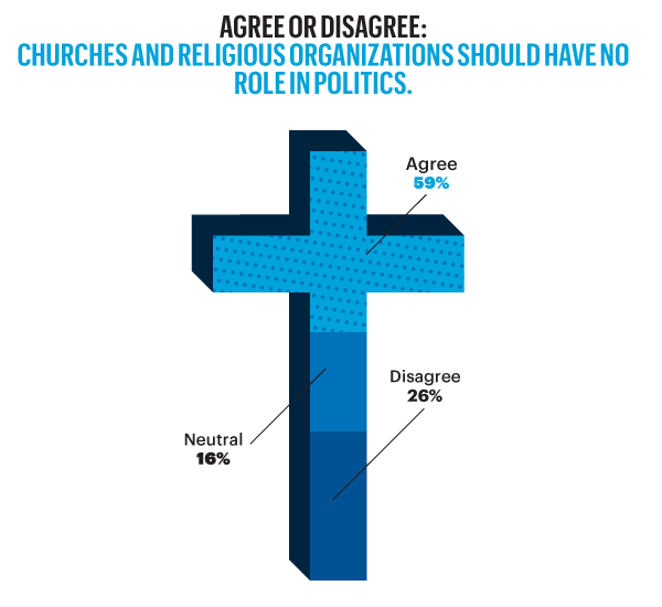
On the other hand, Esquire opted for a more sensationalised direction. The same data points used for the screenshot above creates this graphic below. Not only is less data is contained, less context given, less subtlety and nuance captured, it also is just difficult to read. Is the 59% supposed to be the area of the cross filled in? Its length? Why is it three-dimensional? Where are the Snowdens of yesteryear? At first glance, I ignore the horizontal wings and focus solely on the vertical length of the main bar.
Esquire results
For a useful representation of data, I think NBC News clearly wins. But that both organisations used the same data to craft their separate results, this story on the New American Center is useful for comparing two different design directions and the results thereof.
No designers are specifically mentioned, at least not that I could find, so credit for each piece goes to its respective owner, i.e. NBC News or Esquire.
Gravity was released recently. You know, that film about a station in space that gets hit by something and drama ensues. The Washington Post has this fantastic infographic that illustrates how the station was built over the past 15 years. Scroll down the page and watch the station deconstruct itself into its initial Russian power module. Fantastic.
Deconstructing the ISS
Credit for the piece goes to Alberto Cuadra and Katie Park.
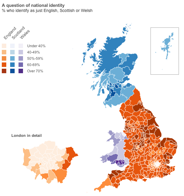
Well, you will have to click through to the article for that data visualisation. But, I will provide you with the choropleth map of national identities. That is, how English do citizens in English authorities consider themselves? Scottish in Scotland? Welsh in Wales?
Happy Friday, everyone. According to xkcd, I am failing the future test. That is to say, by 2019, I will be unable to communicate data through infographics or create data visualisations.
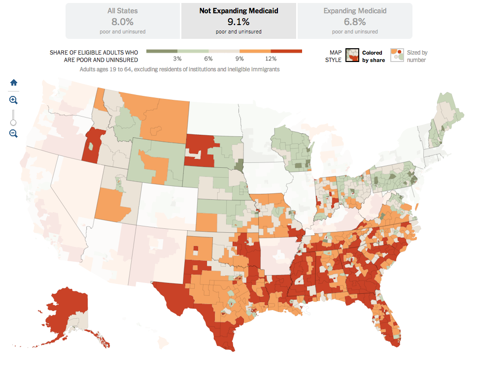
Last summer, the Supreme Court ruled that most of the Affordable Care Act, also known as Obamacare, was constitutional. The one exception, however, was the plan to force states to expand their Medicaid coverage. Medicaid is the government plan tasked with helping to provide health insurance to the poor. But between the poverty level and the income level for subsidies for the new state exchanges, there is a gap. That gap was supposed to be covered by the state expansion of Medicaid.
Because the states are not being forced to expand their coverage, there now exists state-by-state gaps in health insurance coverage. This excellent interactive graphic from the New York Times looks at the poverty and insurance coverage segregated into those states that are and are not expanding their coverage. A good number of those states with high rates of poor and uninsured are Republican, deep-South states. If you’re really clever, you’ll compare this map to my map from earlier this week about the Conservative Party. Notice any overlaps?
States not expanding Medicaid
Credit for the piece Robert Gebeloff, Haeyoun Park, Matthew Bloch, and Matthew Ericson.
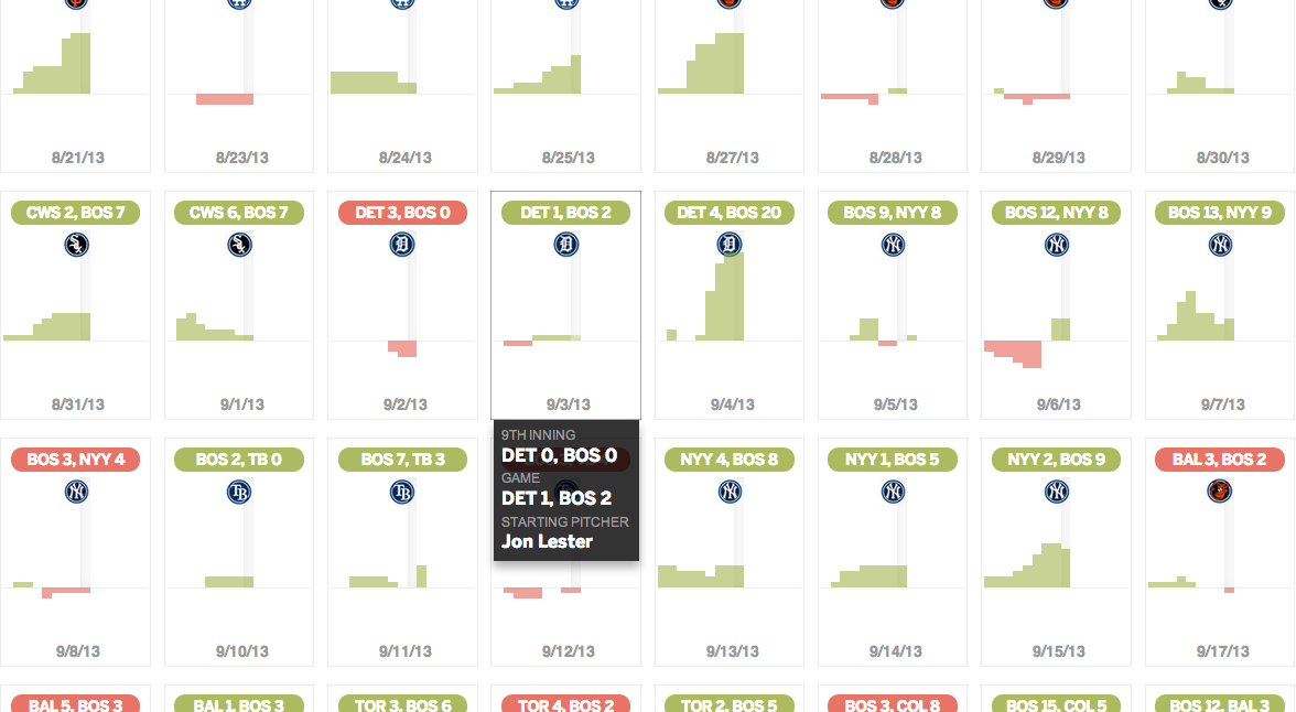
If you’re not a Boston Red Sox fan, what’s wrong with you? Well, okay, so long as you’re not a Yankees fan, you’re not that bad. Anyway, the Boston Globe looked at the 2013 Red Sox season. Game by game, inning by inning. And because Boston is now advancing to the American League Championship Series, and since they will probably face Detroit, here’s a screenshot of the great game that was Scherzer vs. Lester.
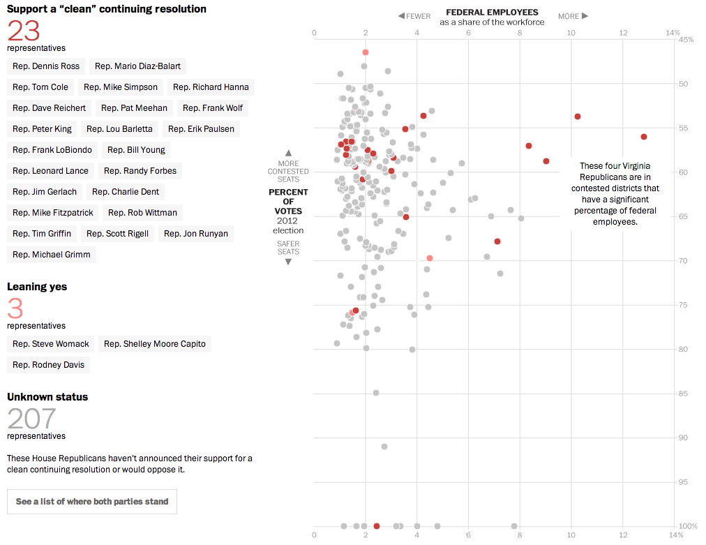
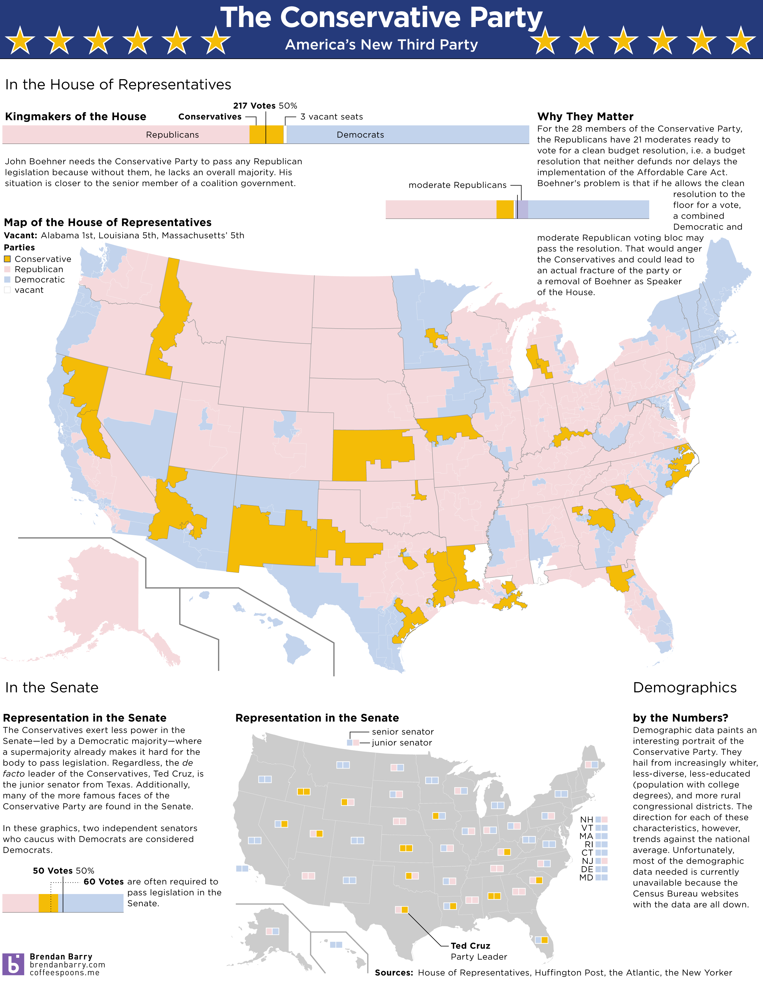
Yesterday, we looked at the new Conservative Party of America. But those are the votes that John Boehner fears to upset—and possibly fracture his party and cost him his job—if he should let a clean budget resolution come to the floor and should it pass. But why would it pass if it needs 217 votes and there are only 200 Democrats? Well, now we have a nice interactive graphic from the Washington Post that explores the moderate Republicans. Which, if this count is accurate, would provide enough votes when combined with Democrats to pass a clean budget.
The moderate Republicans…
Why are these Republicans in favour of a clean budget resolution? The y-axis shows that they are in moderate or mixed congressional districts, i.e. not Conservative districts. The x-axis shows that a fair number of these moderates have a high proportion of federal workers within their respective district. And who’s not working/earning money during the shutdown? Yep, a lot of federal workers.
Credit for the piece goes to Aaron Blake, Dan Keating, Ted Mellnik, and Darla Cameron.
We enter our second week of the government shutdown. Of course, blame for the shutdown falls largely upon a small number of conservative Republican members of the House, bolstered by Senator Cruz (R-TX) and his allies in the Senate. But we already know that there are a number of moderate Republicans who want to pass a clean budget resolution. So one way of looking at this new conservative faction is as a new minor party in a coalition government with Ted Cruz as Party Leader.
The idea is not mine. Ryan Lizza first wrote about the “Suicide Caucus”, a topic that Philip Bump expanded upon several days later. However, as a thought experiment, I was curious to see what would happen if this third party, a Conservative Party, would look in data visualisation terms. So here’s a quick stab at America’s newest third party.