Canadian Fur

The National Post published this fascinating infographic on the Canadian fur industry. Historically speaking, that industry is one of the most important to Canada being one of the primary reasons for Canada’s colonisation by France and later the United Kingdom (to a lesser extent). The graphic provides illustrations of the pelts to scale along with data on the volume and value of the trade in each type of fur. Then it maps the ranges for each of the animals with a matrix of small multiples.
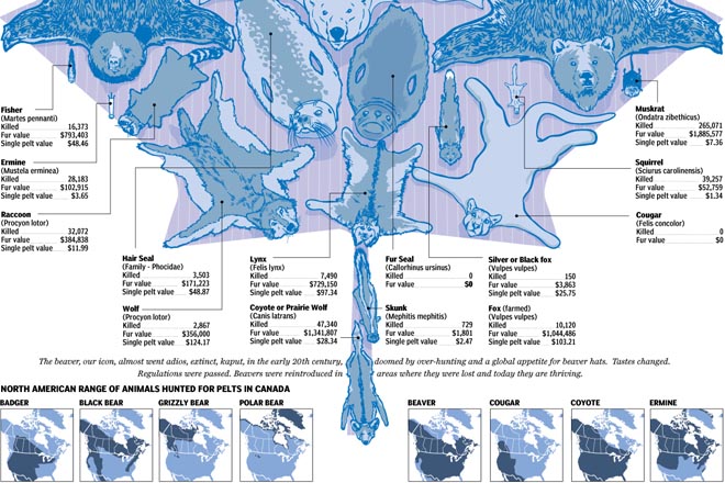
Canadian Fur
Canadian Fur

While it may not be a mistake, I am curious about the two areas of polar bears in the northern United States. Methinks that the Rockies, while snowcapped, would be a bit warm for the bears.

Credit for the piece goes to Joe O’Connor, Andrew Barr, Mike Faille, and Richard Johnson.

British Trident System

The United Kingdom is one of eight, probably nine nuclear powers. (Israel has never confirmed that it has tested/operates nuclear weapons.) Unlike most countries, the UK only uses one delivery system to operate its weapons: submarines using Trident ballistic missiles.

A triad power is a country with all three delivery systems

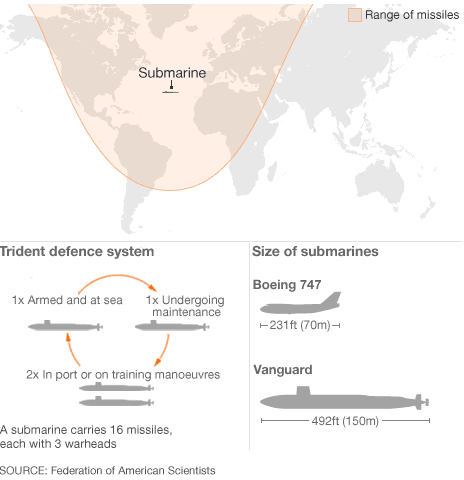
The British Trident system became an issue in the coalition government. While it was supported by both the previous Labour government and the Conservatives, the programme had to be reviewed per the coalition agreement. The review has been completed and it will be made public. But to explain to the public how Trident works, the BBC created this graphic. It does a really good job of showing the reach of the British submarines from one location, but then showing why an adequate replacement would need at least three to four submarines.

The British Trident programme

Credit for the Trident graphic goes to the BBC. The table is my own work.

The Periodic Table of Elements

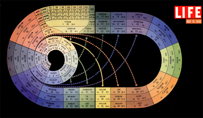
The periodic table of elements is perhaps one of the most important tables to have been created in science. But most of us are probably familiar with the rows and columns of boxes. But via my colleague Jonathan comes today’s post where we look at a 1940s version of the table. Unfortunately the original source does not identify the designer behind the piece, however it was published in Life magazine in 1949.

The fascinating bit is that the table is largely unchanged from that of today’s in its basic structure and organisation. Just instead of a broken row we get a continues oval. (Though I do not understand why hydrogen sits atop fluorine.) That and we have discovered/created a whole new host of elements, especially down near the end of the table.

Periodic table of elements

Credit for the piece goes to Life.

Gay Acceptance

Last week I looked at a piece from the Washington Post about the possible impact of the Supreme Court rulings on gay marriage in the United States. But with the rulings yesterday, we step back and look at globally how the progression of gay rights has taken steps forward or backward.

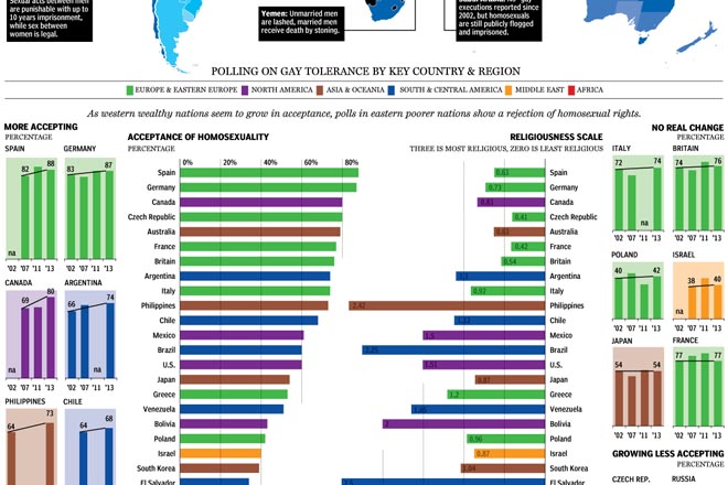
The National Post looked at the reversal of bans of gay marriage as well as polling from several countries to look at changing opinions and perspectives across the world. Fascinating/horrifying are some of the stories about specific countries in the map.

Gay acceptance
Gay acceptance

My only real criticism is that the colour-coding of regions seems a bit jarring. I wonder if grouping countries by region would not have allowed the same data to be presented in a bit quieter tone.

Credit for the piece goes to Richard Johnson.

The Massachusetts Special Election

As I have been blogging the past several days, today the Supreme Court will announce its rulings on the two gay marriage cases. But, I have already looked at that twice now. Today I want to look at the results of the Massachusetts special election for the US Senate, necessitated by John Kerry resigning from the seat to become Secretary of State.

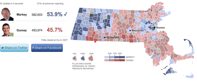
This work comes from the Huffington Post. It offers the usual map fare with towns coloured by the victor and tinted by the share of the vote. Though do note the interesting—is this novel?—means of filling in the town with colour to represent the percent of the town reporting. My screenshot is a bit late, but check out Warren near Springfield or Boston and Cambridge—a bit harder to see because of their size and shape.

Looking across the state for the results

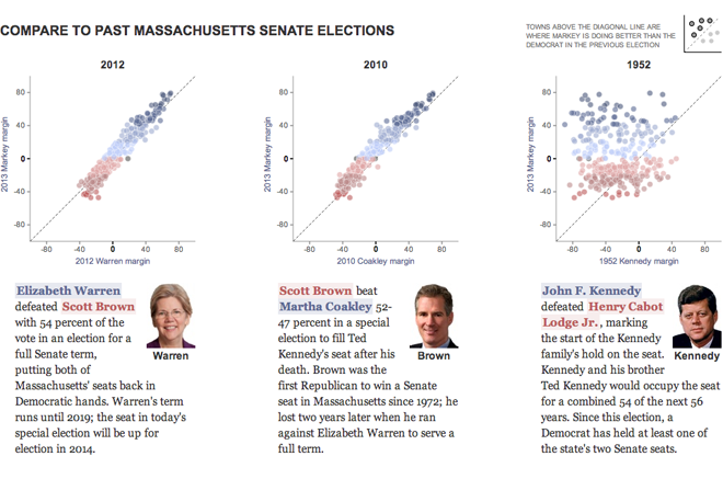
However, the fascinating thing is the use of the small multiples of scatter plots to look at historic elections. The designers included a small key in the upper-right explaining that dots above the line represent towns where Ed Markey, the Democrat who won, outperformed the historic Democrat. I have not seen anybody attempt to portray the data in this fashion before.

Using a scatter plot to chart the results

Credit for the piece goes to Aaron Bycoffe and Jay Boice.

Trending Towards Gay Marriage

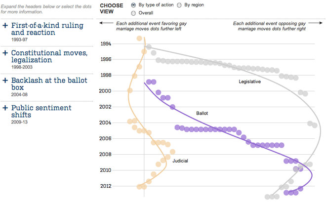
We are (still) waiting for a ruling on many things this week from the Supreme Court, including the rulings on DOMA and Prop 8. Today, we look at an interactive chart by the Wall Street Journal that plots different ballot measures, legislative actions, and court rulings regarding gay marriage. Lines of best fit provide a general trend line, and as the default view shows, the trend is clearly in favour of legalisation.

Trends for ballot measures, legislative actions, and court rulings for/against gay marriage

The piece is quite nice. After the default view, you can change the view to look at events not by type of action but by geographic region. This is one of those instances where the regional data provides an interesting look at the story. Additionally, the headlines on the left expand to provide not just context, but highlight the events plotted from that era.

Credit for the piece goes to Randy Yeip, Colleen McEnaney, and Chris Canipe.

Potential Voting Rights Act Impacts

Last Thursday we looked at the impact of potential outcomes by an expected Supreme Court ruling on two gar marriage cases. (We’re still waiting, probably until this Thursday, though it could be today.) Today, we look at the impact of potential outcomes of another big case before the Court, the Voting Rights Act. Broadly (and quickly), Shelby County, Alabama is challenging the federal government, which according to the act, must approve any changes to electoral law in those places that have had problems in their history of disenfranchising black citizens (and more recently non-English speaking citizens, i.e. Hispanics). The act was renewed for 25 years by President Bush back in 2006.

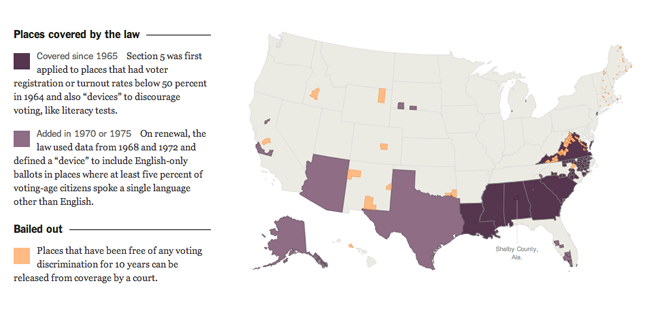
The New York Times explains through interactive maps first the geographic scope of this federal approval. As one might expect, it significantly impacts southern states. But the rules used to determine that coverage are decades old.

Current coverage
Current coverage

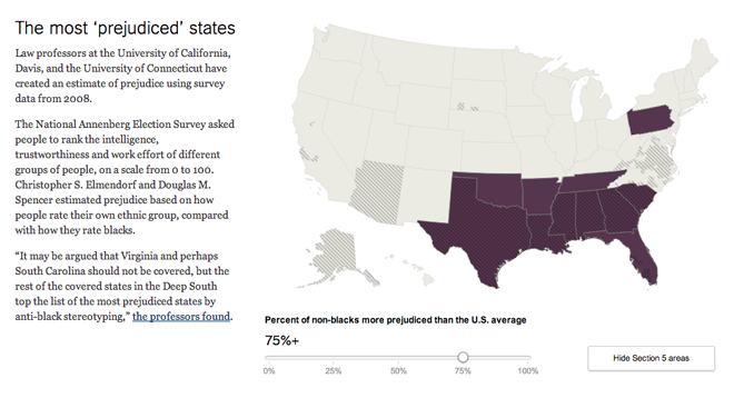
But if the current process must change, several different metrics by which alternative coverage could be determined would offer different coverage. The New York Times allows user to see those different metrics, and then adjust filters to fine tune those areas covered. A nice feature for all of these views is the ability to show/hide those areas under the current coverage.

Using prejudice to define coverage

Credit for the piece goes to the New York Times graphics department.

Nice Work, Bro

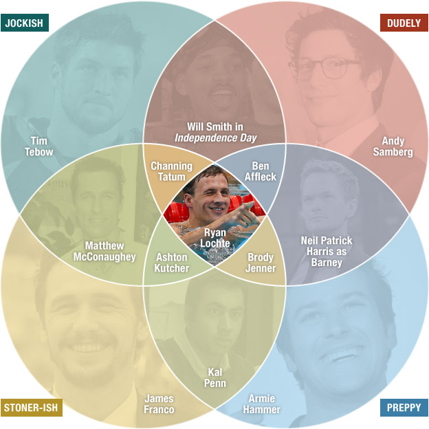
Bro. You have surely heard the term exchanged by young men to each other as a sign of friendship, greeting, &c. If you are like me, you are probably confused as to just what constitutes a bro. Thankfully the folks over an NPR analysed broness and compiled their findings into a Venn diagram that maps out the different types of bros. You should definitely head over to the piece and read up on the methodology, it’s worth the read. (And check out the video that epitomises the essence of bro-ness if for nothing else than a Philly news crew’s reaction to an interview with said essence.)

Bro-ness
Bro-ness

Credit for the piece goes to Alyson Hurt.

Gay Marriage Ruling Outcomes

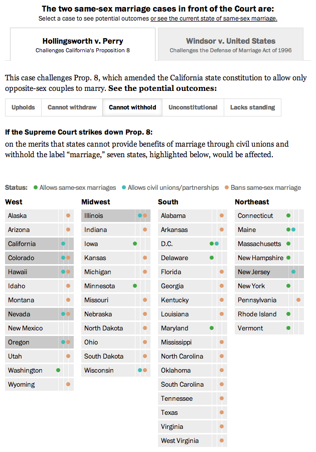
The Supreme Court issues its rulings usually on, if I recall, Mondays and Thursday. And you know what today is, right? One of the last Thursday sessions of the current sitting. So…if not this week then next week the Supreme Court will (likely) rule on several big, hairy, tangly cases. One of those issues, but two of the cases, is same sex marriage. Specifically, a ruling on California’s Proposition 8 and another on the Defence of Marriage Act.

Thankfully, the Washington Post has a great interactive piece that attempts to simplify and explain just how the possible rulings on each of the two cases would impact same sex marriages in all fifty states. Click around and read the explanations to see just how complicated the cases are, especially Prop 8.

Just one of the different outcomes

Credit for the piece goes to Masuma Ahuja, Robert Barnes, and Emily Chow.

Tax Breaks for the Wealthy

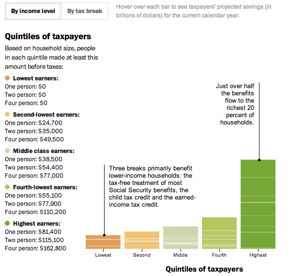
In today’s post we look at a small interactive piece from the Washington Post. Everybody pays taxes. And everybody seeks to find ways to pay less in taxes. This interactive stacked bar chart (and bar matrix) examines how much the different available tax benefits help Americans, grouped into income quintiles. The measure is dollars, not percentage of income (either personal or national), so clearly highest income Americans are the big winners in tax benefits while low income Americans lose out. For example, most low income people do not make enough money to invest in the stock market. Therefore they cannot reap the benefit of preferential tax treatment of dividend income as opposed to wage income.

A look at tax benefits in the US

Credit for the piece goes to Darla Cameron.