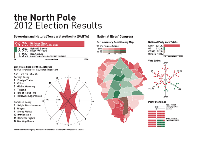
The holiday card I designed for my employer Euromonitor International wishing you happy holidays.
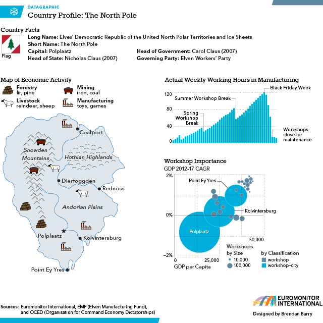
The holiday card I designed for my employer Euromonitor International wishing you happy holidays.

In the aftermath of last Friday, the Washington Post has an informative guide to mass shootings in the United States in 2012.
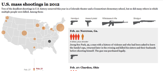
Credit for the piece goes to Wilson Andrews, Bonnie Berkowitz, Alberto Cuadra, Emily Chow, Laris Karklis, Dan Keating and Katie Park.
Don’t worry, you don’t need to answer. But a survey of Canadians did. And these are the results, as visualised in this infographic from the National Post.
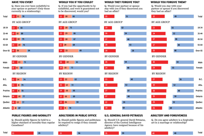
Credit for the piece goes to Richard Johnson.
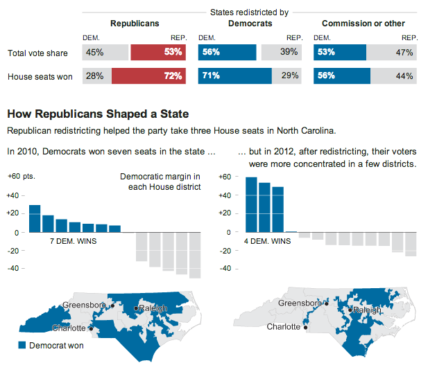
The New York Times looks at who controlled the redistricting of US congressional seats because of the 2010 census. It then showed an example in North Carolina where Republican control led to the state being less competitive in the past for Democrats. In 2010, Democrats held 7/13 seats in North Carolina. But after the redistricting, in 2012 the Democrats held only 4/13. And all of this is done in a small, compact space. This is a very effective graphic.
Credit for the piece goes to Tom Giratikanon.
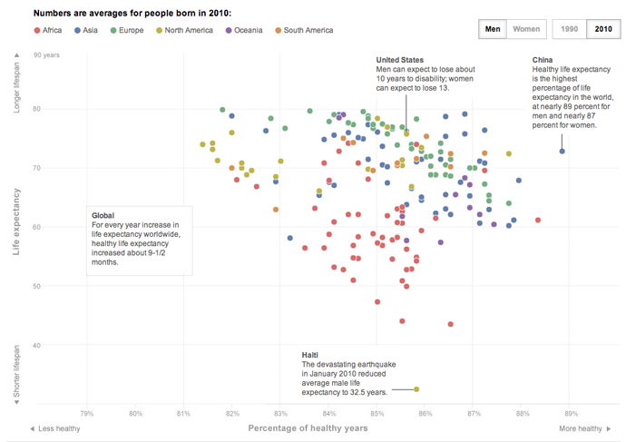
Yesterday the Washington Post published an article and an accompanying interactive infographic on life expectancy. But not just how long one can expect to live, but also how long one can expect to live in good health. What makes the piece particularly nice and effective are the annotations that explain some of the data points, in particular the outlier of Haitian males.
Credit for the piece goes to Bonnie Berkowitz, Emily Chow, and Todd Lindeman.
Earlier this week, the Office of National Statistics in the United Kingdom released census results for England and Wales. (Northern Ireland and Scotland are reported separately.) England has more people than expected, most likely because of undercounting of immigrants, and Wales is now some three million and counting. There are fewer Christians than expected—and fewer Jedi than I expected—as the ranks of the non-religious grow. But from of course all of this comes a bevy of visualisations. These are but a few, but if anybody finds others worth nothing, please feel free to send them my way.
Straight from the source is a set of interactive mapping applications from ONS that compare 2001 data to 2011 data. As best it can, census districts are compared on a one-to-one basis, but with boundary changes that isn’t always possible. Clicking on district provides one with details about the responses for that area.
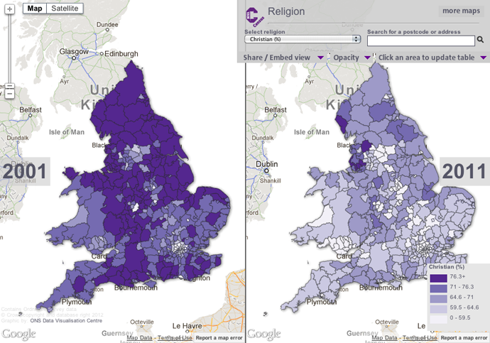
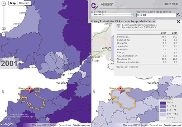
Perhaps the one thing missing from these—and it may well owe to the aforementioned boundary changes—is a map of changes to see which areas have been most impacted. Or a map of the results compared to the average to see where the average can be found and where the positive and negative extremes can be found.
An infographic from the Guardian looks at the overall dataset with quite a few maps and then circle-y things. While the large map is the white population in 2011, the remaining maps are before and after comparisons. Again, an interesting look would have been perhaps deviations from the average or of the actual change per district.
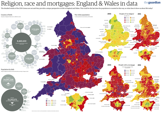
I appreciate the impact of the main story, the increasing diversity of England and, to a lesser extent, Wales. London in particular is now minority white. However, I am less keen on the circle-y things and that data could probably have been presented in a clearer, more direct fashion. I am not a fan of red, yellow, and green traffic light colours, but I also recognise that the Guardian is working within their brand on this.
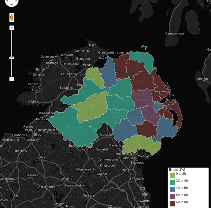
Unfortunately this interactive map of Northern Ireland’s national identity does not quite work for me. I appreciate the toggle between the different response options, however, I find the responses themselves hard to compare. The colours remain the same, but the scales for the results change. For those identifying as Northern Irish, the top value is clearly less than those identifying as either British or Irish. But I would have liked to have seen the scales for British and Irish to closer match. I also find the black background distracting and overwhelming the colours. I wonder how the result would have worked if treated with the above aesthetic.
The BBC took a stab too with a section devoted to the results. Unlike the ONS visualisation above, however, the side-by-side comparison is forced to be smaller with the included text. And when one zooms into a particular district, the map degrades into crude polygons—a particular pet peeve of mine—that would be unrecognisable to someone familiar with the intimate geographic details of their home region. (Yes, simple shapes make the files smaller for overview maps, but when seen up-close, they lose their value by making ugly maps.) Also, the colours and bins in this particular view are not as informative as in the view above.
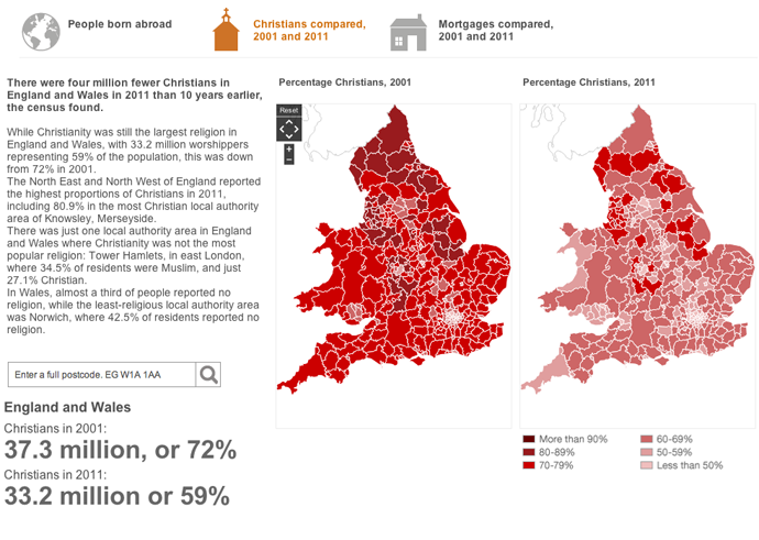
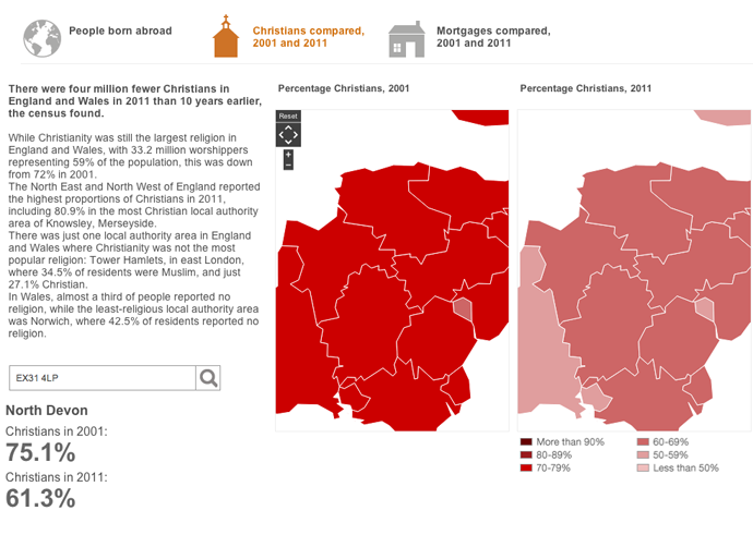
The BBC, however, did create a small graphic for an article that showed population changes in the districts, alas the colours did not work as well as one would hope.
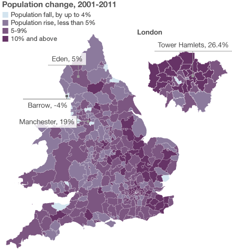
That’s a lot for people to digest, but, overall I think the clearest visualisations go to the ONS. They lack the commentary that can be brought by journalism organisations, e.g. the BBC, but one needs a clear and powerful visualisation before one can start writing an analysis.
Credit for the ONS results goes to the ONS Data Visualisation Centre, for the Guardian infographic credit goes to Paul Scruton and Mark McCormick, for the Northern Ireland piece credit goes to John Burn-Murdoch, and credit for the BBC goes to the BBC.
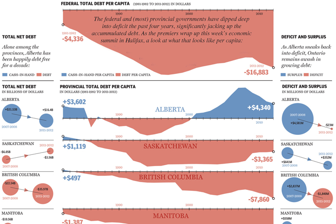
Canada, along with Australia, was one of the few Western, industrialised economies to weather the global recession of 2008 fairly well. However in recent years, despite the economic boom in the energy-rich western provinces, many of Canada’s provinces have been accumulating substantial—though not yet crippling—levels of debt. Toronto’s National Post explores the federal and provincial situation using small (or perhaps medium-sized) multiples.
Credit for the piece goes to Richard Johnson.
A large-scale infographic with lots of drawings of fighter jets. That’s pretty much what this is. And that’s cool enough for me. The background is that the US fighter programme for the F-35 is increasingly ridiculously expensive and beyond budget. Some nations, like Canada, are starting to have second thoughts. This post outlines potential options and adversaries.
Not all of these aircraft are really options. For example, the US has banned the export of the F-22 and it is highly unlikely that Canada would purchase the Raptor. Will the Russians ever build the PAK FA? They’ve been trying to build them for years and the aircraft has yet to go into production. Regardless of the likelihood of facing the adversaries or procuring the options, they’re still pretty cool illustrations and side-by-side comparisons.

Credit for the piece goes to Jonathon Rivait, Mike Faille, and Matt Gurney.
We are warming the planet. And like ice cubes in a glass of water on a hot summer’s day, Earth’s ice caps will, over the course of centuries, begin to melt and contribute to a rise in sea level. Unfortunately, most of the world’s population lives close to shorelines or the rivers connecting continental interiors to the sea. The world for the generations of children following us may very well look much different than it does today.
The New York Times uses an interactive piece to show how sea level rises will impact coastlines and inland ports in the United States. Using a slider, the user can investigate sea level changes of the expected five feet over the next one to three centuries, or two longer-term scenarios that are not yet certain but possible. Below are a few of the 24 cities and metropolitan areas.
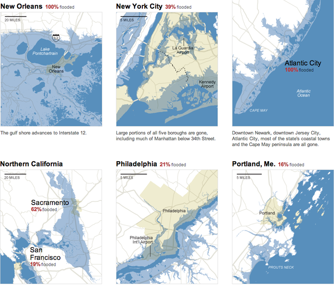
In Philadelphia, a rise of 25 feet inundates South Philly, Old City, Fishtown, Kensington, Port Richmond and the other neighbourhoods close to the Delaware. The Jersey Shore still exists. It has just moved dozens of miles inland. The Cape May Peninsula is well submerged.
Credit for the piece goes to Baden Copeland, Josh Keller, and Bill Marsh.
What words are more synonymous with Christmas than data visualisation? Okay, well probably any other words. For most people. But for family, friends, and co-workers I printed my usual infographic Christmas card. But for those of you who only come to my blog, I created a digital, online version.
