Red Sox–Dodgers Trade

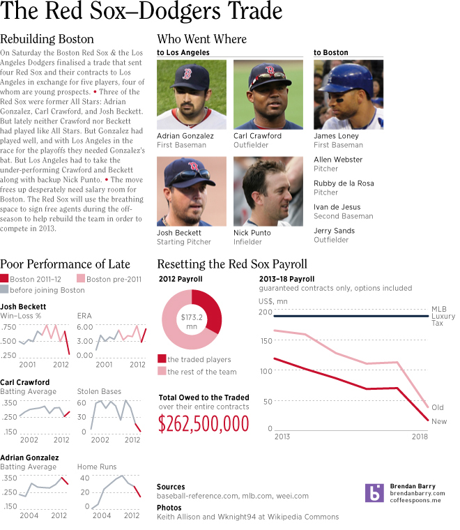
There was a lot of news this past weekend. So we’ll start with the important stuff first. An infographic about the big baseball trade between my Boston Red Sox and the Los Angeles Dodgers. The advantage of a story breaking over the weekend is time to get something together for Monday.
The Red Sox–Dodgers Trade

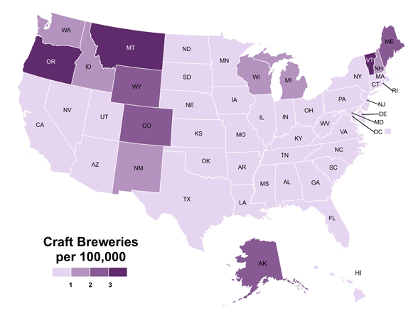
Craft Breweries

From the Atlantic Cities, an offshoot of the Atlantic magazine, comes a nice Friday/for-the-weekend post. It looks at states that have the most craft breweries? Surprise, the states with the largest populations! But then comes the more interesting follow-up, what if we account for population differences? Ah, now we are talking. The visualisation type is a choropleth. Nothing fancy. But, hey, it’s a Friday. So bottom’s up. Cheers. Slainte. Salud. Enjoy the weekend.

Craft Breweries per 100,000

Credit for the map goes to Zara Matheson.

Opportunity

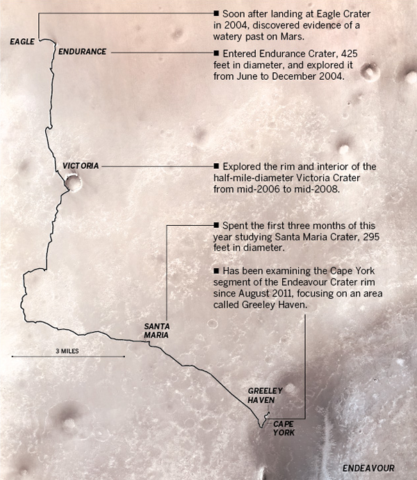
Curiosity is not the only rover on Mars, eight years after a 90-day mission, we still have Opportunity rolling around. The Los Angeles Times published this graphic detailing the exploration conducted by Opportunity. This is a map of Opportunity’s section of Mars.

Path of Opportunity
Path of Opportunity

Credit for the piece goes to Julie Sheer, Lorena Iñiguez, Raoul Rañoa, and Anthony Pesce.

Obama Administration Failing on Mortgage Modifications

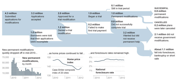
Today’s post features a Sankey diagram from the New York Times that looks at how the Obama administration has been failing to help homeowners with mortgage problems. Less than 25% of applicants have seen successful modifications of their home loans. The diagram here clearly shows the process and the failures that have led to so many Americans not receiving the help they sought.

Sankey
Sankey

Credit for the piece goes to Alicia Parlapiano.

World Bank—Mobile Phones

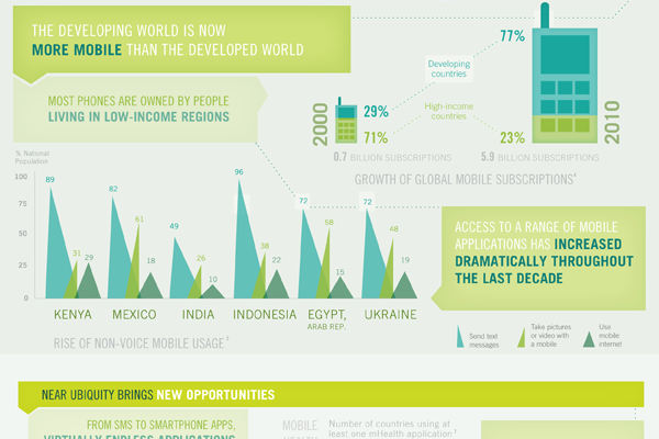
A little while ago the World Bank, generally a rich-country club that doles out loans to the developing world, published an infographic looking at mobile phones and their presence in the developing world.

The piece supplemented a report and is rather large. It actually exists as two separate images. The cropping below focuses just on how people in the developing world use mobile phones. Overall the piece is a bit weak in terms of data visualisation types and some of it is a bit confusing, but the story is clearly worth telling. And fortunately there are more hits than misses.

Developing world usage


Patrolling the US–Mexican Border

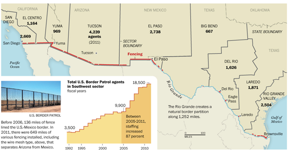
If you haven’t heard, we share a border with Mexico. And we patrol it. And the Washington Post published a graphic looking at the patrolling of the US–Mexican border.

Border patrol staffing

Credit for the piece goes to Anup Kaphle and Bill Webster.

Oil Imports

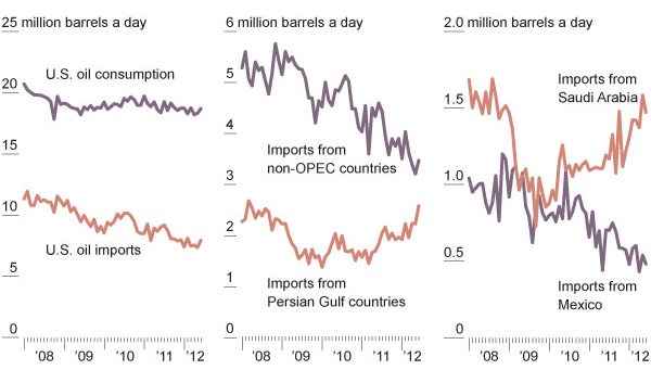
Oil, sweet oil. We Americans love the stuff. Like too much of anything, though, that can lead to some problems. This post isn’t about that. But rather it’s about a New York Times graphic on how even though we are learning to check our sweet tooth, we are importing more oil from the Middle East relative to other oil exporters, like Mexico.

Oil imports
Oil imports

Missions to Mars

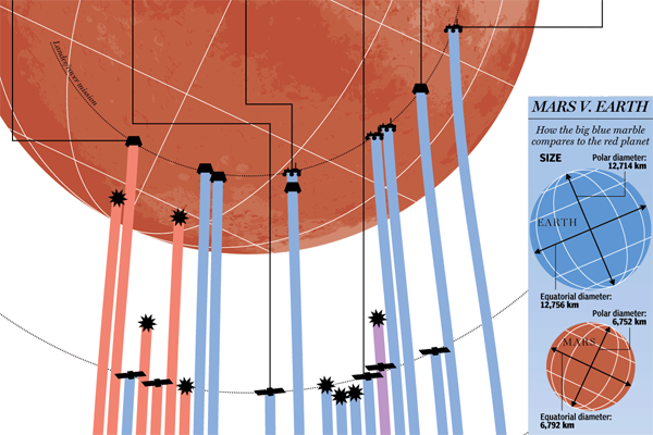
Curiosity shall soon be exploring the surface of Mars seeking to understand the geological history of the planet. But in this infographic, see the cropping below, from the National Post we can see previous missions to Mars. We have not always been successful in operations in and around Mars, but our recent track record is much improved.

Missions to Mars
Missions to Mars


Credit for the piece goes to Mike Faille.

The Muslim World

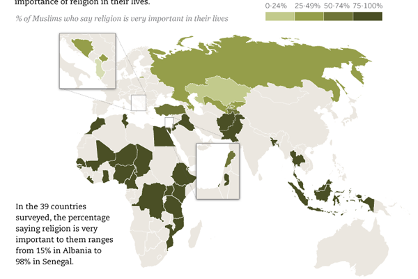
Today’s post comes via a co-worker of mine and is from the Pew Research Center’s Forum on Religion and Public Life. The infographic is of the long-running image type, but in this case is neatly sliced into digestible morsels of tasty infographic-ness. Below is a cropping of the longer piece. It looks at how Muslim populations in different countries feel about the importance of their religion in their daily life.

The Muslim World
The Muslim World

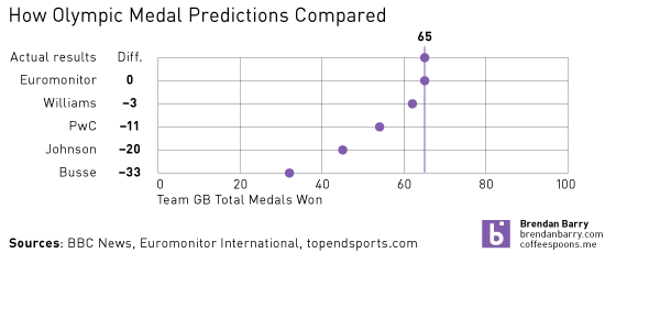
Olympic Forecast Comparison

During my research for the Olympic medal projections, I came across a few sites that presented a few other projections because, quite frankly, 65 seemed rather high given that the UK won only 47 the year before. The chart below just compares how the other forecasts turned out in the end.

Forecasts Compared
Forecasts Compared

Emily Williams from the Tusk School of Business, Price Waterhouse Coopers, Dan Johnson of Colorado College, and Meghan Busse from Northwestern University.