I am a graphic designer who focuses on information design. My day job? Well, they asked me not to say. But to be clear, this blog is my something I do on my own time and does not represent the views of…my employers. I think what I can say is that given my interest in information design—be it in the shape of clear charts, maps, diagrams, or wayfinding systems—I am fortunate that my day job focuses on data visualisation. Outside of work, I try to stay busy with personal design work. Away from the world of design, I have become an amateur genealogist and family historian. You will sometimes see that area of work bleed into my posts.
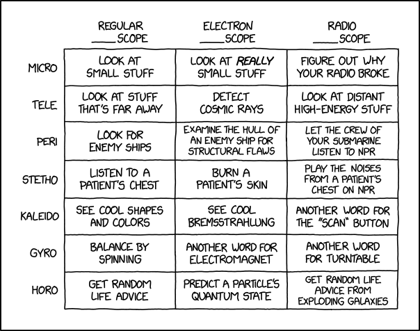
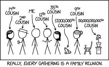
We made it to the end of yet another week. Before the weekend begins for most of my audience—though for my UK readers, enjoy the extended bank holiday and God save the Queen—I wanted to take a look at a graphic from xkcd that shows one can use different types of scopes to make different types of observations.
All the scopes.
I’m constantly thinking about getting a record player. But if I do, maybe I’ll just start calling it my radiogyroscope.
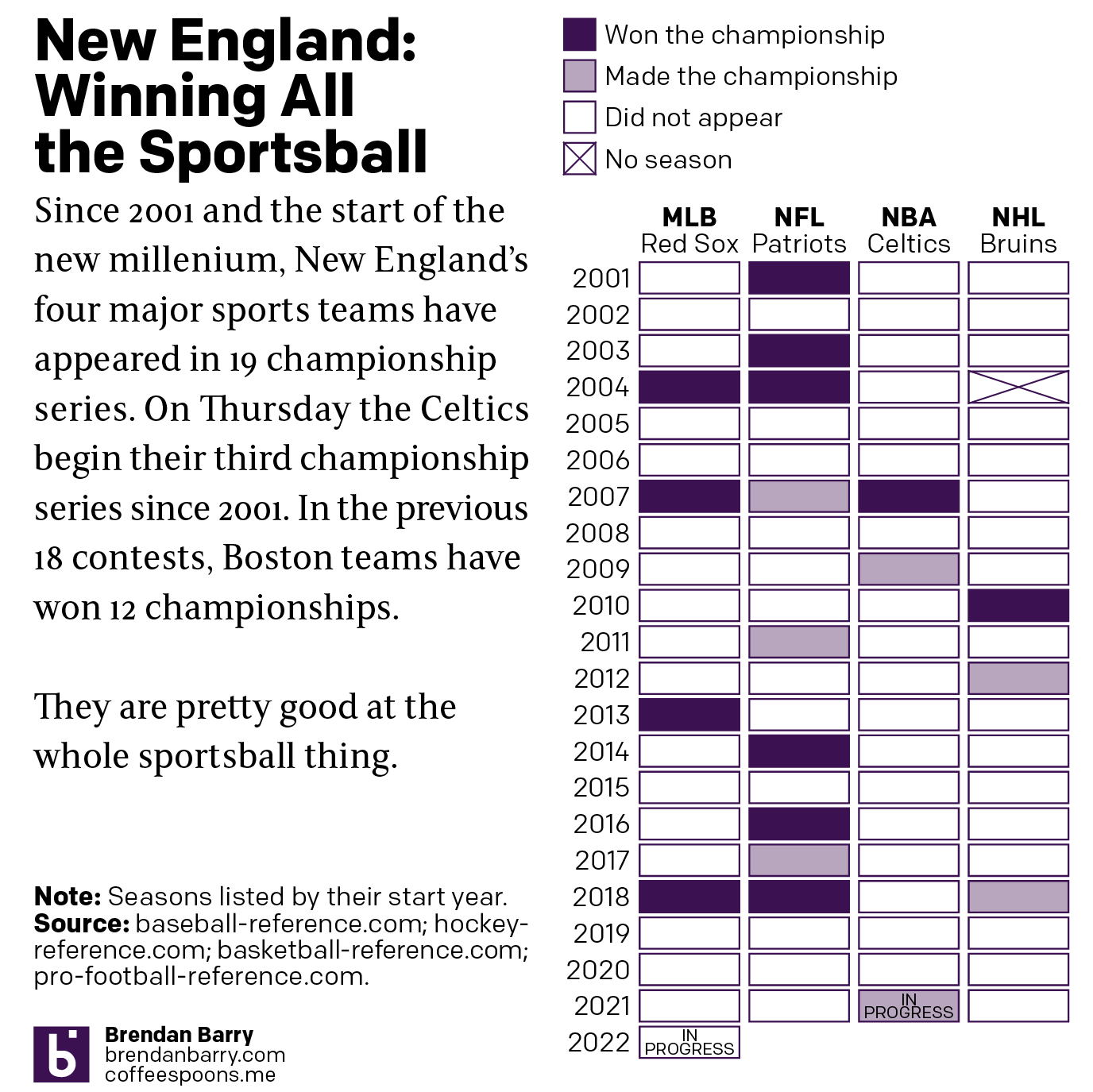
Tonight the Boston Celtics play in Game 1 of the NBA Finals against the Golden State Warriors, one of the most dominant NBA teams over the last several years. But since the start of the new century and the new millennium, more broadly Boston’s four major sports teams have dominated the championship series of those sports. In fact tonight marks the 19th championship series a New England team has played since 2001. And in those 18 series thus far, Boston teams have a 12–6 record.
Let’s go Celtics.
Of the 12 titles won, the New England Patriots account for half with six Super Bowl victories out of nine appearances. The Boston Red Sox have won all four World Series they have played in since 2001. Rounding out the list, the Celtics and Bruins have each won a single championship with the Bruins appearing in three Stanley Cups and the Celtics in two NBA Finals. Tonight begins their third.
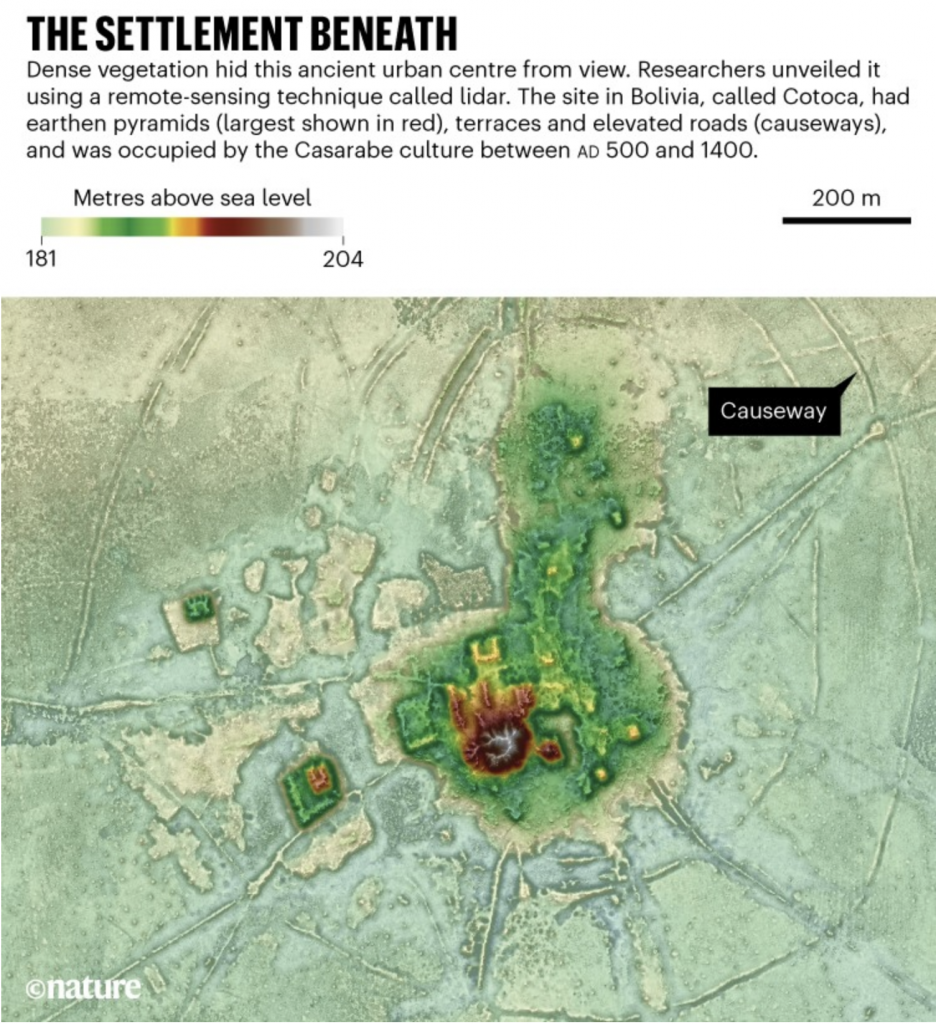
Who did not like Indiana Jones growing up as a kid? Or better yet, stories of explorers like Heinrich Schliemann, who discovered the lost city of Troy? The ancient world boasted a number of civilisations that no longer exist. But not all lost civilisations date back thousands of years. A recent article in Nature details how modern-day explorers used technology instead of trowels to discover urban centres dating only back 1500 years ago, the time at which Europe was just discovering the American continents.
The article includes a map of the elevations uncovered by LIDAR, which is like radar but with lasers. These wavelengths have the ability to penetrate the thick Amazonian jungle and reveal what sits upon the ground and the differences in height between them. This allows human-built structures to become rather apparent in contrast to the natural topography.
Can I build this in SimCity?
You can not only readily discern the pyramids and central civic/religious structures, but also the infrastructure like causeways, moats, and fortifications. They provide a fascinating insight into civilisations whose homelands are not easily accessible being that they are deep within the Amazon rain forest.
Here I like how the designers annotated at least a causeway, though I would also have enjoyed notes pointing out suppositions and hypotheses as to what the other structures may (or may not) be.
Credit for the piece goes to Heiko Prümers, Carla Jaimes Betancourt, José Iriarte, Mark Robinson, and Martin Schaich.
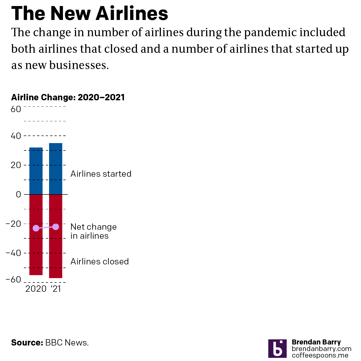
I noticed an interesting thing this morning. Over the holiday weekend I bookmarked a BBC News article about new airlines because it included a small graphic showing the number of airlines started during the pandemic (32) and the number of new airlines lost during the pandemic (55). The graphic used a stock three-dimensional illustration of a passenger airlines with a blank white body. From the top of the body rose two white bars, next to the left was the shorter of the two with a 32. The right was taller and had a 55. Above each was a header saying something to the effect of “Airlines started in 2020” and “Airlines lost in 2020”, respectively. Funny thing this morning that when I returned to the bookmark with this post in mind, the article’s graphic had disappeared.
This weekend I happened to start re-reading 1984, George Orwell’s classic dystopian novel about a man named Winston Smith. He works in the Records Department and is tasked with “rectifying” misstatements. I had just finished reading the section where Orwell describes Smith’s work wherein he takes previously published newspaper articles about statistics and figures and then edits them to include new numbers aligned with the actual outputs. This way should anyone read the old article for evidence of a previous past, they find the output forecasts have always been correct. He then destroys the written record of the old past by dumping it into a memory hole, a pneumatic tube that delivers it straight to a furnace where the old past is incinerated and thus replaced with Smith’s new version.
When I read the article again, because the graphic was gone, I read a paragraph that had figures for 2021. I cannot recall those numbers being present earlier this weekend. But they are roughly where I remember the old graphic being. Yet the article includes no note about any edits to a previous version let alone what those edits may have been. And so now I am left wondering if I really saw what I think I remember that I saw. How very Orwellian.
But let’s assume I did see what I thought I saw, the graphic was actually unnecessary. It presented two figures, 32 and 55. The bar chart itself had no axis labels and that made it a bit difficult to believe the numbers themselves. It did not help that the white bars blended almost seamlessly into the white body of the airliner. Moreover, the graphic was large and fit the full width of the text column. For two figures.
My initial goal was to show this graphic I made to show just how little space truly needs to be used to show an effective graphic. I also changed the direction of the bars. Instead of making one bar about the positive change and the other the negative change, I made both bars about the change. Therefore the one bar moved upwards with the positive (32) and the other downwards with the negative (55). I then plotted a dot to show the net change between the two. Yes, 32 airlines were created in 2020. But that still made for a net loss of 23 that year.
But because the graphic was missing and there was some new text for 2021 figures, I decided to incorporate them as well to show how the trend basically continued year over year.
Finally, a graphic
I left the white space to the right to illustrate how you really do not need a full-width graphic to display only six data points, itself a three-fold increase on the original graphic’s data content. The original graphic contained more illustrated plane than it did data content.
Graphics should be about the data, not about the splashy, flashy, whizbang background content that ultimately distracts our attention away from what should be the focal point of the piece: the data. The article still contains photos of planes with the livery of the new airlines, of empty terminals to represent the pandemic losses, and portraits of executives. This graphic did not need an illustrated plane taking over the graphic. It needed to only show those two numbers.
I would even contend that the article could have made do with a simple factette, two big numbers. Airlines closed in 2020 and the airlines opened. It need not be fancy, but it quickly delivers the big numbers with which the reader should be concerned. You don’t need to see an aircraft or a terminal. You could add some colour to the numbers or even a minus sign as there is a significant difference between a 55 and a -55. But all in all, the graphic need not be full width like it was originally.
But I think we should all keep in mind the value of transparency. The graphic did exist, of that I am certain. But future readers or even my sanity cannot be sure that it did. And in an era where “fake news” and fact-checking are important, I wonder if we need to be including corrections notes in more of our news articles. Because if we lose faith in our news, we have little left to lean upon in our societal discourse about the events of our time.
Well that was a week. But at least we made it to Friday and for my American readers and myself this weekend and its bank holiday on Monday, Memorial Day, mark the unofficial beginning of summer. So thanks to Indexed, it’s time to head down to the beach and hang ten (serfs).
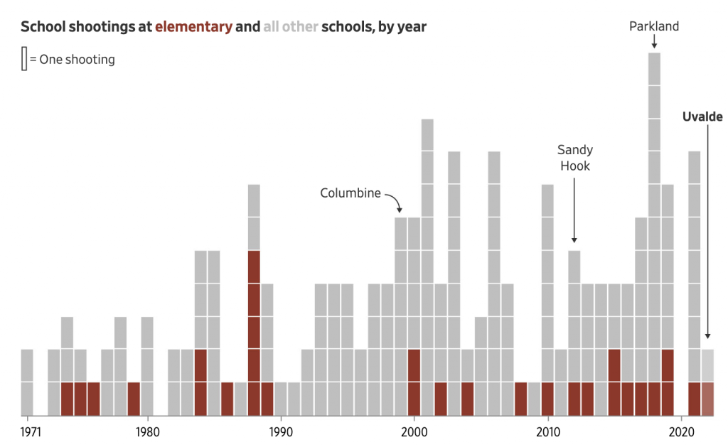
The Wall Street Journal put together a nice piece about the uptick in elementary school shootings, both in the number of shootings and the number of deaths. It used two bar charts, regular and stacked, and a heat map to tell the story. The screenshot below is from a graphic that looks at the proportion of school shootings that occur at elementary schools. They are not as common, but as other graphics in the article show, they can be quite deadly.
Not a great trend…
The graphic above does a nice job of distilling the horror of a tragedy into a single rectangle. That is an important task because it allows us to detach ourselves and more rationally analyse the situation. Unfortunately the analysis is that yes, Virginia, things really have been getting worse.
Overall the article is simple but soberingly effective. School shootings are a problem with which American society has not dealt and my cynical side believes with which we will continue to not deal.
Credit for the piece goes to James Benedict and Danny Dougherty.
Remember how just last week I posted a graphic about the number of under-18 year olds killed by under-18 year olds? Well now we have an 18-year-old shooting up an elementary school killing 19 students and two teachers. Legally the alleged shooter, Salvador Ramos, is an adult given his age. But he was also a high-school student, reportedly more of a loner type. Legally an adult, perhaps, but I’d argue still more of a child. At least a young adult.
Well, as I noted above, here we are again, kids killing kids. With guns!
And it does look like it correlates with those state with more liberal gun laws, including Texas.
If you keep doing the same thing, but expect different results…
For those who don’t know, China currently engages in ethnocide, or cultural genocide in its western province of Xinjiang, a province with a majority of its population being Uighurs, a Turkic Muslim people. Ethnocide is a term I prefer over genocide as genocide more commonly refers to practices like those in Nazi Germany or 1990s Rwanda and Bosnia wherein people are systematically executed and murdered. Ethnocide leaves a people alive but aims to destroy and extinguish their culture ultimately replacing it with that of another. In this case, Beijing’s policy is to strip the Uighurs of their Muslim culture and identity and replace it with loyalty to China and the Chinese Communist Party.
The BBC have just published what they call the Xinjiang Police Files, files and data hacked off of Chinese government servers and then handed over to a US-based expert on Xinjiang and the atrocities there. That person then handed copies to the BBC, which has verified much of the content.
There is not much by way of data visualisation or information design, but the story is worth mentioning because maybe over one million people are being forcibly detained and “re-educated” by Beijing. One of the articles about the files, however, does have a small graphic of one of the “re-education camps”, i.e. prison, and details its design and the facilities therein.
Certainly not like any school I have ever attended…
Political liberalism and pluralism are messy. Often it means we hear and listen to things with which we disagree, sometimes vehemently. Freedom of speech, expression, and religion can make us feel uncomfortable, hurt our feelings, and even sick to our stomachs. But that is also the price of our liberty to speak, express, and pray ourselves. Because we only need to look to China to see what happens when a society or a government decides what is or isn’t acceptable speech (peaceful protests against the government), expression (growing out a beard), or religion (praying in a mosque). An authoritarian regime, an anti-liberal regime, will attempt to stifle, silence, and ultimately imprison those who go against the (Chinese Communist) party line.
1984 rings a little more true each year.
Credit for the piece goes to John Sudworth and the BBC’s Visual Journalism Team.
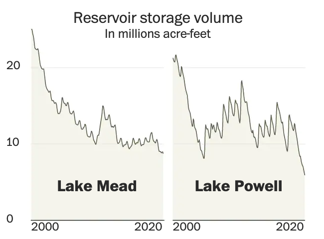
Last week the Washington Post published a nice long-form article about the troubles facing the Colorado River in the American and Mexican west. The Colorado is the river dammed by the Hoover and Glen Canyon Dams. It’s what flows through the Grand Canyon and provides water to the thirsty residents of the desert southwest.
But the river no longer reaches the ocean at the Gulf of California.
Why? Part drought, part population growth, and part economic activity. The article does a great job of exploring the issue and it does so through the occasional use of information graphics. This screenshot captures the storage capacity of the two main dams, Lake Mead and Lake Powell, created by the Hoover and Glen Canyon Dams, respectively. You may have heard of these recently because the water shortages presently affecting the region have brought reservoir levels to some of their lowest levels in years. And that means people have been finding all sorts of things.
But the graphic does a nice job of showing just how low things have gotten of late. Naturally I am curious what the data looks like on a longer timeline. Hoover Dam, of course, began during the administration of Herbert Hoover but was completed during the Franklin Roosevelt administration—who also renamed the dam as Boulder Dam though Congress reversed that change in 1947. Lake Powell came along three decades later and so the timelines would not be the exact same, but I am curious all the same.
Low and getting lower
The overall article makes sparse use of the graphics and they occupy much less space in the design than the numerous accompanying photographs. But the balance in terms of content works, I just would have preferred the charts and maps a bit larger.
Contrast this to what we explored last week in a New York Times piece, specifically the online version. There we saw graphics with no headers, data descriptors, axes labels, &c. Here we see the Washington Post was able to create a captivating piece but treat the data and information—and the reader—with respect. There are fewer graphics in this piece, but the way they were handled puts this leaps and bounds above the online version we looked at last week.
Credit for the piece goes to a lot of people, but the graphics specifically to John Muyskens. The rest of the credits go to the author Karin Brulliard and then just copying and pasting from the page: Editing by Amanda Erickson and Olivier Laurent. Photography by Matt McClain. Video by Erin Patrick O’Connor and Jesús Salazar. Video editing by Jesse Mesner-Hage and Zoeann Murphy. Graphics by John Muyskens. Graphics editing by Monica Ulmanu. Design and development by Leo Dominguez. Design editing by Matthew Callahan and Joe Moore. Copy editing by Susan Stanford. Additional editing by Ann Gerhart.
As many of my long-time readers know, I count genealogy as one of my hobbies. A few weeks ago for Orthodox Easter I travelled up to the hometown of my late grandfather. There I get to see people to whom I’m related as many of us can point to ancestors from the same few villages in a small geographic cluster in the Carpathian Mountains of Slovakia and Poland. In other words, we’re all cousins.
But as xkcd shows, so are we all. And that means you too, cousin.