Well, my week is over and whilst I may publish a post here and there the rest of the month, please do not expect it. My holiday time is truly here and I’ll be away for the next two and a half weeks. Fear not, for like McArthur to the Philippines I shall return. But in 2022.
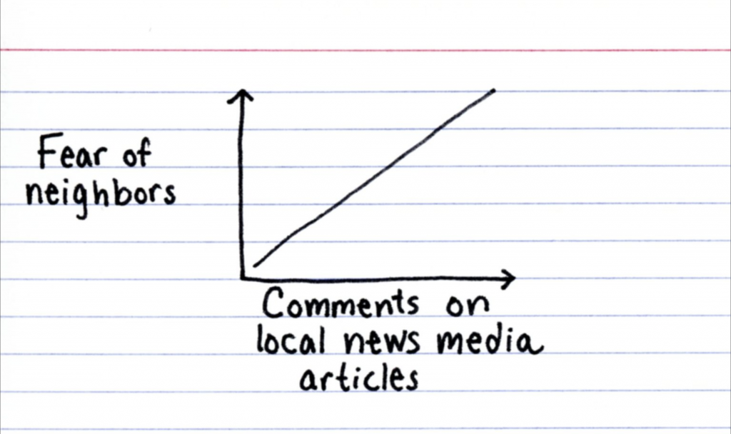
But before I step away for a much-needed break, I encourage you to never read the comments section with this sadly brilliant piece by Jessica Hagy of Indexed.
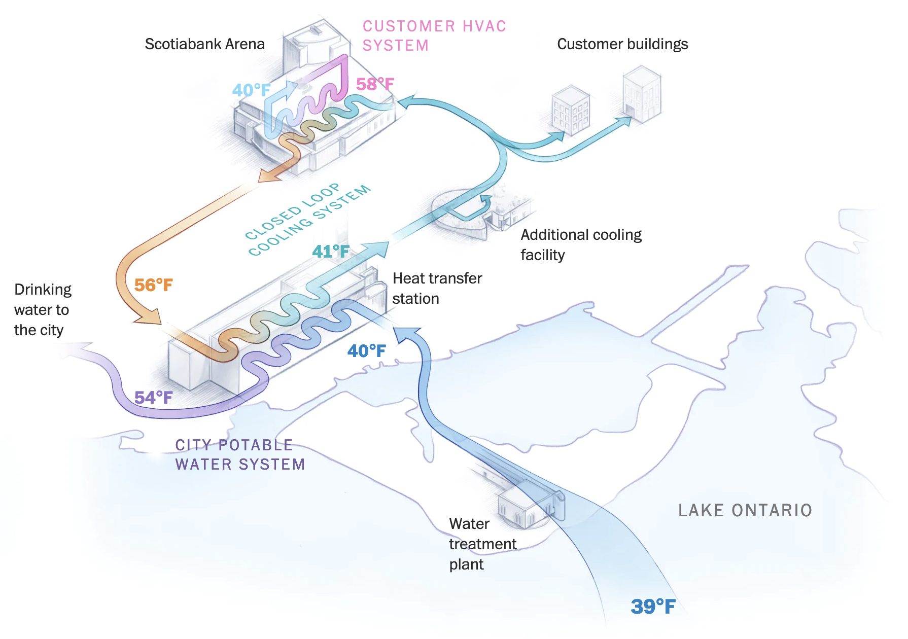
Last month the Washington Post published a nice article that detailed the deep water cooling system that the city of Toronto, Canada uses to keep itself cool. For the unfamiliar, deep water cooling at its simplest means sucking up very cold water from the bottom of a lake or ocean or wherever you can get very cold water, and then pumping that inland to absorb heat before cycling it back.
Of course, for the longer explanation—and what makes Toronto’s system different—you should read the article. And for our purposes it includes some nice illustrations that diagram just how that system works. The screenshot below captures the basic process I just described, but there are additional illustrations that do a great job showing just how the system works.
Just look at those gloriously cool temperatures…
What I particularly enjoy about this style is how the illustrations of the building and similar are minimal and restrained. This allows the diagrammatic elements to come to the forefront, which is important to make the system understood.
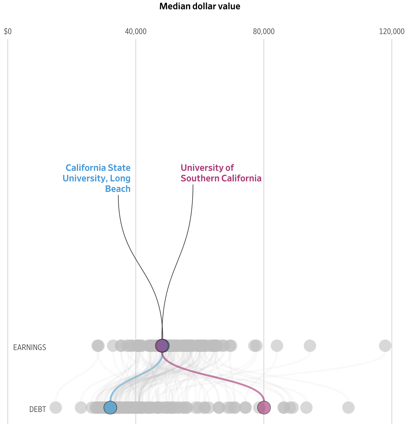
Many of us know the debt that comes along with undergraduate degrees. Some of you may still be paying yours down. But what about graduate degrees? A recent article from the Wall Street Journal examined the discrepancies between debt incurred in 2015–16 and the income earned two years later.
The designers used dot plots for their comparisons, which narratively reveal themselves through a scrolling story. The author focuses on the differences between the University of Southern California and California State University, Long Beach. This screenshot captures the differences between the two in both debt and income.
Pretty divergent outcomes…
Some simple colour choices guide the reader through the article and their consistent use makes it easy for the reader to visually compare the schools.
From a content standpoint, these two series, income and debt, can be combined to create an income to debt ratio. Simply put, does the degree pay for itself?
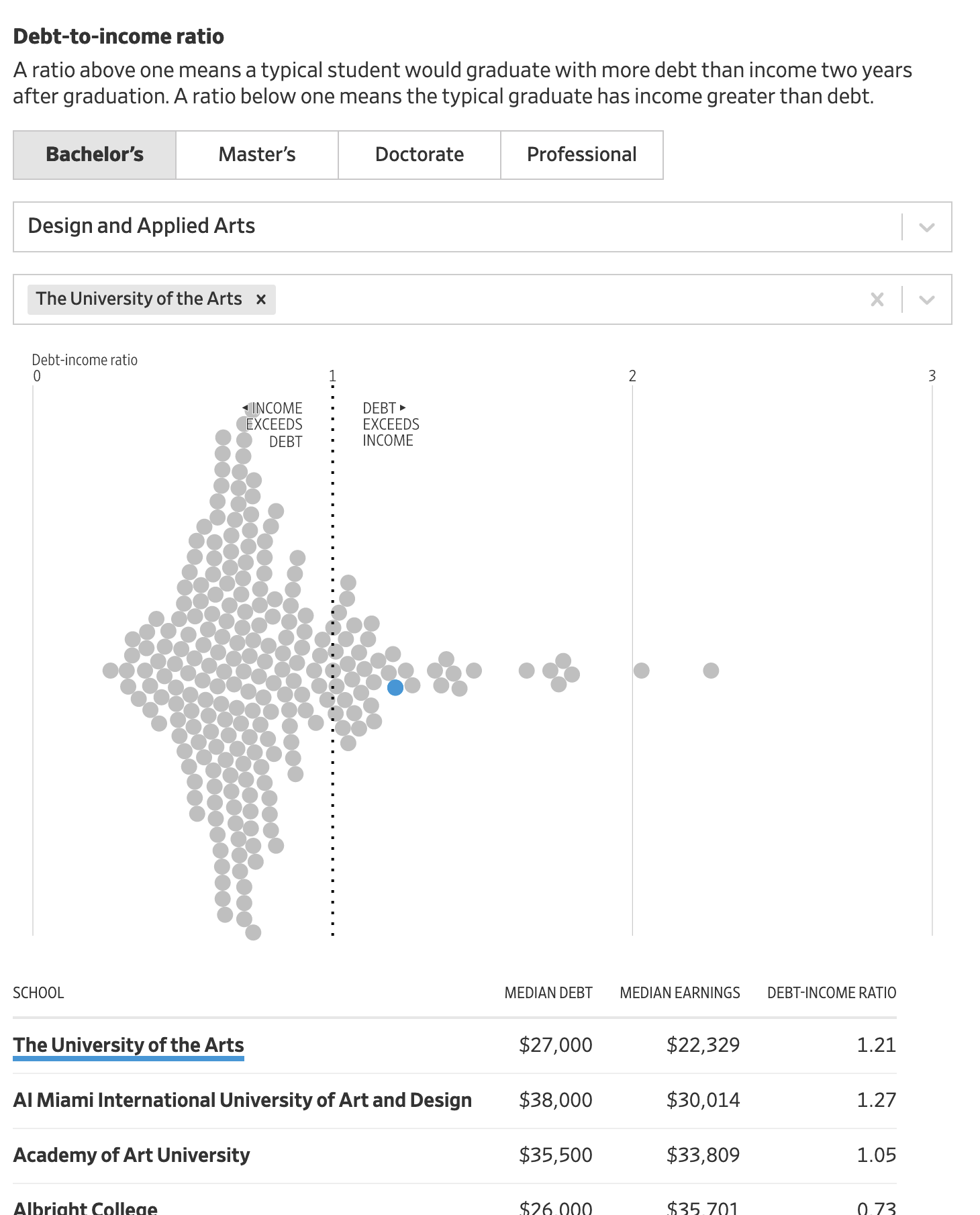
What’s really nice from a personal standpoint is that the end of the article features an exploratory tool that allows the user to search the data set for schools of interest. More than just that, they don’t limit that tool to just graduate degrees. You can search for undergraduate degrees.
Below the dot plot you also have a table that provides the exact data points, instead of cluttering up the visual design with that level of information. And when you search for a specific school through the filtering mechanism, you can see that school highlighted in the dot plot and brought to the top of the table.
Fortunately my alma mater is included in the data set.
Welp.
Unfortunately you can see that the data suggests that graduates with design and applied arts degrees earn less (as a median) than they spend to obtain the degree. That’s not ideal.
Overall this was a really nice, solid piece. And probably speaks to the discussions we need to have more broadly about post-secondary education in the United States. But that’s for another post.
Credit for the piece goes to James Benedict, Andrea Fuller, and Lindsay Huth.
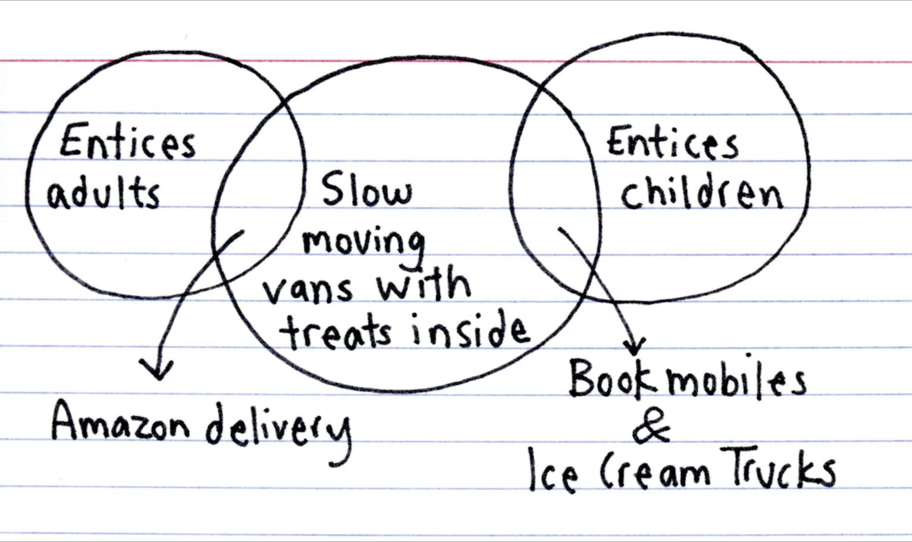
Where is my mind? On the dark side of the humour scale. Because when I saw this latest Venn diagram from Indexed, my mind leapt somewhere else entirely.
Do kids even read books anymore?
At the end of the day, don’t talk to strangers, kids.
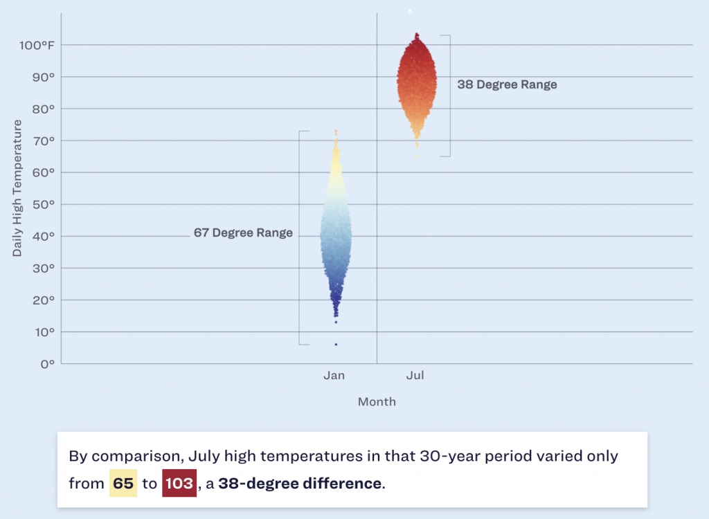
Winter is coming? Winter is here. At least meteorologically speaking, because winter in that definition lasts from December through February. But winters in Philadelphia can be a bit scattershot in terms of their weather. Yesterday the temperature hit 19ºC before a cold front passed through and knocked the overnight low down to 2ºC. A warm autumn or spring day to just above freezing in the span of a few hours.
But when we look more broadly, we can see that winters range just that much as well. And look the Philadelphia Inquirerdid. Their article this morning looked at historical temperatures and snowfall and whilst I won’t share all the graphics, it used a number of dot plots to highlight the temperature ranges both in winter and yearly.
Yep, I still prefer winter to summer.
The screenshot above focuses attention on the range in January and July and you can see how the range between the minimum and maximum is greater in the winter than in the summer. Philadelphia may have days with summer temperatures in the winter, but we don’t have winter temperatures in summer. And I say that’s unfair. But c’est la vie.
Design wise there are a couple of things going on here that we should mention. The most obvious is the blue background. I don’t love it. Presently the blue dots that represent colder temperatures begin to recede into and blend into the background, especially around that 50ºF mark. If the background were white or even a light grey, we would be able to clearly see the full range of the temperatures without the optical illusion of a separation that occurs in those January temperature observations.
Less visible here is the snowfall. If you look just above the red dots representing the range of July temperatures, you can see a little white dot near the top of the screenshot. The article has a snowfall effect with little white dots “falling” down the page. I understand how the snowfall fits with the story about winter in Philadelphia. Whilst the snowfall is light enough to not be too distracting, I personally feel it’s a bit too cute for a piece that is data-driven.
The snowfall is also an odd choice because, as the article points out, Philadelphia winters do feature snowfall, but that on days when precipitation falls, snow accounts for less than 1/3 of those days with rain and wintry mixes accounting for the vast majority.
Overall, I really like the piece as it dives into the meteorological data and tries to accurately paint a portrait of winters in Philadelphia.
And of course the article points out that the trend is pointing to even warmer winters due to climate change.
Credit for the piece goes to Aseem Shukla and Sam Morris.
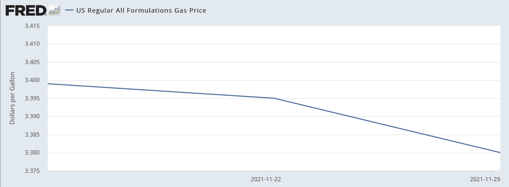
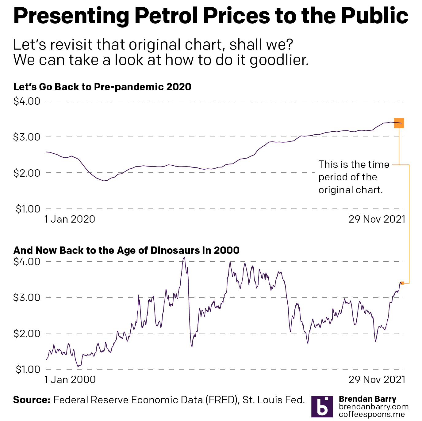
Saw this graphic on the Twitter the other day from the Democratic Congressional Campaign Committee (DCCC), or the D Triple C or D Trip C. The context was that earlier in the day Matt Yglesias posted a clearly tongue-in-cheek chart about how after signing the infrastructure bill, President Biden had single-handedly fixed inflation and gas prices were heading down.
Oh, the power to misuse FRED.
Of course, anyone with a brain knows this isn’t true. The President of the United States cannot control the price of petrol. Because, you know, market economy. The underlying problem of high demand and low supply was, of course, not solved by the infrastructure bill. But lots of people complain on the telly or the internets about Biden not doing more about inflation, but, you know, not really within the wheelhouse.
Anyway, this chart in particular does not bother me. Because Yglesias knows—and most of his audience knows—it is not meant to be taken seriously. It is really just a joke.
But emphasis most of his audience.
Because the DCCC later posted this graphic with the accompanying text “Thanks, Joe Biden”.
Oh boy.
Oh boy.
Clearly they didn’t get the memo about the original being a joke.
The entire scale of the chart is 4¢. I cannot even recall the last time I had to use the glyph ¢ we’re talking so small a scale. The change in the the three week period amounts to a decline of 2¢.
And now you get the joke of the post. Ask me my 2¢ about the chart…
Now look closely at that y-axis. You’ll also note that we are carrying it all the way out to the third decimal point. Now, it’s true that some petrol stations will have a wee little nine trailing just after the two digits to the right of the decimal. Sometimes you might see a 9/10. As was explained to me in school that’s because people will buy something if it looks even a fraction of a cent cheaper. Thing 99¢—getting the use out of this glyph today—versus $1. Makes all the difference. So back when petrol was cheap (inflation stories come round and round), 0.899 looked better than 0.90. But now that it’s routinely well over a few dollars, that 9/10 is a laughable percentage of the total price.
So, yes, we do present petrol prices to three decimals in the environmental design space. But think to yourself, when have you ever aloud repeated a price to the third decimal point? You probably haven’t. And so this chart probably shouldn’t be using that granular a level of specificity.
The other underlying problem, jokes aside, is that the chart spends all that horizontal space looking at three data points. Three. If the data were showing the daily price, not the weekly average, we’d have 21 days worth of data, and that—scale notwithstanding—would be worthy of charting. My basic rule is that if it’s five or six data points, you can use a table unless there is a contextual or design reason for doing so. Say, for example, you’re doing a series of small multiples for a time series of objects in a category. For all but a few categories you have dozens of data points, but just a few have really spotty observations. In those cases, plot the three or four numbers. But in this case, just don’t.
Instead this kind of graphic is best presented as a factette, a big old number, preferably in a narrow or condensed width. Because a 2¢ decline over a three-week period is also not terribly newsworthy. (Unless your story is how prices haven’t changed much over the last three weeks.)
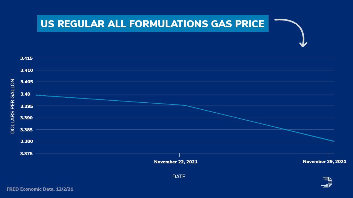
This also points to how the original chart misses the context of time. Granted, a lot can happen in three weeks, but a 2¢ shift is not massive. Give those three weeks their proper place in time, however, and you can see just how little movement that truly is. Cue my own quickly whipped up charts.
That’s more like it.
In the first chart you can begin to see how the change, during the course of the last nearly two years, is not significant. And in the second you can see that things really are not that bad compared to where they were back during the lead up to the Great Recession and then in the recovery that followed. (Aww, look at back in the early oughts when prices averaged just over a $1/gallon. I can still remember filling up my minivan for prices like 99¢.)
If the designer wants to make a point that perhaps we’re reaching the peak prices during this time period, sure. Because a two-week decline in prices could well be the beginning of that. But, to show that you also need to show the context of the time before that.
But once again, the President of the United States cannot much affect the price of petrol short of releasing the strategic reserve, which as its name implies, is meant for strategic purposes in case of national emergency. And high consumer prices are not a strategic national emergency on the scale of, say, a crippling storm impacting the refineries in the Gulf or an earthquake destroying pipelines in Alaska or an invasion or stifling blockade of overseas imports.
At the end of the day, this was just a terrible, terrible chart. And I think it speaks to a degree of chart illiteracy that I see creeping up in society at large. Not that it wasn’t there in the past—get off my lawn, kids—but seems more ever present these days. I don’t know if that’s because of the amplification effect of things like the Twitter or just a decline in education and critical thinking. But those are topics for another day.
This chart fails on so many levels. The concept is bad, i.e. neither Biden nor Trump nor their predecessors nor their successors—unless we adopt a planned economy, am I right, comrades?—can directly affect petrol prices. Prices are governed by larger market forces that boil down to supply and demand.
But also, the sheer design is bad. Don’t use a chart of three data points. Don’t stretch out the x-axis. Don’t use decimal points to a point where they’re unrecognisable.
In the meantime, charts like this? Don’t do them, kids.
Credit for the first original goes to FRED, whose chart Matt Yglesias used.
Credit for the second goes to the DCCC graphics department.
Oh, and because I used Federal Reserve data for the charts, and because I work there, I should add the views and opinions are my own and don’t represent those of my employer.
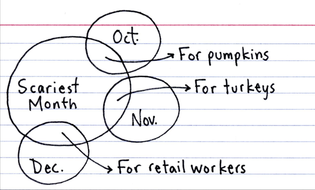
For many years I worked in retail and food service, and for a subset of those years I worked the Christmas shopping season. Black Fridays were indeed awful. And so this graphic that I alluded to last week from Indexed felt appropriate to share. I have no idea how busy in-person retail work will be this year as we begin to near the light at the end of this Covid tunnel, but just keep those in retail and other service industries in mind.
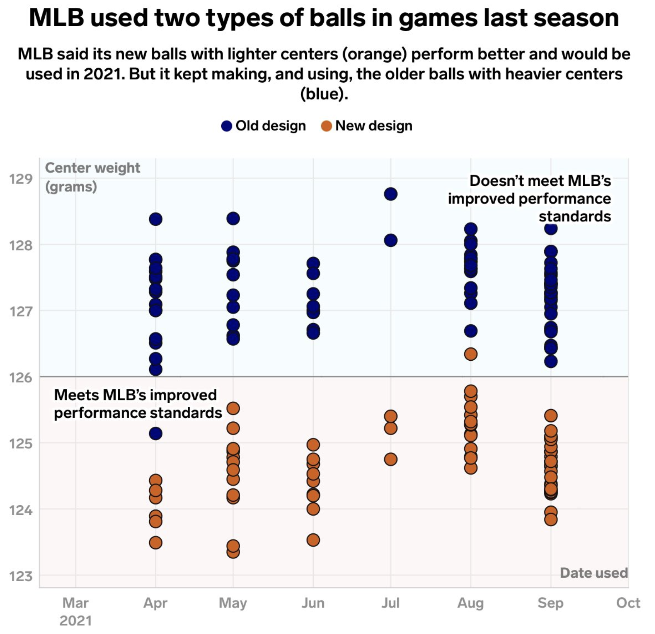
Unfortunately, I don’t subscribe to Business Insider, but I saw this graphic on the Twitter and felt the need to share it. Primarily because baseball will almost certainly stop at midnight when the owners of the teams will impose a lockout (as opposed to players going on strike). And with that baseball will be on hold until the two parties resolve their current labour issues.
And at present that seems like it could take quite some time.
So on the eve of the lockout Bradford William Davis tweeted a link to an article he wrote, alas no subscription as aforementioned, but he did share one of the graphics therein.
Those are a lot of blue balls…
We have a basic dot plot charting the weight of the centre of baseballs, sorted by the month of game from which they were pulled.
The designer made a few interesting choices here. First, typographically, we have a few decisions around the type. I would have loved to have seen a bit of editing or design to eliminate the widow at the end of the graphic’s subtitle, that bit that just says “(blue)”. Do the descriptors in parentheses even need to be there when the designer included a legend immediately below? I find that one word incredibly distracting.
On the other hand, the designer chose to use a thin white outline around the text on the plot. Normally I’d really like this choice, because it can reduce some of the issues around legibility when lines intersect text, especially when they are the same colour. Here, however, the backgrounds are not white. I would have tried, for the top, using that light blue instead of white as the stroke for the outside of the letters. And on the bottom I would have tried the light pink. That would probably achieve the presumed desired effect of reducing the visual interference unintentionally created by the white. I also would have moved the top label up so it didn’t sit overlay the top dot.
As far as the dot plot itself goes, that works fine. I wonder if some transparency in the dots would have emphasised how many dots sit atop each other. Or maybe they could have clustered, but when overlapping moved horizontally off the vertical axis.
Overall this was a really nice graphic with which to end this half of the baseball off season. Hopefully the lockout doesn’t last too long.
If you didn’t know, climate change is real and it threatens much of our current way of life. I don’t go so far as to say it threatens the extinction of mankind, because there are nearly seven billion of us and to wipe out every living soul would be a tall order. But, it could wipe out parts of our history.
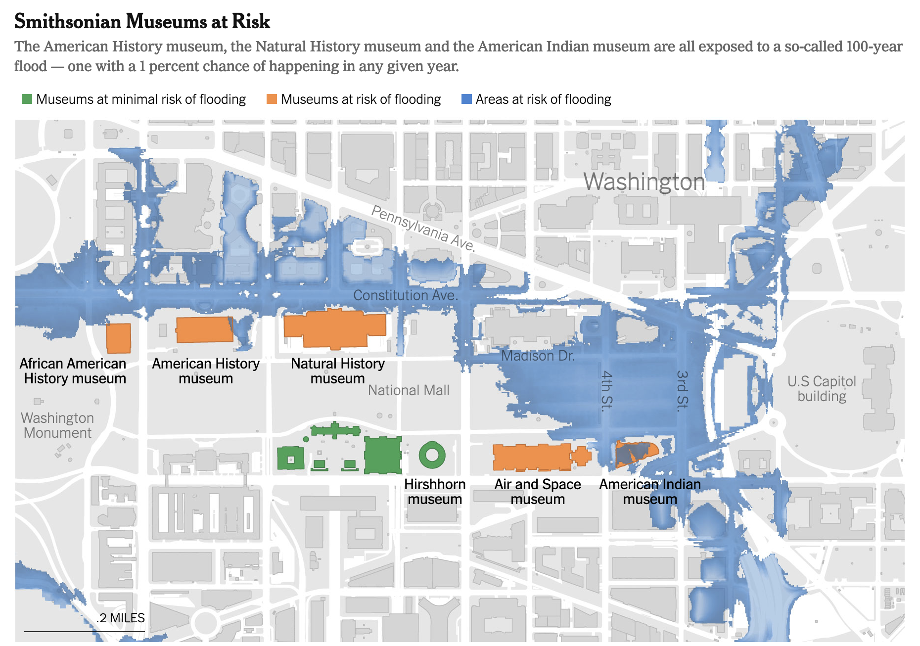
If you didn’t know, the city of Washington in the District of Columbia was built on a swamp. Except, actually, it wasn’t. Most of the city was built on higher ground along the riverbank of the Potomac. True, there are low-lying areas affected by the tides and high water, such as the National Mall, but places like the Capitol were purposefully placed on high ground.
And that gets us to this article in the Washington Post. It takes a look at the impact of rising waters and flash flooding on the National Mall, home to some of the preeminent American museums. The article uses a map to show just how the museums are threatened by extreme weather events that will only increase in frequency as climate change ramps up.
Note the Capitol and the White House will both be fine.
The designer used colour to denote museums by their risk of flooding, and sadly there are several. But as the article describes, there are few short-term fixes that we can undertake to mitigate the risk of damage to the collections.
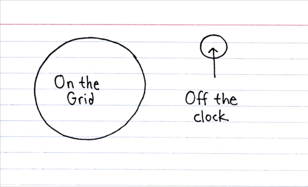
One of the pieces I flagged a month or so ago around the time of my trip to the Berkshires was this one by Indexed. There was a time in my life when I would receive notifications for e-mail, particularly work e-mail, on my mobile. As a manager, I tend to think that’s…not great. There becomes no separation between work and personal life and for many, if not most, people that separation is critical to maintaining a healthy balance of both.
Consequently on my trip I barely even checked my personal e-mail, because I wanted to disconnect nearly entirely from that part of my life. And so this graphic made a lot of sense. Even if I was far from being “off the grid” I was very much “off the clock”.
I don’t think I could ever be off the grid, though…
And for my American friends, it’s time to go off the clock as the Thanksgiving holiday begins for many of us this afternoon or evening. But just remember that many will still be working and serving. More on that next week.