Peeping Map

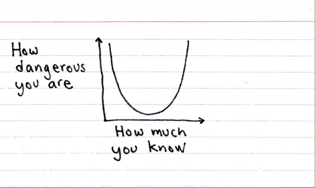
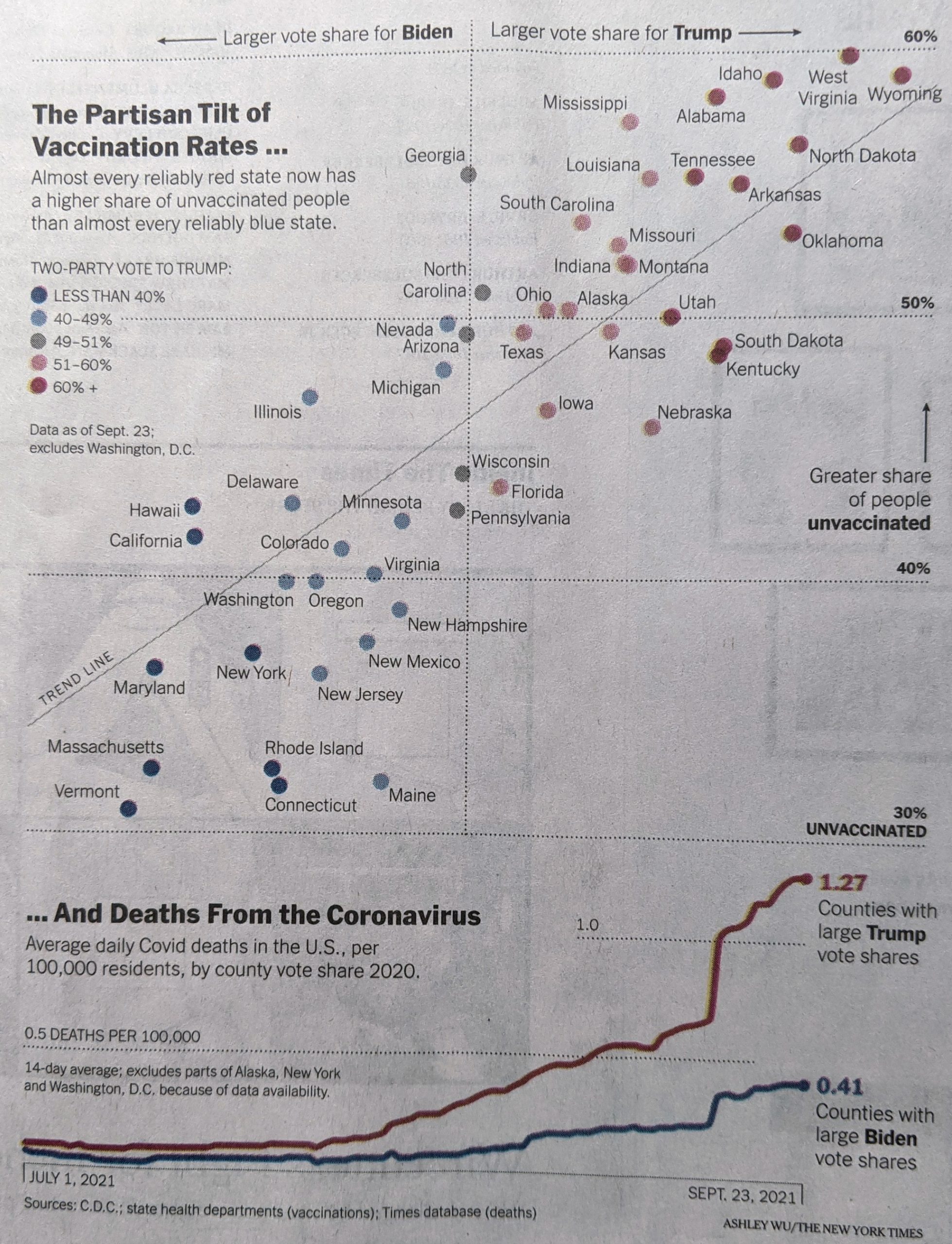
Depending upon where you live, autumn presents us with a spectacular tapestry of colour with bright piercing yellows, soft warm oranges, and attention-grabbing reds all situated among still verdant green grasses and calming blue skies. But this technicolour dreamcoat that drapes the landscape disappears after only a few weeks. For those that chase the colour, the leaf peepers, they need to know the best time to travel.

For that we have this interactive timeline/map from SmokyMountains.com. It’s pretty simple as far as graphics go. We have a choropleth map coloured by a county’s status from no change to past peak, when the colours begin to dull.

All the colour

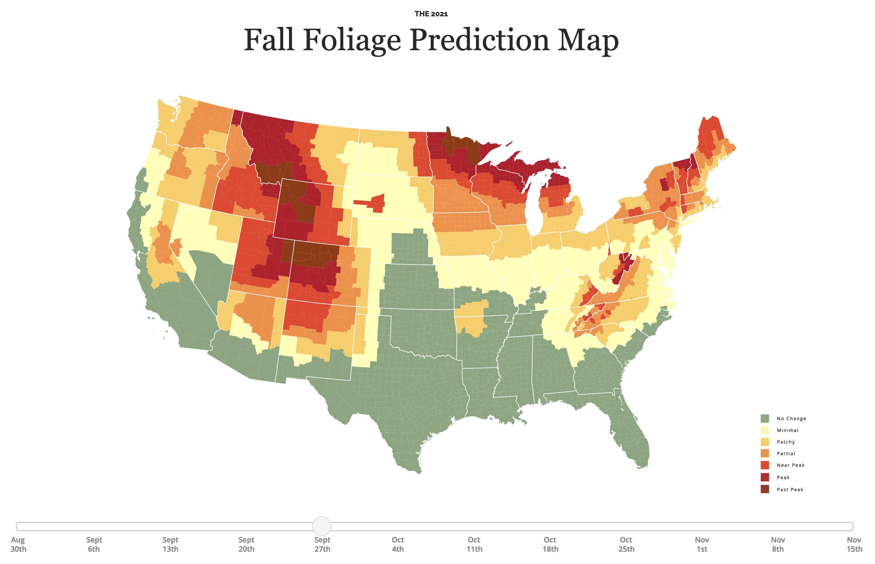
The map itself is not interactive, i.e. you cannot mouse over a county and get a label or some additional information. But the time slider at the bottom does allow you to see the progression of colour throughout the autumn.

Normally, as my longtime readers know, I am not a fan of the traffic light colour palette: green to red. Here, however, it makes sense in the context of changing colours of plant leaves. No, not all trees turn red, some stay yellow. Broadly speaking, though, the colours make sense.

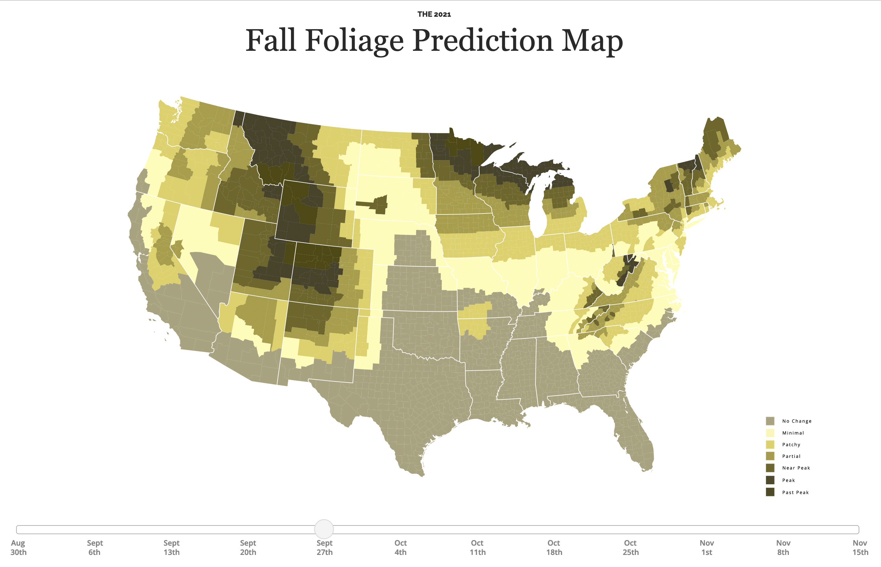
And to that end, the designers of the map chose their colours well, because this map avoids the issues we often see—or don’t—when it comes to red-green colour blindness. This being the reason why a default of green-to-red is a poor choice. Their green is distinct from the red, as these two proof colour screenshots show (thanks to Photoshop’s Proof Colour option).

Protanopia
Deuteranopia

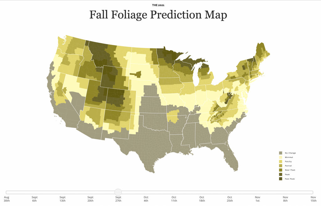
The choice isn’t great, don’t get me wrong. You can see how the green still falls into the shades of red. A blue would be a better choice. (And that’s why I always counsel people to stick to a blue-to-red palette.) Compare, for example, what happens when I add a massive Borg cube of blue to the area of Texas and Oklahoma—not that you have a choice, because resistance is futile.

A bit of blue

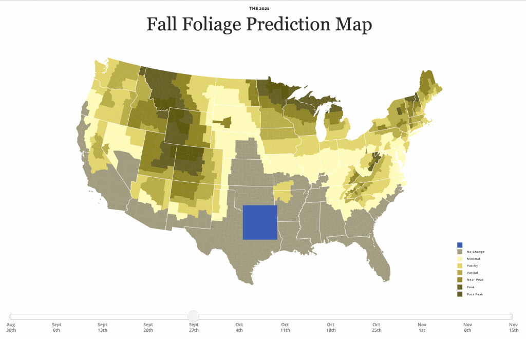
Here the blue is very clearly different than the reds. That makes it very distinct, but again, I think in the context of a map about the changing of leaf colours from greens to reds, a green-to-red map is appropriate. But only if, as these designers have, the colours are chosen so that the green can be distinguished from the reds.

As I always say, know the rules—don’t use red-to-green as one—so that you know the few instances when and where it’s appropriate to break them. As this map is.

Credit for the piece goes to the SmokyMountains.com

Danger Isn’t My Middle Name

Happy Friday, everyone, we’ve made it to the weekend. When I work with developers I always make clear to them that they are the experts and that they know the best ways of coding the crazy ideas in my head. I then almost always add that I do, however, know a little bit of HTML and CSS. Just enough to be dangerous.

So when I saw this post from Indexed I had to laugh to myself.

I like living on the edges.

How very true it is.

Credit for the piece goes to Jessica Hagy.

Covid Update: 29 September

Last week when I wrote my update on Covid-19, we had seen a few signs for optimism, but in other states the news was hard to interpret or, in the case of Pennsylvania, not going the right way at all. So where are we this week? In some ways, not a lot has changed over the last seven days.

New case curves for PA, NJ, DE, VA, & IL.

Last week, we had positive developments in both New Jersey and Illinois. There cases had begun to noticeably and consistently fall with clear peaks in this fourth wave of infections. Their seven-day averages were decidedly below their recent peaks. That trend continued last week. In fact, in Illinois the seven-day average is now also below the peak from not just this fourth wave, but also the third wave. That’s good.

New Jersey’s fourth wave was nowhere near as impactful as its first three. It helps to have one of the highest vaccination rates in the United States. But the Garden State’s seven-day average is also falling, though not as quickly as in Illinois. You could even make the argument that over the last week cases have really remained flat, though the last few days I would contend are evidence of a slow slowdown.

Delaware had been a tricky state to judge given some recent volatility in its average. But as we can see over the last week the new case curve clearly has flattened. The flat line, however, remains just that, a flat line. This is more of a plateau shape than a descending hill shape. That means that cases are continuing to spread, but at a steady rate of about 450 new cases per day. This isn’t uncommon, but hopefully it precedes a fall in new cases rather than serving as a respite on an ever upward climb.

In Virginia I had mentioned some early indications of a potential flattening, the first step towards a decline in the average. That flattening appears to be taking hold. In the chart above you can clearly see a sharp decline beginning to take root in Old Dominion. The curve here most closely resembles Illinois in what, at least for now, is a fairly symmetrical increase and decrease.

Finally we have Pennsylvania. I was pretty short in my analysis last week, the state was headed in the wrong direction. The latest data shows that the Commonwealth may just be beginning to turn the corner and flatten the curve. However, after the pre-Labour Day slowdown that then erupted into a full-blown outbreak, I’m wary of saying anything definitive about Pennsylvania. All we can do is hope that these early trends hold true.

So what about deaths? Are we seeing any progress on that front? Last week I noted that it was almost all bad news. In all but Illinois we had death rates continuing to climb.

Death curves for PA, NJ, DE, VA, & IL.

That story, sadly, remains largely the same. Illinois, unfortunately has actually seen its seven-day average resume ticking upwards, although not by a significant degree. It’s enough that I think it fair to say deaths have largely plateaued and not necessarily begun to climb. And as I keep saying, that would track for a state where we have seen new cases falling for the last few weeks now.

Unfortunately, that’s about it. Deaths in New Jersey have remained fairly stable, though the average has moved from 19.3 to 17.4 as of yesterday. Perhaps that could be an indication of a falling death rate. But just a few days ago it was still nearer 19 than 18. I would want to see more data showing a consistent and persistent decline before saying New Jersey is headed the right way.

And in Pennsylvania, Delaware, and Virginia, deaths are headed the wrong way, plain and simple. At the beginning of the sample set, Delaware reported 14 deaths in one day, the most in a month. Consequently the average has jumped from 2.6 last week to 3.4 today. In Virginia we had seen deaths jump from 20 to 34. Well this week they jumped again, though by half the amount, to 41 deaths per day. Pennsylvania performed the worst, however. Deaths here climbed from 43 to 57 per day.

While we have seen new cases plateau in Delaware and begin to fall in Virginia, which should mean declining death rates in a few weeks, in Pennsylvania the numbers of new cases may only be beginning to flatten. Consequently, unless we begin to see a sharp decline in new cases, we will likely continue to see rising deaths in the Commonwealth. At least for a little while longer.

Credit for the piece is mine.

Covid Vaccination and Political Polarisation

I will try to get to my weekly Covid-19 post tomorrow, but today I want to take a brief look at a graphic from the New York Times that sat above the fold outside my door yesterday morning. And those who have been following the blog know that I love print graphics above the fold.

On my proverbial stoop this morning.

Of the six-column layout, you can see that this graphic gets three, in other words half-a-page width, and the accompany column of text for the article brings this to nearly 2/3 the front page.

When we look more closely at the graphic, you can see it consists of two separate parts, a scatter plot and a line chart. And that’s where it begins to fall apart for me.

Pennsylvania is thankfully on the more vaccinated side of things

The scatter plot uses colour to indicate the vote share that went to Trump. My issue with this is that the colour isn’t necessary. If you look at the top for the x-axis labelling, you will see that the axis represents that same data. If, however, the designer chose to use colour to show the range of the state vote, well that’s what the axis labelling should be for…except there is none.

If the scatter plot used proper x-axis labels, you could easily read the range on either side of the political spectrum, and colour would no longer be necessary. I don’t entirely understand the lack of labelling here, because on the y-axis the scatter plot does use labelling.

On a side note, I would probably have added a US unvaccination rate for a benchmark, to see which states are above and below the US average.

Now if we look at the second part of the graphic, the line chart, we do see labelling for the axis here. But what I’m not fond of here is that the line for counties with large Trump shares, the line significantly exceeds the the maximum range of the chart. And then for the 0.5 deaths per 100,000 line, the dots mysteriously end short of the end of the chart. It’s not as if the line would have overlapped with the data series. And even if it did, that’s the point of an axis line, so the user can know when the data has exceeded an interval.

I really wanted to like this piece, because it is a graphic above the fold. But the more I looked at it in detail, the more issues I found with the graphic. A couple of tweaks, however, would quickly bring it up to speed.

Credit for the piece goes to Ashley Wu.

Flowing Lava and Layers

I didn’t have the internet yesterday morning, so apologies for no posting. But at least it was back by the afternoon. Unlike utilities in La Palma, where a volcano has been erupting and lava flowing, covering parts of the island.

The BBC had a brief article last week detailing the spread of the lava, which has been devastating the town. And it was a neat little graphic that I really liked.

At least it doesn’t move super quickly?

This graphic does a couple of things that I really like. First, context. Yes, the main graphic is the actual spread over four days (the fifth layer is almost half-a-day later). But in the upper-right corner, we have the same graphic layered over a satellite image of the region. I’m not sure how I feel about the satellite image, but overall it does provide a sense of scale.

Because the second thing I like is how the larger map shows not a satellite view, but rather a topographic or terrain view. The lines represent points of continuous height and help explain why the lava flow looks the way it does. The drawback here is that you don’t get any sense of urban development, like streets or neighbourhoods impacted. For that you could often use a satellite image, but then the colours and their saturation could detract from the importance of the graphical element, the lava flow layers.

Finally for the layers, I like the stepped gradients of the dark reds. This makes the sequential flow very clear. My only quibble might be the stroke or border on the shape. You can see that for all but the final shape, the stroke is a thin white line. But because those layers are stacked in reverse order—or else you would only be able to see the last layer, the most distant spread—the white stroke often overlaps and hides the black stroke for the final day.

Here I would recommend taking the five layers, duplicating them then merging them into a single sixth shape that sits atop the original five layers. I would eliminate the fill colour from the shape and then put the outline to black, that way the final borders of the lava flow in the graphic could be seen for the entirety of the flow.

But overall, this was a really nice piece that provides a lot of context to the lava flow.

Credit for the piece goes to the BBC graphics department.

An Animated Approach to Understanding Vaccines…

…courtesy of Family Guy.

In the last 18 months of looking at the data behind Covid-19 and the vaccines, I’ve had a lot of conversations with people, maybe even some of you, about the pandemic and the vaccines we’re using to combat it. Unfortunately, I’m just one person. Seth MacFarlane, however, has himself and the crew behind Family Guy to produce an advert for the Ad Council. The advert explains how vaccines work, why you should get them, and does so with some really nice animation. Animation that tops any illustrations I could do.

So enjoy their animated short.

It’s like Schoolhouse Rock…without the rock.

Credit for the piece goes to Seth MacFarlane and the crew behind Family Guy.

Covid Update: 22 September

It’s been a little over a week now since my last update on Covid-19 in Pennsylvania, New Jersey, Delaware, Virginia, and Illinois. So where do we stand now, especially since last week we had seen a split with some good news and some not so good news?

Well let’s start with where we had good news last week: Illinois and New Jersey. In those two states we had the clearest evidence of the fourth wave peaking and beginning a slow descent.

New case curves for PA, NJ, DE, VA, & IL.

This week we can see that in Illinois the peak really does appear to have been reached as the seven-day average for new cases has been heading down slowly over the last week or so. In New Jersey we saw a sort of false peak, because new cases began to rise again not long after I posted. And with it the seven-day average did as well. However, in the last few days, the seven-day average has flattened ever so slightly, though it is still increasing.

Delaware is a bit harder to judge. When I last posted the seven-day average sat at 457 new cases per day. Yesterday? 454 new cases per day. If you look at the chart, you can see there was a brief spike that I had noted as a potential indicator of a peak for Delaware. After that brief decline however, you can see how the curve shot back up again, exceeding the earlier peak with an average of 470 new cases per day before cooling off slightly. New cases have been increasing for the last four days, but they are still below that 470 new cases number.

Virginia’s fourth wave long looked the worst. You can see some aberrant declines and spikes due to the extra day holiday in reporting—recall Virginia does not publish its weekend data. Since then however, there are some initial indications that Old Dominion may have peaked. Consider that when I last posted, the seven-day average sat at 4700 new cases per day. But over the last nine days, the average dropped to the 3600s for six days, then the 3500s for two days, and yesterday the average fell into the 3400s. That is the kind of flattening we want to see if there is a real peak.

Finally we have Pennsylvania. Right before Labour Day we had evidence of a slowing outbreak. But then after the holiday, new cases began to climb sharply. There was then a quick slowdown, but ever since we’ve continued to see rising numbers of new cases in the Commonwealth. At the time of my last post we had an average of 4100 new cases per day. Yesterday that was at 4700.

Pennsylvania looks like the only state we cover here that is clearly moving in the wrong direction.

But what about deaths?

Death curves for PA, NJ, DE, VA, & IL.

Well, here it’s almost all bad news. Before we can reasonably expect deaths to begin to slowdown, we need to see the spread of new cases slowdown. Remember that deaths are a lagging indicator as it can take weeks from infection to hospitalisation to death. And if most of our states have not yet clearly peaked, we shouldn’t really expect deaths to have peaked yet.

Here the only good news is Illinois where deaths peaked at 41 per day, but have since fallen to 31. Compare that to the shape of the curve in the new cases chart. We can clearly see the peak in new cases being followed by sometime by the peak in deaths.

In all the other states, however, we continue to see climbing numbers of deaths. In Pennsylvania over the last nine days we’ve seen the average climb from 24 deaths per day to 43. New Jersey increased a bit more slowly, from 13 to 19. And Delaware, again due to its small size, climbed, but only from 1.1 to 2.6. And in Virginia, we’ve seen the average number of deaths climb from 20 to 34.

If we are nearing peaks in New Jersey and Virginia, we should begin to see deaths cool down in the near future. The same holds true for Delaware, but there we have less evidence of a peaking outbreak.

Credit for the piece is mine.

Updated DNA Ethnicity Estimates

Earlier this year I posted a short piece that compared my DNA ethnicity estimates provided by a few different companies to each other. Ethnicity estimates are great cocktail party conversations, but not terribly useful to people doing serious genealogy research. They are highly dependent upon the available data from reference populations.

To put it another way, if nobody in a certain ethnic group has tested with a company, there’s no real way for that company to place your results within that group. In the United States, Native Americans are known for their reluctance to participate and, last I heard, they are under-represented in ethnicity estimates. Fortunately for me, Western European population groups are fairly well tested.

But these reference populations are constantly being updated and new analysis being performed to try and sort people into ever more distinct genetic communities. (Although generally speaking the utility of these tests only goes back a handful of generations.)

Last night, when working on a different post, I received an email saying Ancestry.com had updated their analysis of my DNA. So naturally I wanted to compare this most recent update to last September’s.

Still mostly Irish

Sometimes when you look at data and create data visualisation pieces, the story is that there is very little change. And that’s my story. The actual number for my Irish estimate remained the same: 63%. I saw a slight change to my Scottish and Slavic numbers, but nothing drastic. My trace results changed, switching from 2% from the Balkans to 2% from Sweden and Denmark. But you need to take trace results with a pretty big grain of salt, unless they are of a different continent. Broadly speaking, we can be fairly certain about results at a continental level, but differences between, say, French and Germans are much harder to distinguish.

The Scottish part still fascinates me, because as far back as I’ve gone, I have not found an identifiable Scottish ancestor. A great-great-grandfather lived for several years in Edinburgh, but he was the son of two Ireland-born Irish parents. I also know that this Scottish part of me must come from my paternal lines as my mother has almost no Scottish DNA and she would need to have some if I were to have had inherited it from her.

Now for about half of my paternal Irish ancestors, I know at least the counties from which they came. My initial thought, and still best guess, is that the Scottish is actually Scotch–Irish from what is today Northern Ireland. But I am unaware of any ancestor, except perhaps one, who came from or has origins in Northern Ireland.

The other thing that fascinated me is that despite the additional data and analysis the ranges, or degree of uncertainty in another way of looking at it, increased in most of the ethnicities. You can see the light purple rectangles are actually almost all larger this year compared to last. I can only wonder if this time next year I’ll see any narrowing of those ranges.

Credit for the piece is mine.

Misleading Graphics Aren’t Limited to US Elections

Last week I wrote about how CBS News’ coverage of the California recall election featured a misleading graphic. In particular, the graphic created the appearance that the results were closer than they really were.

This week we had another election and, sadly, I find that I have to write the same sort of piece again. Except this time we are headed north of the border to Canada.

I was watching CBC coverage last night and I noticed early on that the vote share bar chart looked off given the data points. Next time it popped up I took a screenshot.

Look at the bars

First we need to note these are three-dimensional and the camera angle kept swinging around—not ideal for a fair comparison. This was the most straight-on angle I captured.

Second, at first glance, we have the Conservative share at a little more than 3/4 the Liberal vote share. That looks to be about right. Then you have the New Democratic Party (NDP) at roughly half the vote of the Conservatives. And the bar looks about half the height of the blue Conservative bar. Checks out. Then you have the People’s Party of Canada at roughly 1/4 the amount of NDP votes. But now look at the bar’s height. The purple bar is nearly the same height as the orange bar.

Clearly that is wrong and misleading.

The problem, I think, is that the designers artificially inflated the height of the bars to include the labels and data points for the bars. The designers should have dropped the labelling below the bars and let the bars only represent the data.

I created the following graphic to show how the chart should have looked.

And my take…

Here you can more clearly see how much greater the NDP victory was over the People’s Party. The labelling falls below the charts and doesn’t distort the height comparison between the bars. In some respects, it wasn’t even close. But the original graphic made it look else wise.

I just wish I knew what the designers were thinking. Why did they inflate the bars? Like with the CBS News graphic, I hope it wasn’t intentional. Rather, I hope it was some kind of mistake or even ignorance.

Credit for the original piece goes to the CBC graphics department.

Credit for the updated version is mine.

Update on Tiffany

Last month on another Friday I shared some graphics from a video by CCP Grey that looked at the origin and history of the name Tiffany. It’s a great video and I highly recommend it. But last week he published…an addendum I guess you could call it.

The piece takes a look at a research path he took for the video. It happened to involve some history and genealogy, two things I personally enjoy, and found it to be a fascinating insight into his research process.

All the paths don’t lead to Rome

The screenshot above hints at the idea that sometimes work is not linear and, especially when I’m doing genealogy work, there are often tangents and dead ends. In other words, to an extent, I can relate.

Happy Friday, all.

Credit for the piece goes to CCP Grey.