Happy Friday, all. We made it through another week of Covid, vaccinations, asteroids, and all that pleasant stuff. So let’s end with an upbeat note.
Over on YouTube there’s a channel I have long enjoyed, CCP Grey, who creates videos about, well lots of things, but sometimes really interesting historical, geographical, and political topics.
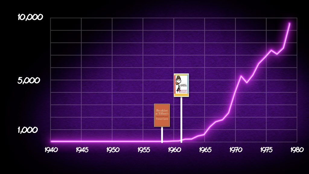
This week he released a video about Tiffany. As in the name Tiffany.
In addition to some great 80s aesthetics, the video touches on a couple of things that particularly interest me.
You see names are an important part of genealogical research. After all, almost all of us have names. (Some infants died without names.) Now in my family, on both my mother’s and father’s side I have a lot of Johns. In fact, I broke a line of five consecutive John Barrys. But occasionally a family will have a rarer or more uncommon name that allows you to trace that individual and therefore his or her family through time and space/place.
Grey tracks the history of the name Tiffany from its possible origin to some reasons for its popularity in the 1980s. And that includes some great graphics like this chart tracking the number of children with the name.
Thinking I need breakfast…
In the screenshot above you can see one thought he has on why the name took off in the latter half of the 20th century after languishing for centuries.
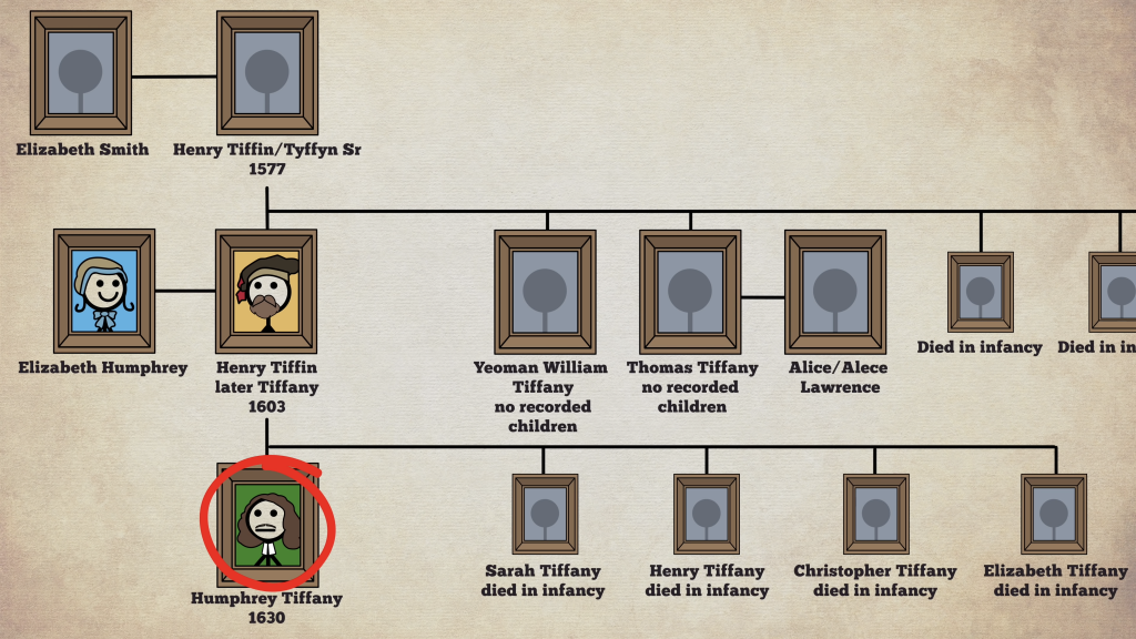
But he also examined the family history of one Tiffany and how that became important in the cultural zeitgeist. And to do so he used a family tree.
Family trees, with so many deaths in infancy
It’s a nine-minute long video and well worth your time.
I think what’s interesting to consider, however, is how this story could be told for many if not most names. There’s a reason they exist and how, by pure happenstance, they survive and get passed down family lines.
Though I have to say I did a quick search in my family tree and I have not a single Tiffany.
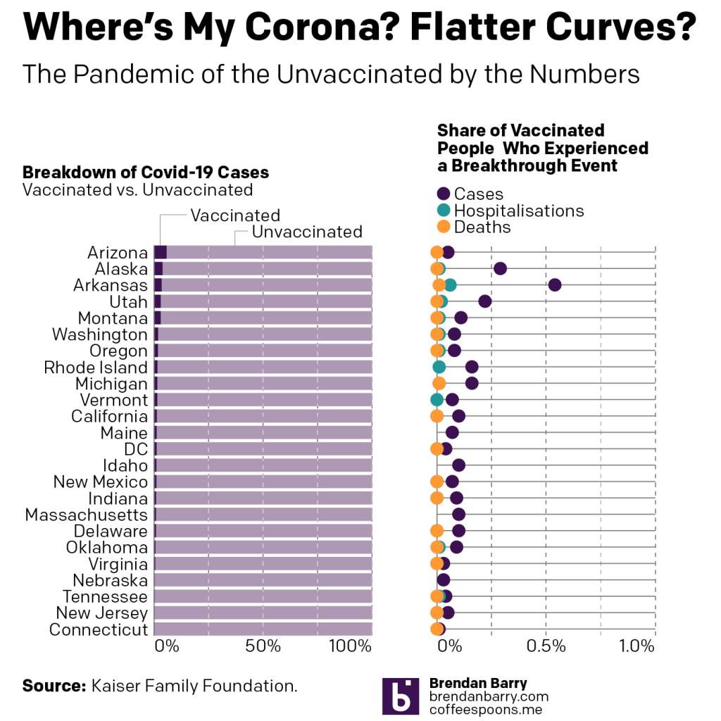
It’s pretty much that simple. But for just under half the country, it’s not getting through. So I went looking for some data on the breakdown of Covid-19 cases by vaccinated and unvaccinated people.
I found an analysis by the Kaiser Family Foundation (KFF), a non-profit that focuses on health and healthcare issues. They collected the data made available by 24 states—not all states provide a breakdown of breakthrough cases—and what we see across the country is pretty clear. If you want more details on their methodology, I highly recommend you check out their analysis.
Breakthrough cases
In all but Arizona and Alaska, vaccinated people account for less than 4% of Covid-19 cases. In most of these states, it’s less than 2%. For the states that we regularly cover here—Pennsylvania, New Jersey, Delaware, Virginia, and Illinois—we have New Jersey, Delaware, and Virginia represented in the data set.
Delaware leads the three with vaccinated people accounting for just 1% of Covid-19 cases. Virginia is 0.7% and New Jersey is just 0.2%. In other words, in New Jersey almost nobody vaccinated is catching Covid-19 over the observation period.
And when we look at the vaccinated population, we can see what breakthrough events—cases, hospitalisations, and deaths—they are experiencing.
In almost all states, less than 0.5% of vaccinated people are getting Covid-19. Only in Arkansas do we see a number greater than that: 0.54%. In no state do we have more than 0.6% of vaccinated people requiring hospitalisation. And with that number so low, it won’t surprise you that in no state do we have more than 0.01% of vaccinated people dying.
In other words, the rapidly climbing numbers of new cases and slowly rising deaths that we looked at yesterday, that’s almost all in people who haven’t yet gotten vaccinated.
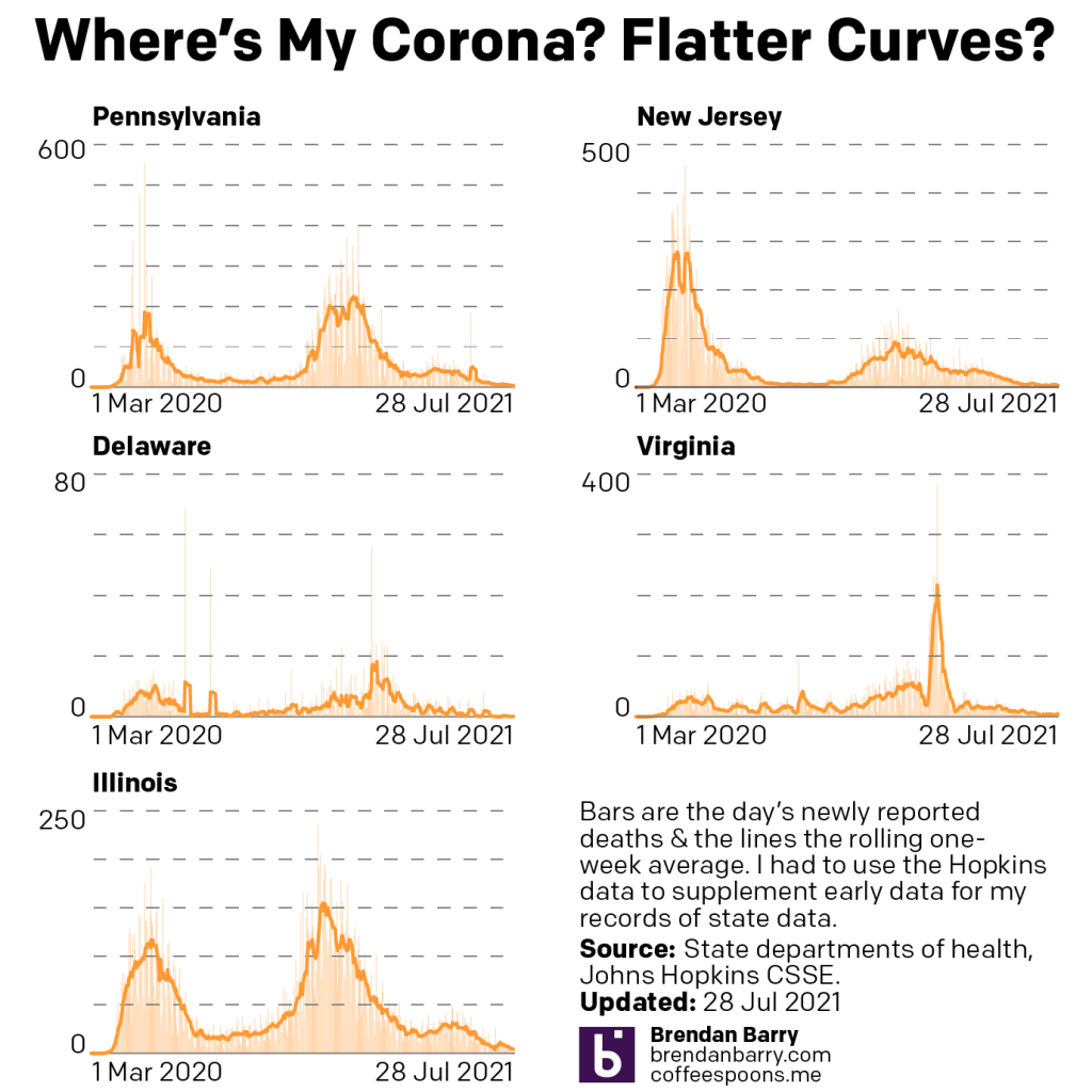
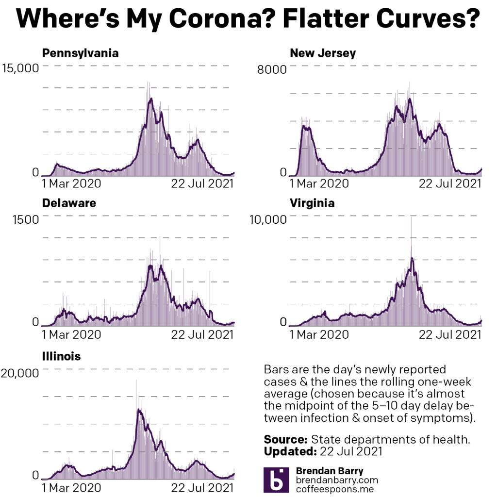
Late last week I provided a brief update on the Covid-19 situation in Pennsylvania, New Jersey, Delaware, Virginia, and Illinois. Today I wanted to circle back to my statement that I’d update everyone again early this week. Of course, we had to wait until states began reporting their Monday data to get a better sense of where we are at in terms of new cases and deaths.
Spoiler: nowhere good.
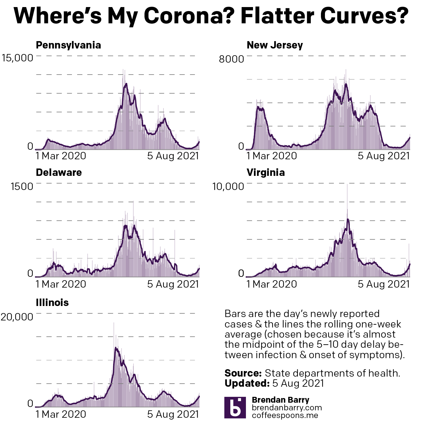
Let’s start, as usual, with new cases.
New case curves for PA, NJ, DE, VA, & IL.
We can see just from the tail end of the charts above that new case growth is accelerating in nearly all five states. Nearly because New Jersey’s growth has remained fairly constant, in other words the number of new people getting infected is not becoming larger each day but remaining relatively flat. That said, compared to 28 July, my last more thorough update, the seven-day average for new cases is still up by 66%.
In the other four states we see accelerating growth, i.e. the number of people infected grows daily. Virginia and Illinois are perhaps in the worst positions. Consider that earlier this spring during the Third Wave, Virginia peaked with a seven-day average of 1615 new cases per day. Yesterday the seven-day average reached 1625. This Fourth Wave is making more people sick now than they were in the spring. Illinois is not yet at the peak of its Third Wave, 3390 new cases per day, but yesterday the Land of Lincoln reached 2713. It’s not far from that ugly benchmark. Can Illinois’ seven-day average see an increase of about 600 new cases per day in a week? Consider that one week ago the average was at 1914. That’s an 800-new case increase. I would expect that if my next update is next Tuesday we will find Illinois in a worse position now than it was in this past spring.
What about the last two states of the tri-state area? Fortunately—for now—both Pennsylvania and Delaware remain below, roughly by half or so, their springtime peaks during the Third Wave. In part, that’s because—along with New Jersey—the Northeast has some of the highest rates of vaccination. But none of those states are near the levels we would need for herd immunity, especially given the increased transmissibility of the Delta variant.
In Pennsylvania the seven-day average for new cases is now just shy of 1500 new cases per day. Interestingly, if we halve the Monday data that includes both Sunday and Monday the daily numbers of new cases have declined for five consecutive days. I wouldn’t expect that trend to continue given the rampancy with which Delta is spreading throughout the Commonwealth, but that would be the signal in the data we would be looking for when this Fourth Wave breaks.
Delaware reports much the same. Cases are significantly up, but now so much so as to outpace the Third Wave. The First State’s seven-day average now sits at 185 new cases per day, but for the past four days the daily number has exceeded 200. Unlike Pennsylvania, that’s not the signal we would want to see to give us a sense the wave might be breaking.
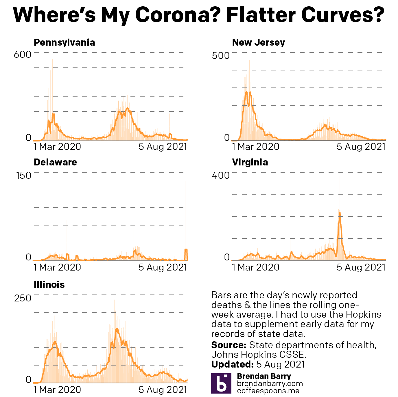
What about deaths? Last week I mentioned we were seeing those numbers begin to creep back up despite falling during the initial weeks of the Delta wave.
Death curves for PA, NJ, DE, VA, & IL.
The tail ends here, with the exception of Illinois, are far harder to see. In Illinois, on 28 July the seven-day average for deaths bottomed out at 4 deaths per day. Deaths have climbed ever since, tripling to 12 deaths per day. Prior to yesterday, the state had seen double-digit daily deaths for five consecutive days for the first time since early June. These are signs that deaths are heading in the wrong direction. But if we want to try and find a glimmer of hope, those deaths started at 18 on 4 August, but have dropped each day landing at 10 on 8 August and just 6 yesterday. Fingers crossed?
In the remaining states the picture is similar in that deaths are rising, but not nearly as badly as they are in Illinois. In Illinois the death rate tripled, but to be fair it also did so in Delaware. Though that meant climbing from 0.1 to 0.3. In the states where we are seeing deaths from Covid-19, the rates have not even doubled. Pennsylvania and New Jersey are the two closest to hitting that grim number. Their seven-day averages of 3.6 and 3.7, respectively, have reached only 6.6 and 6.4, respectively. Certainly not good, but perhaps we can be cautiously optimistic given the states’ relatively high rate of vaccination.
In Virginia we have seen the death rate climb from an average of 4.4 per day, nearly the same rate as Illinois, which has a lower overall rate of vaccination, to only 5.6 deaths per day as of yesterday.
It is important to note that vaccinations are doing a good job at keeping the vaccinated from needing to go to hospital or even dying. The phrase “pandemic of the unvaccinated” is very accurate. Whilst the vaccinated can become infected, most suffer very mild symptoms or are asymptomatic. The reason for masking is that the Delta variant can infect the vaccinated to such a degree that, whilst not sick, they can infect the unvaccinated.
If you have not been vaccinated yet, it is critical that you do so. They are safe. They are effective. And they are free. There are only a few valid reasons for not receiving the vaccination. And “not wanting it” or “not needing it” or “not trusting the government” or “not sure whence the virus came” are not valid excuses.
Earlier this morning (East Coast time) the Intergovernmental Panel on Climate Change (IPCC), the UN’s committee studying climate change, released its latest review of climate change. This is the first major review since 2013 and, spoiler, it’s not good.
I’ve read some news articles about the findings, but I want to critique and comment upon some of the graphics contained within the report itself. This started going too long, however, so I think I will break this into several shorter, more digestible chunks.
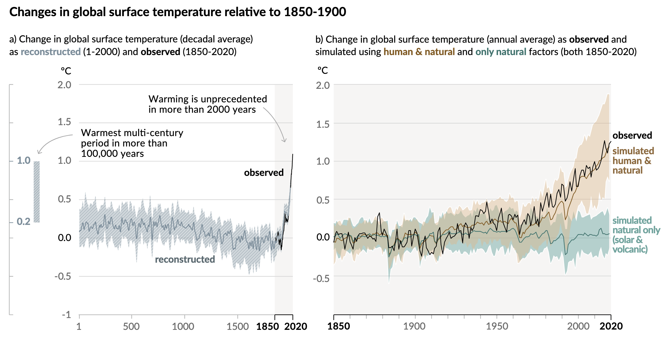
And I want to start with the first chart, two line charts that lay out the temperature changes we’ve seen.
Going up…
One of the first things I like here is the language. Often we might see these or similar charts that simply state temperatures from the year 1 through 2020. One of the common reasons I hear from people that deny climate change is that “people weren’t recording temperatures back in 1 AD.
They would be correct. We do not have planet-wide meteorological observations from the time of Julius Caesar. But in the year 2021 we do have science. And that allows us to take other evidence, e.g. dissolved carbon dioxide in ice, or tree ring size, &c., and use them to reconstruct the temperature record indirectly.
And reconstruct is the word the IPCC uses to clearly delineate the temperature data pre- and post-1850 when their observed data set begins.
The designers then highlight this observed data set, broadly coinciding with the Industrial Revolution when we as a species began to first emit extra greenhouse gasses into the atmosphere. You can see this as a faint grey background and a darker stroke along the x-axis.
Additionally, the designers used annotations to call out the first main point, that warming in the last almost two centuries is far beyond what we’ve seen in the last two millennia.
The second annotation points to a bar, reminiscent of the range of a box plot, that exists outside the x-axis and almost embedded within the y-axis. This bar captures the range of temperatures reconstructed in the past 100,000 years. And by including it in the chart, we can see that we have just recently begun to exceed even that range.
In the second chart, we have the entire background shaded light grey and the whole x-axis in a darker stroke to remind us that we are now looking at the Industrial/Post-Industrial era. But what this chart does is do what scientists do, test whether natural, non-manmade causes can fully explain the temperature increase.
They can’t.
The chart plots the modelled data looking at just natural causes vs. modelled data looking at natural causes plus human impacts. Those lines and their ranges are then compared to the temperatures we’ve observed and recorded.
Since the 1930s and 40s, it’s been a pretty clear and consistent tracking with natural plus manmade causes. For years the scientific community has been in agreement that humanity is contributing to the rising temperatures. This is yet more evidence to make the point even more conclusively.
These are two really good charts that taken together show pretty conclusively that humanity is directly responsible for a significant portion of Earth’s recent climate change.
I’ll have more on some other notable graphics in the report later in the week, so stay tuned.
Credit for the piece goes to the IPCC graphics team.
Note: This was supposed to post Friday morning. But it didn’t for technical reasons. Throwing it up late because I’ll probably wait until Tuesday and the release of Monday data to do another update. And I want people to have the latest charts for the weekend.
Unfortunately, I don’t have a lot of time to write up my usual analysis of the charts. Maybe I’ll do that for Monday, we’ll see. But I do want to post the latest Covid-19 data on cases and deaths before we head into the weekend.
The overall picture is that things are continuing to get worse. You can see that in all states the fourth wave, driven largely by the Delta variant, is here.
New case curves for PA, NJ, DE, VA, & IL.
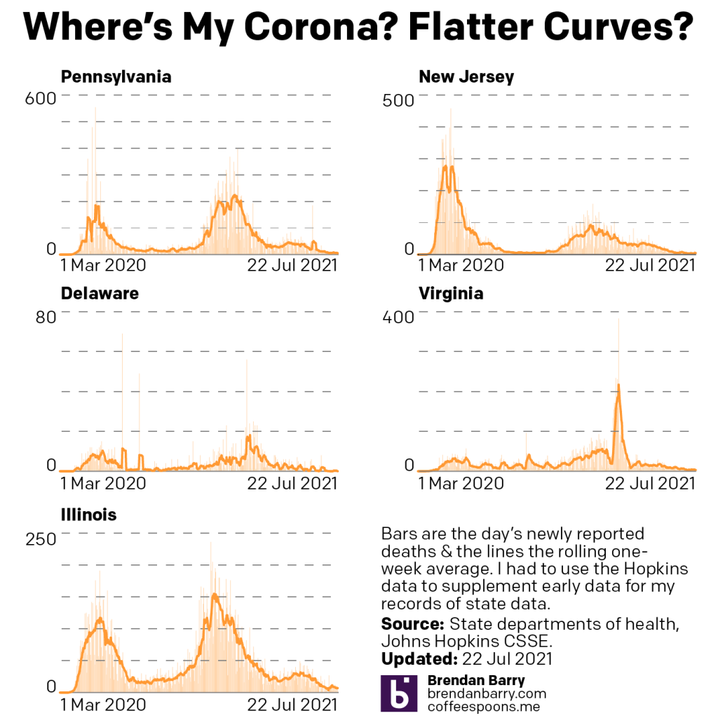
When we look at deaths, last week I had mentioned how deaths were still trending down. But as a lagging indicator it was just a matter of time before the new cases led to new hospitalisations led to new deaths. And that moment appears to have just arrived.
Death curves for PA, NJ, DE, VA, & IL.
I should point out that Delaware appears to have folded in their probable deaths in with their confirmed deaths, as many states had done months ago. So that spike of 135 new deaths isn’t “real” as in those deaths happened a long time ago. The pre-probable death number was the same as afterwards.
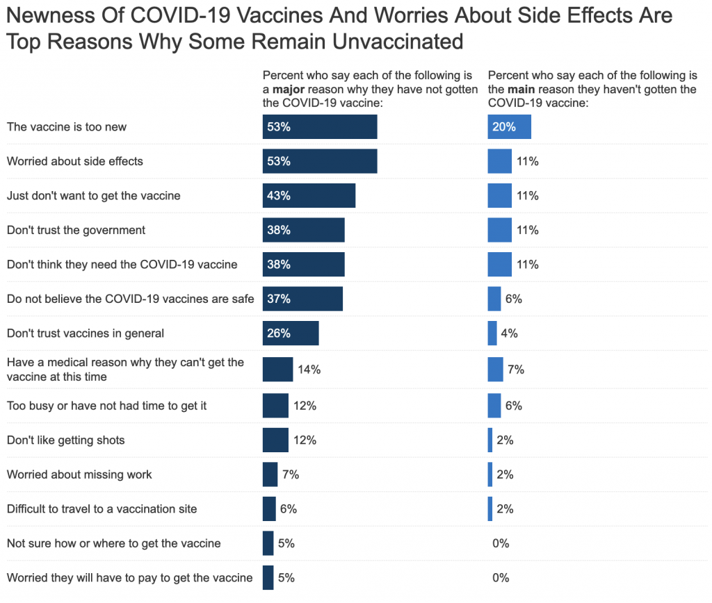
I spent a good chunk of last week talking with people about reasons why people are not taking the vaccines for Covid-19 despite the fact they’ve been proven safe, been proven effective, and are free. I have heard a number of excuses in person—perhaps the subject for another post. But those are all anecdotal stories, though evidence that such reasons exist. Well this weekend I found some quantitative data.
The source is the Kaiser Family Foundation (KFF), a group that focuses on health, health information and its communication. For Covid-19 they’ve been running quite a bit of information communication as one can imagine. One part of that? Public polling.
The latest survey covers the middle of June, but does include a question on why the unvaccinated remain unvaccinated.
Let’s start from the top, shall we?
I’ve got some quibbles with the design of the chart, primarily axis labels vs. a data label for every single bar, but I want to focus on the content today.
The vaccines is too new? I will grant you that it was developed very quickly. But there are two big reasons for that. First, to give the Trump administration credit where credit is due, whilst they didn’t really plan for a federal rollout of the vaccine they did eliminate much of the red tape and bureaucratic hassles that can slow down vaccine research. They did not, however, reduce the scientific rigour with which the vaccines were tested. Keep in mind that often times we heard stories of how the administration wanted to approve the drug well before it was ready. That is a sign that the testing wasn’t rushed.
Second, the mRNA method is new, but had been in advanced stages of research for a number of diseases including both influenza and zika. Scientists simply began to “reprogramme” the RNA bit to battle the SARS-CoV-2 virus that causes Covid-19. In other words, we had been researching the type of vaccines for decades, but we just found a new target for its first widespread application.
Worried about side effects? Fair question. Last numbers I specifically saw were something like fewer than 300 severe allergic reactions out of over 3,000,000 million doses of Pfizer. In other words, that was a 0.01% chance. If you get Covid-19, the mortality rate is somewhere between 1% and 5%. In other words, you’re far more likely to get sick or even get sick and die from Covid-19 than from the Covid-19 vaccine.
Just don’t want to get the vaccine? Well now you’re being selfish. Vaccines aren’t just about you. They are a public health and safety measure. If you get sick, you put others at risk. In 1905, we heard similar arguments for people not wanting to get the new smallpox vaccine. (A disease we’ve almost entirely eradicated thanks to vaccinations, go look up how devastating it was to populations pre-vaccine. I’ll wait.) But these people who didn’t want the smallpox vaccine took their argument of “it’s a personal choice” all the way to the Supreme Court.
They lost.
The Supreme Court decided that personal liberty does have limits and can be overruled by what we call the police power of the state, specifically when personal liberty risks public health and safety. Here’s a simlar example. I have the freedom to speak without being censored by the government. However, I cannot go into a crowded theatre and scream fire. Because at that point I am endangering the stampeding masses. The government has the right to limit my speech in that specific area.
There are lots of things we don’t want to do, but have to do. Getting vaccinated is one of those things.
Don’t trust the government? Well the vaccine wasn’t developed by the government. The three big ones in the United States are Pfizer, Moderna, and Johnson & Johnson. For my UK audience, you’re also looking at Oxford-AstraZeneca. I believe it was Pfizer even rejected accepting development money from the US government specifically to ensure that its research remained above reproach. In other words, the government hired the scientists who conducted the tests that proved the vaccines were safe for use.
But, and this is the kicker, the vaccines first began to roll out to the public in December 2020. We now have seven months’ worth of evidence and data in real world scenarios. The vaccines consistently have been proven safe and effective.
Don’t think you need the vaccine? Well like I said above, the vaccine isn’t about just you, it’s about society at large. We have personal liberty, but social responsibility. And your choice to not get vaccinated threatens and endangers the lives of others. Because there are, and we’ll get to this, some people who cannot receive the vaccine even if they want to. And you not getting it, threatens them.
Don’t believe the Covid-19 vaccines are safe? We spent nearly six months studying them in clinical trials and they were proven safe. We now have an additional seven months of real world, in the shit testing. And they have been proven safe time after time after time.
Don’t trust vaccines in general? If you’re grandparents or great-grandparents are still alive, ask them about how deadly smallpox was. Or maybe ask your parents about how terrible the mumps were. Or measles. Go ahead, I’ll wait. Turns out they were pretty terrible. There was a reason that older generations generally rushed to get vaccines, because they protect us from the scourge of viruses and bacteria. I haven’t seen a person with smallpox in my entire life because vaccines all but eradicated the virus. (It exists only within the bio-weapon laboratories of the United States and the Russian Federation.)
Have a medical reason why they can’t receive the virus at this time? Great, I mean, not great, but this is a real reason why people cannot and should not receive the vaccine for Covid-19. And this is why we want everyone who doesn’t have a precluding reason to get the vaccine, so that we can help protect you. But hopefully you’ll be able to get vaccinated at some point in the future.
Too busy or have not had the time to get it? Well, it’s been several months and it’s increasingly hard to believe you don’t have a half-hour or an hour to spare. It took me a 15-minute walk and then walked through an empty, snaking line for about five minutes, then had the little prick in a minute, then waited 15 minutes. Then walked home. Did that twice in a matter of weeks.
But let’s say you’re working crazy hours. Well, that’s one reason the White House is asking employers to give employees paid time off to receive the vaccine.
Don’t like getting shots? Neither do I. I told that to the corpsman who administered my first shot and I simply looked away. I’d rather get two little pricks than risk needing to go to hospital or die or infecting someone else.
Worried about missing work? As I said above, it doesn’t take long. The actual processing is just a few minutes. You have to wait longer in observation to make sure you don’t have an allergic reaction. But also like I said, that’s why the White House is pushing employers to give their employees paid time off to receive the vaccine.
Difficult to travel to a vaccination site? This would have been especially hard in the early months when the goal was to equip mass vaccination sites in city centres that could serve the most people the most effectively and the most efficiently. Since then, most pharmacies and many doctors offices are offering the vaccine. There are a number of mobile vaccination sites around.
Worried you will have to pay to get the vaccine? You don’t have to! The government is footing the bill for all of us. All you need to is show up with the required ID to prove you are who you say you are, wait your turn in line, get your shot, and wait for your observation period. Then, if you receive either Pfizer or Moderna, because you need two shots, you go back and present them with your vaccination card, and do it all over again.
But nowhere in that do you have to pay.
That was it for the reasons in the survey. But like I said, maybe I’ll address some of the other things in a post later this week.
Credit for the piece goes to the KFF graphics team.
Another week, more bad news when it comes to Covid-19 in the states of Pennsylvania, New Jersey, Delaware, Virginia, and Illinois. Last week I wrote about how the slight upticks in new cases in the states were not so slight. This week it’s more of the same, though it would be fair to say that the spread of Covid is beginning to accelerate, although in some states more quickly than others.
To start, the most basic of refreshers. Pennsylvania, New Jersey, and Delaware are all in the Northeast. Virginia is in the South. Illinois is in the Midwest. At a broad level, Covid is beginning to strike places with low vaccination rates and in particular has been hitting the South and Midwest fairly severely. You might say that Virginia has the northern suburbs of Washington and Illinois has Chicago, but in both states simply head south and west and you’ll very quickly find yourself in an entirely different culture, almost a different state in both. And it is in those parts of the states where the increase is most noticeable.
Conversely, the Northeast has had some of the highest rates of vaccination and the new Delta variant is taking longer to take root. Because, that’s the entire point of the vaccination process. We want to starve the virus of potential host bodies. But we needed to reach much higher than the 50-odd percent of the states to be fully vaccinated. So where are we? Let’s take a look.
New cases curves for PA, NJ, DE, VA, & IL.
The recent tails are curving up now and it’s plain to see. Two weeks ago the tails were barely noticeable in most states. You had to really look at the numbers to see the differences. Even last week in Pennsylvania and Delaware the tails were still fairly flat. This week is unmistakable. You may be over the pandemic and done with Covid, but the pandemic isn’t over and it’s not done with us.
In both Virginia and Illinois the seven-day averages for new cases rose by nearly 50% in the last week. Yesterday Illinois reported more than 2,000 new cases, the first single-day report that high since the beginning of May. And in Virginia we had more than 1,000 cases yesterday, again the most in a single day since the end of April.
In the tri-state area we also saw increases over the last week, albeit not as great as in Virginia and Illinois. Though they weren’t off the pace by much. In fact, at this rate, I would not be surprised if next week I write how both Pennsylvania and New Jersey see more than 1,000 cases in a single day. Neither state is there yet, as New Jersey reported 830 yesterday and Pennsylvania only 645—though it reported 986 on Tuesday. Both states’ seven-day averages are also a bit behind Virginia and Illinois, but again, I would not be surprised to see them nearing 1,000 though maybe not surpassing it this time next week.
I cannot overstate this next part, however. The virus is primarily infecting, sickening, and killing the unvaccinated amongst us. If you have not received your vaccine shots yet, please, please do. The vaccines have been proven safe. They have been proven effective. And they are free.
The good news, if we want to find some, is that the death rates largely continued to fall overall.
Death curves for PA, NJ, DE, VA, & IL.
Largely. Keep in mind as I noted above, the deaths are almost all occurring in those who have not been vaccinated. Now in Virginia we are seeing the death rate increase, though not yet dramatically. Last week the seven-day average was three per day. This week we are at four.
But compare that to three of the other four states. (Delaware continued to have almost deaths and its average is zero.) Last week both Pennsylvania and New Jersey had averages of 5 deaths per day and this week they area at 4. And in Illinois the average fell from 7 to 4.
What I will be watching over the next week or two is whether these death rates begin to increase beyond Virginia. I mentioned before how deaths are a lagging indicator and we are beginning to reach the point at which, during earlier waves, where we could begin to see increasing numbers of deaths.
But again, the key is for any and all my readers who are unvaccinated, please make an appointment to get your shots as soon as possible.
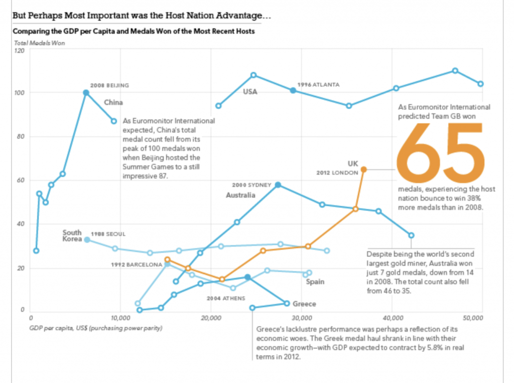
Every four years (or so) I have to confess that I think fondly back upon my former job, because I worked with a few wonderful colleagues of mine on some data about the Olympics. And the highlight was that we had a model to try and predict the number of medals won by the host country as we were curious about the idea of a host nation bump. In other words, do host countries witness an increase in their medal count relative to their performance in other Olympiads?
We concluded that host nations do see a slight bump in their total medal count and we then forecast that we expected Team GB (the team for Great Britain and Northern Ireland) to win a total of 65 medals. We reached 64 by the final day and it wasn’t until the women’s pentathlon when, in maybe the last event, Team GB won a silver medal bringing its total to 65, exactly in line with our forecast.
Probably the most Olympics I’ve ever watched.
Of course we also looked at the data for a number of other things, including if GDP per capita correlated to Olympic performance. We also looked at BMI and that did yield some interesting tidbits. But at the end of the day it was the medal forecast that thrilled me in the summer of 2012.
So yeah, today’s a shameless plug for some old work of mine. But I’m still proud of it two olympiads later.
If you’d like to see some of the pieces, I have them in my portfolio.
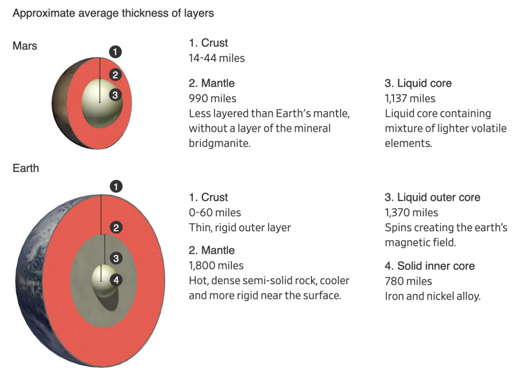
Yesterday I mentioned more about revolutions, well today we’re talking about Mars, a planet that revolves around the Sun. Late last week scientists working with the InSight lander on the Red Planet published their findings. Turns out we need to rethink what we know about Mars.
First, the planet is probably much older than Earth. Mars’ composition also differs from Earth in some significant ways. InSight mapped the interior of Mars by studying the seismic waves (think like sound waves but through the inside of planets) of marsquakes.
The Wall Street Journal published a great article spelling out the findings in detail that is well worth the read. It also included some nice graphics helping to support the piece. The one I wanted to highlight, however, was a brilliant comparison of Mars to Earth.
But how many licks to get to the centre?
Conceptually this is important, because many diagrams and graphics I’ve seen about these findings only detail the interior of Mars. But what makes Mars important is how it differs from Earth, and let’s be honest, how many of us remember our Earth science classes at school and can diagram out the interior of Earth?
And right here the designer compares the smaller—and now older—brother of Earth. Again, read the article for the details, but in short, some of the key findings are that the core is larger, but also lighter, than we thought. Our planet’s core differs because Earth has two parts: a solid and heavy ball of iron and nickel surrounded by a liquid core that spins. That spinning core creates the magnetic fields that protect our planet from the Sun and have kept our atmosphere intact. Mars doesn’t have that. And that’s in part because, given the core is larger than we thought, the mantle is smaller.
A smaller mantle means that certain materials couldn’t form that insulate the Earth’s core. So while Earth’s core has been prevented from cooling and slowing down, Mars was not. And so while it did have a magnetic field at one point, that slowing, cooling core slowly dissipated the magnetic field. That may be why the planet, once rich in water, now is a barren rock exposed to the Sun.
Again, this is a big deal in terms of planetary science. Consider that Earth and Mars are broadly made of the same materials that orbited the Sun billions of years ago. But Mars took those same ingredients and made itself into a very different planet. And now we know quite a good deal more about the Red Planet.
One last point to make about the graphic above. Again, many illustrations will increase the size of the crust to make it more visible. Here the designer chose to keep it more in proportion to the scale of the planets’ interiors. (Even though Mars’ crust is quite a bit thicker than Earth’s.) I think that’s important because it puts us into perspective. We can build monuments like the Pyramids that last thousands of years and dig bore holes miles deep and tunnel out connections through mountain ranges, but that also just scratches the surface of the crust. But that crust is the thinnest of shells over the mantle and cores of these planets.
That life began and took hold on Earth, on that thinnest of shells protected by a magnetic field because of a spinning molten core buried at the centre of the planet…something to think about sometimes.
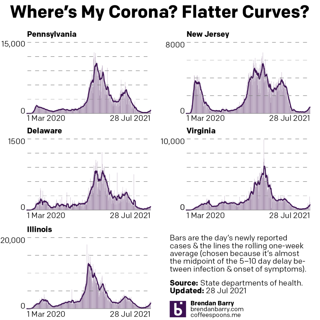
I know that I typically post more light-hearted content on Fridays. But after taking a holiday Monday and my internet being down all day yesterday—fun fact, trying to type up a blog post on my mobile is…well suffice it to say I am glad that it is only an emergency backup plan—we are going to enter the weekend with some updates on the spread of Covid-19 in Pennsylvania, New Jersey, Delaware, Virginia, and Illinois.
A little over a week ago I wrote about the emergence of slight upticks in our region of coverage. Nine days hence, those slight upticks are no longer so slight.
New case curves for PA, NJ, DE, VA, & IL.
In all five states we are seeing significant increases in the numbers of new cases. In New Jersey we hit the milestone of 900,000 total cases. Three weeks ago, the Garden State had bottomed out with an average of about 160 new cases per day. Yesterday the moving seven-day average surpassed 500 for the first time since mid-May.
But New Jersey is not alone. In Illinois the seven-day average has doubled since my last post. The state reported just under 2000 new cases yesterday and that brought the seven-day average above 1000 for the first time since late-May. Before the spring surge earlier this year, Illinois had bottomed out with a seven-day average of about 1500 new cases per day. If these numbers continue, I would not be surprised to see the state back at those levels within another week or two.
Nor has Virginia been spared and yesterday Old Dominion’s seven-day average rose to just short of 500 new cases per day. That too is a level we haven’t seen since…wait for it…mid-May. The pattern emerging here is fairly clear. Things are beginning to get worse and get worse in a hurry. The average has nearly doubled since my last post about Covid.
We see the same situation in Delaware though it’s increase is on the smaller side. The seven-day average in the First State hit 50 new cases per day earlier this week, though it’s ebbed back slightly and sat at 48 yesterday. You have to go back to early June to find levels that high.
And finally it’s not as if Covid has spared Pennsylvania. Three weeks ago we were nearing 100 new cases per day. At the time of my last post, the seven-day average was just a little over 200 new cases per day. The average is double that number as of yesterday at 438 new cases per day. The Commonwealth has now reported three consecutive days of over 500 new daily cases for the first time since…early June. Surprised at that timing?
The common thread in these states is that the virus, almost certainly the Delta variant, is racing through the unvaccinated populations. And we are beginning to see rises in the numbers of hospitalisations, something that I don’t chart but on which I keep tabs. But what I do track visually are the deaths from Covid.
Death curves for PA, NJ, DE, VA, & IL.
We need to keep in mind again that deaths are a lagging indicator and that it takes a few weeks from someone’s infection to their death, if that person’s case is severe enough.
The good news is that we are not yet seeing a corresponding increase in the numbers of deaths. Though it might still be too early for that, should it occur. Of course lack of death does not preclude one from suffering from long Covid, a debilitating and persistent illness that lasts for months. As for deaths, instead we see the numbers entering something of a holding pattern.
Starting with Pennsylvania, deaths from Covid-19 have halved since this time last month. But we were largely at that point when I last wrote nine days ago. Deaths haven’t fallen significantly since, dropping from 7.3 per day to 5.3 per day.
And that’s a pattern we see elsewhere. In Illinois deaths are also down nearly half from an average of 12 per day last month to just 7 per day. But they were at 9 when I last wrote. In New Jersey deaths were averaging 6 per day last month and now they sit at an average of 4.7. What was the average nine days ago? 4.7. Virginia is also similar, going from an average of 6 deaths per day to 4 and now just 3.
Delaware is the one state where we have some genuinely good news. Deaths had been averaging about 2 per day last month and we are at 0 today. Since the beginning of July we’ve seen only three additional deaths. That’s great news, but Delaware is also one of the smallest states.
The takeaway from this should be please get vaccinated if you’re still not. They are safe. They are effective. And they are free. Especially as this new Delta variant begins ripping through unvaccinated populations, I really hope my unvaccinated readers will take an opportunity this weekend to get their shots. Because remember, except for the Johnson & Johnson vaccine, you need two shots and you need to wait between those two doses. And then the vaccine takes about two weeks to kick in after that second dose.