For the last two days Philadelphia and much of the East Coast suffered from a heavy haze of smoke that blanketed the region. This wasn’t just any smoke, however, but smoke from the wildfires on the West Coast. This post isn’t about the wildfires, but rather something that exacerbated them. We are talking about the heat domes that formed earlier this summer. The ones that melted trolley cables in Portland.
This was a nice print graphic in the Guardian Weekly, a magazine to such I subscribe that had several articles about the domes.
Missing that cold, cold Canadian air
It does a nice job of showing the main components of the story and sufficiently simplifying them to make them digestible. One quibble, however, is how in the second map how oddly specific the heat dome is depicted.
The first graphic in particular is more of an abstraction and simplified illustration. But here we have contours and shapes that seem to speak with precision about the location of this heat dome. It also contains shades of red that presumably indicate the severity of the heat.
There’s nothing wrong with that, but it stuck me as odd juxtaposed against the top illustration.
Credit for the piece goes to the Guardian Weekly graphics department.
Yesterday I mentioned how I spent Monday researching some old family properties in Philadelphia. In some cases the homes my family owned still stand. But, in many others the homes have long since been replaced. But that’s the nature of city development.
That got me thinking about an article published earlier this month at Philadelphia YIMBY where the author created an animated .gif detailing the Philadelphia skyline from 1905 through 2020. This screenshot captures the overlay of 2020 atop 1905 from the south of Philadelphia.
Kind of how it’d look from the sports complex.
But the gem of the piece is the animation. Implicit in the graphic but unmentioned is the text, which is understandably centred on the architectural designs of the skyline, is the history of Philadelphia.
In the old days, well before 1905, the city was concentrated along the Delaware River because it was—and still is—a port city. But as those shipping businesses were replaced by banks and financial companies which were replaced by other offices and manufacturing headquarters that were themselves replaced by corporate highrises and so on and so forth, we can see the centre of gravity shift westward.
The mass of buildings by 1905 has shifted away from the Delaware River and is concentrated to the east of City Hall, the tallest building until the 1980s. But you can see the highest and largest buildings moving more to the left in every frame. Though in the latest you can see some new largely residential highrises built along the Delaware waterfront.
I took a holiday yesterday and headed down the street to the Philadelphia City Archives, which houses some of the oldest documents dating back to the founding of the colony. But I was there primarily to try and find deeds and property information for my ancestors as part of my genealogy work.
When I walked into the building—the archives moved a few years ago from an older building in University City into this new facility—an interactive exhibit confronted me immediately. Now I did not take the time to really investigate the exhibit, because I anticipated spending the entire day there and wanted to maximise my time.
But there was this one graphic that felt appropriate to share here on Coffeespoons.
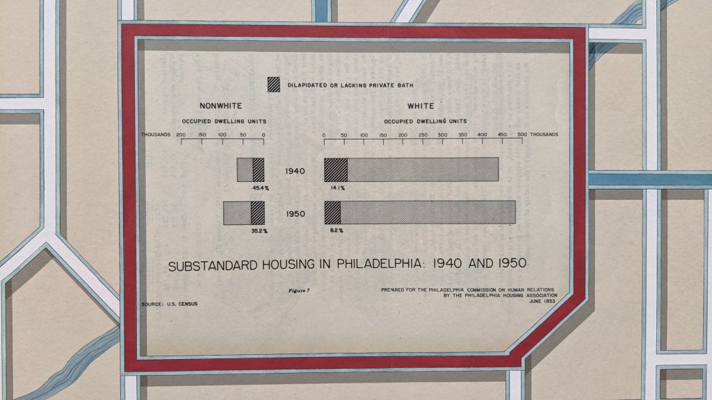
Philadelphia’s population crested in the 1950 census, it would decline continually until the 2010 census.
Like a lot of statistical graphics from the mid-20th century we have a single-colour piece because colour printing costs money. It makes use of a stacked bar chart to highlight the share of housing in the city that can be classified as substandard, i.e. dilapidated or without access to a private bath.
The designer chose to separate the nonwhite from the white population on different sides of the date labels, though the scale remains the same. I wonder what would have happened if the nonwhite bars sat immediately below the white bars within each year. That would allow for a more direct comparison of the absolute numbers of housing units.
That would then free up space for a smaller chart dedicated to a comparison of the percentages that are otherwise written as small labels. Because both the absolutes and percentages are important parts of the story here.
The white housing stock increased and the number of substandard units decreased in an absolute sense, leading to a strong decline in percentages.
But with nonwhite housing, the number of substandard units slightly increased, but with larger growth in the sheer number of nonwhite housing units overall, that shrank the overall percentage.
Put it all together and you have significant improvements in white housing, though in an absolute sense there still remain more substandard units for whites than nonwhites. Conversely, we don’t see the same improvements in housing for nonwhites. Rather the improvement from 45% to 35% is due more from the increase in housing units overall. You could therefore argue that nonwhite housing did not improve nearly as much as white housing between 1940 and 1950. Though we need to underline that and say there was indeed improvement.
Anyway, I then went inside and spent several hours looking through deed abstracts. Not sure if those will make it into a post here, but I did have an idea for one over a pint at lunch afterwards.
Credit for the datagraphic goes to some graphics person for some government department.
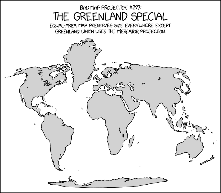
Happy Friday, all. Whether we’re talking melting ice sheets or attempted purchases by the Trump administration, the island of Greenland has often been in the news the last few years.
So here’s an appropriate map from xkcd comparing the size of Greenland to the rest of the world.
Some prime beachfront property in the north Atlantic looks pretty good to me…
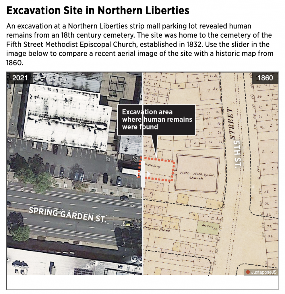
Okay, technically not Spring Garden Street, but a strip mall along one of Philadelphia’s main arterial city streets. Luckily these aren’t some victims of a serial murderer, but rather the result of Philadelphia being an old city (for the United States). As this article from the Philadelphia Inquirer explains, the bodies were discovered during excavations for new construction at the site.
The reason I shared this today was that this past weekend, I had a pint with a colleague of mine at Yards Brewery located at 5th and Spring Garden. We sat at an outside table along Spring Garden and at some point I recall pointing out that Spring Garden hadn’t always been a street. Originally it only existed west of Broad.
Little did I know that the construction site across the street on that sultry Sunday afternoon was home to an archaeological excavation of an old, long since demolished city church cemetery.
Of course I still want a tram/trolley or light rail line to run down the length of Spring Garden like it did in years past.
You can use the slider in the article to compare the layout of the intersection in 2021 to that of 1860. I love these old timey maps, especially when working on genealogy. Because while we know the cities where we live today, they didn’t look like we know them 150 years ago. And in lieu of photography, it’s otherwise difficult to try and make sense of our ancestors’ world.
Just a few doors south of the Methodist church we had a bakery and a small alley called Brussels Place. And facing the alley we had what look like a number of small homes or perhaps stables. Larger presumably rowhomes lined the main streets of the intersection.
At the right of the screen, I also remember my colleague and I discussing some of the old-looking rowhomes. They may very well be the same ones depicted on this 1860 map. They are the few survivors as most of the area, as the article points out, was eventually turned into a petrol station that later became the strip mall today fenced off to be turned into flats.
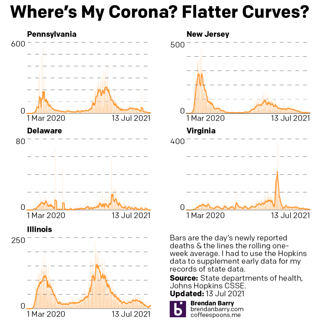
So Mondays no longer work for these regular updates, because as we know Illinois no longer reports weekend data. Starting next week, neither will Virginia. Furthermore, keeping track of the vaccinations is tough, because the same. But also, then we have Pennsylvania, which includes Philadelphia, but Philadelphia only updates vaccination data twice per week.
Consequently, I’m not sure what I’m going to continue doing. But at the least, these updates of cases and deaths could continue, because after one cycle the zero numbers for Saturday and Sunday will average out.
The question is where are we today?
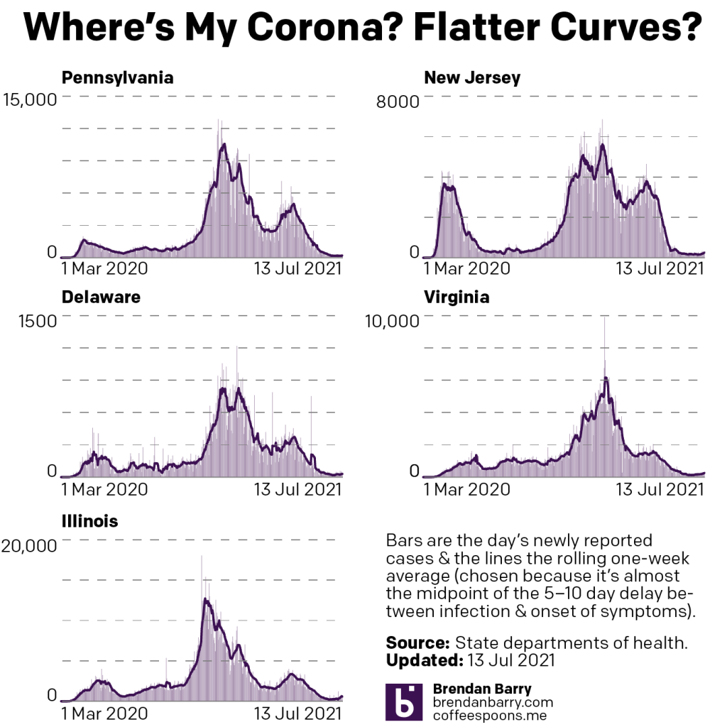
Well when it comes to new cases, we are seeing slight upticks across the board.
New case curves for PA, NJ, DE, VA, & IL.
But whereas the upticks were slight last week in Pennsylvania and Delaware, they were a little bit greater this week. Still, we are far from drastic upswings, but they are noticeable. Look at the very tail end of Delaware and you will see a slight change in the curve’s slope. Pennsylvania’s is, for now, less noticeable.
In New Jersey, where cases had still been declining last week, the numbers are now heading back up. You can see this as well in the chart with a sudden little jump in the last day or so.
Meanwhile in Virginia and Illinois, the upward swings have clearly begun and they are plainly visible. But the numbers are increasing, because in Virginia today’s seven-day average is now the highest it’s been since the end of May. In Illinois, yesterday’s average was higher than today’s, but both are about the same as the average was in the beginning of June.
State departments of health indicate these increases are mostly all in unvaccinated people. And that’s not terribly surprising given that the new Delta variant beginning to take root in the United States is far more effective at viral spread than its predecessors. The worry is that the variant may be more lethal.
And to that point we are also seeing the seven-day average for deaths rebound in most states.
Death curves for PA, NJ, DE, VA, & IL.
First, the exception. Delaware has now gone over a week without any Covid-19 death and its average now sits at 0.0.
In all other states, the trend is pretty clear if not visible in the charts. Illinois is the most obvious where the recent rise in deaths from Covid-19 can be seen in the sharp jump of the orange line at the tail end of the chart. The state is now flirting with double-digit death rates after hitting 11 and 13 deaths per day Sunday and Monday.
Elsewhere, we have numbers creeping up, but still below the levels we saw two weeks ago. On 28 June, Pennsylvania averaged 12 deaths per day. That had fallen to 5 for last week’s write-up, but today it sits at 7. New Jersey went from 8 to 4 but is back up to 5. And Virginia went from 6 to 3 and is now at 4.
Again, these are not catastrophic increases, to be clear. However, after several weeks of declining numbers of deaths the death rates are climbing once more. As with new cases, state departments of health point to the deaths being in the unvaccinated populations.
If you haven’t been vaccinated yet, I encourage you to do so. They have been proven both safe and effective. And if cost is your concern, they’re free. This new Delta variant can make you sick even if you’re only partially vaccinated—only one of the two required shots for Pfizer and Moderna. Factor in the month+ you need from your first of the Pfizer and Moderna doses through the second and the two-week waiting period, it’s critical you schedule your shots as soon as possible.
I’ll try to look at writing up the numbers again next Tuesday or Wednesday, and over the course of the week I’ll be following these numbers. Though I’m not entirely certain I’ll continue posting them daily to my social media feeds. (In fairness, I’ve been busy enough to preclude me from doing that the last two weeks.)
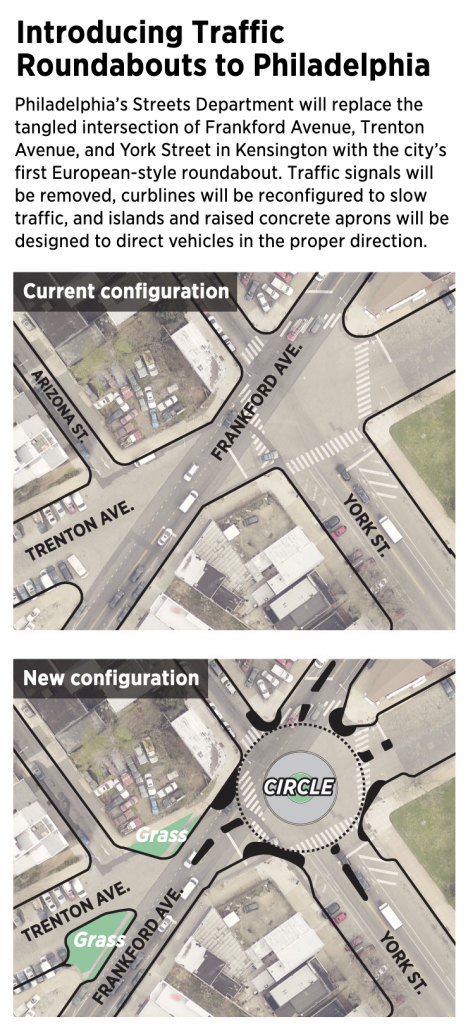
This is a piece I’ve been sitting on for a little while now, okay half a year now. There isn’t too much to it as it’s an illustration overlay on a satellite photo. But the graphic supports an article about the construction of a new roundabout in Philadelphia, coincidentally where I used to live.
That intersection is…tricky to navigate at best as a pedestrian because there are six and a half streets converging at the junction—I give a half to Arizona St because, well, you’ll see shortly. When I lived in the neighbourhood I saw several near accidents between vehicles and pedestrians and vehicles and cyclists. Anything to help improve the safety will be welcome. And that improvement is what the Philadelphia Inquirercovered back in January.
More roundabouts please.
This definitely fits in the category of well done, small graphics. Not everything needs to be large and interactive. This does a great job by using transparency over the satellite image and layering illustration atop the photo.
Now if we could only restore the old rails on Trenton Ave to be some kind of tram/trolley or light rain corridor. Regardless, there are some good restaurants and drinks options in the neighbourhood, so maybe I’ll have to go investigate in person now that going out is an option again. You know, to a do a proper follow-up.
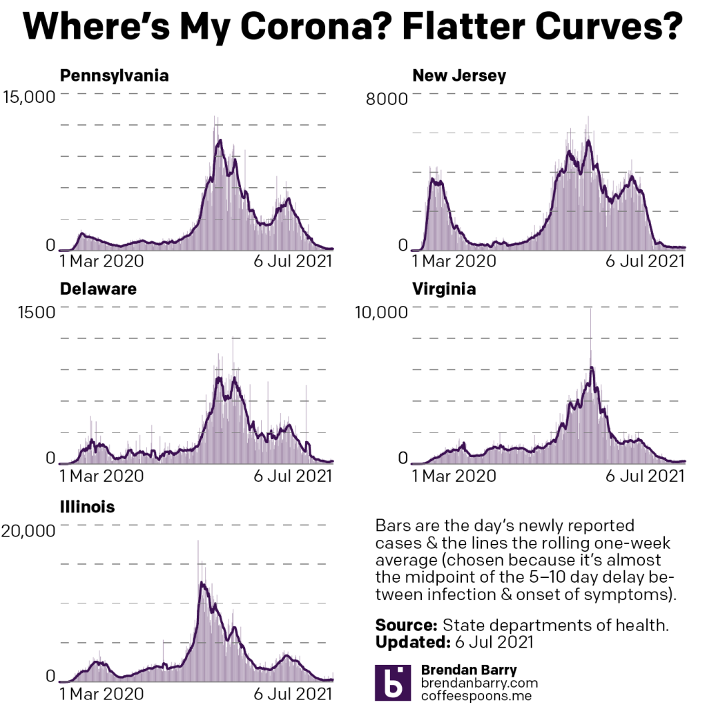
In trying to limit my Covid-19 updates to Monday, bank holidays definitely affect the schedule. For my international audience, that meant Monday was a day of no posting. It also meant that some states—Illinois—were not reporting data. Add to that Illinois had already stopped reporting data on Saturday and Sunday, I wanted to wait until we had Tuesday’s data before putting it all together. And so here we are.
Last week I discussed “divergent patterns at the margins”. We saw some states continue their progress in decreasing the numbers of new cases with falls in their seven-day averages. You could group the tri-state area in this category. Then in the other group we had Virginia and Illinois where the seven-day average had begun to rise.
New case curves for PA, NJ, DE, VA, & IL.
In the week since, this pattern largely held the same. Both Virginia and Illinois continued to see rising numbers of new cases. Compared to 20 June, before this pattern emerged, Virginia’s seven-day average sat at 129 new cases per day and Illinois was just slightly worse at 156. Yesterday those numbers were 180 and 328, respectively. A far cry from an emergency, yes, but also not ideal.
What about the tri-state area? Well we can now lump Pennsylvania and Delaware in with Virginia and Illinois since both states saw a rise in their seven-day averages. Back on 28 June Pennsylvania sat on an average of 177 new cases per day and Delaware was at 19. Yesterday those numbers were 181 and 27, respectively.
The difference here is that in both Pennsylvania and Delaware this recent rise is still below the numbers from 20 June. On that date Pennsylvania’s seven-day average was 261 new cases per day and Delaware’s was 28. So it’s not great, but it’s still not bad either.
How about New Jersey? The Garden State continues to see declining numbers of new cases. From the 20th to the 28th to yesterday the average has fallen from 179 to 176 to 162. Certainly not dramatic, but it’s progress nonetheless.
With deaths we saw broad and general progress, however, so that’s good.
Death curves for PA, NJ, DE, VA, & IL.
Last week I mentioned how I had hoped we would see Pennsylvania’s seven-day average of deaths slip into the single digits. Instead it had climbed higher. Well, Pennsylvania finally fell into the single digits and rests at 5 deaths per day.
When we look at the remaining states we see good news across the board. In Illinois the seven-day average fell from 9 to 7 deaths per day. In two states the numbers fell by half. New Jersey fell from 8 to 4 and Virginia went from 6 to 3. Finally, Delaware now averages just 0.1 deaths per day.
I don’t have the data on vaccination, because there are some holes and I want to see if I can fill that data out. But in the three states we track, we are talking about less than a percentage point increase in fully vaccinated people over the course of over a week. That continues to be not ideal.
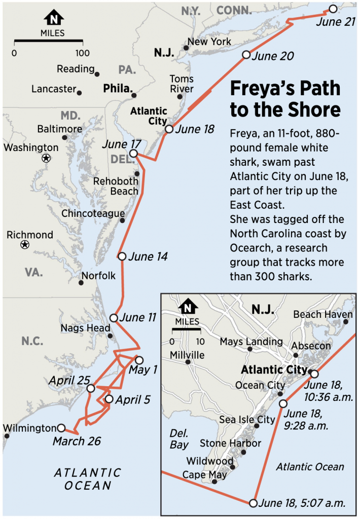
A little over a week ago the Philadelphia Inquirer posted an article about sharks. It wouldn’t be the American holiday of 4th of July without mentioning Jaws. Think of it, there really are no good Hollywood films about the Constitutional Convention or Declaration of Independence. I mean we have Mel Gibson’s The Patriot. But, that’s terrible. I digress, we’re here to talk about sharks.
A great white shark swam past the Jersey coast in mid-June. She swam just off the shore of Atlantic City’s beaches before moving on towards a shark nursery in more northern waters near New York and New Jersey.
Why are we discussing it? Because sharks have always fascinated me. It’s my blog. Oh, and it had a map.
Definitely a bigger boat
There isn’t much to say about this map, it makes a good use of contrasting red for the shark’s path against the light blue of the ocean.
Hopefully none of you were eaten by a shark over the holiday.
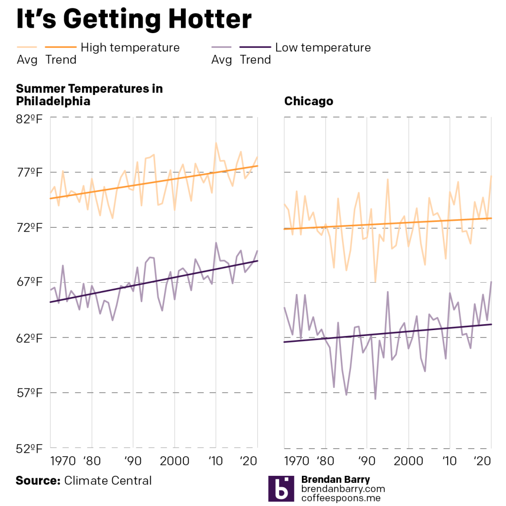
Like I said yesterday, I wanted to compare cities, surprise, Philadelphia vs. Chicago. And so with some extra time I was able to finish this graphic that took the data from Climate Central to compare the two cities.
What you can see below is that Philadelphia has seen more significant temperature growth in both summer highs and summer lows. And, importantly, the increase in low temperatures, i.e. nighttime, has been greater than that of daytime highs. That means that we have less of an opportunity to cool down after a hot summer day, adding stress to the system.
Chicago on the other hand has seen less overall growth, though it’s still present. And there too we see the same pattern of greater increases in low, i.e. nighttime, temperatures than of daytime highs.
It’s all unbearable
It’s remarkable to think that the flat where I lived seven of my eight years in Chicago had no air conditioning unit in the bedroom, only in the living room. It was, of course, an older concrete building from the 1960s/70s when, as the chart above shows, nighttime temperatures didn’t really require air conditioning.
But like I said yesterday, I’m just glad I’ve been able to crank the air conditioning the last several days.