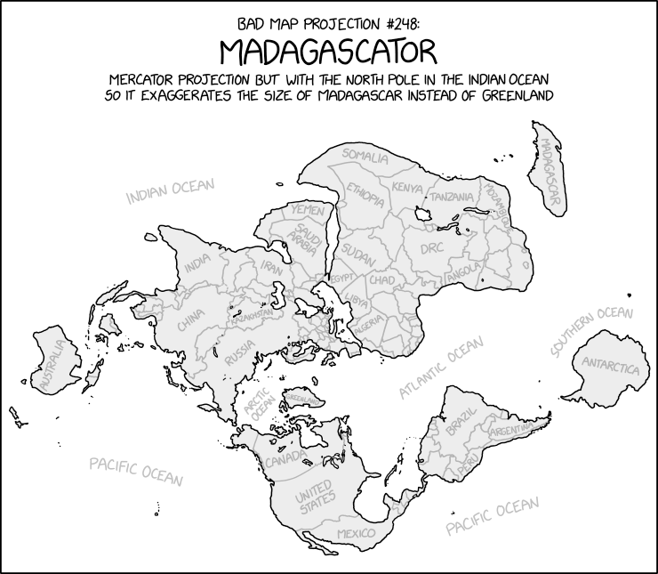
Well we made it through the week. Yesterday we looked at plate tectonics and the future shape of the world. So today it’s time to look at a map recently made by xkcd. Specifically it looks at the world through the lens of Madagascar.
Now try to roll it up onto a sphere.
Greenland isn’t as big as it looks on Google Maps. So this piece fixes that by placing Madagascar in its place.
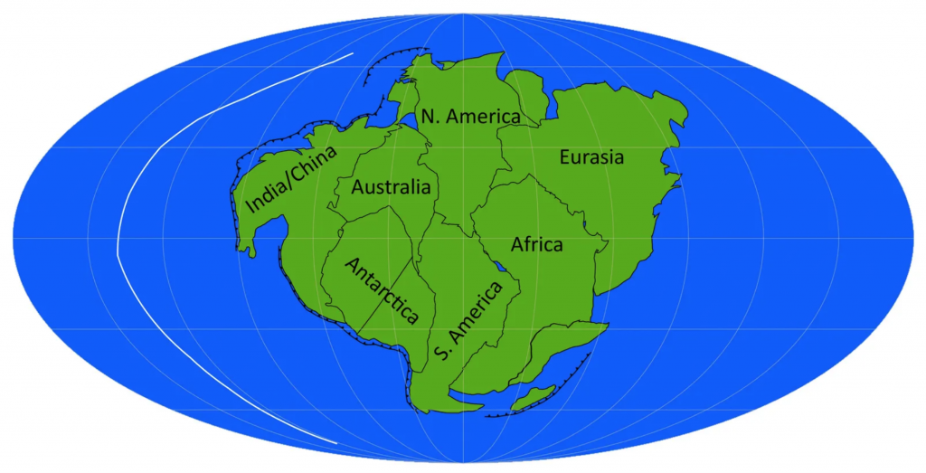
To be clear, we know the Earth is round. At least most people know that. Some people delude themselves. We also know that sitting atop the mantle we have plates of rock that move around. Sometimes they slip underneath others. Other times they collide and crumple. Plate tectonics explain why there are so many similarities between continents separated by an ocean.
But while that explains historical connections, what does it say about the future? The fact is that we don’t know for certain. Luckily a recent BBC article explored four different scenarios. And they included graphics, here’s a screenshot of one of them.
They called this scenario Aurica
The graphics are pretty simple with green continents and blue oceans. But they work really well for showing the scenarios. The maps also include black lines for subduction zones, i.e. lines along which the plates that define the ocean floor, and the white lines represent mid-ocean ridges. Those are where the ocean plates diverge and in the process create new ocean floor. The designers also included some labels to help the audience understand just what green shape came from today’s continents.
Credit for the piece goes to the BBC graphics department.
Last night we had breaking news on two very big fronts. The first is that somebody inside the Supreme Court leaked an entire draft of the majority opinion, written by Justice Alito, to Politico. Leaks from inside the Supreme Court, whilst they do happen, are extremely rare. This alone is big news.
But let’s not bury the lede, the majority opinion is to throw out Roe v. Wade in its entirety. For those not familiar, perhaps especially those of you who read me from abroad, Roe v Wade is the name of a court case that went before the United States Supreme Court in 1971 and was decided in 1973. It established the woman’s right to an abortion as constitutionally protected, allowing states to enact some regulations to balance out the state’s role in concern for women’s public health and the health of the fetus as it nears birth. Regardless of how you feel about the issue—and people have very strong feelings about it—that’s largely been the law of the United States for half a century.
Until now.
To be fair, the draft opinion is just that, a draft. And the supposed 5-3 vote—Chief Justice Roberts is reportedly undecided, but against the wholesale overthrow of Roe—could well change. But let’s be real, it won’t. And even if Roberts votes against the majority he would only make the outcome 5-4. In other words, it looks like at some point this summer, probably June or July, tens of millions of American women will lose access to reproductive healthcare.
And to the point of this post, what will that mean for women?
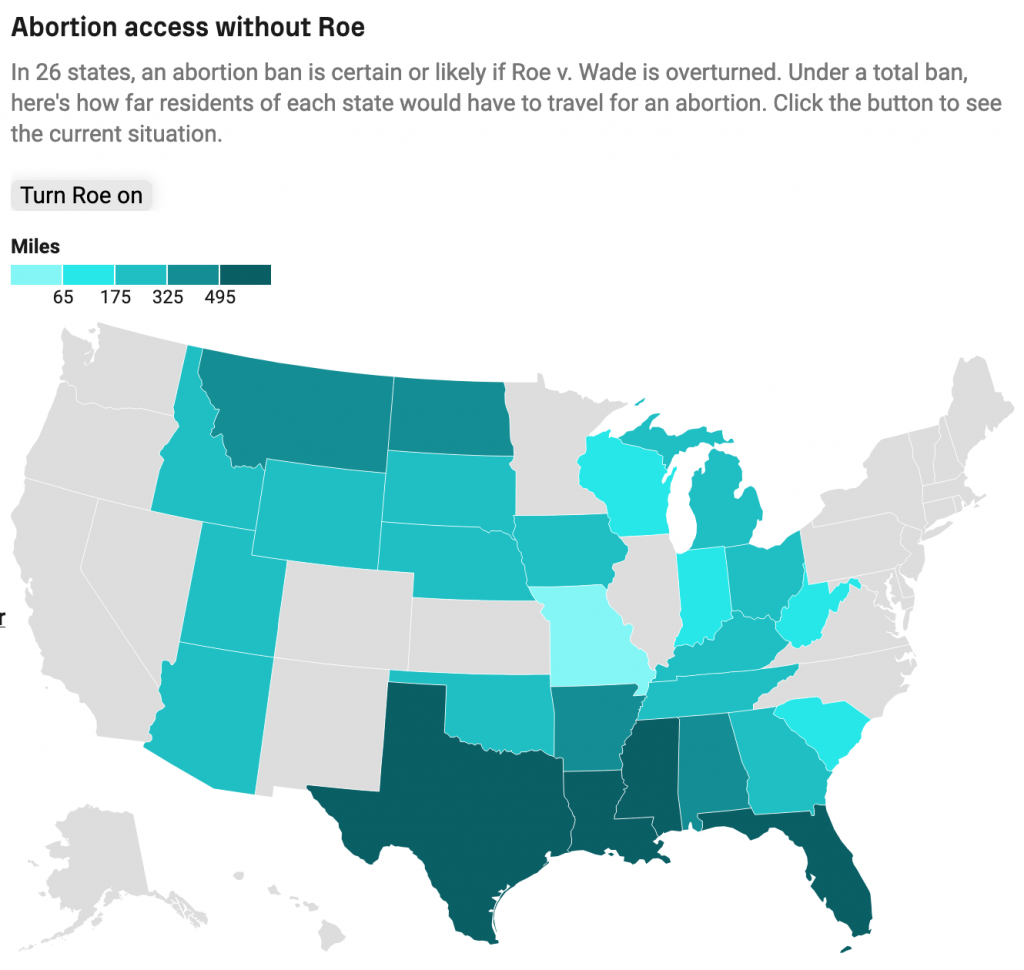
This article by Grid runs down some of the numbers, starting with laying out the numbers on who chooses to have abortions. And then ultimately getting to this map that I screenshot.
That’s pretty long distances in the south…
The map shows how far women in a state would need to travel for an abortion with Roe active as law and without. I’ve used the toggle to show without. Women in the south in particular will need to travel quite far. The article further breaks out distances today with more granularity to paint the picture of “abortion deserts” where women have to travel sometimes well over 200 miles to have a safe, legal abortion.
I am certain that we will be returning to this topic frequently in coming months, unfortunately.
I took last week off for the Orthodox Easter holiday. But I am back now. For some of the time I was away, I stayed at an old stone farmhouse that the owners renovated into a short-term rental. That made me think about what I would want or need in my own space. Of course the pandemic has changed much of both where we work and live. For many of us the two overlap significantly.
This article from Axios detailed some of the findings from a survey that investigated how the pandemic changed the wants and needs of homeowners and homebuyers. Using the survey’s findings, an architectural firm designed a concept home embodying those changes and that’s what this screenshot captures.
That’s a big home.
It’s pretty straightforward as far as graphics go. We have a flat two-dimensional floor plan of what the architects called the Barnaby. The graphic does a nice job of keeping the furniture and fixings in white and then using colour to indicate the flooring options, hardwood of course.
If you want to read more about the house itself, in addition to the article the company behind the design has a site about the house itself.
I spent the past weekend in Harrisburg, Pennsylvania on a brief holiday to go watch some minor league baseball. That explains the lack of posting the last few days. (Housekeeping note, this coming weekend is Orthodox Easter, so I’ll be on holiday for that as well.)
Whilst in Harrisburg I did other things besides watch baseball because minor league games are so much faster now. (Maybe more on that in another post.) So after a Sunday afternoon match, I grabbed my camera and went for a walk about town. Mostly I photographed buildings and things, but at one point I came upon a gentleman sitting reading a paper on a bench.
Except it wasn’t a person; it was a statue.
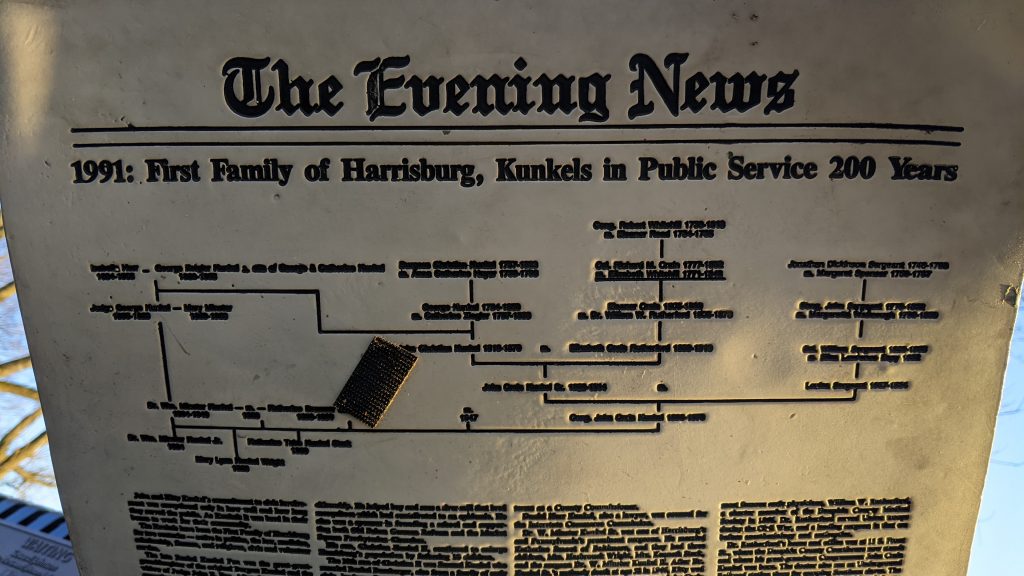
Entitled “Waiting”, the statue portrays a bespectacled man reading a newspaper with a briefcase and an upturned brimmed hat sitting neatly atop said briefcase. (I’d show you the photo, but it’s still on my camera waiting to be downloaded.)
I was curious what the man was reading. Was it relevant? Did it say something important? Or was it lorem ipsum or placeholder text?
As it turned out, the paper told the story of a founding family of Harrisburg via article headlines. But on the front page, we had a nice little family tree diagram. And that’s what makes this anecdote germane to this blog.
But what does it say?!
I cannot read the specific details, nor did I want to. The paper was angled downwards, light was fading as the sun was setting, and this was backlit enough already.
The sculpture dates from 1992, making that headline the most recent article. From that, I will probably be able to do some of my own research and create my own version of that family tree, because I could not read it and now I’m curious. But what appears to be happening is primarily the ancestors of one line of one person’s—this gentleman’s?—parents. But critiquing it further is complicated by the illegibility of the chart.
Of course I should point out that the point was probably not a legible genealogical descent chart, but rather to in a quick visual show the person in particular comes from a long line of people, presumably public servants all or most.
Credit for the piece goes to the sculptor, Seward J. Johnson Jr.
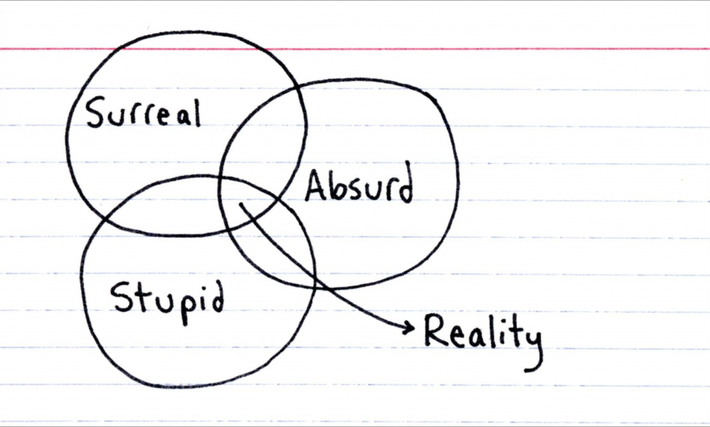
It’s been another week. And that’s why I thought of this post from Indexed last week. It seems to adequately describe where are at in this crazy world.
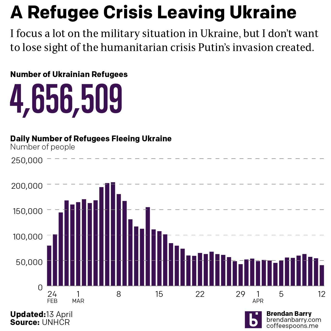
Another week, more combat and refugees in Ukraine. I’m going to try and hold the war update until tomorrow pending some news that hasn’t been confirmed yet: the fall of Mariupol. Instead, we’re going to again look briefly at the refugee situation in Ukraine—technically outside. I haven’t seen a recent number on the internally displaced, though we have begun to see some people return to Ukraine especially in the north and around Kyiv. It’s unclear to me if the data includes those people returning.
Regardless, we are at over 4.6 million Ukrainians who have fled Ukraine.
Slowing down of late.
The question now is as Russia refocuses its effort now on the Donbas—though fierce fighting has been waged in the area for eight years now—will these numbers begin to see a notable change.
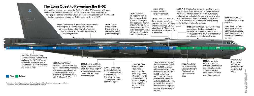
Not the band, but the long-range strategic bomber employed by the United States Air Force. This isn’t strictly related to Ukraine, but it’s military adjacent if you will.
I thought about creating a graphic a few years ago to celebrate the longevity of the B-52 Stratofortress, more commonly called the BUFF, Big Ugly Fat Fucker. Obviously I did not, but over at Air Force Magazine, they created a graphic timeline showing the history of the aircraft, specifically as it relates to its engines, which will now be replaced in an effort to extend the life of the bombers.
100 years of bombings
I don’t love the image of the bomber behind the graphic, but I understand why it’s there given the B-52 is the focus of the timeline. I wonder if a different layout could have highlighted the placement of the engines and separated the timeline from the image of the bomber.
Overall I like the graphic, but it could just be that right now I’m spotlighting and working on a lot of graphics dealing with military issues and Ukraine in particular.
Credit for the piece goes to Dash Parham and Mike Tsukamoto.
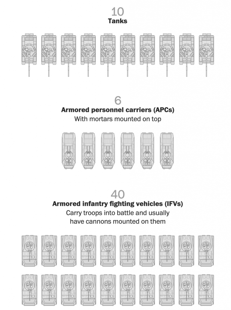
As Russia redeploys its forces in and around Ukraine, you can expect to hear more about how they are attempting to reconstitute their battalion tactical groups. But what exactly is a battalion tactical group?
Recently in Russia, the army has been reorganised increasingly away from regiments and divisions and towards smaller, more integrated units that theoretically can operate more independently: battalion tactical groups. They typically comprise less than a thousand soldiers, about 200 of which are infantry. But they also include a number of tanks, infantry fighting vehicles (IFVs), armoured personnel carriers (APCs), artillery, and other support units.
In an article from two weeks ago, the Washington Post explained why the Russian army had stalled out in Ukraine. And as part of that, they explained what a battalion tactical group is with a nice illustration.
Just some of the vehicles in a BTG
Russia’s problem is that in the first month of the war, Ukrainian anti-armour weapons like US-made Javelins and UK-made NLAWs have ripped apart Russian tanks, IFVs, and APCs. Atop that, Ukrainian drones and artillery took out more armour. The units that Russia withdrew from Ukraine now have to be rebuilt and resupplied. Once fresh, Russia can deploy these into the Donbas and southern Ukraine.
This graphic isn’t terribly complicated, but the nice illustrations go a long way to showing what comprises a battalion tactical group. And when you see photos of five or six tanks destroyed along the side of a Ukrainian road, you now understand that constitutes half of a typical unit’s available armour. In other words, a big deal.
I expect to hear more out of Russia and Ukraine in coming days about how Russia is providing new vehicles and fresh soldiers to resupply exhausted units.
Credit for the piece goes to Bonnie Berkowitz and Artur Galocha.