New Job Trepidation

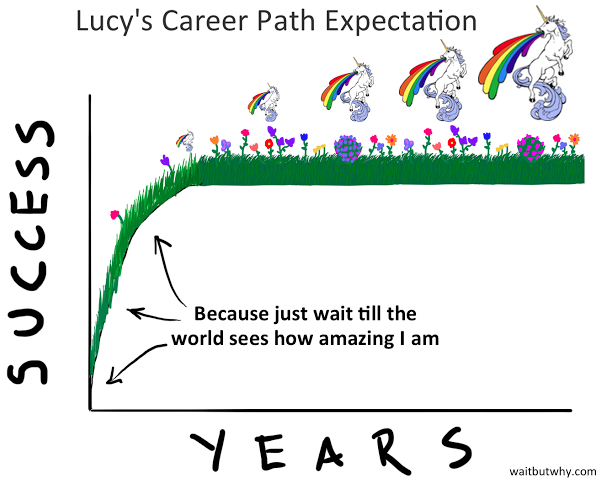
Some of my co-workers are taking me out for a few drinks as I started a new job at my company last month. It’s a lot of work and a lot of learning things I know little about. So this piece from This Is Indexed seems appropriate for this Friday.

My new job is somewhere in the sliver

Credit for the piece goes to Jessica Hagy.

The History and Future of Data Visualisation

From time to time in my job I hear the desire or want for more different types of charts. But in this piece by Nick Brown over on Medium, we can see that there are really only a few key forms and some are already terrible—here’s looking at you, pie charts. How new are some of these forms? Turns out most are not that new—or very new depending on your history/timeline perspective. Brown illustrated that timeline by hand.

A timeline of chart forms

Worth the read is his thoughts on what is new for data visualisation and what might be next. No spoilers.

Credit for the piece goes to Nick Brown.

How the Diesel Engine Works

For a little while now I have been wondering about just how the emission cheating system worked for Volkswagen. Thankfully the AFP put together a graphic illustrating how their diesel engine process works. It gets me partially to the level of understanding for which I am looking. But even though I now understand how the diesel engine works, I am confused about where the cheating device fits into the process.

How the diesel engine works

Credit for the piece goes to the AFP graphics team.

Unhappy Millennials

I attended a dinner on Monday where the topic of Millennials arose. While most of the evening is not germane to this post, I did recall Wait But Why’s piece on why Millennials are unhappy on the way back to my flat. So here you go, a look at the Millennials and why we are unhappy. Bonus: we have unicorns and rainbows.

What GYPSYs expect
What GYPSYs expect

Credit for the piece goes to Tim Urban.

Rich Hill’s Curveball

Today marks the final start of the year for Rich Hill of the Boston Red Sox. It’s also only his fourth start of the year. He was signed as depth as attrition left an empty spot in the rotation. In his three starts, however, he has given up only three runs in 23 innings while striking out 30 and walking only two. How does he do it? Over at Baseball Prospectus they took a look at Hill’s curveball and the deception he generates from his arm slot and the location of his fastball. They show this by a comparison graphic. I’ve added the names of the two players, but otherwise the graphic is unaltered.

Hill is on the left
Hill is on the left

If I am lucky, I can catch this last Hill start at the pub tonight.

Credit for the piece goes to Baseball Savant.

Expensive Wines Taste the Best…

But not for the reasons you might think. This video from Vox looks at the notion that expensive wines taste better. And it turns out they do. Sort of. In terms of the design of the piece, it uses some nice charts and motion graphics to make its point. Plus, it includes snippets from Sideways, notably: “I’m not drinking any fucking Merlot.” Classic.

Wine ratings
Wine ratings

Credit for the piece goes to Joss Fong, Anand Katakam, Joe Posner, and the Vox.com staff.

Taking You All to School

Like the title said, it’s about time I took you all to school…by which I mean university scorecards from the US Department of Education. I used my alma mater, the University of the Arts, to show the design here. Basically you have several sections key to understanding a university from the student body to the financials to the graduates’ prospects.

The scorecard for UArts

Credit for the piece goes to the US Department of Education.

Supermoon Lunar Eclipse

Last night we experienced a total lunar eclipse here in Chicago. Unfortunately, significant cloud cover meant that much of the event went unseen. That was unfortunate, because eclipses are fantastic. To explain it we have this piece from the BBC.

What is a lunar eclipse

And for those were either unable to see it or did not know about it, here is one of the photos I took.

During the eclipse
During the eclipse

Credit for the diagram goes to the BBC graphics department.

Credit for the photo is mine.

Your State’s Power Sources

By now you should all know that I am a sucker for small multiples. They are a great way of separating out noise and letting each object be seen for its own. You should also know that I am a sucker for things industrial, e.g. nuclear power. So when you put the two together like NPR did earlier this month, well, I am going to be a huge fan.

All 50 states
All 50 states

Credit for the piece goes to Alyson Hurt.