
In January 2011, I made a map of counties I had visited in my life. I just rediscovered the file last weekend, and so today I decided to update the map. So below is 2011 and then after is 2015.
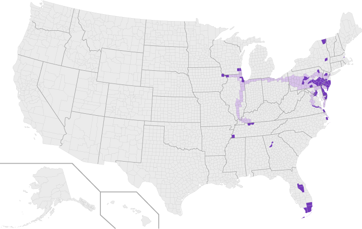
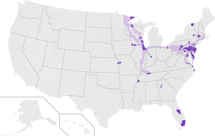
In January 2011, I made a map of counties I had visited in my life. I just rediscovered the file last weekend, and so today I decided to update the map. So below is 2011 and then after is 2015.
Today’s piece really is not a flashy one. I mean you can see that from the bar chart below. But, FiveThirtyEight put together a piece around it explaining just how that one chart is incredibly useful.
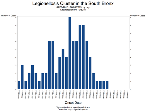
Credit for the graphic goes to the New York City Department of Health. For the analysis piece, that goes to FiveThirtyEight.
The minimum wage of $15 per hour does not necessarily mean the same thing to everyone all across the country. Based on where one lives, the purchasing power of a dollar might make minimum wage worth more or less than $15. The Pew Research Centre put together a map showing where $15 is worth more or less.
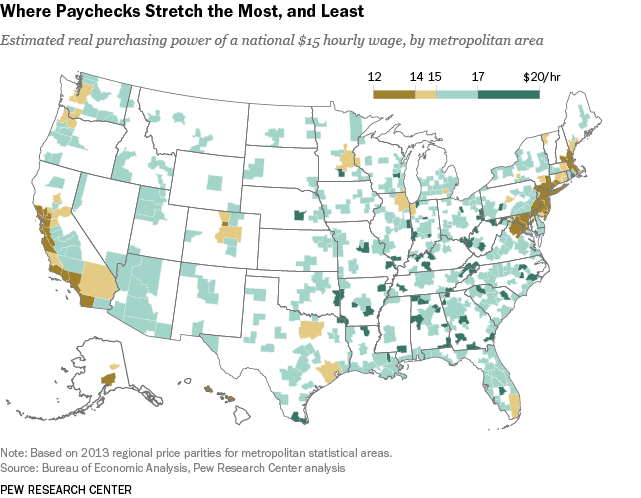
Credit for the piece goes to the Pew Research Centre.
A few weeks back the White House announced some new plans for clean electricity. The Washington Post put together an interactive graphic looking at the sources for American power.
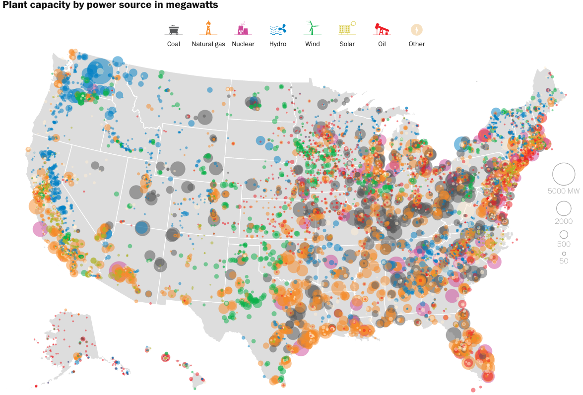
Credit for the piece goes to John Muyskens, Dan Keating, and Samuel Granados.
North Korea Time!
But no, seriously, North Korea announced this past Friday that it is placing itself inside a new time zone. This Washington Post piece has a graphic that looks at just how weird the new time zone is in relation to the rest of the region.
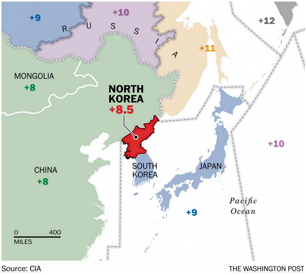
Credit for the piece goes to the Washington Post graphics department.
Even when things are funny, I do not always laugh aloud. This xkcd post, however, made me do just that. And for that, it’s going up on the blog as today’s graphic of choice.
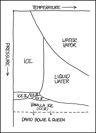
Credit for the piece goes to Randall Munroe.
On 6 August 1945, the United States dropped one of the only two nuclear weapons used in combat on the city of Hiroshima, Japan. 70 years later, the city has been rebuilt and the war is long since done and over—the atomic bombings playing no small part in changing the Japanese calculus of surrender. But, what happened on 6 August and then 9 August (when we used the second of two nuclear weapons on Nagasaki)? The Washington Post has this nice piece with illustrations and maps and diagrams to explain it all.
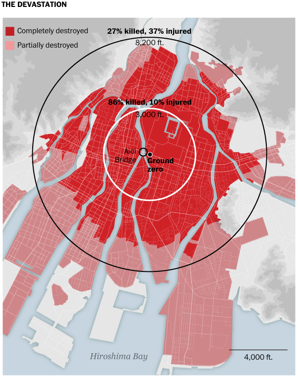
Credit for the piece goes to RIchard Johnson and Bonnie Berkowitz.
The UN released some new population estimates. And no surprise here, the world is still getting larger and a lot of that growth will be in Africa. But the Economist put together a graphic looking at some of the forecasts, including the ever popular bragging rights of “Who is the Largest Country?”
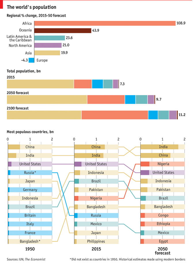
Credit for the piece goes to the Economist Data Team.
Journalism is not always a safe profession. Indeed, many journalists risk their lives to bring us news from conflict zones or otherwise dangerous places. This piece from the Washington Post supplements an article about a particular Pakistani journalist, but looks at a broader set of journalist deaths over the last 20+ years.
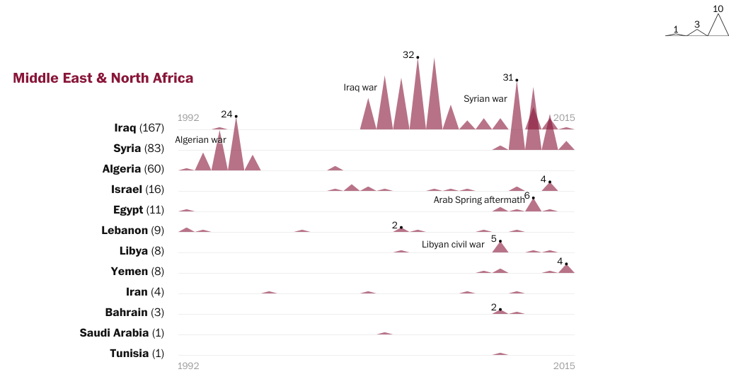
That said, unless you are a fan of the Mountain of Conflict, this graphic does nothing for me. Because of the way the points form mountains, it begins to emphasise the area of the triangle, not the height of the point. Secondly, the mountains overlap and then because of the way the colours interact, give increased emphasis where there should not be any. After all, the overlap does not signify anything of itself.
Credit for the piece goes to John Muyskens and Samuel Granados.
So this is sort of a recycled post, in the sense that I talked about it back in April of 2013. But it’s worth revisiting in light of last month’s announcement of Kepler 452b. For those unaware, the planet is a little bit larger than Earth, but is believed to be a potentially rocky planet like Earth that orbits a star very similar to our Sun in a very similar orbit.
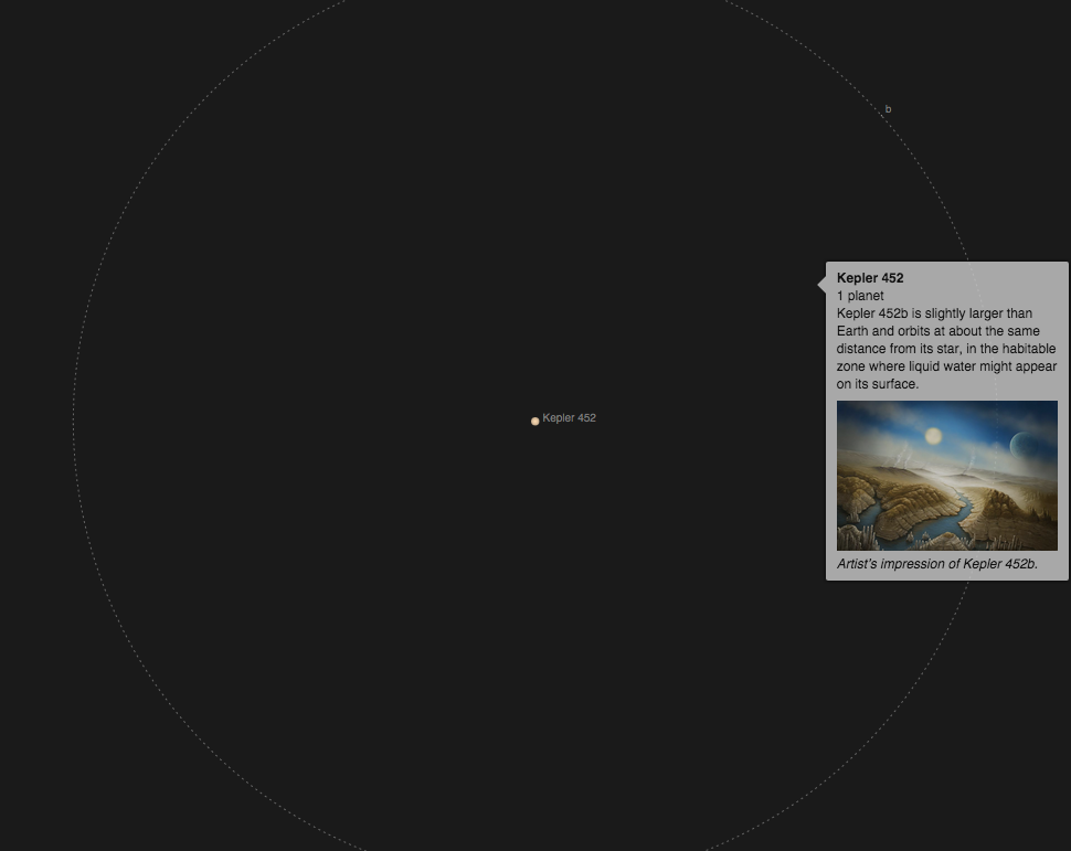
Credit for the piece still goes to Jonathan Corum.