American Football Videogames

This week we have been looking at baseball (and Leonard Nimoy’s Star Trek). Today, we are going to turn to a sport I know nothing about: American football video games. Okay, so video games are not really a sport, but they are based on a sport. The reason I bring it up? FiveThirtyEIght has a really nice two-article story on how the Madden game franchise uses ratings to build characters for the game.

Rate yourself
Rate yourself

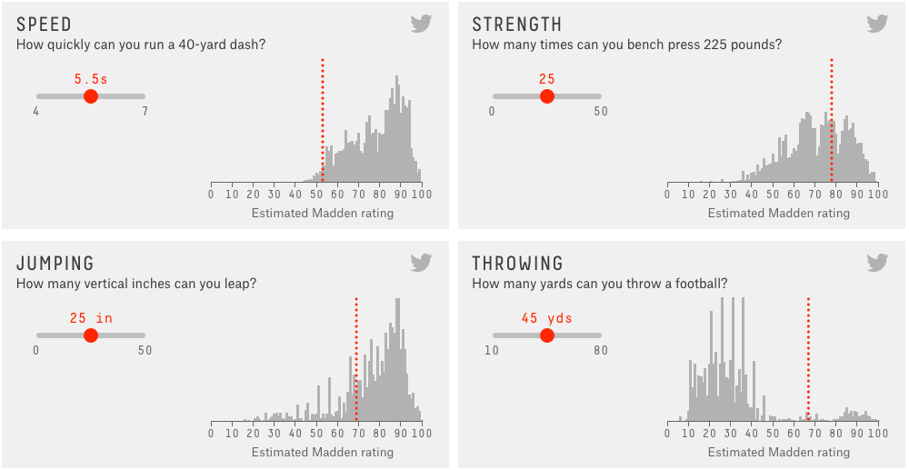
The above graphic is an interactive part of the story that lets you compare yourself to the real sports people, as estimated by the video game company. The second article in the story then builds upon that by using a reporter as a basis to test/understand the ratings.

And pay attention to the sidebar content. It’s actually worth heeding for once.

Credit for the piece goes to Reuben Fischer-Baum.

Where to Catch Foul Balls

As we established yesterday, baseball is rumbling back to life with Spring Training. That means it is time to start buying tickets for games. But if, like me, you have never caught a foul ball or home run, you may want to sit in a location where you can optimise your chances. Where is that? Well, now we have an app for that, Ideal Seat, as covered by Time. It uses interactive maps of stadiums and data on where hit balls land to generate an average number of balls per game—an average of about 30 foul balls per game.

Safeco Field as a sample

Credit for the piece goes to Ideal Seat.

Baseball Is (Almost) Back

As the title says, baseball is almost back. Red Sox spring training games begin as the Red Sox take on Northeastern today. The off-season is perhaps the hardest part of the year for a fan, because unless you take super interest in trades, there is no baseball. But what about on Twitter? Well, today’s piece is an article from Fangraphs that looks at team-by-team off-season Twitter use.

Twitter engagement
Twitter engagement

Personally, I am not really a fan of the graphic. As a static image, it does not allow me to easily compare the different retweets or favourites. But, in the aggregate, you can see that the Seattle Mariners are perhaps the most active Twitter account.

Credit for the piece goes to Sean Dolinar.

He’s dead, Jim.

For those of you living beneath a Taurusan boulder, Leonard Nimoy died last week. He is perhaps best known—at least to me—for his role of Spock in Star Trek. Clearly your author is too young to have ever watched Star Trek during its original run. Instead, I belong to the next generation of Star Trek fans—the domain of Picard not Kirk. But, as I grew older, I could rent the original series films. And in the age of the Internet, I could watch the original series. And so I learned to appreciate the green-blooded, pointy-eared hobgoblin Spock. And through the new movie series, another generation can now enjoy Star Trek. But even then, we had Leonard Nimoy cameos to enjoy.

Well, as you can imagine, today’s piece is an infographic I found that looks at Star Trek the Original Series.

Star Trek
Star Trek

Credit for the piece goes to Olka Kirsanova and Natalya Platonova.

Understanding Genealogy

I came upon this piece a little while ago and realised that it in some ways paralleled my own interest in genealogy. Basically the story comes down to realising that you probably only know a mere fraction of the stories behind all the people who led up to you. To put in another context: “you’re the product of 127 romances, just in the last 200 years alone”. Anyway, the article is a nice read and explains the math with illustrations.

How the story starts

Credit for the piece goes to Tim Urban.

Military Hardware

Earlier this week we looked at Ukraine’s loss of Debaltseve. Today we look at a piece from the Economist that compares the military hardware of the United States, Russia, and China. These are the mere datapoints on quantity, not quality. But it still illustrates fairly well why we should not fight a land war in Asia.

Comparing the numbers

Credit for the piece goes to the Economist’s Data Team.

Wars Are Bad, But Not as Bad as They Used To Be

War is bad for the population business—arguably good for business business. A year ago, the Hague Centre for Strategic Studies released a .pdf that looked at peace and conflict and their respective drivers. The designers clumsily pieced everything together so that the sum is less than the constituent parts. But, if you isolate each piece and look at it alone, you can ignore the overall design and focus on the merits of each component. The excerpt below looks at the deaths in wars over time and their share of world population.

You don't see the word Westphalian used very often
You don’t see the word Westphalian used very often

Credit for the piece goes to Tim Sweijs and Joshua Polchar.

Ukraine Retreats from Debaltseve

This is a short piece—it is only really an inline map—but it illustrates fairly well why Ukraine’s loss of Debaltseve in eastern Ukraine last week is kind of a big deal. Basically, the now mostly abandoned city is a transport hub linking the two quasi capitals of the Novorossiya.

Rebel-controlled area

Credit for the piece goes to Gene Thorp.

The American Shopping Mall

This past weekend Al-Shabab, the Al Qaeda affiliate based in Somalia, threatened shopping malls in the United States, Canada, and the United Kingdom. This threat carries a certain amount of weight given the deadly attack Al-Shabab launched against the Westgate Shopping Mall in Nairobi, Kenya a few years ago.

So what to look at today? Well, a few weeks back a colleague sent me a link to a Bloomberg article about the American shopping mall. The article examines the makeup of stores, the people shopping, and the regionalisation in the food court(s). On a personal note, I was glad to see that King of Prussia received a mention.

Auntie Anne's in KoP? I'd rather Philly Pretzel Factory
Auntie Anne’s in KoP? I’d rather Philly Pretzel Factory

Credit for the piece goes to Dorothy Gambrell and Patrick Clark.