Setting the Presidential Primary Field

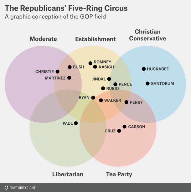
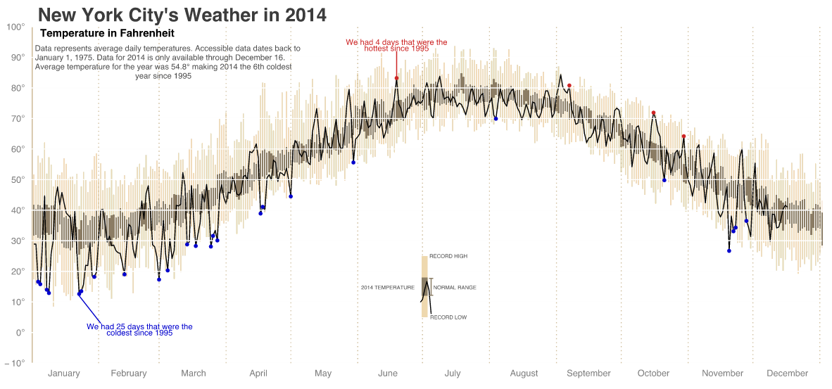
The last week or two have seen some interesting announcement regarding Republican potential presidential candidates. Seems pretty early no? Well, FiveThirtyEight looked at the timing of the announcements and found that it’s quite normal to be announcing this early. The data was summarised in this great dot plot/box chart.

Plotting appearances

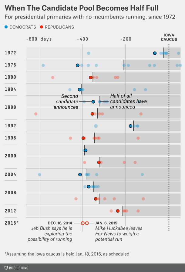
Credit for the piece goes to Ritchie King.

The Perception vs Reality of Islam in Europe

Last week’s terror attacks in Paris highlight the tension in Europe between secular Europe and those believing in Islamist values. The Economist looked at some of the available data and noted the gap between Europe’s perception of Islam and its reality. A quick figure called out for France, French respondents thought 31% of the French population to be Muslim. The reality is a mere 8%.

Perception vs reality

Credit for the piece goes to the Economist Data Team.

Income Peak Map

Today’s post looks at peak income for the middle class. The Washington Post looked at peak median household income for each county in the United States. And for 81% of counties, that peak was over 15 years ago.

Income map
Income map

The really nice features of this piece are not actually the map, which is a standard choropleth map. Instead small multiples above the map breakdown the appearance of counties in each era bracket. And then to the right the user can compare a selected county against both the state and the United States. Overall, a very nice piece.

Credit for the piece Darla Cameron and Ted Mellnik.

Periodic Table of Non-elements

Science is great. But science is also a process and scientific progress goes boink. Some of the mis-steps in chemistry have been erroneous elements. Thankfully the Boston Globe built a small periodic table of non-elements with short anecdotes about the selected few.

Table of non-elements

Credit for the piece goes to Mary Virginia Orna and Marco Fontani.

The Link Between Work and Transit

The Wall Street Journal recently published an interesting article about the link between work and access to transit. They included a graphic that looked at the link between the two.

Linking the two together

Credit for the piece goes to the Wall Street Journal graphics department.

Board Games

On New Year’s Eve, well technically in the wee hours of New Year’s Day, the group with which I was spending the holiday broke out Settlers of Catan. We played that game—and drank a few bottles of champagne—until 04.00. My experience of playing the game—not necessarily the part about being inebriated on New Year’s Eve—bears out the increasing popularity of board games. This article from FiveThirtyEight seeks to understand what makes particular board games popular. And, because I am mentioning it on this blog, it has a few charts worth noting.

Game ratings organised by year of introduction

Credit for the piece goes to Rasmus Greve.

How Different Temperature Profiles Make Different Precipitation Types

I apologise for the lack of posts over the last two weeks, but I was on holiday. Naturally, I have returned just in time for some snowstorms in the Midwest. But today’s piece comes from WGN and it explains how the type of winter precipitation that falls depends not solely on ground temperatures. Rather, temperature profiles in the upper atmosphere can make all the difference between rain, sleet, and snow.

How temperatures create different precipitation types

Credit for the piece goes to Steve Kahn and Jennifer Kohnke.

Surviving Holiday Parties

The Christmas holidays are known for many things. One of them is the office holiday party. Today’s post looks at a flow chart put together by the company for which I work, Euromonitor International. As it was put together by the design team, you might very well think that I had something to do with it. But I couldn’t possibly comment.

The beginning of the flow chart

Credit for the piece goes to the Euromonitor design team.