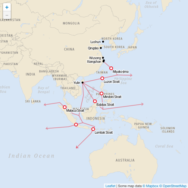
This weekend the Wall Street Journal published an article that combined my interest in data visualisation with my interest in naval ships. The article looks at the growth of the Chinese nuclear submarine programme. And alongside the article are maps, charts, illustrations, and a narrated video that support the written word.
Choke points for the Chinese navy
Credit for the piece goes to Alberto Cervantes and the Wall Street Journal’s graphics department.
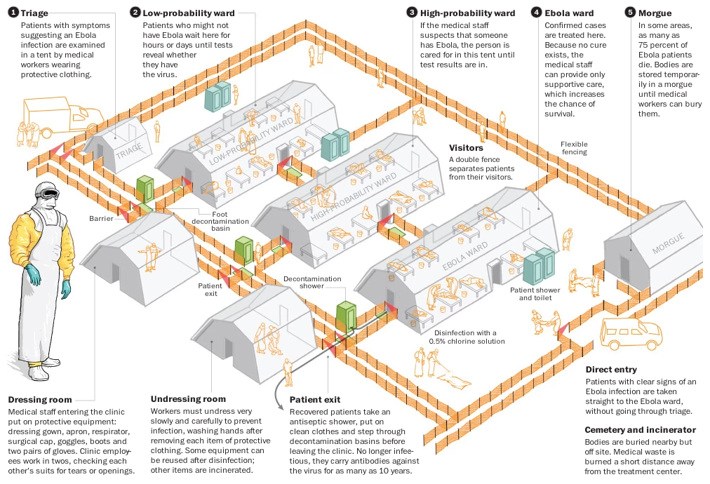
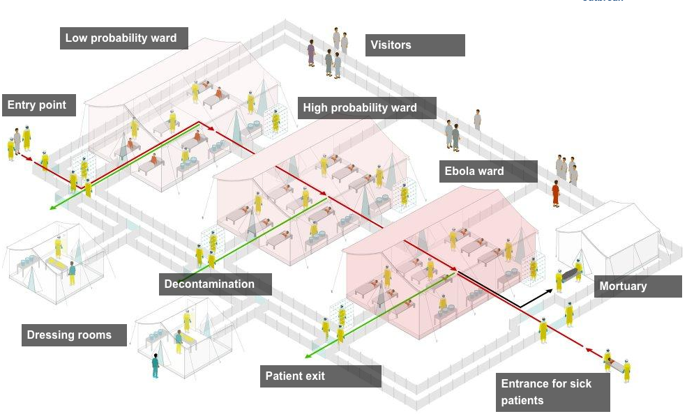
Last week we looked at the BBC and its rendition of an Ebola treatment centre. This week we are looking at the Washington Post and how they treated the same material. As you can imagine, with the same source material, the treatment is fairly similar. I do appreciate the colour applied to the various elements called out in the illustration. Though, to be super nitpick-y, I could probably do less orange with the fence. It becomes a bit distracting from some of the other details.
To continue with this week’s theme of Ebola, we are looking at another Washington Post article. Online the Post presents it as an interactive, guided explanation of how Ebola basically kills people. Spoiler, it is not pretty. But what I do really like about this online presentation is how the Post has a downloadable .pdf version of the piece available.
How Ebola works
Credit for the piece goes to Patterson Clark, Darla Cameron, and Sohail Al-Jamea.
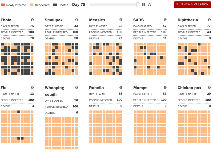
Yesterday we looked at the New York Times’s reporting of some basic facts about Ebola. Today to continue along the refutation of scaremongering path, we have an article from the Washington Post. I understand that people are afraid of Ebola, because if you catch it, you have a good chance you are going to die. The current strain for the outbreak in West Africa is about 50%. But, you are far more likely to catch less-deadly disease. Like the flu.
Comparing modelled outbreaks
Credit for the piece goes to Bonnie Berkowitz and Lazaro Gamio.
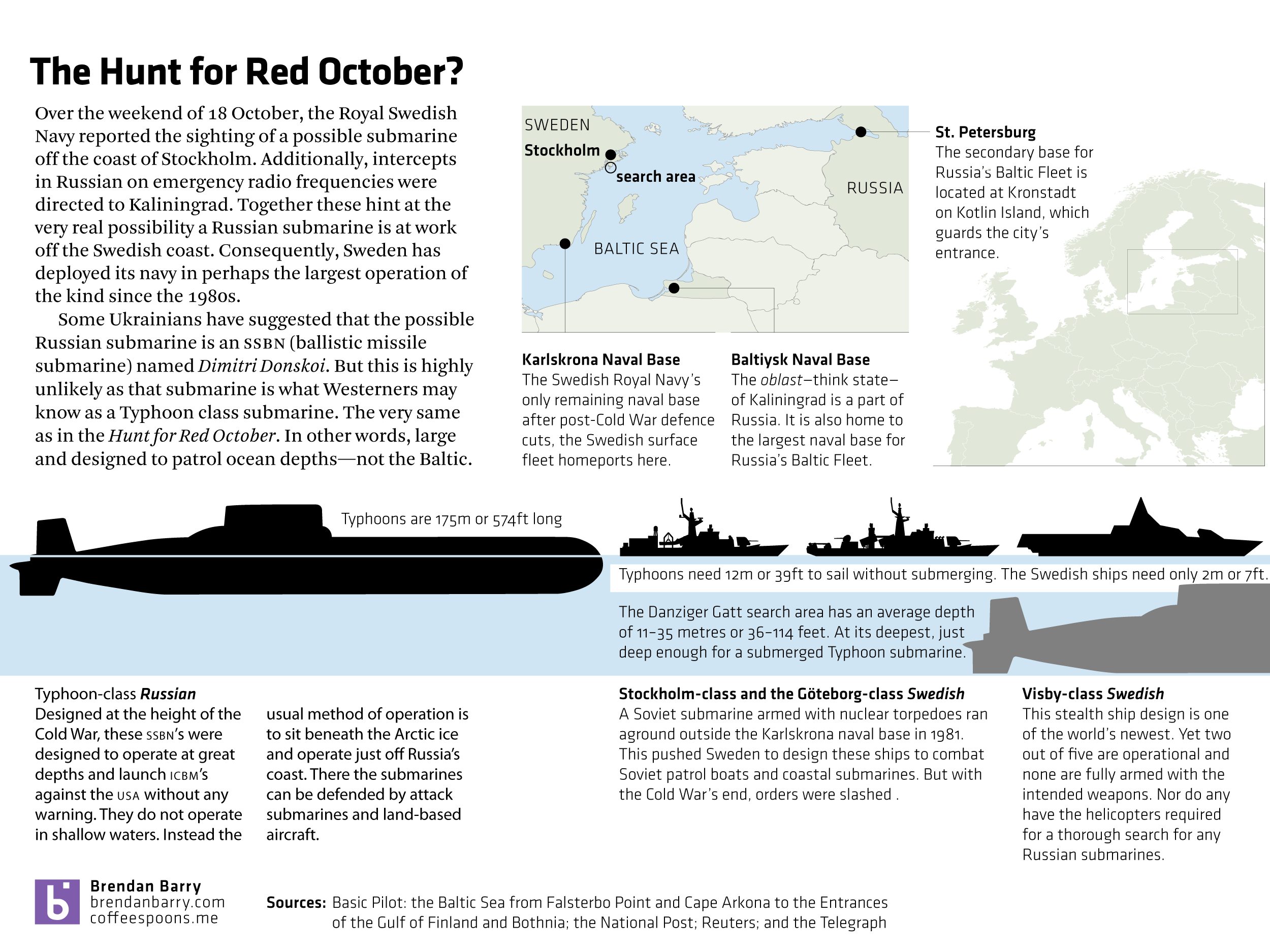
Today you are going to get two posts. The first is this, which is a break from the week’s theme. But news stories happen. The second will be back to regular programming at the regular time. Basically, the Swedish government is reporting that a foreign submarine is operating within its waters and the available evidence points to Russia. I have seen some ridiculous claims that one of Russia’s largest submarines is in trouble there. But I highly doubt that. And here is why.
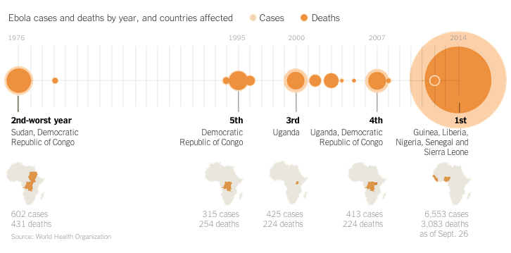
I really enjoy reading articles where graphics accompany the text and not just for the want of graphics. While the Ebola outbreak in West Africa is tragic, the data allows for some nice visualisation pieces. Additionally, one could say that the United States is victim to quite a bit of scaremongering as a result of a few isolated cases of Ebola in Dallas, Texas. Spoiler, an Ebola outbreak is not really a threat to the United States or Western Europe. Perhaps to relieve some of said scaremongering, the New York Times has a nice article titled Ebola Facts that outlines just that, the facts about Ebola. And guess what? The article is accompany by a number of useful inline graphics.
Ebola outbreaks
Credit for the piece goes to the New York Times’ graphics department.
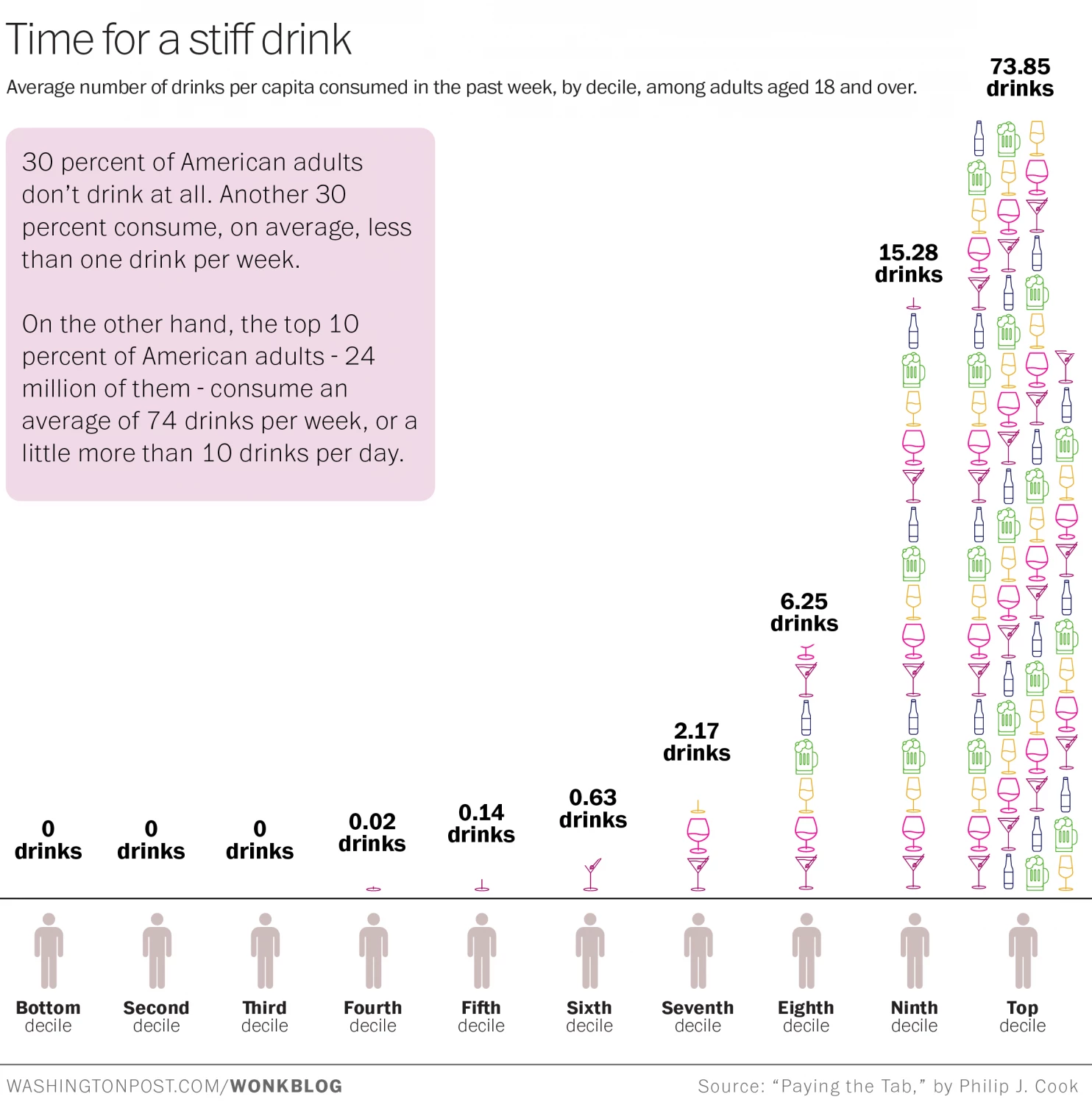
Happy Friday, everybody. I’m looking forward to a pint. But thanks to some research, as an American, I might actually be looking forward to 10 pints if I fall within the highest decile of American drinkers. They imbibe on average over 73 alcoholic drinks per week. Yep, that means over 10 per day. Bottoms up, Merica. The Washington Post brings up the graphic summary of the study.
Credit for the piece goes to Christopher Ingraham.
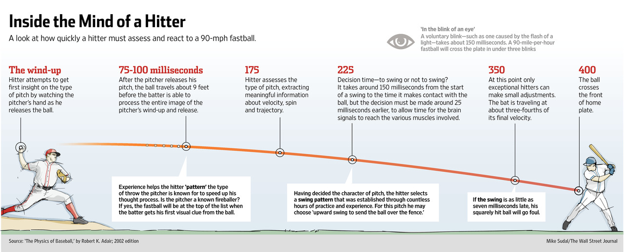
Tonight is Game 5 of the National League Championship Series. For those of you who do not follow baseball, this is the semi-finals for the national championship called the World Series. Anyway, hitting a baseball is hard because you have so little reaction time. The Wall Street Journal has an article about how some baseball teams are beginning to experiment with neuroscience. The idea is to better train hitters to recognise pitches earlier, in essence, giving them said reaction time. The article is accompanied by an illustration showing just how little time there is to hit a pitch.
Ebola is still a thing. And it is still getting worse. Or rather, with deaths and/or infections in both Europe and the United States, we are finally paying a bit more attention to it. We have no cure for Ebola, but we still need to treat people for symptoms, but most importantly we need to isolate those infected from the broader population. How and where is this done? Thankfully, the BBC put together an interactive graphic illustrating a typical treatment centre. Each main section is a clickable link that explains the functions and key points to the different areas.
A treatment centre
The article goes on to explain in more detail what is going on and does so with photos and also a map of treatment centres in Guinea, Sierra Leone, and Liberia.
Credit for the piece goes to the BBC graphics department.
If you missed it, last week the United Kingdom held a few by-elections. For we Americans, those are like special elections for seats in the Senate or the House that are not part of the regular Congressional elections. Anyway, the big news was that the United Kingdom Independence Party (UKIP)—think Tea Party wanting out of the European Union…kind of—won a by-election for Clacton-on-Sea (not surprisingly located on the sea) from the Tories (think establishment Republicans). UKIP almost won a by-election away from Labour (kind of think Democrats?). The former was shocking but not surprising, the latter was both.
Anyway, one of the drivers of the results was the fact that British voters are no longer consistently voting for either the Tories or Labour. The Telegraph used a nice graphic to show just how far the British two-party system has declined from its peak in 1951. The piece is not very fancy, but it does the trick.
Tory–Labour vote share since 1951
Credit for the piece goes to the Telegraph’s graphics department.