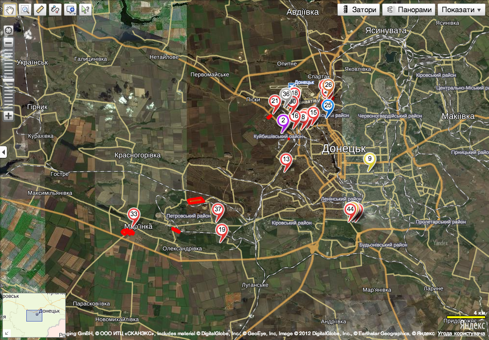
Today’s piece will not likely be the most readable for myself or most of you, my audience. But it is an interesting look at how technology can change the understanding of a modern battlefield for non-combatants. This is a map of Donetsk, Ukraine—the focus of Kiev’s efforts to defeat separatists in eastern Ukraine. The map plots artillery strikes from various days with links to images of the attacks.
Artillery strikes in and around Donetsk
Credit for the piece goes to the site’s designers.
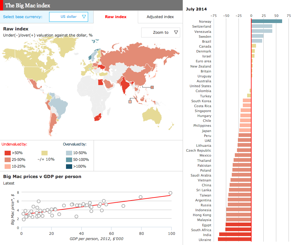
For years, the Big Mac Index from the Economist has been a standard of sorts for examining differences in currencies across the world. Well now we have an online, interactive version of the index.
The Big Mac Index
Credit for the piece goes to the Economist’s graphics department.
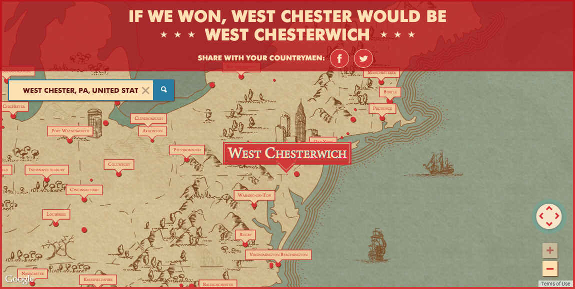
A few weeks ago, one of my coworkers, sent me a link to a Newcastle Ale campaign video asking what would America be like if Britain had won the Revolutionary War. Anybody who knows me really well knows I am an Anglophile. I say mobile instead of cell phone, from time to time I switch from apartment to flat or truck to lorry or elevator to lift. So naturally I checked out the campaign site and what did I find? A map of place names if the Americans had not won the war. You can search for your residence or hometown and see what the Brits would have named it.
Though this ignores the fact that most of where I am from was actually named by the Brits. West Chester was originally called Turk’s Head, but after the a bunch of boundary changes that separated the British named Chester from my area, Turk’s Head was renamed West Chester because it is west of Chester, located on the Delaware River. Anyway, place names are cool. Happy Friday, everybody.
I would have grown up in West Chesterwich
Credit for the piece goes to the design team behind the ad campaign.
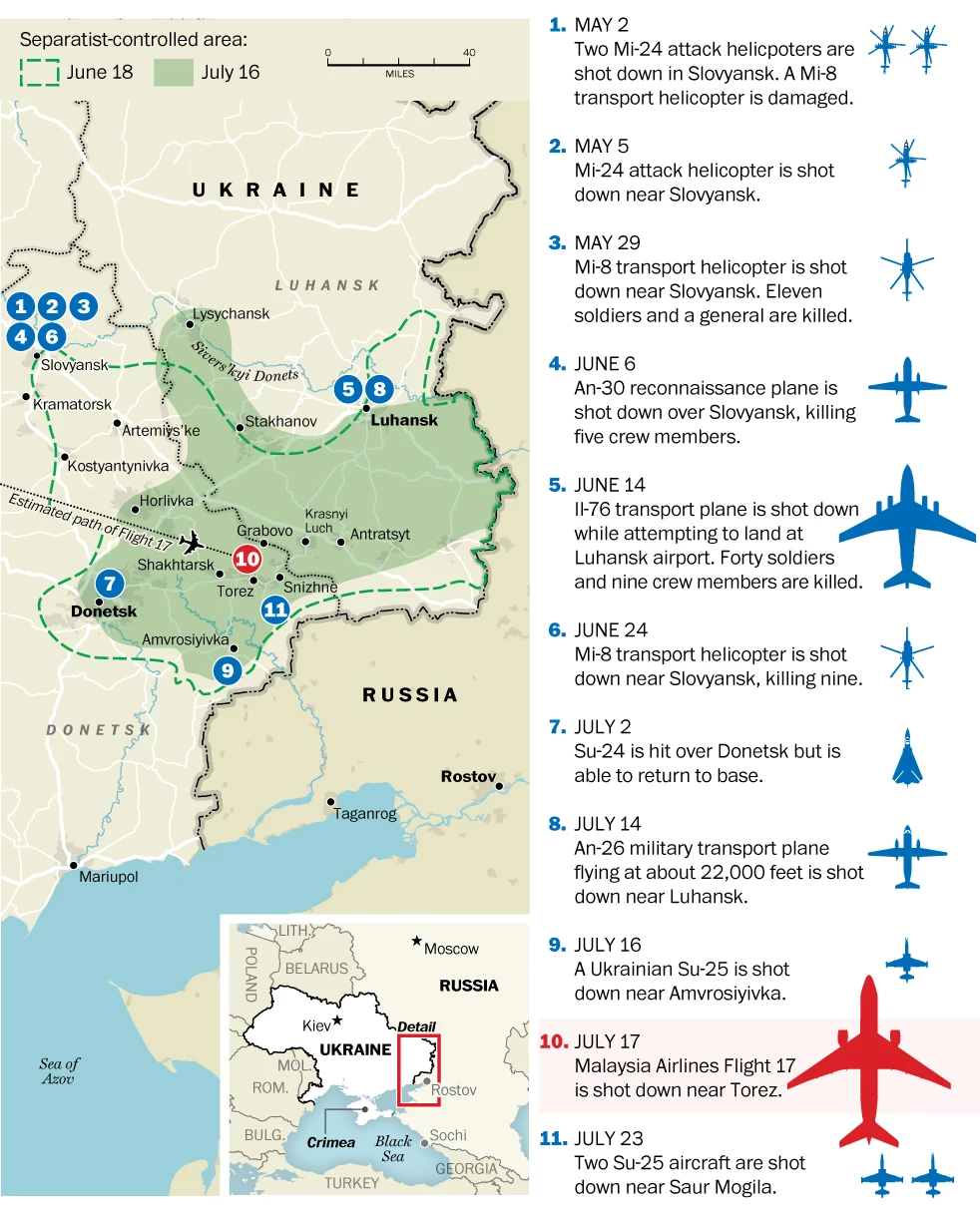
The Boeing 777 jetliner was not the first nor even at this point the latest aircraft shot down over eastern Ukraine. Just yesterday, two Sukhoi Su-25 aircraft were shot down—the Ukrainian government claims from medium-altitude surface-to-air missiles fired from within Russia. While I was working on drawing something up to catalogue just what has been shot down, I stumbled upon this piece from the Washington Post that does just that.
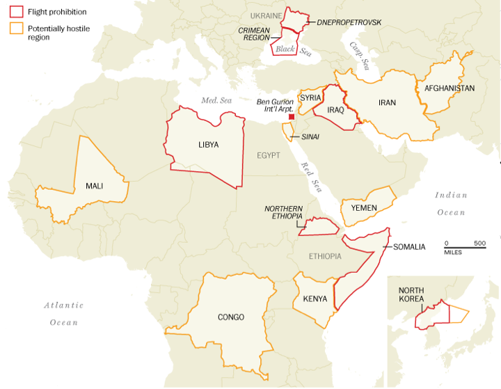
One of the questions in the wake of last week’s shoot down of Malaysia Airlines Flight 17 is why was the aircraft even flying over eastern Ukraine? Generally speaking, because it was not banned from doing so. In today’s graphic, the Washington Post takes a look at those areas that the United States’ Federal Aviation Administration (FAA) restricts flights or warns against travel due to hostile threats, e.g. war. Also note that the Post has included Ben Gurion Airport, which is still under the 24-hour period ban because of a Hamas rocket landing a mile away from the airport in Tel Aviv, Israel.
FAA restriction areas
Credit for the piece goes to Katie Park, Kevin Schaul, and Gene Thorp.
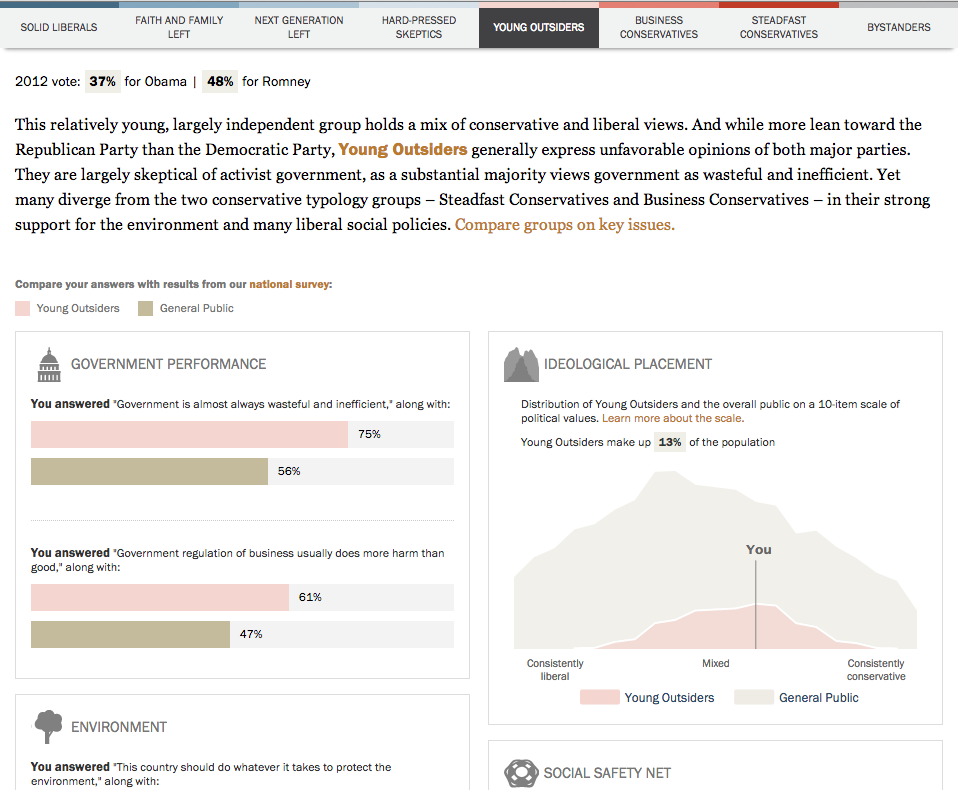
Maybe? But thanks to Pew Research, you can see if we align politically. Today’s post comes via Pete, a coworker of mine, and it is basically a survey that works by asking you 23 political questions on topics from big/small government, immigration, climate change, gay rights, defence spending, &c. They crunch some numbers and spit you out on a results page, the image below a crop from the results for your humble author. (For better or worse revealing my political leanings.)
My type
From a survey standpoint, I found it interesting the questions presented only binary responses. In general, I found that I never agreed with either statement entirely and was forced to choose the “closest” response. Since I never see myself on the conservative side of the spectrum, I was surprised to see my “type”, Young Outsiders, coloured with a tint of red. Regardless, I’m still thankful that according to Pew, I am still more in the centre than on the ends as it makes it a lot easier to compromise. I’ve heard that that is an adult thing to do.
By the way, if you want the results of the full survey upon which this quiz was based, you can check out that site here. It’s full of bar charts for those who like the data visualisation.
Credit for the piece goes to the Pew Research Center.
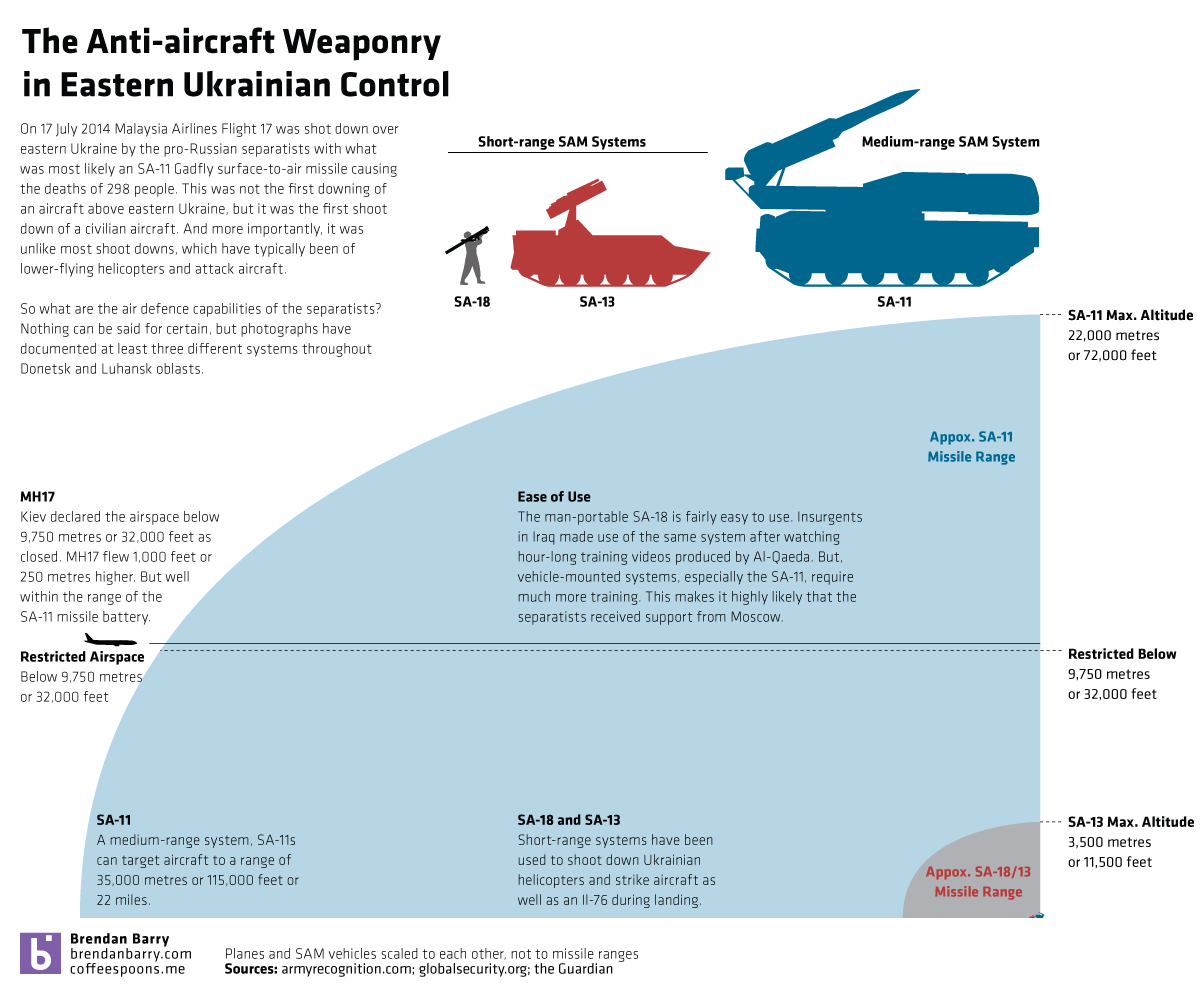
Last week, separatists in eastern Ukraine shot down Malaysia Airlines Flight 17 with what appears to have been an SA-11 Gadfly missile. Separatists had previously claimed to have had this system in operation and days earlier shot down a high-altitude Ukrainian military aircraft—though not necessarily with the SA-11. How much more powerful is the SA-11 than the other two known surface-to-air missile systems the separatists have used to shoot down Ukrainian military helicopter and aircraft? Well, I decided to create a small graphic to show you that the SA-11 is a significant advancement over the shorter range systems in use up to now.
Talk about an airline with bad luck this year. Malaysia Airlines—yes of the missing flight in the Indian Ocean fame—lost another aircraft yesterday as separatists in eastern Ukraine allegedly shot it down with an SA-11 Gadfly surface-to-air missile. For those unaware, that is a much more deadly and capable system than the shoulder-launched missiles separatists have been using to shoot down Ukrainian aircraft. (In my non-expert opinion, the separatists probably thought they were doing just that, shooting down a Ukrainian transport plane.)
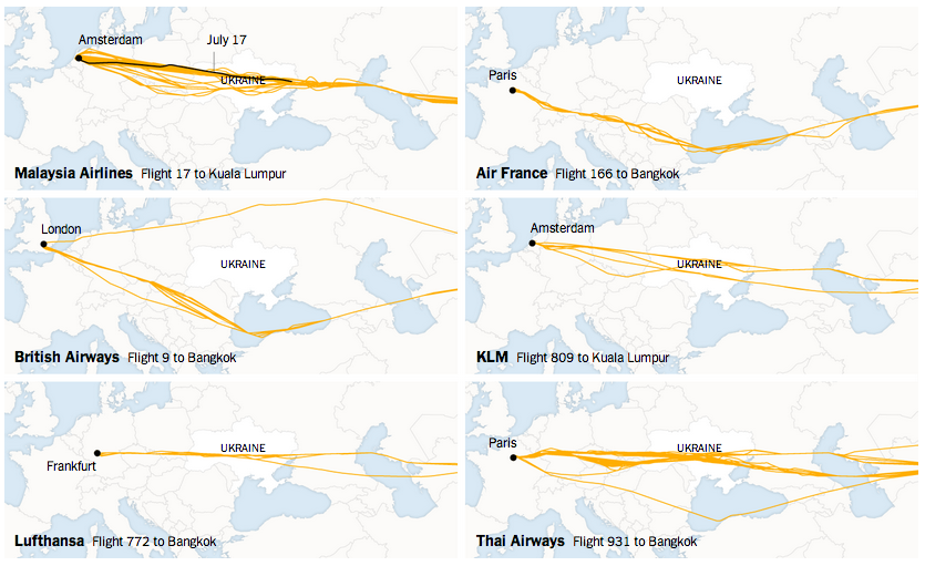
In short, there is quite a bit going on in eastern Ukraine today. Thankfully we have the New York Times creating a page of maps to explain the shoot-down of MH17.
Not all airlines have flown over Ukraine
Credit for the piece goes to the graphics department of the New York Times.
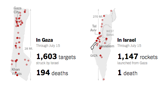
Today’s piece, the first not on Québec, is a small but poignant reminder of the disparity between the number of deaths in Gaza and in Israel during this most recent conflict. According to the article, as of 16 July there has been one death in Israel for 194 in Gaza. This small piece from the New York Times shows the geographic location of the attacks from both sides and tallies the number of strikes. And the number of dead.
Comparing the death toll
Credit for the piece goes to Craig Allen, David Furst, Nilkanth Patel, Archie Tse, and Derek Watkins.