Well, Iraq is in the news again. Basically because the Islamist insurgency in Syria has now crossed the border—to be fair, though, that happened awhile back—and taken control over swathes of northern Iraq. Part of that swath includes the city of Mosul, Iraq’s second-largest city with a population of almost 2 million.
The New York Times has been putting together a series of maps to explain the background of why this is happening (hint: that Shia–Sunni divide we talked about years ago, well it’s back) as well as where this is happening.
The Shia–Sunni–Kurdish divide
Credit for the piece goes to Sarah Almukhtar, Jeremy Ashkenas, Bill Marsh, Archie Tse, Tim Wallace, Derek Watkins, and Karen Yourish.
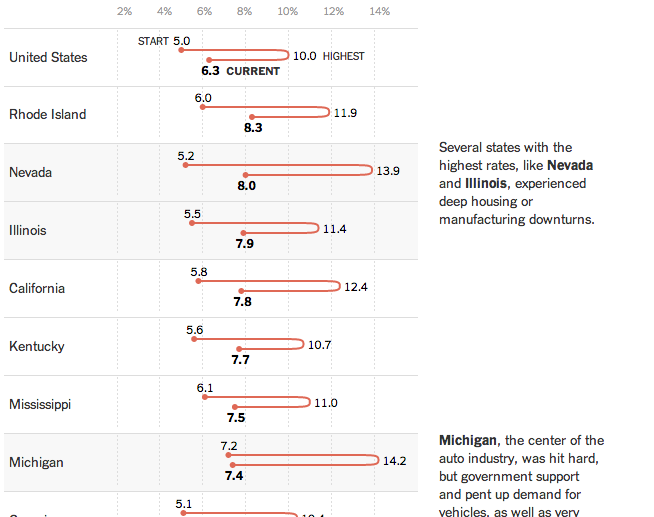
Today’s post is a New York Times piece that looks at state levels of unemployment. In particular, whether states have returned to pre-Recession levels of employment. (Spoiler, they have not.)
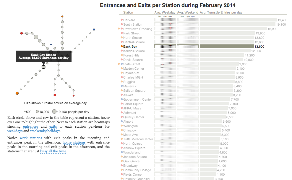
Today’s post is the graduate work of Michael Barry and Brian Card of Worcester Polytechnic Institute. The two looked at the available public data of the Massachusetts Bay Transportation Authority (MBTA)—the T to those that know—to better understand the Boston area subway system. Here the subway system refers to the heavy rail lines, i.e. the Blue, Orange, and Red lines.
T stations
In short, the piece has a lot to look at that is worth looking at. This particular screenshot is an analysis of the stations across all times on average weekdays and weekends. You can see how in this particular selection, the size of the station markers pulse depending upon the time of day and the number of turnstile entries. Meanwhile the charts to the right show you the density through time of said entries and then compares the average number of turnstiles entries per day. Text beneath the system map to the left provides a short analysis of the data, highlighting work vs. home stations.
Credit for the piece goes to Michael Barry and Brian Card.
A little old, but this graphic from the New York Times explores urban blight in Detroit. The interesting feature about the map is the blue, highlighted section. The designers used Google Streetview to show an actual blighted street.
Detroit blight
Credit for the piece goes to the New York Times graphics department.
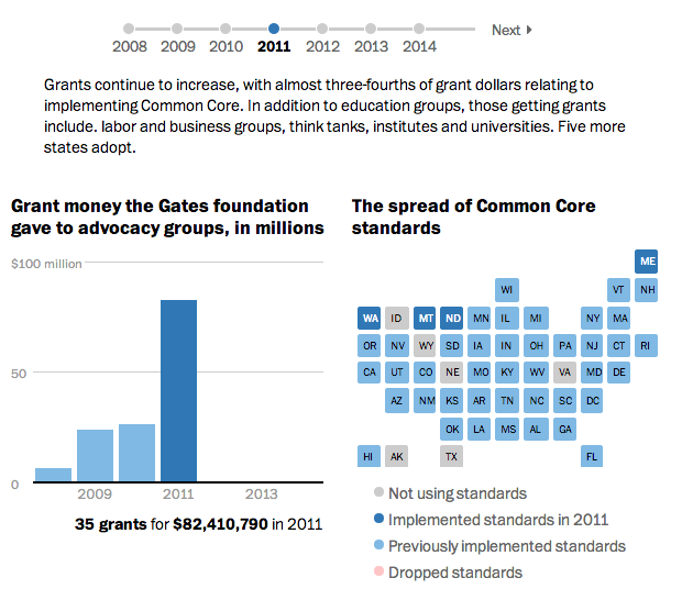
Today’s piece is a timeline-driven piece from the Washington Post. It looks at the success the Gates Foundation has had in pushing its Common Core standards as an educational standard across the country.
Common Core’s Growth
Credit for the piece goes to Darla Cameron, Ted Mellnik, and Cristina Rivero.
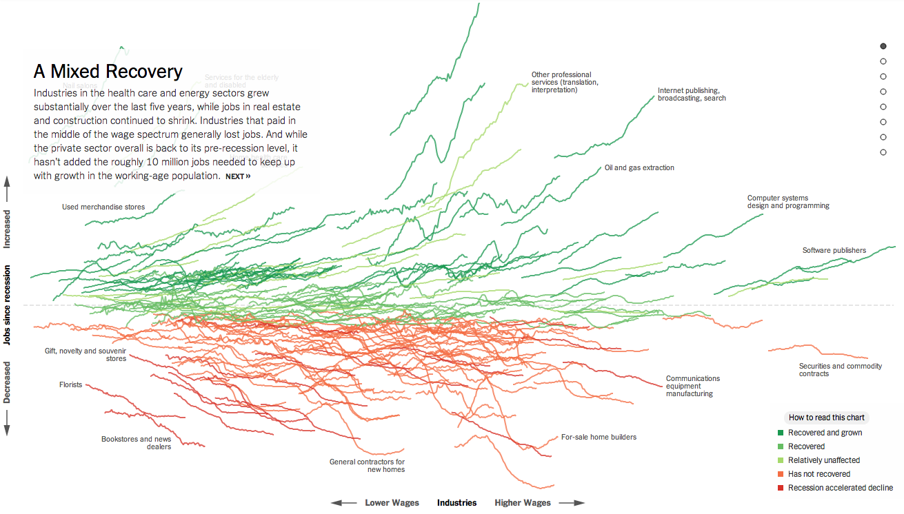
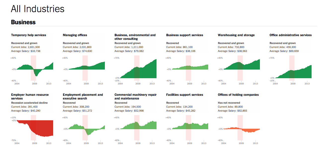
Normally I try to reserve Fridays for the lighter stuff. But yesterday, the New York Times published a really fantastic piece about how the Great Recession changed the American economy through job growth or loss in each sector of the economy. Naturally this sounds very difficult because the American economy is both very large and very diverse.
Job growth in the American economy
If you check the piece out, however, you will find that you are offered a guided tour with analysis to provide context to an otherwise jumble of coloured lines. As a bonus, highlighted words in the text bring up small charts showing the actual job growth history for the particular sector. The jumble, however, is also organised along the x and y axes by two important metrics: wages and jobs since the Great Recession. This allows you to see whether low wage jobs have performed better than higher paying and whether either has created more jobs than the other. Line colouration denotes whether a particular sector has grown and recovered, recovered, not recovered, or recession accelerated a previous decline.
Then at the very end is another really great part of the piece. This is a collection of all the small charts arranged by areas of the economy.
View sectors individually as small multiples
Lastly, for those of you who have to work on smaller screens, don’t worry, they made it responsive. Overall, a great piece.
Credit for the piece goes to Jeremy Ashkenas and Alicia Parlapiano.
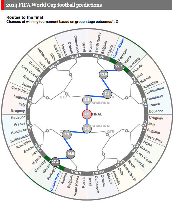
Earlier this week we looked at how Bloomberg was doing predictions and odds for the World Cup. Today we look at the Economist’s go. It uses something called the probability circle. It lacks the depth of Bloomberg’s piece, but from a design angle does play off the shape of the soccer ball and not in the cheesiest of fashions. Here it actually begins to work in lieu of our familiar bracket system (see every other sports final tournament series I have ever seen). To be fair, the Economist does not actually make any predictions in this, rather, it provides the odds that different teams will make different stages.
Economist’s odds on each team
Credit for the piece goes to A.Y., P.K., D.D.M., J.M.F., and K.N.C.
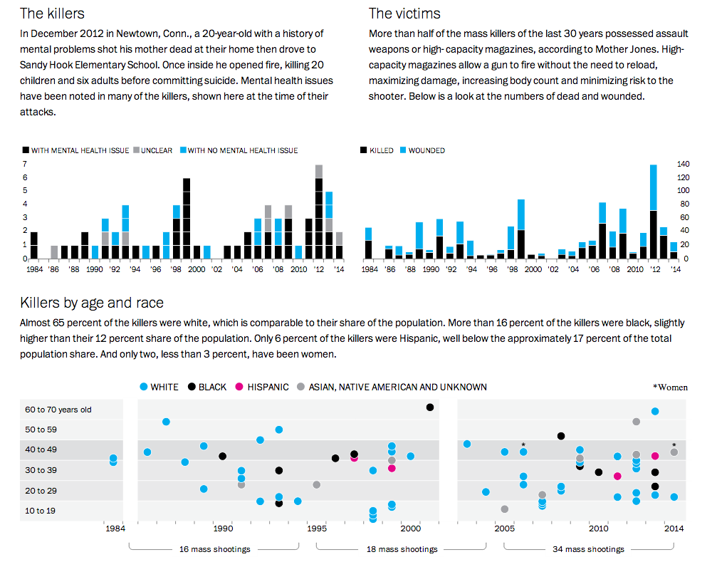
America loves its gun. The big draw of this piece from the Washington Post is the illustration of the guns used in the mass shootings and whether each was legally or illegally acquired. But more interesting from a data visualisation standpoint are the charts below. They show the numbers of killers, victims, and then the demographics of the killers.
Killers and Victims
Credit for the piece goes to Alberto Cuadra, Richard Johnson, Todd Lindeman, Ted Mellnik, and Kennedy Elliott
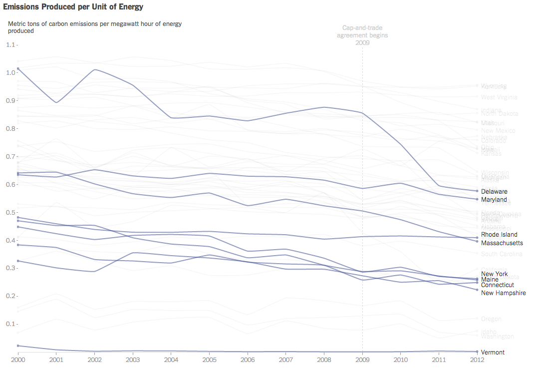
President Obama announced new regulations to be enforced by the EPA that aim to reduce carbon emissions. Principally, the expected reduction will come through state-by-state measures to meet new federally mandated targets. Each state will have the ability to find different means of achieving the cuts, e.g. building more solar plants or nuclear plants or implementing cap-and-trade schemes.
Consequently, the New York Times published this interactive graphic that examines the carbon emissions and energy prices of states. The charts default to a highlight of several Northeast states already participating in a cap-and-trade scheme. The top component charts emissions on a per unit of energy over time while the bottom charts the price of energy.
Carbon emissions over time
Credit for the piece goes to Hannah Fairfield and Derek Watkins.
The World Cup is starting soon and that means predictions are also on their way. And snazzy graphics. Today’s snazzy graphic with predictions comes from Bloomberg. They have host Brazil winning the overall tournament. And if you want to investigate the matches further, you can do that by clicking on the match.
Brazil wins
Credit for the piece goes to the Bloomberg graphics department.