
To day’s post comes frm teh Washington Post. It luuks at how esy it is to sppel eesy wrds wrong. But aparently I’s can spel wrds. Note teh way wrds speled wrng are coloured by frekwency.
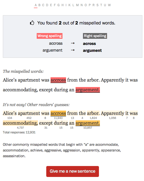
Cridet fr eht peice goes 2 Emily Chow and Kat Downs.
To day’s post comes frm teh Washington Post. It luuks at how esy it is to sppel eesy wrds wrong. But aparently I’s can spel wrds. Note teh way wrds speled wrng are coloured by frekwency.
Cridet fr eht peice goes 2 Emily Chow and Kat Downs.
Nik Freeman took US Census blocks that had zero population and created a map with them. In essence, he highlighted where we do not live.
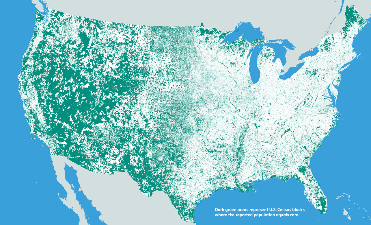
Credit for the piece goes to Nik Freeman.
Massimo Vignelli died yesterday at the age of 83. Fastco has a much better article than I think I could read, this image is from their piece but is of Vignelli’s transit map for New York. I wrote about an interactive piece several years back that allowed you to compare Vignelli’s map to the new system map for the MTA.
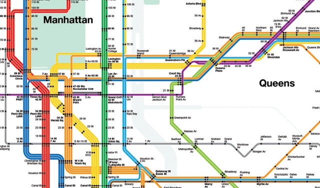
Credit for the piece goes to Massimo Vignelli.
Sunday (and a few days preceding it) was election day in the European Union for the European Parliament. Unfortunately it was also a banner day for the far-right parties. In France the National Front (FN) took the top slot and in the United Kingdom that went to the UK Independence Party (UKIP). This graphic from the Economist looks at the results, highlighting the right-wing or eurosceptic parties.
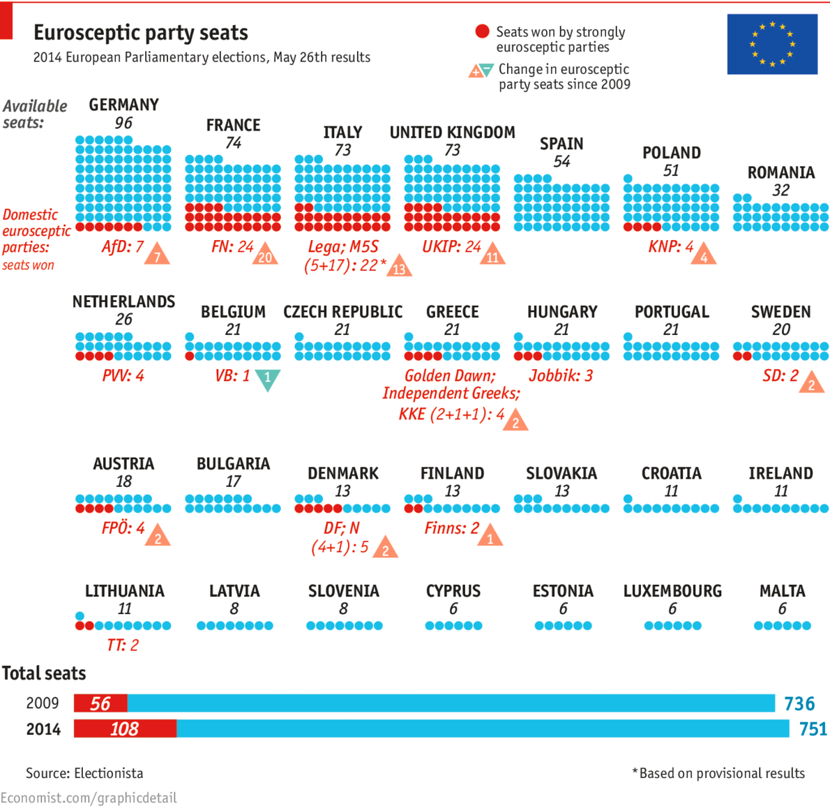
Credit for the piece goes to K.N.C. and P.K.
Happy Friday. Happy Memorial Day Weekend. Happy Summer. Just about all of those things mean a drink of some kind. And thanks to Time, we can look at ourselves and find out what drinking culture each of us best reflects. The data comes from the WHO and looks at both total consumption and then share of consumption.
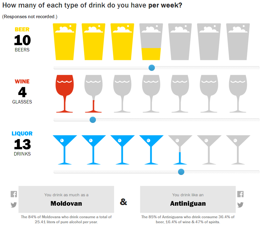
So last week I drank like a Moldovan and most nearly like an Antiniguan. Of course, they meant Antiguan. It just so happens I caught the spelling error. But since most of last week can be chalked up to a house party, I did the week before too. Then I drank like a Belarusian in the style of Guyanese person.
And for those of you who know me, yes, things like this are exactly why I record all the drinks I consumer in my little black book.
Credit for the piece goes to Pratheek Rebala.
Over the last few weeks, tensions have been rising in the South China Sea. While most of the world has been focused on violence in Ukraine and Nigeria, fishing boats and other maritime vessels in the South China Sea have been clashing—thankfully without the use of guns or missiles. These clashes contribute to a growing fear that one day, one clash will spiral out of control and lead to something more than required paint jobs for fishing trawlers.
Thankfully, for those of you unfamiliar with who exactly owns what and what they think they own versus what they think others own—in short a mapped out version of the conflict—the New York Times has put together a nice map.
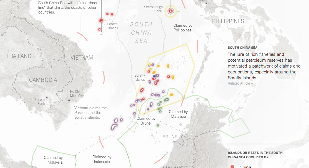
Credit for the piece goes to Derek Watkins.
While I hate coffee, I do like sankey charts. And this piece from Quartz makes use of one when discussing the exports of coffee. In particular, the article focuses on the value that coffee manufactures, e.g. Nestle, add to Swiss imports of un-roasted beans before exporting them roasted. (Increasingly in little pods.) Overall, the piece is of a digestible length and worth a read. If you like coffee. Personally, I’m sticking with tea.
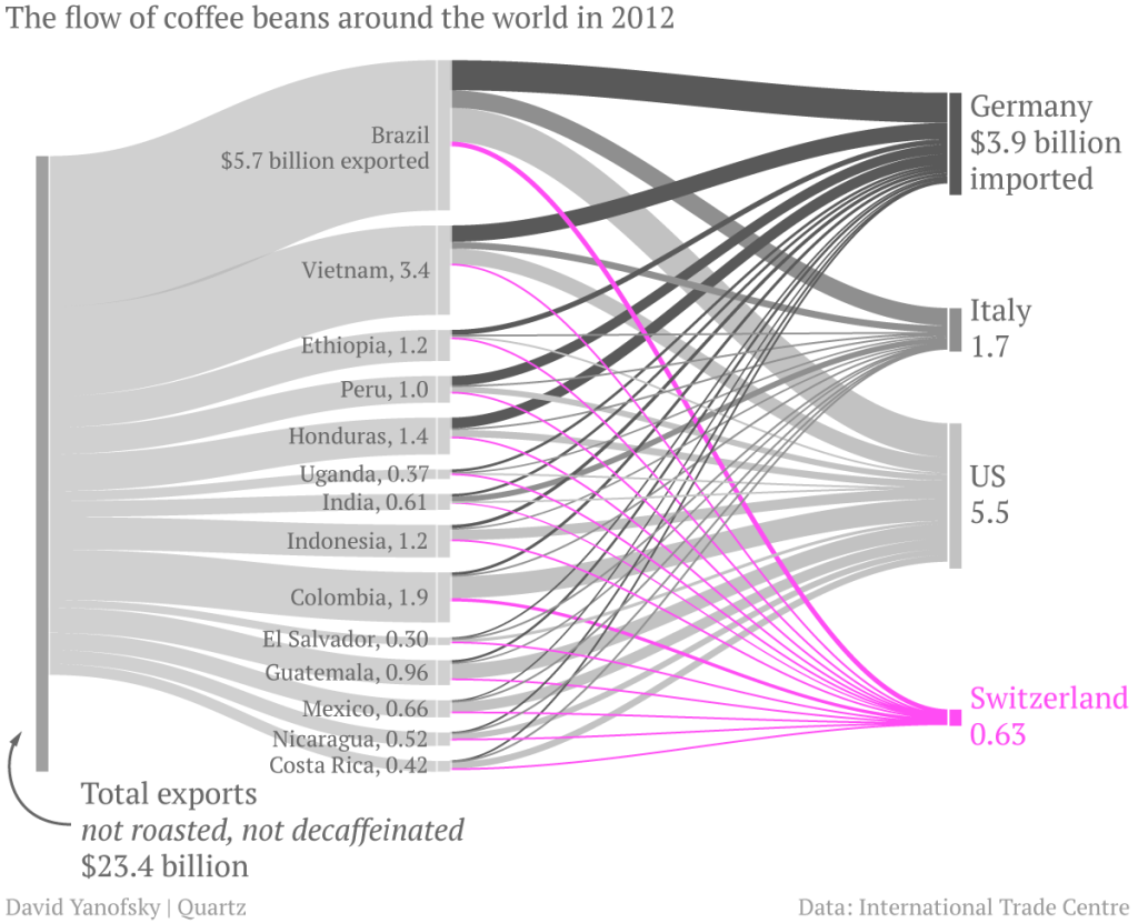
Credit for the piece goes to David Yanofsky.
Today’s piece is hit and miss. It comes from the World Economic Forum and the subject matter is the use of Twitter across Africa. I think the subject matter is interesting; mobile communication technology is changing Africa drastically. The regional trends shown in the map at the core of the piece are also fascinating. Naturally I am left wondering about why certain countries. Does spending on infrastructure, GDP per capita, disposable income levels have any sort of correlation if even only on a national and not city level?
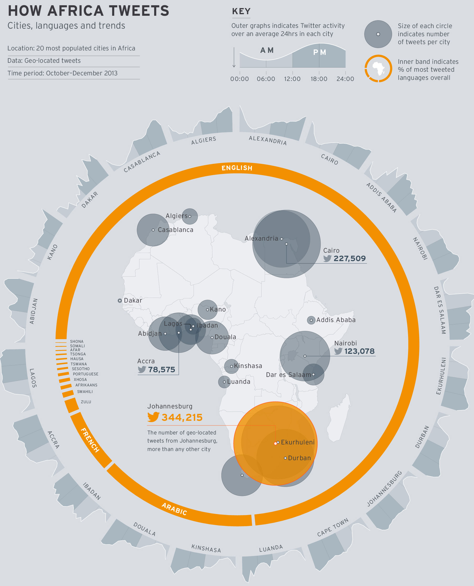
But what really irks me is the content that wraps around the map. First the donut chart, I think my objections to donuts—at least the non-edible kind—are well known. In this case, I would add—or sprinkle on—that the white gaps between the languages are unnecessary and potentially misleading.
Secondly, the cities are eventually displayed upside down. Thankfully the labels are reversed so that city names are legible. However, the continually changing angle of the chart makes it difficult to compare Douala to Luanda to Alexandria. A neatly organised matrix of small multiples would make the data far clearer to read.
In short, I feel this piece is a good step in the right direction. However, it could do with a few more drafts and revisions.
Credit for the piece goes to Allan Kamau.
Racism is a long-standing problem for humanity. But in the wake of the Donald Sterling scandal in the NBA, the New York Times put together a graphic looking at white attitudes towards blacks in the United States. The data reveals that while racist views are down from highs decades past, there is still a substantial amount.
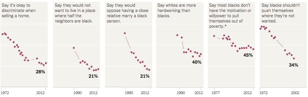
From a design standpoint, I would have probably added some sort of axis label. Additionally, I would have removed that topmost segment and used the space for the labelling.
Credit for the piece goes to Amanda Cox.
Last Friday, we looked at how one individual defined the state of Florida. Today, we look at how FiveThirtyEight attempted to get lots of people to define the Midwest.
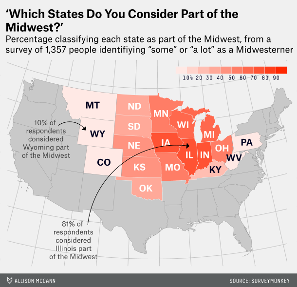
Personally, as someone from Philadelphia I tend to side with the author of the article, Walter Hickey. He writes he’s “from New York, and [he] generally consider[s] anything west of Philadelphia the Midwest.” That’s pretty much the truth.
And if you like this piece, check out the subsequent piece on defining the South.
Credit for the piece goes to Allison McCann.