Acquiring Technology via Purchases

Last week Facebook acquired a company specialising in virtual reality. The Wall Street Post put together a timeline of technology company acquisitions over the last several years. Each line is a different company and sizes of dots represent the value of the different purchases.

Technology company acquisitions

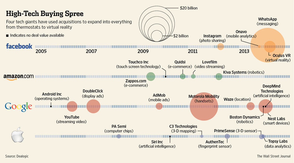
Credit for the piece goes to the Wall Street Journal’s graphics department.

Recent Military Expenditure

The Crimean situation has highlight how much not just Ukraine is not ready to fight Russia, but also how much less Western Europe is prepared to fight. This piece from the Washington Post examines actual defence expenditure and then defence expenditure as a share of GDP. While Europe has remained steady or in decline, Russia has been ramping up its defence spending since the beginning of the 21st century.

Defence spending
Defence spending

Credit for the pieces goes to Patterson Clark.

Spilling the Oil

A few weeks ago, Bloomberg Businessweek published a nice graphic that summarised the last 25 years of oil spills. I’m finally getting around to posting it. But what it does really well is show just how bad the Deepwater Horizon spill was compared to the other big name disaster: Exxon Valdez. Of particular note is the bar chart at the bottom right comparing the millions of gallons of oil spilled.

Oil spills
Oil spills

Credit for the piece goes to Evan Applegate.

New Transit Map for Springfield

Springfield from the Simpsons, of course. Happy Friday, and have fun visiting the Ethnictown station. The article comes from Atlantic Cities.

Springfield's transit map
Springfield’s transit map

Credit for the piece goes to the designers of the Simpsons.

Maps for the Search of MH 370

Yesterday we looked at the USA Today’s piece on the search for MH 370. Today we look at the New York Times, which has been running a series of maps that offer increasing amounts of detail on the context for the search.

Movement of buoys
Movement of buoys

Credit for the piece goes to Josh Keller, Sergio PeÇanha, Shreeya Sinha, Archie Tse, Matthew L. Wald, Tim Wallace, Derek Watkins, and Karen Yourish.

Finding MH370

Today’s piece comes from USA Today via a colleague. The piece is part of a larger article about the increasingly all-but-certain crash of MH 370. In step-by-step fashion, it guides the user through several facets of the flight and the investigation as well as the human impact.

Finding MH 370
Finding MH 370

Credit for the piece goes to Frank Pompa, Janet Loehrke, Jeff Dionise, Anne R. Carey and Denny Gainer, Alejandro Gonzalez, and Kevin A. Kepple.

Smoking in the US

Today’s piece comes from the New York Times. It fits within a broader article about smoking in the United States. The map is a choropleth that compares the smoking rate across counties and states in 1996 and 2012. However, as the article talks about how difficult it has been to decrease the smoking rates among the poor, I wonder if even just a third map would be useful. This map could have shown the actual decline, perhaps in percentage points, of counties between 1996 and 2012. Or another related graphic could have tried to correlate income and said change.

Map of Smoking in 2012

Credit for the piece goes to the New York Times graphics department.

The Scale of Searching for MH370

Search authorities may have finally found the missing Malaysian Airlines flight in the southern Indian Ocean. The Washington Post created this great interactive piece to give you a sense of scale of just how difficult it has been to find the aircraft.

The MH370 Search Area

Credit for the piece goes to Richard Johnson and Denise Lu.

The International Arms Trade

One of the possible set of sanctions against Russia by the United States and European Union would impact the country’s defence industries. This chart by the Economist shows how that might not have the most impact. Most of Russia’s arms exports go to China, India, and Algeria. None of whom are the United States or European Union.

International arms trade

Clearly I don’t love the pie charts. I would much rather have seen segmentation within the bars. Or a full-on Sankey diagram. But, the story is still worth telling.

Credit for the piece goes to R.L.W. and L.P.