The Polar Vortex…Or Not

If you live in the United States, you probably have heard the term polar vortex by now. People have been using the term to describe the bitterly cold temperatures affecting the eastern two-thirds of the country. But the term polar vortex is a meteorological term that means a specific phenomenon. In other words, it’s more than a hashtag along the lines of snowmageddon. The Washington Post explains what the polar vortex is.

The Post explains the polar vortex

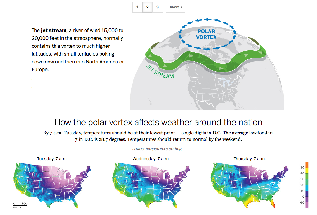
My caveat for this piece is that from my understanding, it’s not entirely correct. Or perhaps not detailed enough. In brief, we turn to the National Weather Service out of New York for a more technically correct, but more poorly designed graphic.

National Weather Service explanation

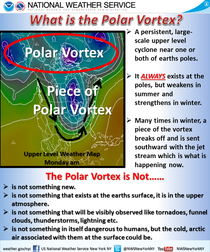
Poor type, poor colours, poor hierarchy. Those are abundantly clear, but the important part is that the NWS wants to correct many of the popular misconceptions. Somewhere between the well-intended but less-than-entirely-clear Post piece and the accurate-but-also-unclear National Weather Service piece is an opportunity to explain the concept to the public.

Credit for the Washington Post piece goes to Bonnie Berkowitz, Richard Johnson, Katie Park, and Gene Thorp.

Credit for the National Weather Service goes to the graphics team at the National Weather Service of New York.

Holiday Tidings…of War

I’ve been away for over two weeks on holiday. So to spread good cheer to all, today I am sharing an image from a series of maps the BBC put together to try and explain the civil war in South Sudan.

Ethnic groups and tribes of South Sudan

Credit for the piece goes to BBC graphics department.

Travelling for the World Cup

Well, travel for the teams, not you. It’s a big issue in Brazil because unlike the last couple of times, the teams need to travel big distances to reach the cities where they play their matches. Thankfully, to explain just how far some of these distances are for some of these teams, Quartz put together a nice article with quite a few graphics.

This graphic in particular juxtaposes the travels of the US team and the Argentinian team. Who do you think has it easier?

US and Argentinian travels

Credit for the piece goes to Jason Karaian and Ritchie King.

Winds Across the World

Most of us have likely seen the wind map by Fernanda Viegas and Martin Wattenberg. However, this new wind map takes the idea and makes it a bit more useful. It offers the user the opportunity to look at winds at different levels of the atmosphere. Or you can look at different projections. Some projections show wind patterns better than others. You can also see wind across the world, not just the United States.

Wind map
Wind map

Credit for the piece goes to Cameron Beccario.

Charting Literary Greatness

This is an interesting piece from Brain Pickings that looks at the literary careers of some of the 20th century’s greatest authors. Naturally, much debate will centre upon what is exactly a masterpiece, but if you take the subjectivity out of the graphic, you are left with an interesting piece. And I say interesting because in this case, I am not quite clear how I feel about this particular piece. But if I had the time I would love to be able to take a stab at it.

Literary careers
Literary careers

Credit for the original piece goes to La Lettura, I am unclear on who deserves the credit for translation.

Tracking You While You Text

Today’s post comes from the Washington Post, which looks at further revelations about the NSA surveillance programme. Specifically, the Post details how the NSA tracks Americans by what is called co-traveler analytics. The piece does a really nice job of explaining how the tracking works through illustrative examples.

Tracking via co-traveler analytics

Credit for the piece goes to the Washington Post graphics department.

The Long and Winding Cotton Production Path

Today’s piece is straightforward, but I felt very good at detailing its story. The Wall Street Journal mapped out the path cotton takes on its way from the fields to the denim in your jeans.

Cotton's path to market
Cotton’s path to market

Credit for the piece goes to the Wall Street Journal graphics department.

The Next Cold War?

The New York Times has a nice piece about the Arctic, which is increasingly fought over by the nations north of the Arctic Circle. Maps like these are always opportunities I enjoy to see the world in an infographic that is not a standard projection, e.g. Mercator or Robinson. The slight change in fill or opacity also serves to highlight the focus of the piece on the area north of the Arctic Circle while areas even more distant slowly fade to white.

Map of the Arctic
Map of the Arctic

Credit for the piece goes to Baden Copeland and Derek Watkins.