Cancelling the Cincinnati Streetcar Project

So Cincinnati was going to have a streetcar. Now it won’t because the recently elected mayor, John Cranley, campaigned on killing the streetcar. I won’t get into the whys and the why nots mostly because I’m not from Cincinnati and others can do it better. Suffice it to say that costs and budget battles played a part. Yesterday the city council opted to pause the project. This will likely suspend federal grant payments, meaning contractors don’t get paid, which means the city faces lawsuits for being in breach of contract, which potentially means the city spends almost as much money cancelling the project as they would completing it.

Ordinarily I would post something from a local newspaper or media outlet covering the story. But today I have the pleasure of sharing some work that my former professor made. His infographic explores the fiscal details of the streetcar project and how much Cincinnati owes if they opt to cancel it in the end.

Funding the Cincinnati Streetcar project

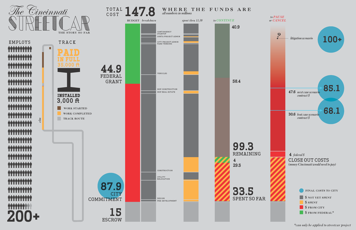
Credit for the piece goes to Giacomo Ciminello. You can download the original here. And you can visit his site here.

College Football Conference History

Your author graduated from art school. That means my college sports consisted of…a fencing team. And dancers. And some of them were cheerleaders for the Eagles I heard. Does that count? I did, however, attend Penn State for a year. So in this interactive graphic from the New York Times that tracks conference membership for various college football teams, I clicked Penn State.

Penn State football history

Colour is effective in this piece. The use of purple to highlight key stories off the grey background becomes even more important when they are offset from the selected schools in orange. If you cannot find your particular line of interest, a drop-down menu makes for an easy selection.

Bonus points—not shown here—for using spark lines in the introductory paragraph. A solid piece overall.

Credit for the piece goes to Mike Bostock, Shan Carter, and Kevin Quealy.

Speeding on Chicago’s Tollways

The Illinois Tollways will be raising speed limits starting 1 January. Part of that process includes researching current driving habits and patterns. This graphic by the Chicago Tribune looks at some of the results. While the map part is necessary to show the routes themselves and the limits on those routes, the more interesting part is the dot plot below.

Illinois Tollway speeds

Credit for the piece goes to the Chicago Tribune’s graphic department.

Travelling in Space and Time

Following last week’s post about Doctor Who comes another because, since this is the last post of the week, you might as well enjoy it. This interactive graphic from the BBC looks at the Doctor travelling across time. And while you might dismiss it as being silly fun, pay close attention to the layering of timelines and the information provided in each line, i.e. click on one. Additionally, the bottom panel contains some broader context. Overall, this is a very smart piece.

The Doctor's Travels
The Doctor’s Travels

Credit for the piece goes to iibStudio and the BBC graphics department.

Enriching Uranium

This past weekend, the US and allies reached an agreement with Iran on the Iranian nuclear programme. In this graphic the Washington Post explains the several steps necessary to take uranium and make it useful for a reactor, a research reactor, and nuclear weapons. Admittedly, a simplified diagram, but still quite useful.

Enriching uranium
Enriching uranium

Credit for the piece goes to the Washington Post graphics department.

Peyton Manning is a Pretty Good Quarterback

On Sunday night the Denver Broncos played the New England Patriots. The contest sported two of the game’s best quarterbacks: Tom Brady and Peyton Manning. This interactive graphic by the Guardian detailed how, in this season alone, Manning is putting up record numbers.

Comparing Manning's stats
Comparing Manning’s stats

Credit for the graphic goes to the Guardian US interactive team.

50 Years of the Doctor

Doctor Who? Exactly. This weekend, Saturday in fact, is the 50th anniversary of British sci-fi show Doctor Who. That is not to say it has been airing for 50 years. In the 1990s and early 2000s the show was off the air, living on only in audio broadcasts and novelisations. But in 2005, the show was relaunched and it slowly began to acquire a new generation of followers. Some, like your author, have watched it in the States first via SyFy since 2006.

Still 50ish years of television about time travelling through space in a blue police box makes for lots of data. And so back in March Simon Rogers created this infographic to explain some of the history of the show.

The Guide to Doctor Who

If you intend on watching the 50th special this weekend—or Monday in some movie theatres here in the States—and you want to brush up on the timeline of the Doctor and his travelling companions, the Guardian also has this graphic.

The Guardian's gallery of Doctors
The Guardian’s gallery of Doctors

But of course the BBC, which produces Doctor Who, has a more in-depth site about the history of the character and the show. Did I mention the content is displayed within the TARDIS? I know, it’s bigger on the inside.

The BBC's inside the TARDIS
The BBC’s inside the TARDIS

Have you ever watched the show? Do you have a favourite Doctor? A favourite companion?

Credit for the first Guardian piece goes to Simon Rogers.

Credit for the second Guardian piece goes to the Guardian’s Graphic News team.

Credit for the BBC piece goes to Christopher Ashton, Christine Jeavans, Helene Sears, Tian Yuan, Nick Davey, and Ben Fell.

The Tallest of the Tall (in Los Angeles)

I have always had an interest in architecture. And so this piece from the Los Angeles Times is just because I like to indulge myself every so often, a look at the five tallest buildings in Los Angeles.

Map of the five tallest buildings

Credit for the piece goes to Scott J. Wilson, Matt Moody, and Anthony Pesce.

Internet Explorer in South Korea

The Washington Post had an interesting story on how, in South Korea, Internet Explorer dominates the internet. I won’t spoil the story, it is kind of fascinating and worth a short read, but the accompanying graphics show just how dominant the browser has been in a leading technology country in Asia.

Internet Explorer in South Korea

Credit for the piece goes to Richard Johnson.