There Goes the Shore

The National Oceanic and Atmospheric Administration (NOAA) released its 2022 report, Sea Level Rise Technical Report, that details projected changes to sea level over the next 30 years. Spoiler alert: it’s not good news for the coasts. In essence the sea level rise we’ve seen over the past 100 years, about a foot on average, we will witness in just thirty years to 2050.

Now I’ve spent a good chunk of my life “down the shore” as we say in the Philadelphia dialect and those shore towns will all have a special place in my life. But that looks more to be like a cherished memory fading into time. I took a screenshot of the Philadelphia region and South Jersey in particular.

Not just the Shore, but also the Beaches

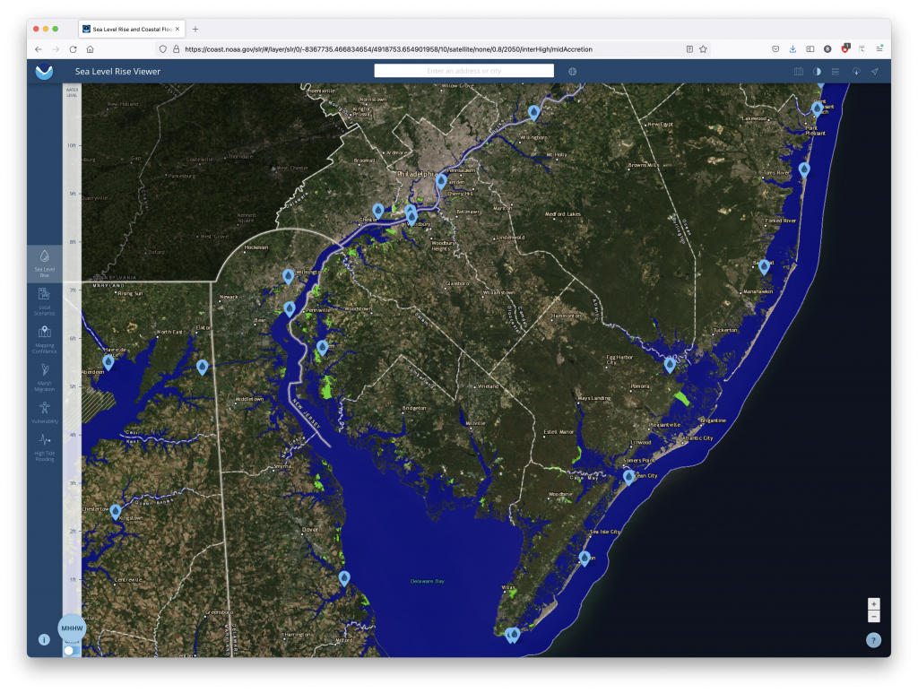
To be fair, that big blob of blue is Delaware Bay. That’s already the inlet to the Atlantic. But the parts that ought to disturb people are just how much blue snakes into New Jersey and Delaware, how much/little space there is between those very small ribbons of land land off the Jersey coast.

You can also see little blue dots. When the user clicks on those, the application presents the user with a small interactive popup that models sea level rise on a representative photograph. In this case, the dot nearest to my heart is that of the Avalon Dunes, with which I’m very familiar. As the sea level rises, more and more of the street behind protected by the dunes disappears.

My only real issue with the application is how long it takes to load and refresh the images every single time you adjust the zoom or change your focus. I had a number of additional screenshots I wanted to take, but frankly the application was taking too long to load the data. That could be down to a million things, true, but it frustrated me nonetheless.

Regardless of my frustration, I do highly recommend you check out the application, especially if you have any connection to the coast.

Credit for the piece goes to NOAA.

Bodies Buried Under Spring Garden

Okay, technically not Spring Garden Street, but a strip mall along one of Philadelphia’s main arterial city streets. Luckily these aren’t some victims of a serial murderer, but rather the result of Philadelphia being an old city (for the United States). As this article from the Philadelphia Inquirer explains, the bodies were discovered during excavations for new construction at the site.

The reason I shared this today was that this past weekend, I had a pint with a colleague of mine at Yards Brewery located at 5th and Spring Garden. We sat at an outside table along Spring Garden and at some point I recall pointing out that Spring Garden hadn’t always been a street. Originally it only existed west of Broad.

Little did I know that the construction site across the street on that sultry Sunday afternoon was home to an archaeological excavation of an old, long since demolished city church cemetery.

Of course I still want a tram/trolley or light rail line to run down the length of Spring Garden like it did in years past.

You can use the slider in the article to compare the layout of the intersection in 2021 to that of 1860. I love these old timey maps, especially when working on genealogy. Because while we know the cities where we live today, they didn’t look like we know them 150 years ago. And in lieu of photography, it’s otherwise difficult to try and make sense of our ancestors’ world.

Just a few doors south of the Methodist church we had a bakery and a small alley called Brussels Place. And facing the alley we had what look like a number of small homes or perhaps stables. Larger presumably rowhomes lined the main streets of the intersection.

At the right of the screen, I also remember my colleague and I discussing some of the old-looking rowhomes. They may very well be the same ones depicted on this 1860 map. They are the few survivors as most of the area, as the article points out, was eventually turned into a petrol station that later became the strip mall today fenced off to be turned into flats.

Credit for the piece goes to John Duchneskie.

This Is Not My Populous State

With the release of the 2020 US Census’ topline data, we can see which state populations increased and which few decreased. And in that we can sort, or resort, states by population. The Washington Post did this a few weeks ago with an interactive ranking chart in a nice online article. (I’d be curious what the print version was, alas I only receive the New York Times.)

The piece begins with a nice intro motion graphic that selects states and shows how their ranking among the other states (plus the District of Columbia, DC), has evolved since 1920.

Here we see the fall of Iowa in the rankings.

After scrolling down briefly, the reader enters a portion of the story displayed by keeping the hero graphic static whilst blurbs of texts scroll over the lines. As the blurbs move past, different states or sets of states become highlighted to draw attention to them.

I guess I’m picking on Iowa?

This works really well. When discussing the case of Iowa vis-a-vis the growth of California, Texas, and Florida, I don’t need to see the story of Nebraska. Especially as the end of the piece features this hero graphic as an interactive, explore-the-data piece of content. I don’t have a screenshot of that, because it’s really just the above two but with a dropdown selector and a legend.

As the user scrolls through the story, they move past the semi-motion graphic and into a text-driven narrative for each region of the United States. I’ve highlighted only the Northeast, where I was born, raised, and presently live. As an aside, I remember my family completing the 2000 Census around the kitchen table. The 2010 Census I filled out at a small desk not long after I moved into my second flat in Chicago. And this most recent one I completed whilst under quarantine here in Philadelphia.

The Northeast. Definitely not Iowa.

This section of the article uses static images with the region’s constituent states highlighted. Again, this works really well, because when looking at the Northeast, I’m still not interested in Nebraska. And also again, we have the interactive explorer at the end of the article.

Overall this is a really strong piece from the Post. I have some quibbles with the design, primarily I don’t understand the function of the connecting lines’ fades and curves. But I find neither too terribly distracting from the content of the graphic.

Credit for the piece goes to Harry Stevens and Nick Kirkpatrick.

Can We Pop Our Political Bubbles?

It’s no secret that Americans—and likely at least Western communities more broadly—live in bubbles, one of which being our political bubbles. And so I want to thank one of my mates for sending me the link to this opinion piece about political bubbles from the New York Times.

The piece is fairly short, but begins with an interactive piece that allows you to plot your address and examine whether or not you live in a political bubble. Using my flat in Philadelphia, the map shows lots of little blue dots, representing Democratic voters, near the marker for my address and comparatively few red dots for Republicans.

An island of blue in a sea of red.

If you then look a bit more broadly, you can see that by summing up the dots, my geographic bubble is largely a political bubble, as only 13% of my neighbours are Republicans. Not terribly surprising for a Democratic city.

A certain lack of diversity in political thought.

And while the piece does then zoom back out a wee bit, it tries to show me that I don’t live too far from a politically integrated bubble. Except in this case, it’s across a decent sized river and getting there isn’t the easiest thing in the world. I’m not headed to Gloucester anytime soon.

Things are better in Jersey?

These interactives serve the purpose of drawing the user into the article, which continues explaining some of the causes of this political segregation, by both policy, redlining, and personal choice, lifestyle. The approach works, because it gives us the most relatable story in a large dataset, ourselves. We’re now emotionally or intellectually invested in the idea, in this case political bubbles, and want to learn all about it. Because the more you know…

The piece uses the same type of map to showcase the bubbles more broadly from the Bay Area to the plains of Wyoming. (No surprises in the nature of those political bubbles.) It wraps up by showing how politicians can use the geography of our political bubbles to create political geographies via gerrymandering that shore up their political careers by creating safe districts. The authors use a gerrymandered northeastern Ohio district that encompasses two cities, Cleveland and Akron, to make that point.

That’s in part why I’m in favour of apolitical, independent boundary commissions to create more competitive congressional districts. Personally, I would have been fascinated to see how Pennsylvania’s congressional districts, redrawn in 2018 by the Pennsylvania Supreme Court, after the court found the gerrymandered districts of 2011 unconstitutional, created political competition between parties instead of within parties. But I digress.

And then for kicks, I looked at how my flat in Chicago compared.

Less island of blue and sea of red, because a lake of blue water alters that geography.

Not surprisingly, my neighbourhood in Lakeview was another political bubble, though this one even more Democratic than my current one.

Lakeview is even more Democratic than Logan Square, Philly’s Logan Square that is.

But if I had wanted to move to an integrated political bubble, instead of Philadelphia, I could have moved to…Jefferson Park.

Because everyone can agree Polish food is good food.

Credit for the piece goes to Gus Wezerek, Ryan D. Enos and Jacob Brown.

The Armchair General…

Manager.

Of the New England Patriots.

As many of my long-term readers know, I am really only a one sport kind of guy. And that sport is baseball. American football, well, I’ve seen one match live and in person and it was…boring. But it’s a big deal in America. And this is the time of the year when teams begin signing free agents.

I happened to be reading the Boston Globe for news on the Red Sox, my team, when I saw a link to this interactive tool allowing users to build their own roster with free agent signings.

Go Pats

Conceptually, the piece is fairly simple. There is a filterable list of free agents, broken out by whether their forecast signing values falls into the high-, middle-, or low-end of the range. Plus a draft pick.

I root for the Patriots. However, if you asked me to name a single player on last season’s roster, I could only name Cam Newton. Apparently he wasn’t great. I really and truly don’t follow the sport.

The piece displays the available free agents, along with those no longer available. (Though, the piece does offer you the option to go back to the beginning of free agent season and pretend reality didn’t happen.)

I have no idea who any of these people are.

I went through and began semi-randomly picking names. I’d heard of some of them, and others were blind choices. Once you’ve selected within the budget, you can choose a draft pick. They all appear in list format to the right with the ability to remove them via a small X button.

Nope, not a clue.

Once you’ve confirmed your choices you’re taken to a screen that reviews your selection. You are able to either tweet it to the world—which I did not do—or start over again. I would do that, but I wouldn’t do any better than how I just did.

I hope I did at least okay.

Overall, the piece felt intuitive and I never had any issues selecting my free agents. Of course, it would help if I knew anything about the sport. But that’s a user problem.

Credit for the piece goes to Ben Volin.