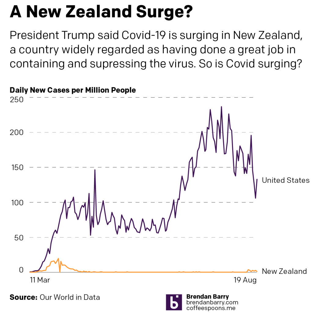
Yesterday, President Trump claimed that Covid-19 was “surging” in New Zealand, a country widely lauded as having successfully contained and suppressed their outbreak. That has allowed Wellington to reopen large swathes of their economy without incident.
Until this surge.
And by surge we mean something like 30 cases in 3 days. So, let’s compare that surge to the numbers of new cases in the United States.
Now, to be fair, New Zealand has a population of nearly 5 million, the United States has nearly 335 million. So a direct number-to-number comparison of the number of new cases per day isn’t fair.
So let’s look at the number of new cases per million people, which equalises the data for population.
So yeah, New Zealand is not “surging”. The data shows that even with the more limited testing per capita conducted in the United States, we are nowhere near the point of bending the curve anywhere close to zero.
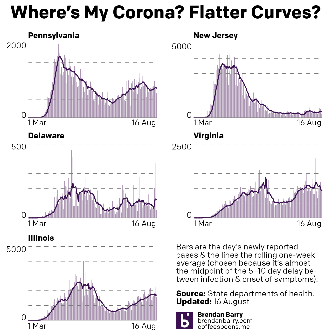
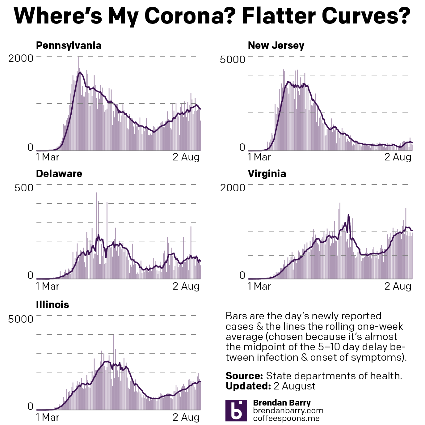
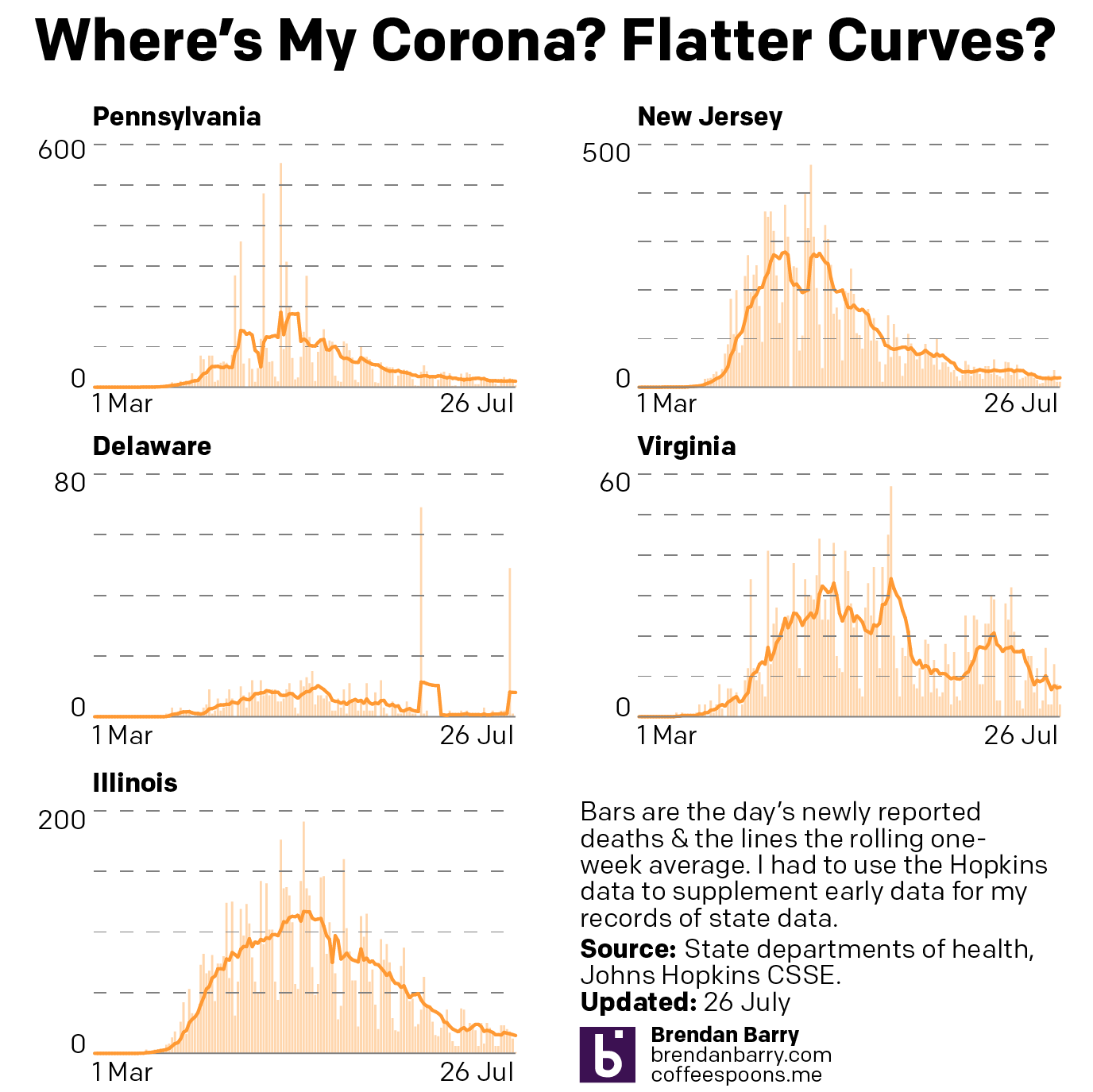
So here are the charts from the last week of Covid data in Pennsylvania, New Jersey, Delaware, Virginia, and Illinois.
When we compare last week’s update to today’s, we can see that Pennsylvania did indeed bottom out and is back on the rise and the same can probably be said for Delaware. Although a fair amount of the one-day spikes in those numbers we see today are from an outbreak in a correctional system.
Whilst Virginia did go up, by week’s end, it had settled back down to a point not dissimilar to last week. So nothing really changed and time stood still in Virginia. The same can also be loosely said for New Jersey, where it was more about fluctuations than determined rises or falls.
In Illinois, however, we finally saw a plateauing of the new cases numbers and with the slightest of declines .
New cases curve in PA, NJ, DE, VA, and IL.
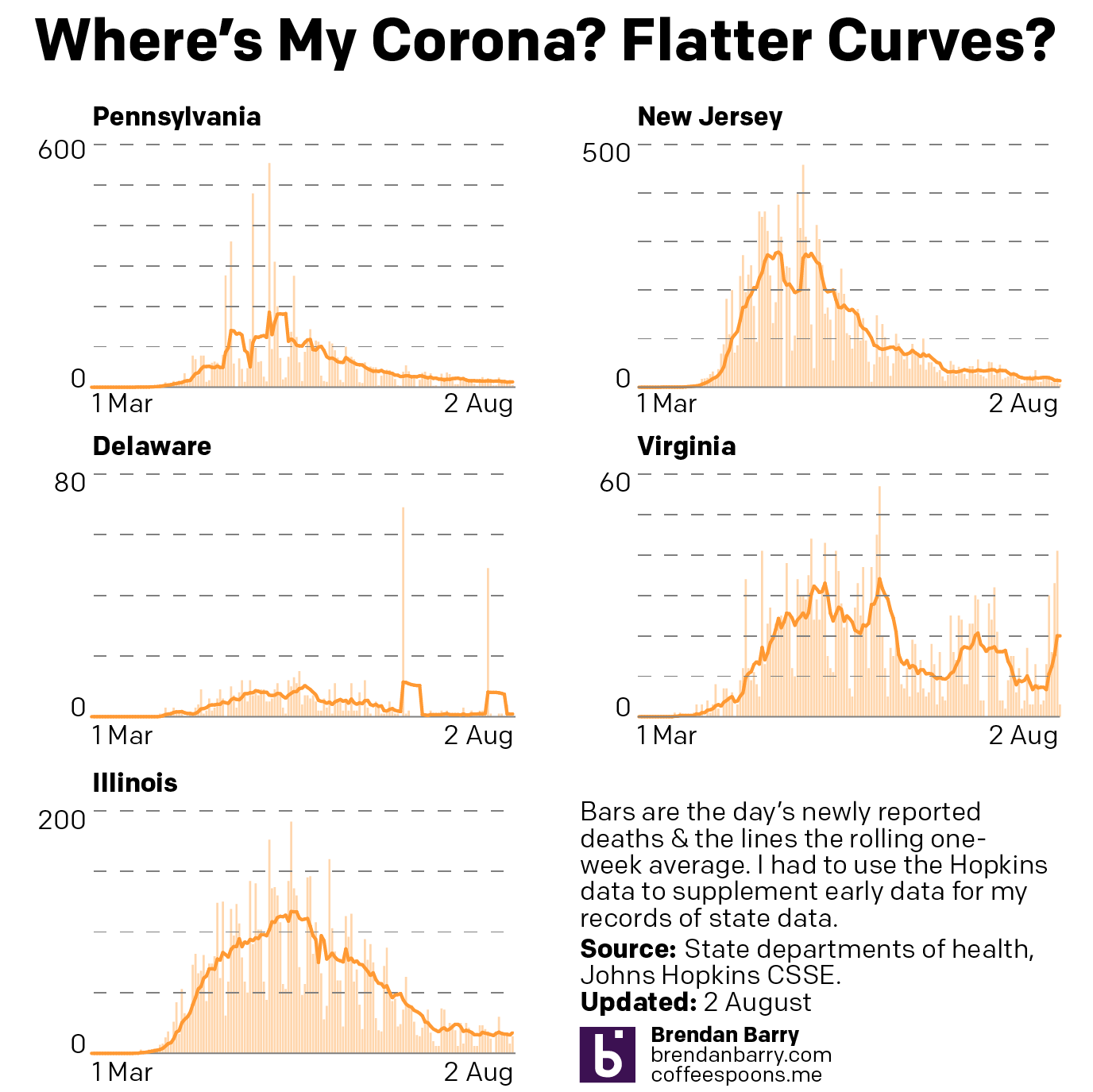
Then in deaths we have not much to say as they remain low in New Jersey and Delaware and stable and moderate in Illinois.
Virginia’s recent spike appears to have subsided, as it’s back to nearly 10 deaths per day from the virus.
But most concerning is Pennsylvania. Here, while the numbers are still relatively low, they are on a slow and gradual rise. At this point the seven-day average is beginning to rise above 20 deaths per day.
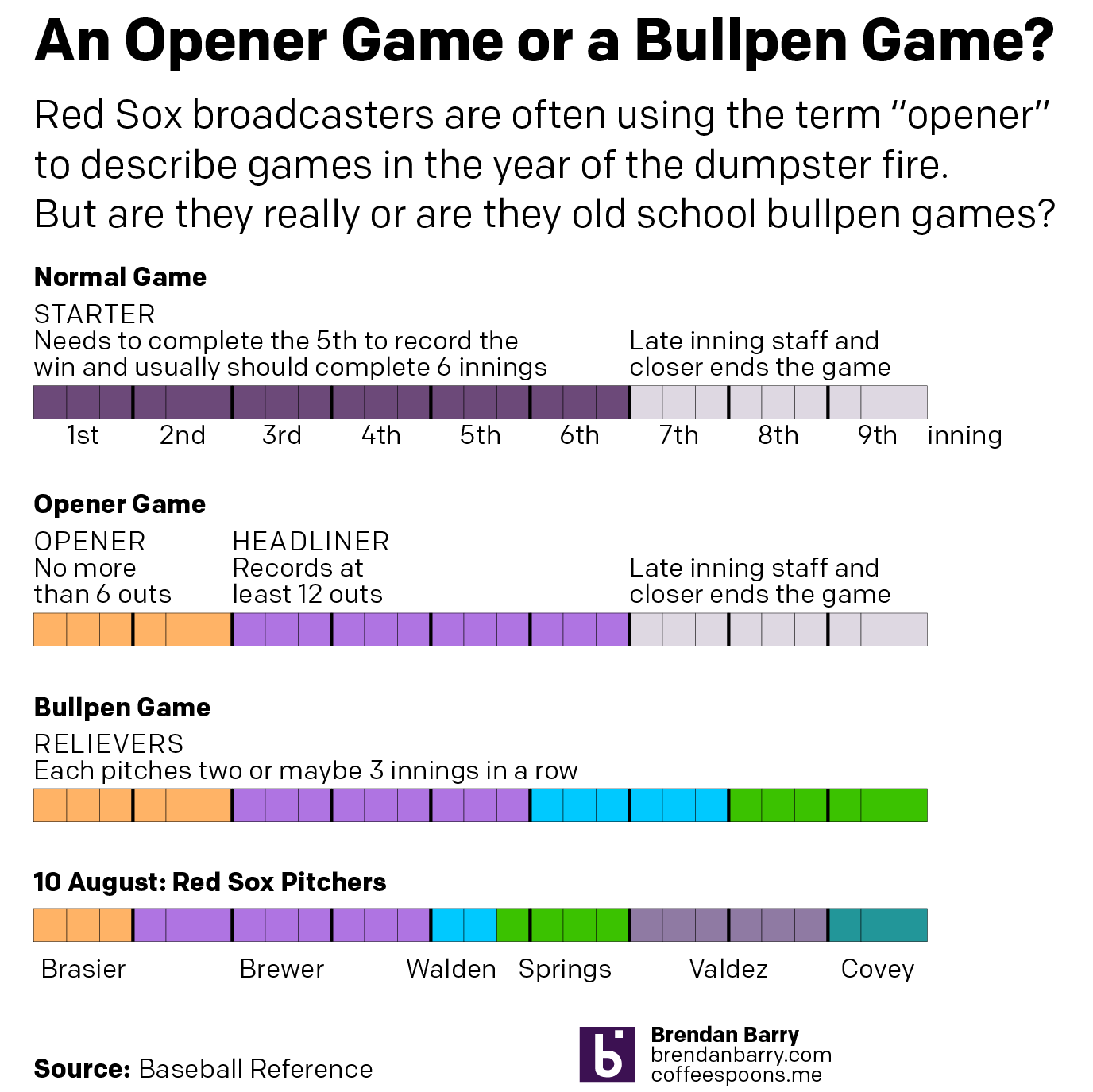
Whenever someone not named Eovaldi or Perez starts a Red Sox game in 2020, that’s when.
We all know the Red Sox are the worst team in the American League. They have only two starters, maybe sometimes a third. And then the last two days of the regular five-day rotation cycle, manager Ron Roenicke throws some relievers at the wall and sees which ones stick that night. Spoiler: Few do.
But as much as I enjoy listening to the three-man broadcasting booth (Remy and Eck make the games fun to at least listen to) the games are unwatchable. And then to hear them try and dress a game up as having an opener? Well, what is the opener?
For the non-baseball fans, most are probably aware enough that some guy goes out to a small hill and throws (pitches) a ball at a batter for most of the night. Then towards the end, when the guy’s energy wanes, he is replaced by some guy who throws really fast. That’s over simplified, but that’s a normal ballgame. A starting pitcher records five, but ideally at least six, innings of work before handing the ball over to an eighth-inning setup man and then a ninth-inning closer. Sometimes a really good seventh-inning reliever sets up the setup man.
A bullpen game, by contrast, is when a bunch of those relief pitchers handle the entire game. Usually this would be after a game went into extra innings (since baseball cannot end in a tie, unless you’re in an All Star game), and the next day’s starting pitcher had to finish the long game by pitching several innings. With nobody available to throw six innings, a bunch of relievers come in and try to cover that by pitching one, two, or three innings each.
The opener game is relatively new. The idea is in addition to the really good closer, a really good opener records the first inning or two (3–6 outs) to deal with the opposing team’s best hitters. He then hands the ball over to a mediocre starting pitcher who throws the next four or five innings, who then hands the ball over to the late-inning relief specialists. Doing it this way, the starter avoids one set of at-bats or plate appearances by the opposition’s best hitters.
But when is an opener just a bullpen game? Well, it’s when that mediocre starting pitcher isn’t really a starting pitcher. And when he doesn’t even throw four or five innings. Basically all the Red Sox games this year.
I made a graphic this morning to contrast those different types of games and compare them to a game I watched two nights ago between the Red Sox and the Tampa Bay Rays. The game was teed up as an opener with a good relief pitcher by the name of Ryan Brasier starting the first inning. But then instead of a mediocre starter pitching four or five innings, we got a mediocre reliever pitching three innings. He handed it over to a guy who was supposed to go maybe two, but couldn’t get through his second inning. He handed it over to another guy, who handed it over to another guy, who handed it over to a final guy. And none of those last guys were the good relievers you would typically expect to see. (Though, to be fair, the Sox weren’t winning, so why use your best relievers?)
Different game types compared
Credit for the piece is mine.
Credit for the Red Sox dumpster fire of a season goes to John Henry and ownership.
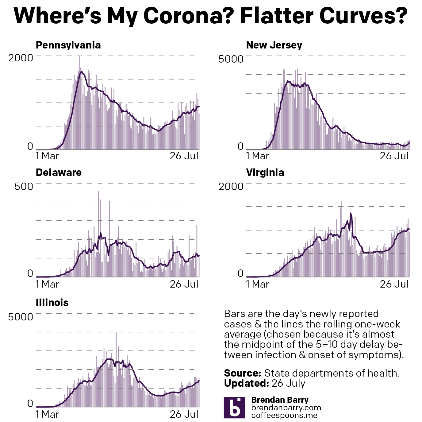
Weekend data means, usually, lower numbers than weekdays. And with the exception of Delaware that’s what we have today. Some drops, like Illinois, are more dramatic than others, like New Jersey. And so we look at the seven-day trend.
And that tells a slightly different story. On the one hand we have states like Virginia and Illinois that appear to be continuing upward. The rise in Illinois has been slow and steady, but the average is approaching nearly 2000 new cases per day. In Virgina, the rise was more abrupt and the question is whether this peak has crested in recent days or if come the middle of next week it will resume rising.
In New Jersey and Delaware we see two states with does declines after some sudden spurts of new cases. Jersey had risen to nearly 500 new cases less than two weeks ago, but that’s now back down to fewer than 350. And in Delaware, while today’s number is greater than yesterday’s, the trend is still downard after being at over 100 new cases per day two weeks ago.
New cases curves for Pennsylvania, New Jersey, Delaware, Virginia, and Illinois.
Then we have Pennsylvania. At one point doing it had done so well in controlling the outbreak to bend the curve to fewer than 500 new cases per day at one point. Then as the state began to reopen, cases began to rise again in the west and now the east. But over the last week that statewide average began to fall. But in the last two days that fall appears to have potentially bottomed out. So come the middle of next week, the question will be does the downward trend continue or has the state hit a new valley before another rise?
Finally, in terms of new deaths, with the exception of Virgina, we have yet to see any rise in deaths that might correlate with the recent rises in new cases. And so nothing new there. But it’s worth pointing out that New Jersey has now reached the high single digits in terms of daily deaths from Covid-19. That’s remarkable for a state that back in April saw nearly 300 people dying every single day.
New death curves for Pennsylvania, New Jersey, Delaware, Virginia, and Illinois.
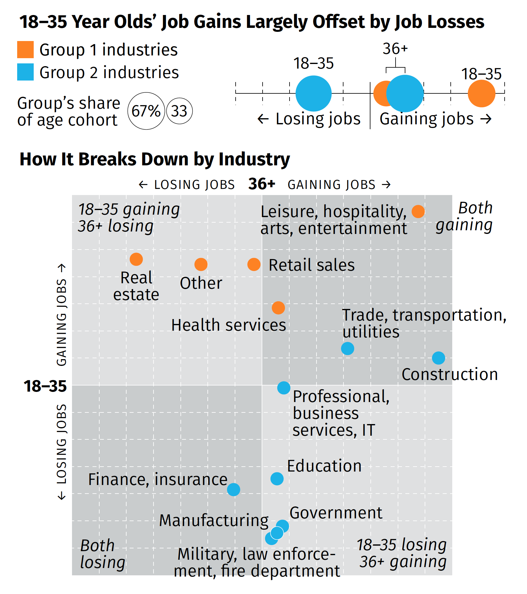
Earlier this week, some of the work work my team does was published. We produced a one-page summary of a far larger and more comprehensive (relative to the scope of the summary) survey of consumers during the Covid Recession. I will spare you the details of recreating existing templates from scratch and the design decisions that went into that bit—neither insignificant nor unsubstantial—and rather focus on the one graphic we designed.
The broad thrust of the summary is that while overall we are beginning to see some job recovery, that the recovery is uneven and that, in fact, those below the age of 36 are getting hit pretty hard (my words, not the authors). That while in some industries the young are recovering in good numbers, in other industries, industries with a larger share of the youth population, young people are still losing jobs. Then we broke those top line numbers out by industries in the below graphic captured by screenshot.
There are a couple of things from a design side to discuss. We had about two or three days from when we started the project to develop some ideas and then execute and produce the summary. And as I noted above, that also included quite a bit of time in emulating existing documents and building ourselves a new template should we need to do something similar in the future.
But for that graphic in particular, there’s one thing I wanted to highlight: the lack of values on the axis. The challenge here was that the data displayed is people not working. And when we compared this time period (Wave 3) to the earlier waves, we were looking for declines. And so if we going to say that 36+ are gaining construction jobs, that would be -2% value and the youth are about a -13% increase. If you are doing a bit of a double-take at a negative increase, so did the team. Ultimately, we used the data to generate the chart, but then opted for qualitative labelling on the axes. They simply point that in one direction, youth are either gaining or losing jobs, and the same for the 36+. To reinforce this idea, we also added some descriptors in the far corner of each quadrant that said whether the age groups were gaining or losing jobs.
Despite the unusual design decisions I took in the graphic, I’m really proud of this piece especially given its tight turnaround. It shows in almost real-time how fractured the recovery—is this a recovery?—is at this point.
Credit for the piece goes to the team on this, Tom Akana, Kate Gamble, Natalie Spingler, and myself.
As I mentioned last week, I am going to try using my blog here for the weekly update on the five states people have asked me to explore. And for the second week in a row, we are basically seeing numbers down compared to previous days. But given that numbers are generally lower on the weekends, that is not terribly surprising.
The real question is by Friday, will these numbers have rebounded?
Earlier this morning, the Bureau of Economic Analysis released its US 2nd quarter GDP figures and the news…isn’t great. On an annualised basis, we saw -32.9% growth. That’s pretty bad. Like Great Depression level bad. I’ve posted on the social media how bad this current recession is and how nobody in the workforce today worked or didn’t through the Great Depression to really relate to the numbers we are seeing.
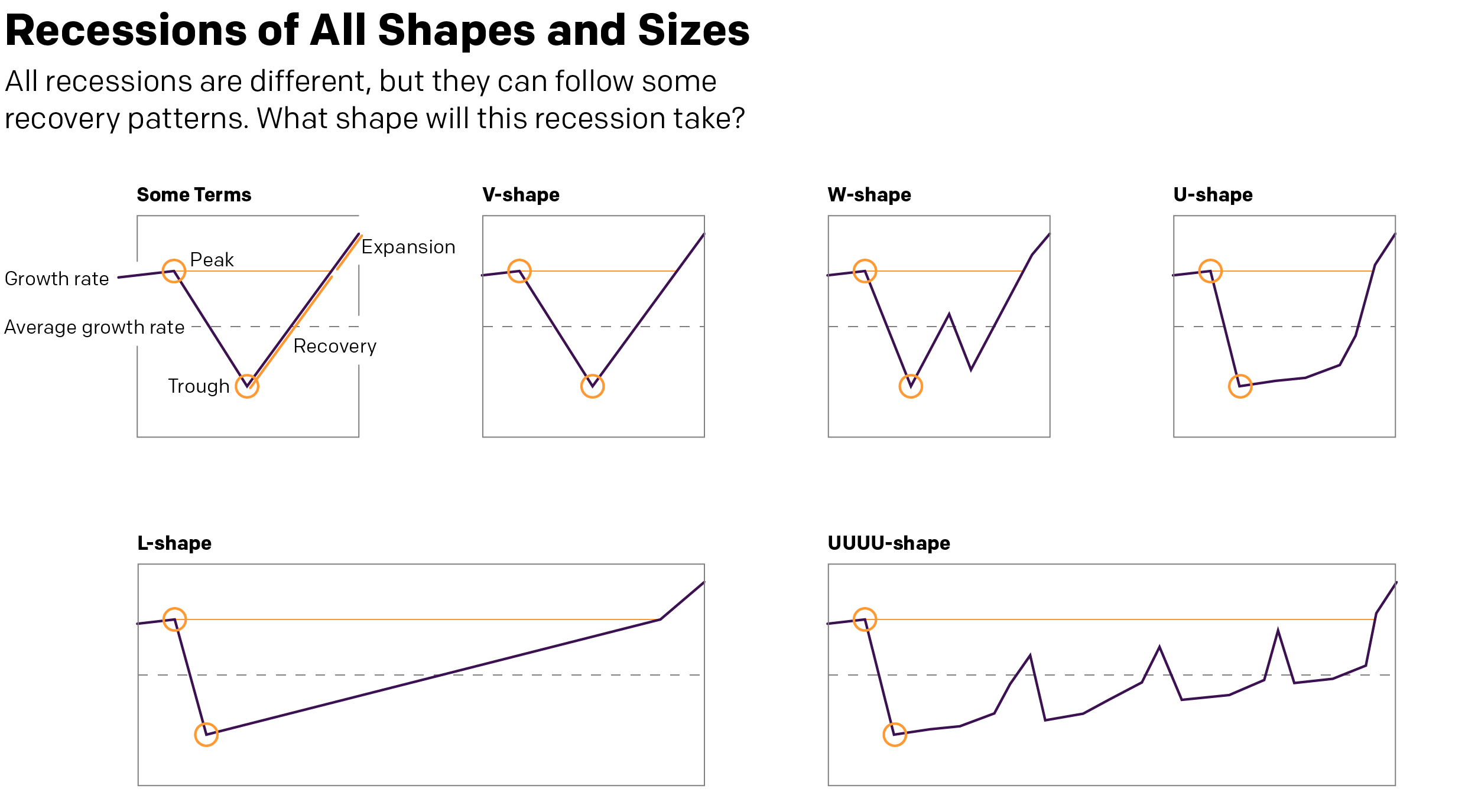
But that’s all today. The sun will come out tomorrow. (And scorch the Earth as climate change renders certain parts of the globe uninhabitable to mankind. But we’ll get to those posts in later weeks.) And when it does come out, eventually, what will the recovery look like? I’ve seen a few mentions recently in the media of a V-shaped recovery. What is this mysterious V-shape?
A long time ago, in a galaxy far away. Or during the last recession in Chicago, I worked with some really smart people in some of my professional projects and we covered the exact same question. There are a couple key “shapes” to an economic recovery. And when we say recovery, we mean just to return to pre-recession peak levels of growth. Anything above that is an expansion. That’s what we want to get back to.
Who knew typographers loved economics?
The V-shape we hear a lot about is a sharp recovery after the economy bottoms out (the trough). Broadly speaking, if a recession has to last two consecutive quarters (it doesn’t, but that’s a pretty common definition so let’s stick with it), then in a V-shape, we are talking about a recovery one or two quarters later.
Similar to the V is the W-shape, where things start to improve rapidly, but some kind of shock to the economic system and things go back negative once again before finally picking up quickly. It’s not hard to imagine something going horribly wrong with the Covid-19 pandemic to be just that external shock that could push the economy back down again.
Similar still is the U-shape. Here, after hitting rock bottom, growth isn’t quite as quick to pick up as we linger in the depths of the valley of recession. But after a bit of time, we again see a rapid recovery to pre-recession levels of growth.
These are all pretty short term recoveries, the W being a little bit longer because two sharp downturns. But they are nothing compared to what’s also possible.
First we have the L-shape. Here, after hitting bottom, things start to recover quickly. But that recovery is slow and takes a long time. Growth remains slower than average, creeping up to average, and then still takes its time to reach pre-recession levels. Is something like this possible? Well, if vaccines fail and if some countries still can’t get their act together (cough, US, cough), the willingness of consumers to go out, eat, drink, buy things, travel, and generally make merry could be suppressed for a long time. So it’s certainly not out of the question.
And then lastly we have the UUUU-shape. Though you could probably add or subtract a U or two. This features more drawn out stays at the bottom of the valley with quick and sharp upticks in growth. But those growths, never reaching pre-recession levels, also collapse quickly back into declines, though also never really reaching the same depths as earlier. Essentially, the recovery faces multiple setbacks knocking the economy back down as it sputters to life. As with the L-shape, it’s also not hard to imagine a world where a country hasn’t managed to contain its outbreak struggling to get back on its feet.
What do you think? Are we at rock bottom? Did I miss a recovery type?
I do not want this blog to become a permanent Covid-19 data site. So in my push to resume posting last week, I tried to keep to from posting the numbers and instead focused on discussing how the data is displayed.
But I hear from quite a few people via comments, DMs, emails, and text messages that they find the graphics I produce helpful. So on the blog, I’m going to try posting just one set of graphics per week. Will it always be Monday? I don’t know. On the one hand, new week, new data. But on the other, weekend numbers tend to be lower than the rest of the week and could make it seem like, yay, the numbers are starting to go down especially if you only come to my blog and only see this data once a week.
Daily new casesDaily new deaths
So yeah, we’ll see how this goes. And I’ll try to keep Tuesday–Friday to discussing the world of data visualisation, although in these days, a good chunk of it will likely revolve around Covid.
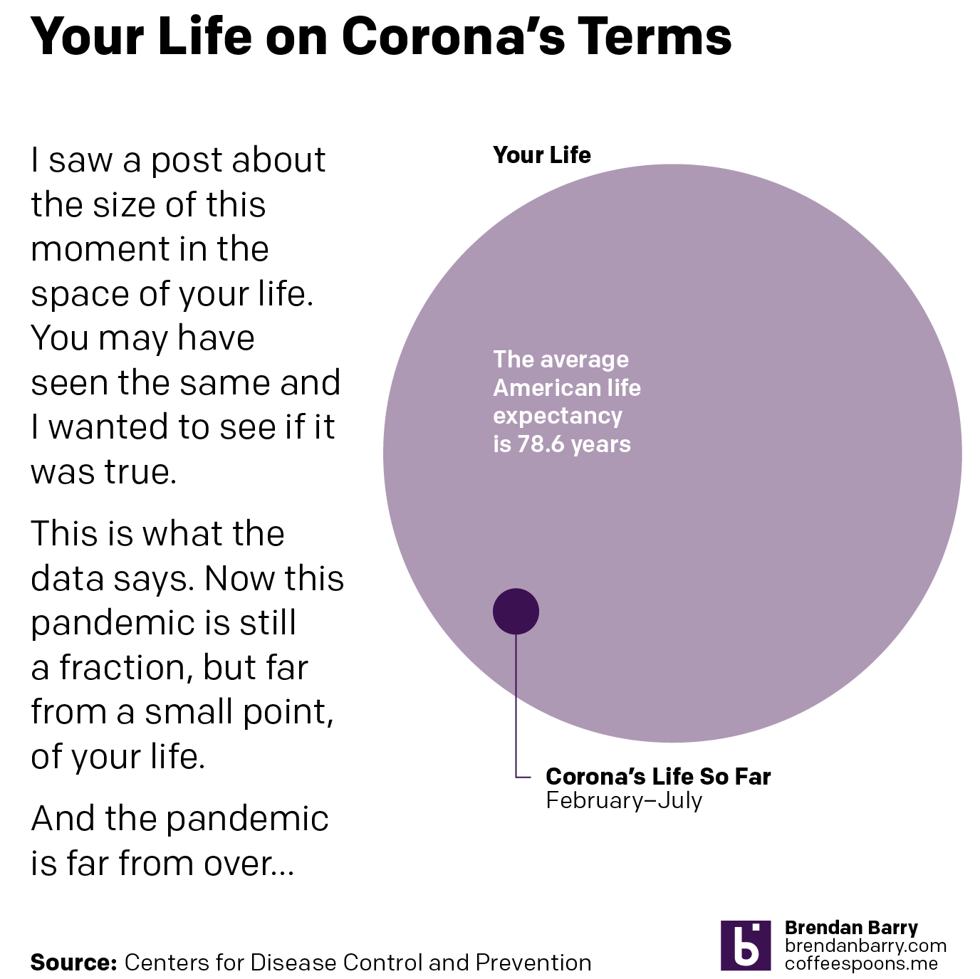
Earlier this week I was on the social medias when I came across a graphic some people were sharing that was meant to be inspirational. It had a giant circle and then a small black pixel that represented “this moment”. Of course, how you define the moment is entirely subjective.
But it made me wonder, if we looked at the coronavirus Covid-19 pandemic as a moment in our lives, how big of a moment is it? Well, I went to the CDC to get a sense of the average life expectancy of an American and then I got the fraction of that lifespan that is the last six months. And, well take a look.
A not so insignificant span of time
As you can see, the Covid-19 pandemic is more than just a pixel. It’s a significant moment, and of course the pandemic is ongoing. There are new concerns that the 2020 Olympics, now postponed to 2021, may not happen in 2021.
That dot represents graduations, weddings, funerals, birthdays, anniversaries, holidays, opportunities for education, career advancement, life goals all delayed or in some cases missed and never to return.
And while the rest of the world shows some signs of improvement, for my American audience, things are going from bad to worse.
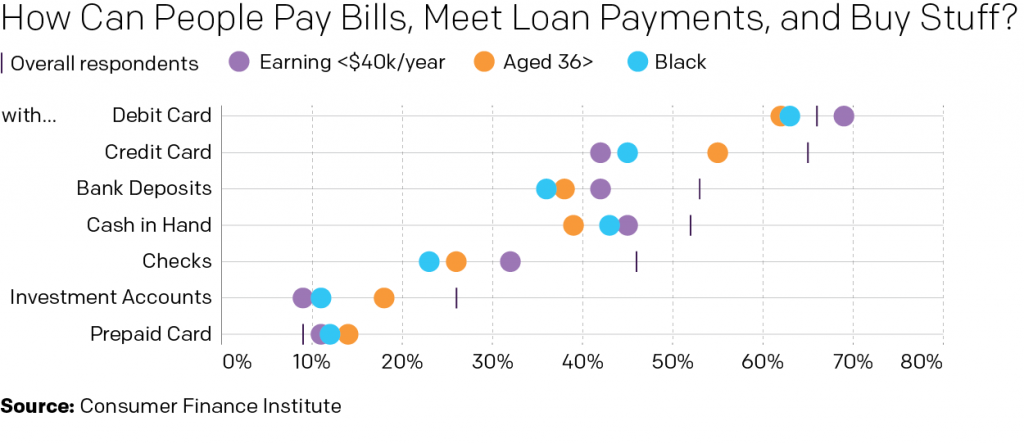
Okay, so we’re going to post some more of my work today, but it’s not about cases and deaths. Instead, I took some data produced by my colleagues and thought that it could do for a small transformation from a table into a chart. The original table can be found in their report on consumer payment options during the Covid-19 pandemic.
After setting the kettle on for some tea this morning we started on their Table 1. Thirty minutes later and a cup of Irish Breakfast consumed, I had transformed it into this:
Obviously I changed the language/title a little bit. But the original was too long and didn’t fit. Also this is my blog, so my rules. The visualisation improves upon the table in a number of ways, but tables do have their place. Tables are great for organising information. Find a column header and a row header and you can get any specific data point. But, if you want to make a comparison between two data points or several of them, a chart is the way to go. Now, you may lose some precision. For example, do I know to the decimal point or to the tenths even what one of those dots represents? Nope. But at a glance, can I see which dots are below the overall respondents? Yep. It’s abundantly clear that those earning less than $40,000 per year have a greater availability of debit cards than the other groups shown.
And after all, I couldn’t have made this graphic without that table.
Full disclosure, as alluded to above, I work at the Federal Reserve Bank of Philadelphia. But I had nothing to do with the data, report, or presentation thereof.