Today is yet another Friday in the pandemic. And so I wanted to just upload a few of the graphics I have been making for family, friends, and coworkers and posting on the Instagram and the Facebook. I did this two weeks ago as well, and if you compare those maps to these, you will see quite a stark difference. But on to today’s maps.
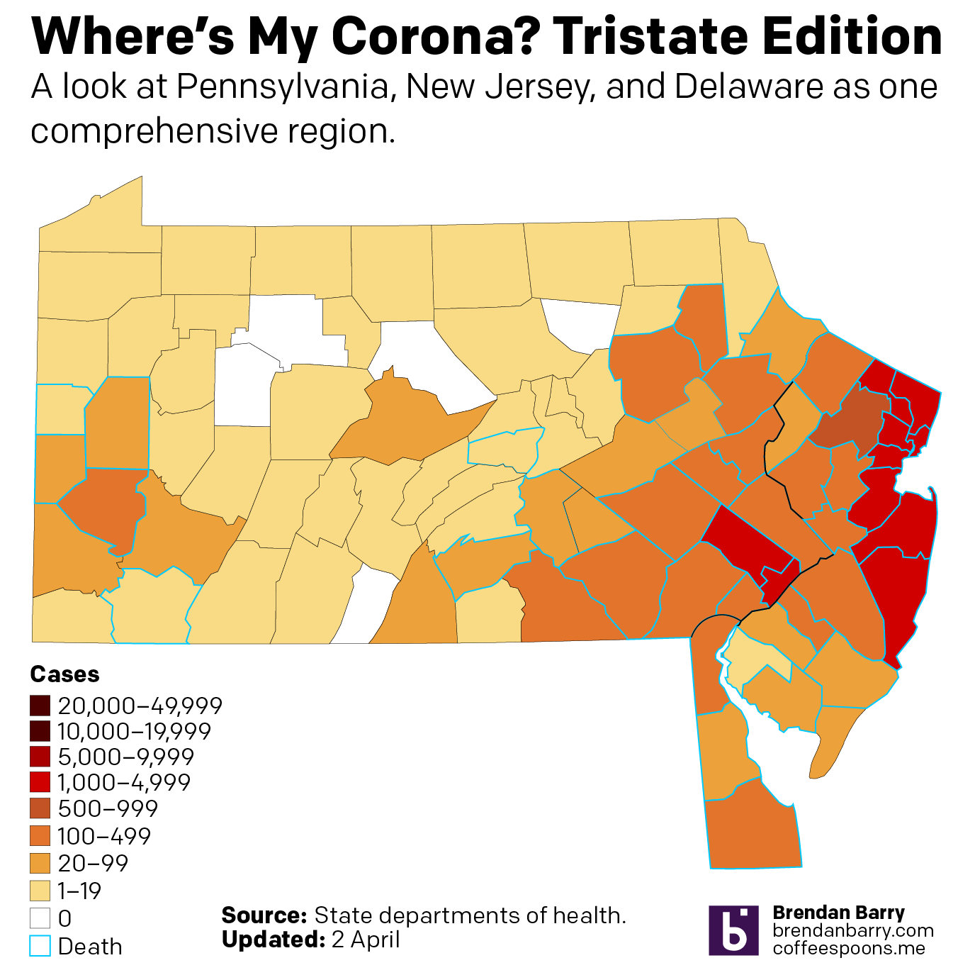
As a brief reminder, I am specifically looking at Pennsylvania, New Jersey, and Delaware—the tri-state region for my non-Philly followers—as well as Virginia and Illinois by the request of friends and former colleagues who live in those states. And then at the end I’ve been putting the tri-state region together to provide a fuller regional context.
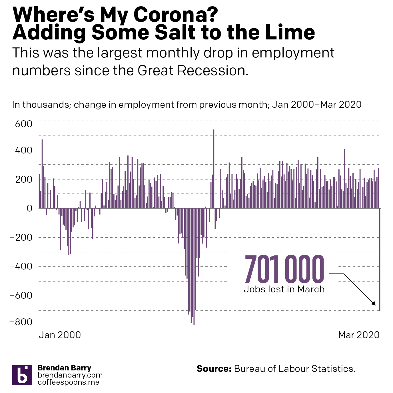
Lastly, for today only, the Bureau of Labour Statistics published its jobs report about the number of job losses in March across the US. And…it wasn’t pretty.
Conditions in PennsylvaniaConditions in New JerseyConditions in DelawareConditions in VirginiaConditions in IllinoisConditions in the tri-state region
Plus, the added bonus of the Bureau of Labour Statistics’ monthly jobs report. And spoiler, things aren’t so great out there.
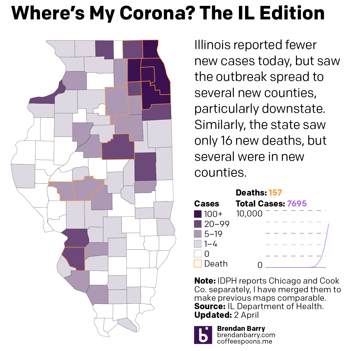
By now we have probably all seen the maps of state coverage of the COVID-19 outbreak. But state level maps only tell part of the story. Not all outbreaks are widespread within states. And so after some requests from family, friends, and colleagues, I’ve been attempting to compile county-level data from the state health departments where those family, friends, and colleagues live. Not surprisingly, most of these states are the Philadelphia and Chicago metro areas, but also Virginia.
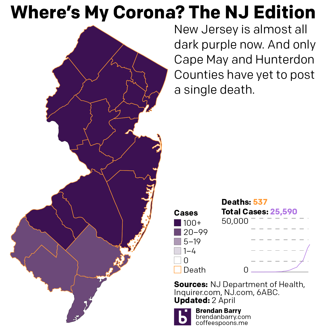
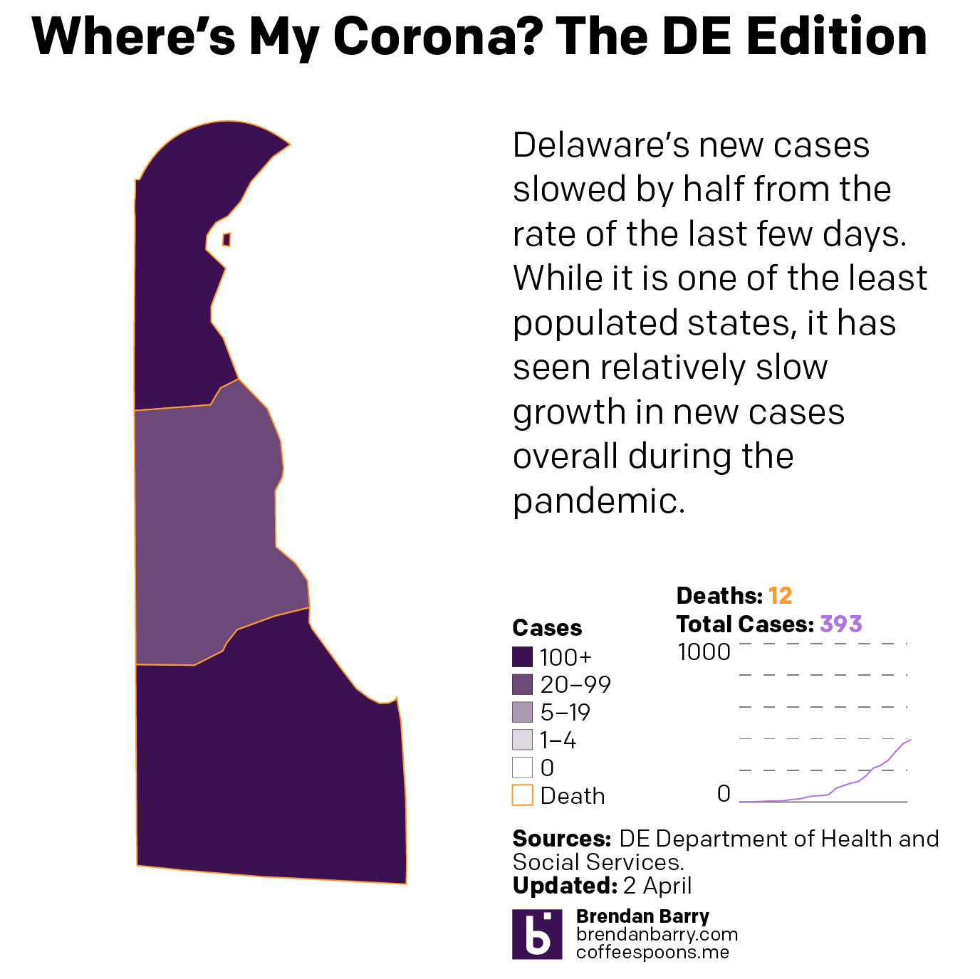
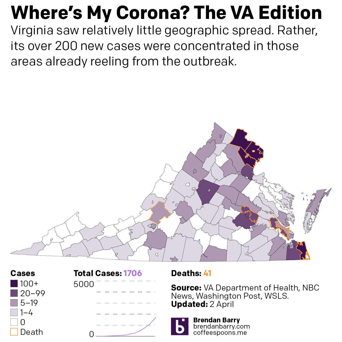
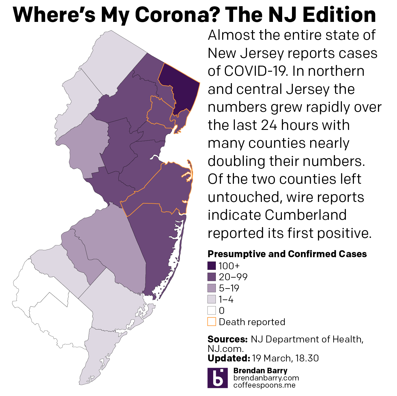
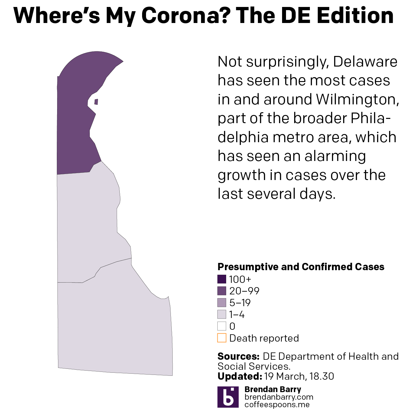
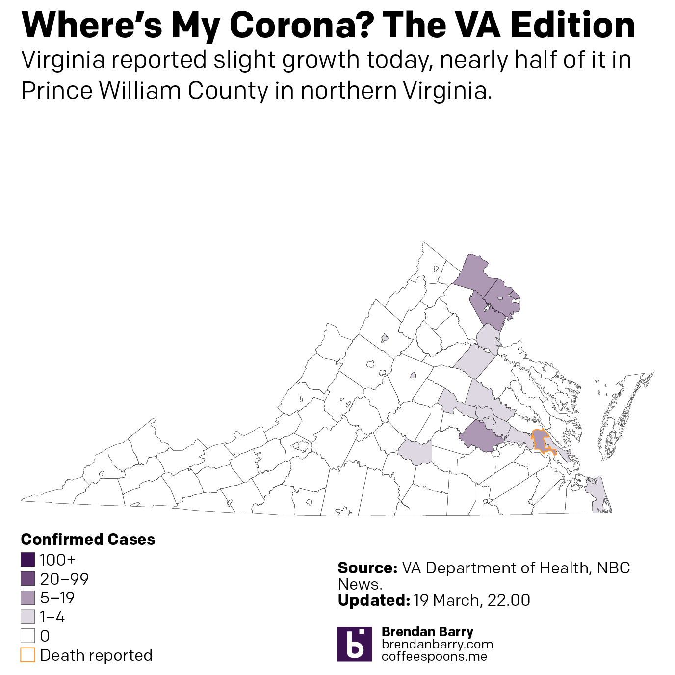
These are all images I have posted to Instagram. But the content tells a familiar story. The outbreaks in this early stage are all concentrated in and around the larger, interconnected cities. In Pennsylvania, that means clusters around the large cities of Philadelphia, Pittsburgh, and Harrisburg. In New Jersey they stretch along the Northeast Corridor between New York and Trenton (and along into Philadelphia) and then down into Delaware’s New Castle County, home to the city of Wilmington. And then in Virginia, we see small clusters in Northern Virginia in the DC metro area and also around Richmond and the Williamsburg area. Finally in Illinois we have a big cluster in and around Chicago, but also Springfield and the St. Louis area, whose eastern suburbs include Illinois communities like East St. Louis.
19 March county wide spread of COVID-1919 March county wide spread of COVID-1919 March county wide spread of COVID-1919 March county wide spread of COVID-1919 March county wide spread of COVID-19
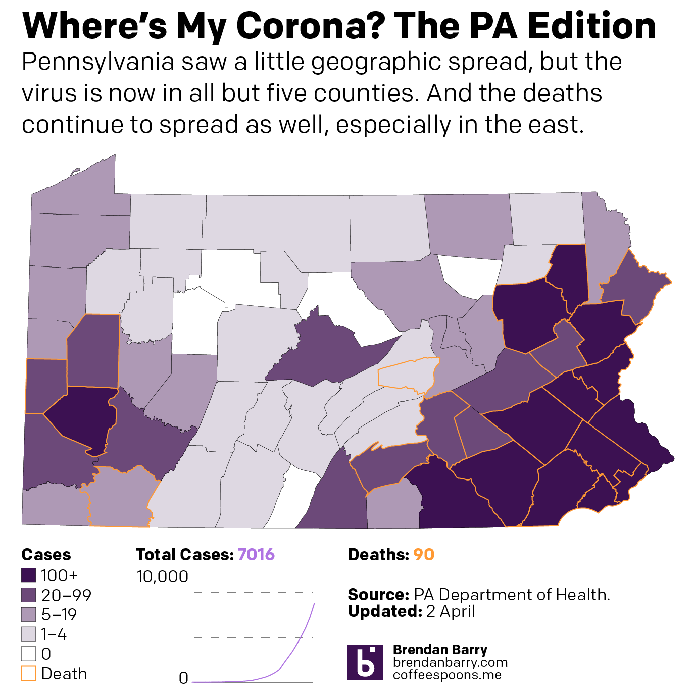
I have also been taking a more detailed look at the spread in Pennsylvania, because I live there. And I want to see the rapidity with which the outbreak is growing in each county. And for that I moved from a choropleth to a small multiple matrix of line charts, all with the same fixed scale. And, well, it doesn’t look good for southeastern Pennsylvania.
County levels compared
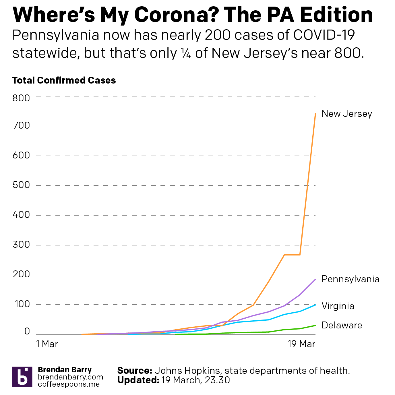
Then last night I also compared the total number of cases in Pennsylvania, New Jersey, Delaware, and Virginia. Most interestingly, Pennsylvania and New Jersey’s outbreaks began just a day apart (at least so far as we know given the limited amount of testing in early March). And those two states have taken dramatically different directions. New Jersey has seen a steep curve doubling less than every two days whereas Pennsylvania has been a bit more gradual, doubling a little less than every three.
State levels since early March
For those of you who want to continue following along, I will be looking at potential options this coming weekend whilst still recording the data for future graphics.
On Tuesday the United States had another round of primaries, this time in Arizona, Florida, and Illinois. Ohio was scheduled to be the fourth, but its governor postponed the vote to some point in the future due to the ongoing coronavirus COVID-19 epidemic.
As my regular readers all know, I thoroughly enjoy election season because we get all the data to look at and try to explain what is going on. And more data means more graphics, so I doubly enjoy it. And so the last few weeks have been exciting. But while there were twists and turns and excitement the last several weeks, we walked into Tuesday night with a common hypothesis or story line. Biden would probably win all three states, though Latinos could help Sanders in Arizona in a long shot, or an anticipated depressed turnout in Illinois due to COVID-19 could allow Sanders to pick up a victory there.
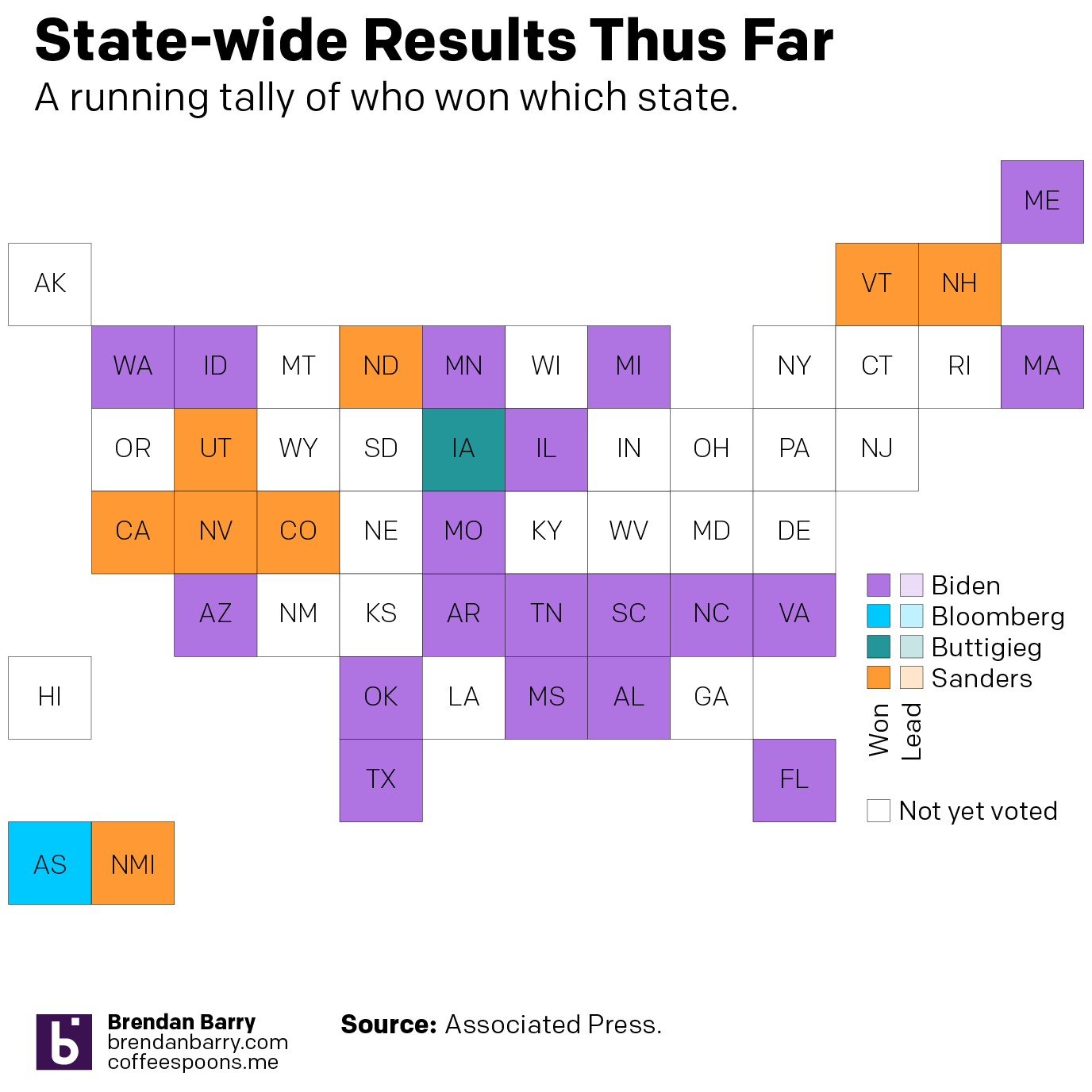
The results did not surprise most: Biden beat Sanders decisively in all three states. And over the last two weeks, that put eight of the nine states in play into Biden’s camp. Furthermore, Biden has won the majority of states now since primary season kicked off with that disastrous caucus in Iowa. You can see that in this graphic that I made Tuesday night and posted on Instagram. (All the images that follow I posted on Instagram that night and the night after Michigan voted.)
Who has won each state
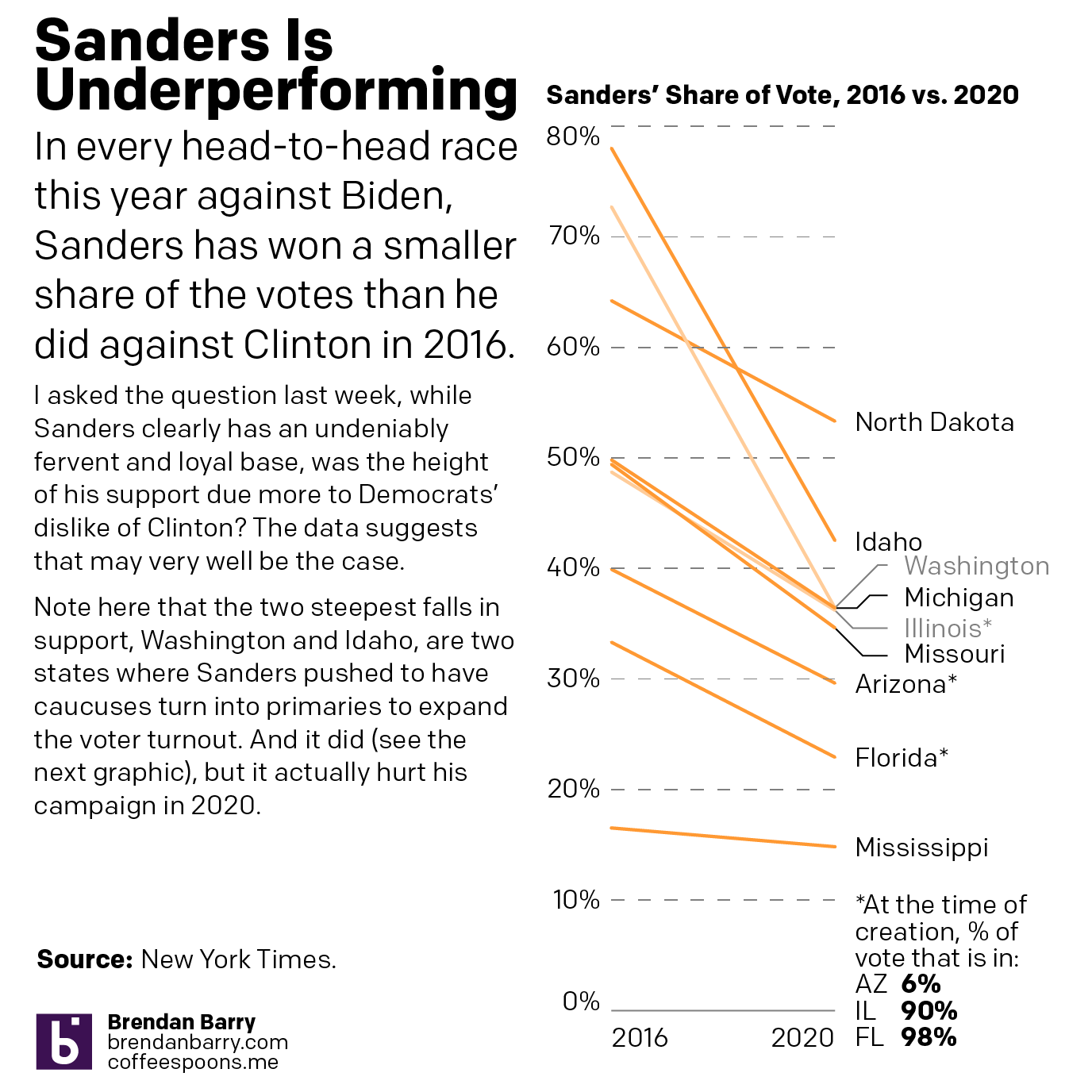
But beyond the top line figure of who won which state, I wanted to look at some of the underlying data on Sanders’ support. Specifically, the margins in the head-to-head contests seemed, as far as I could recall, vastly different than the close run races between Sanders and Clinton in 2016. For this, I had to discount everything up to and including Super Tuesday. All those contests featured multiple centrists/moderates and multiple leftist/progressives and that muddied up the data.
Instead I focused on the states over the last two weeks. (I noted that Washington and Idaho had switched from caucus to primary in an effort to draw out more Democratic voters, in an attempt to generate more support for Sanders’ campaign.) And I discovered that in every state, without exception, Sanders performed worse in 2020 than he had in 2016.
Sanders underperformed in every head-to-head match up this year relative to his numbers against Clinton in 2016
I hypothesise that one factor in this underperformance relative to 2016 is that he has Joe Biden as a foil instead of Hillary Clinton. Before the campaign began, Biden was one of the most favourably regarded Democratic politicians. There’s a reason people have given him the nickname Uncle Joe (though his gaffes certainly are another factor in that sobriquet). Conversely, Hillary Clinton was, well, suffice it to say, not popular. She was eminently qualified, but had low favourability numbers.
First, we can clearly establish that Sanders enjoys a strong and loyal core base of support. With squinting eyes and a little bit of spit, we can say the floor is probably in the 20–25% range of the Democratic voting bloc. Clearly in some states it is far higher, in others far lower. But was the 2016 vote, where, relative to 2020, he over-performed perhaps due to that low favourability of Clinton?
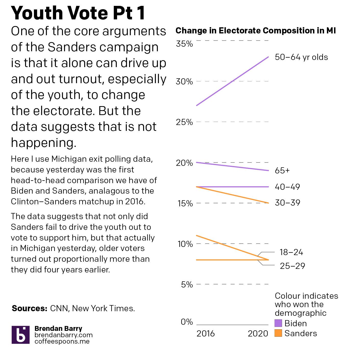
One possible hypothesis is that Sanders suffers from lower turnout than 2016. After all, his own campaign makes the point that he will bring out a larger, more diverse, and crucially younger electorate to propel him to victory.
On the youth front, one of the drawbacks to the coronavirus outbreak is that this week we had no exit poll data to understand the demographic breakdown of the voters in Arizona, Illinois, and Florida. (And I highly doubt we will see exit polling through the next several sets of primaries.) But we could take a look at it last week, and I did with the crucial state of Michigan. After all, that had been Sanders’ surprise upset that allowed him to carry on almost into the convention. But, what I found was that youth turnout was actually lower, proportionally, in 2020 than it was in 2016.
In Michigan the youth vote was largely down, though a tarnished silver lining would be 25–29 year olds held steady
So, if the idea was that Sanders would be turning out the youth vote, well, it should have gone up and not down. Again, a more robust check on this hypothesis would be to look at exit poll data from more states, but right now we have few states to do that. Washington, which voted the same night as Michigan, would be a fascinating study, except it switched from caucus to primary and so the numbers cannot be directly compared.
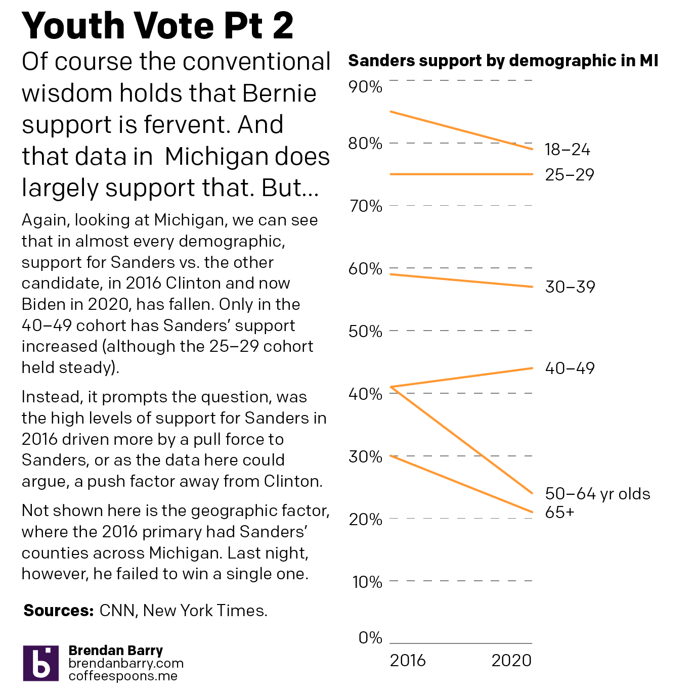
But it also wasn’t just the youth vote was down proportionally. In fact, a look at that Michigan data shows how Sanders had a lower share in most demographics, only seeing a rise in the 40–49 cohort.
Sanders’ support in Michigan was down in most demographic cohorts
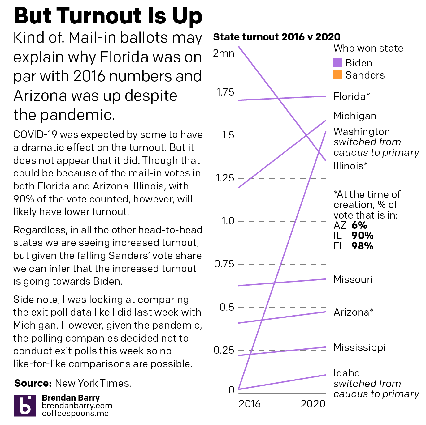
If the youth (and potentially others) vote is down, maybe overall lower turnout is what hampers Sanders’ performance. Here, I looked at the total number of ballots cast in the states over the last two weeks. I noted that Illinois in particular would be lower given the outbreak as both Florida and Arizona do a significant number of mail-in ballots. And what I found is that, no, turnout is actually up almost across the board.
Turnout is generally up in all the head-to-head states.
And so we can see clear evidence that despite Sanders’ strong and fervent support with his core supporters, he has been unable to grow that support and build a coalition. His share of the vote fell in every state where we had a head-to-head race and yet turnout is up, which runs counter to the argument of his campaign.
Sanders is clearly underperforming in 2020. 2016 was the year that people felt the Bern. Maybe in 2020 a significant number of his 2016 supporters are Berned out.
Over the last several days, along with most of the country, I’ve taken an interest in the spread of the novel coronavirus named COVID-19. Though, to be fair, it’s actually been in the news since early January, though early news reports like this from the Times, simply called it a mysterious new virus. At the time I thought little of it, because the news out of China was that it did not appear it could spread amongst humans. How did that idea…wait for it…pan out?
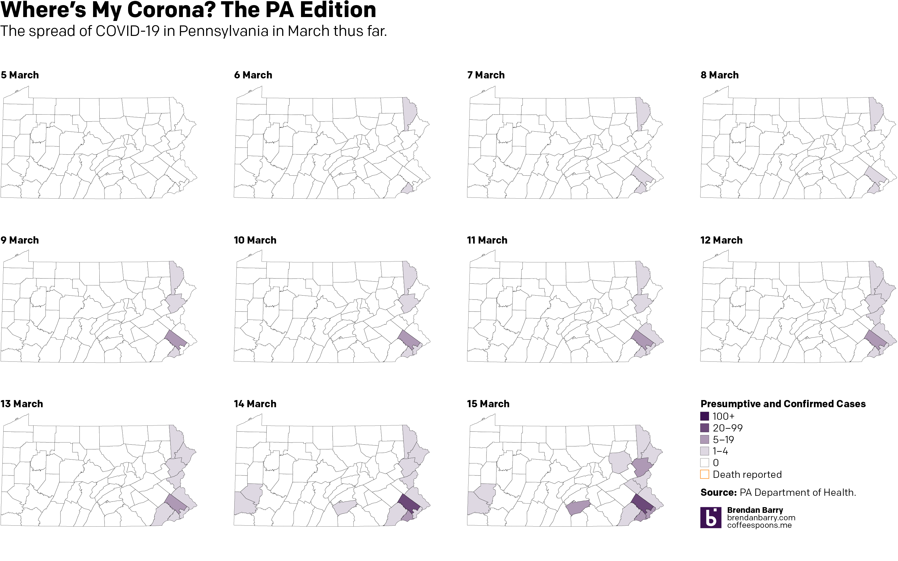
Anyway, over the last couple of days I’ve been making some maps for Instagram because people tend to look at a national map and see every nearly state infected when, in reality, there are pockets and clusters within those states. So I started looking at Pennsylvania. And initially, the cluster was along the Delaware River, namely Pennsylvania as well as its upper reaches near the Lehigh Valley and in the far northeast of the state.
But the spread has grown, and fairly quickly, with Montgomery County, a Philadelphia suburb, a hotspot. Consequently, the Pennsylvania governor has shut down all schools across the state and ordered non-essential shops, restaurants, and bars in the counties surrounding Philadelphia—as well as the county containing Pittsburgh—closed.
So 11 days in, here’s where we stand. (To be fair, I looked at including the early numbers out of today, but nothing has really changed, so I’ll wait until the evening figures are released before I update this again.)
Credit is mine. Data is the Pennsylvania Department of Health.
Apologies for the lack of posting the last few months. There are several things going on in my life right now that have prevented me from focusing on Coffee Spoons as much as I would like. I will endeavour to resume posting, but it might not be the daily schedule it had been for at least a little while longer.
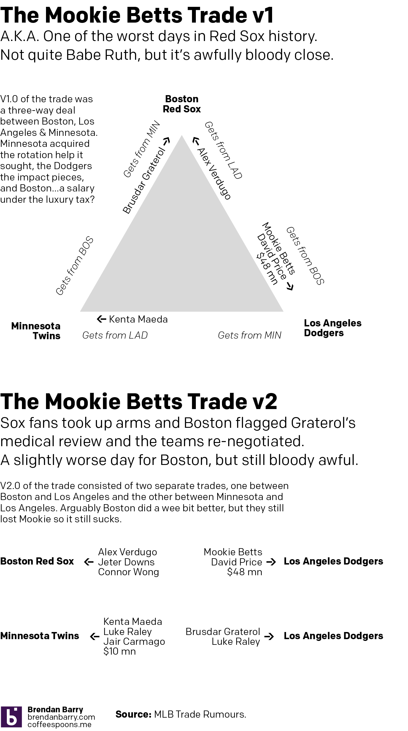
Onwards and downwards to the title—one of the dumbest, stupidest, worstest things the Boston Red Sox have done. At least in my lifetime. But also probably in all time. Except Babe Ruth to the Yankees. Also dumb. I’m so upset by this trade I’m using my words good.
The Red Sox had some financial difficulties, or so they claimed. Their payroll was one of the highest in baseball and was over an arbitrary line called the luxury tax, above which teams incur penalties. Repeat offenders pay increased fines, lose draft picks, &c. Boston was a repeat offender and was set to be again with several large contracts on the books.
Instead of sucking it up for a year and fielding a competitive team, the Red Sox dumped a huge chunk of their salary by trading away their star player, maybe baseball’s second best, and their second best pitcher. For a good, not great, outfielder, a fringe-y second baseman, and an even fringier catcher. But mostly they got salary relief. And the 2020 Sox are going to be painful to watch.
Anyway, I made a graphic about this complete suckfest. Because it sucks.
Suckfest 2020.
Credit for this awfulness goes to Chaim Bloom, the new president of Red Sox baseball operations. But the graphic is mine.
The British election campaign is wrapping up as it heads towards the general election on Thursday. I haven’t covered it much here, but this piece from the BBC has been at the back of my mind. And not so much for the content, but strictly the design.
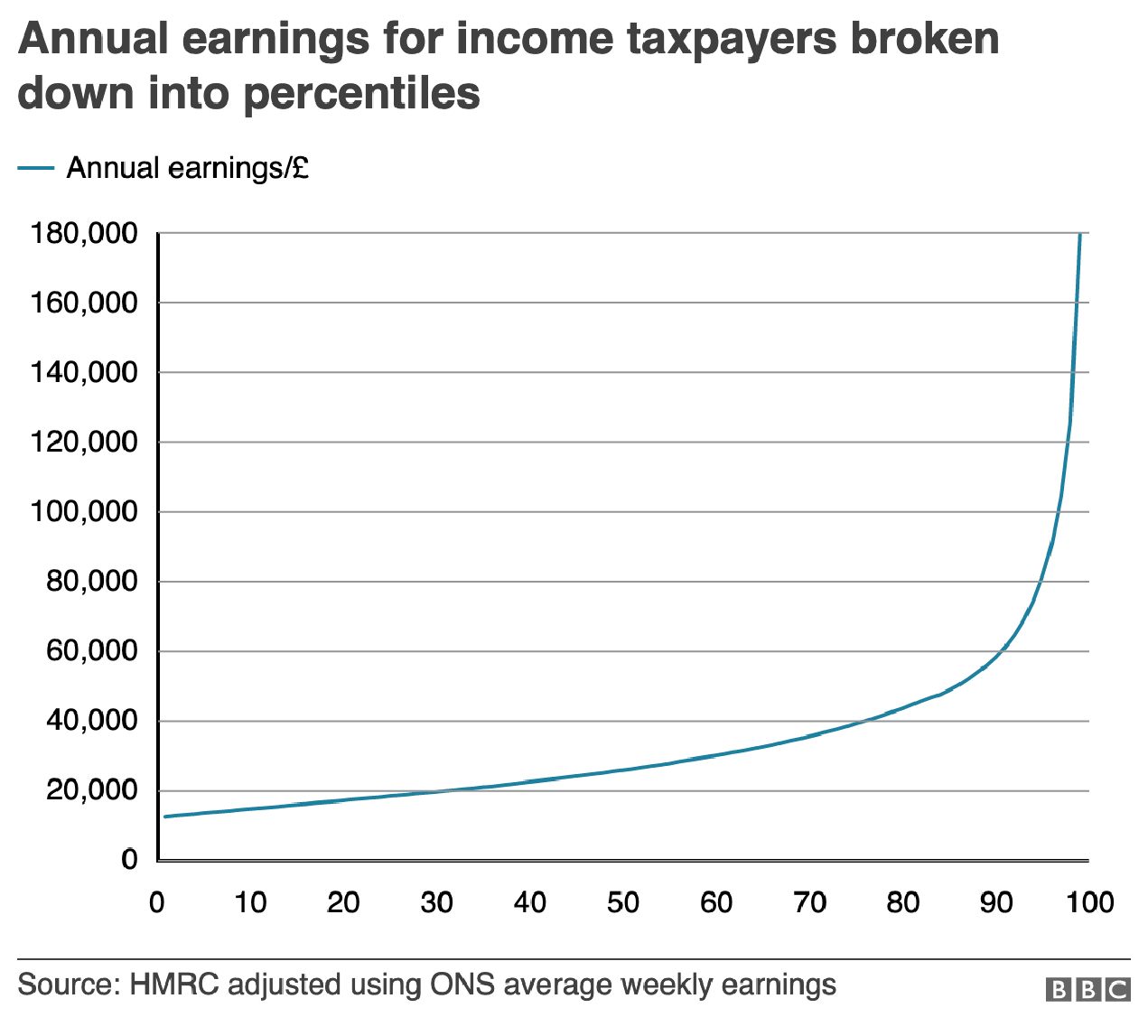
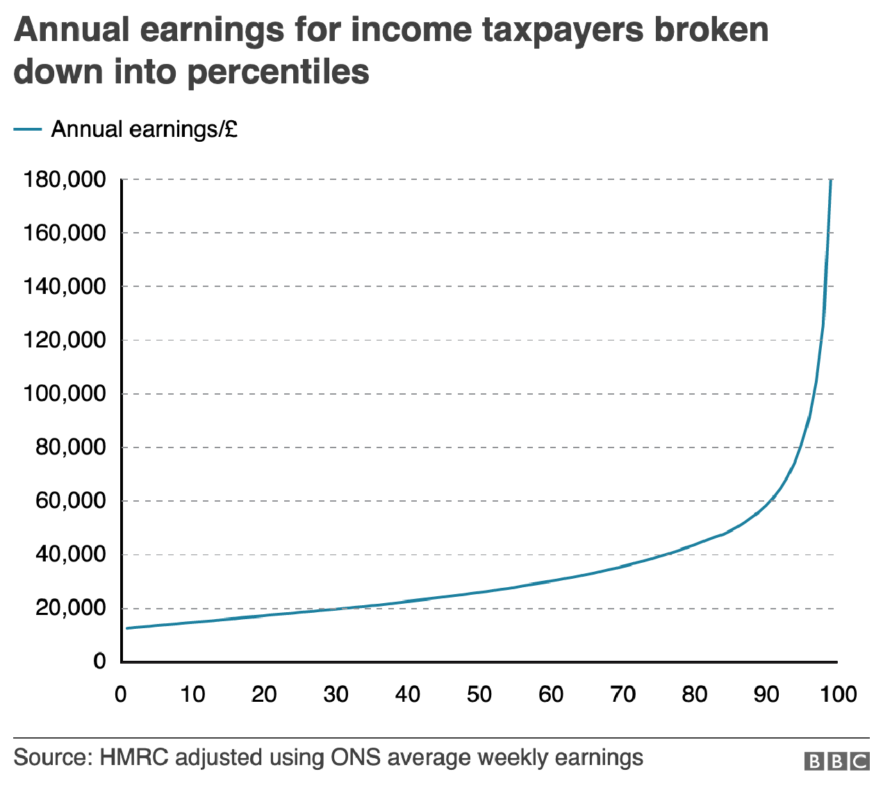
In terms of content, the article stems from a question asked in a debate about income levels and where they fall relative to the rest of the population. A man rejected a Labour party proposal for an increase in taxes on those earning more than £80,000 per annum, saying that as someone who earned more than that amount he was “not even in the top 5%, not even the top 50”.
The BBC looked at the data and found that actually the man was certainly within the top 50% and likely in the top 5%, as they earn more than £75,300 per annum. Here in the States, many Americans cannot place their incomes within the actual spreads of income. The income gap here is severe and growing. But, I want to look at the charts the BBC made to illustrate its points.
The most important is this line chart, which shows the income level and how it fits among the percentages of the population.
Are things lining up? It’s tough to say.
I am often in favour of minimal axis lines and labelling. Too many labels and explicit data points begin to subtract from the visual representation or comparison of the data. If you need to be able to reference a specific data point for a specific point on the curve, you need a table, not a chart.
However, there is utility in having some guideposts as to what income levels fit into what ranges. And so I am left to wonder, why not add some axis lines. Here I took the original graphic file and drew some grey lines.
Better…
Of course, I prefer the dotted or dashed line approach. The difference in line style provides some additional contrast to the plotted series. And in this case, where the series is a thin but coloured line, the interruptions in the solidity of the axis lines makes it easier to distinguish them from the data.
Better still.
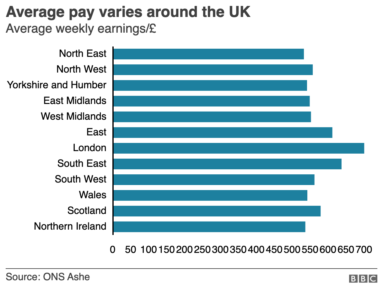
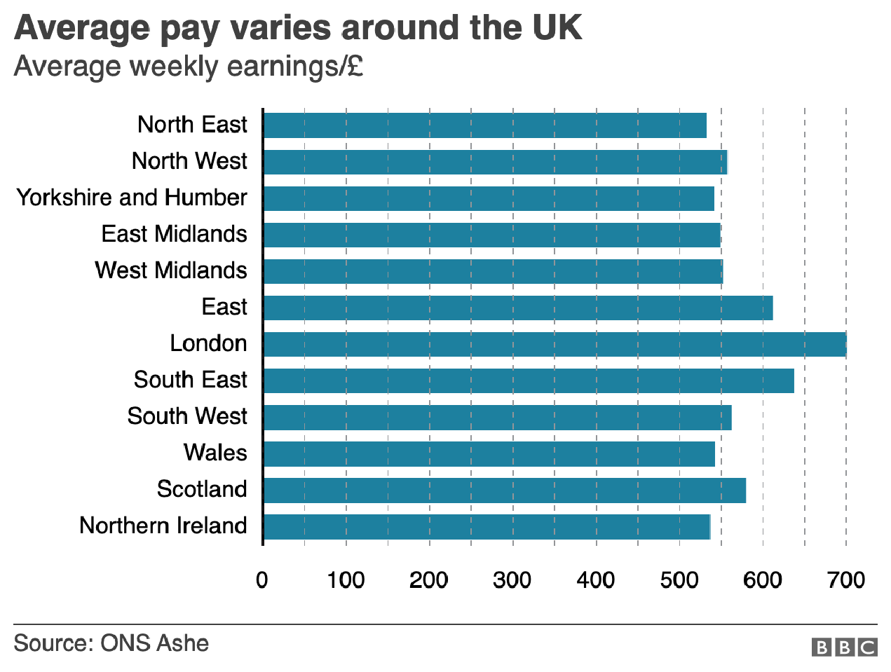
But the article also has another chart, a bar chart, that looks at average weekly incomes across different regions of the United Kingdom. (Not surprisingly, London has the highest average.) Like the line chart, this bar chart does not use any axis labels. But what makes this one even more difficult is that the solid black line that we can use in the line charts above to plot out the maximum for 180,000 is not there. Instead we simply have a string of numbers at the bottom for which we need to guess where they fall.
Here we don’t even a solid line to take us out to 700.
If we assume that the 700 value is at the centre of the text, we can draw some dotted grey lines atop the existing graphic. And now quite clearly we can get a better sense of which regions fall in which ranges of income.
We could have also tried the solid line approach.
But we still have this mess of black digits at the bottom of the graphic. And after 50, the numbers begin to run into each other. It is implied that we are looking at increments of 50, but a little more spacing would have helped. Or, we could simply keep the values at the hundreds and, if necessary, not label the lines at the 50s. Like so.
Much easier to read
The last bit I would redo in the bar chart is the order of the regions. Unless there is some particular reason for ordering these regions as they are—you could partly argue they are from north to south, but then Scotland would be at the top of the list—they appear an arbitrary lot. I would have sorted them maybe from greatest to least or vice versa. But that bit was outside my ability to do this morning.
So in short, while you don’t want to overcrowd a chart with axis lines and labelling, you still need a few to make it easier for the user to make those visual comparisons.
Credit for the original pieces goes to the BBC graphics department.
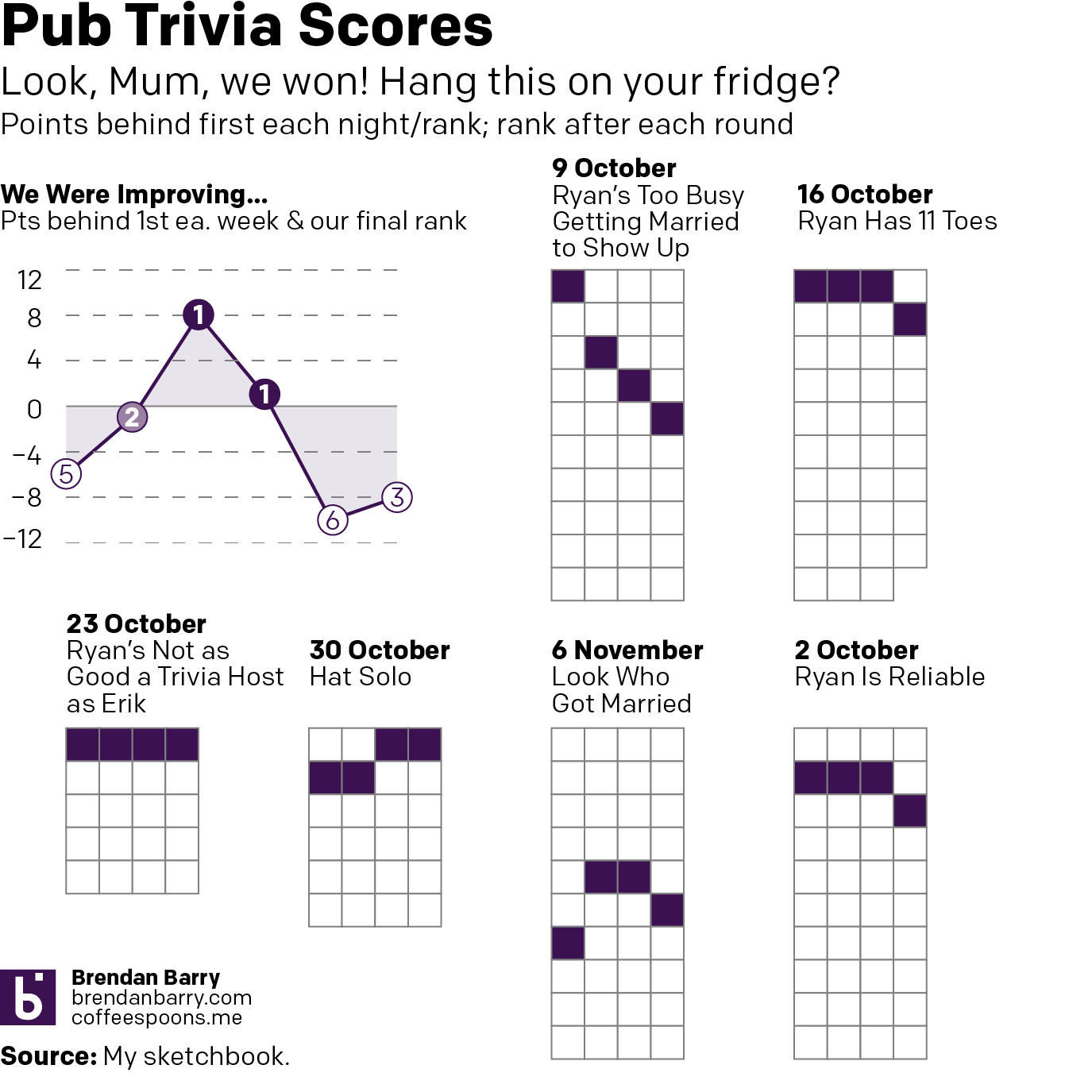
Next week is Thanksgiving and for me that means no pub trivia next week. So ahead of a two-week gap, here are our latest (and greatest?) in trivia scores. We won some, we lost some. And we definitely blew some. The key, as always, remains score points before music. Because we do not know music.
Yesterday was Armistice Day, a bank holiday hence the lack of posting. So I spent a few hours yesterday looking at my ancestors to see who participated in World War I. It turned out that on my paternal side, my one great-grandfather was too old and the other was both the right age and signed up for the draft, but was not selected.
And so the only two that served were my maternal great-grandfathers. One served a few months in the naval reserve towards the end of the war. My other great-grandfather served for a year, a good chunk of it in France. This I largely knew from my great aunt, who had told us stories about how he had told her about blowing up bridges they had just built to prevent Germans from capturing them. And then how after the war he served as military police, arresting drunk American soldiers in France. But I had never realised some of the documents I had collected told more of the skeletal structure like units and ranks. Consequently, I decided to make this graphic.
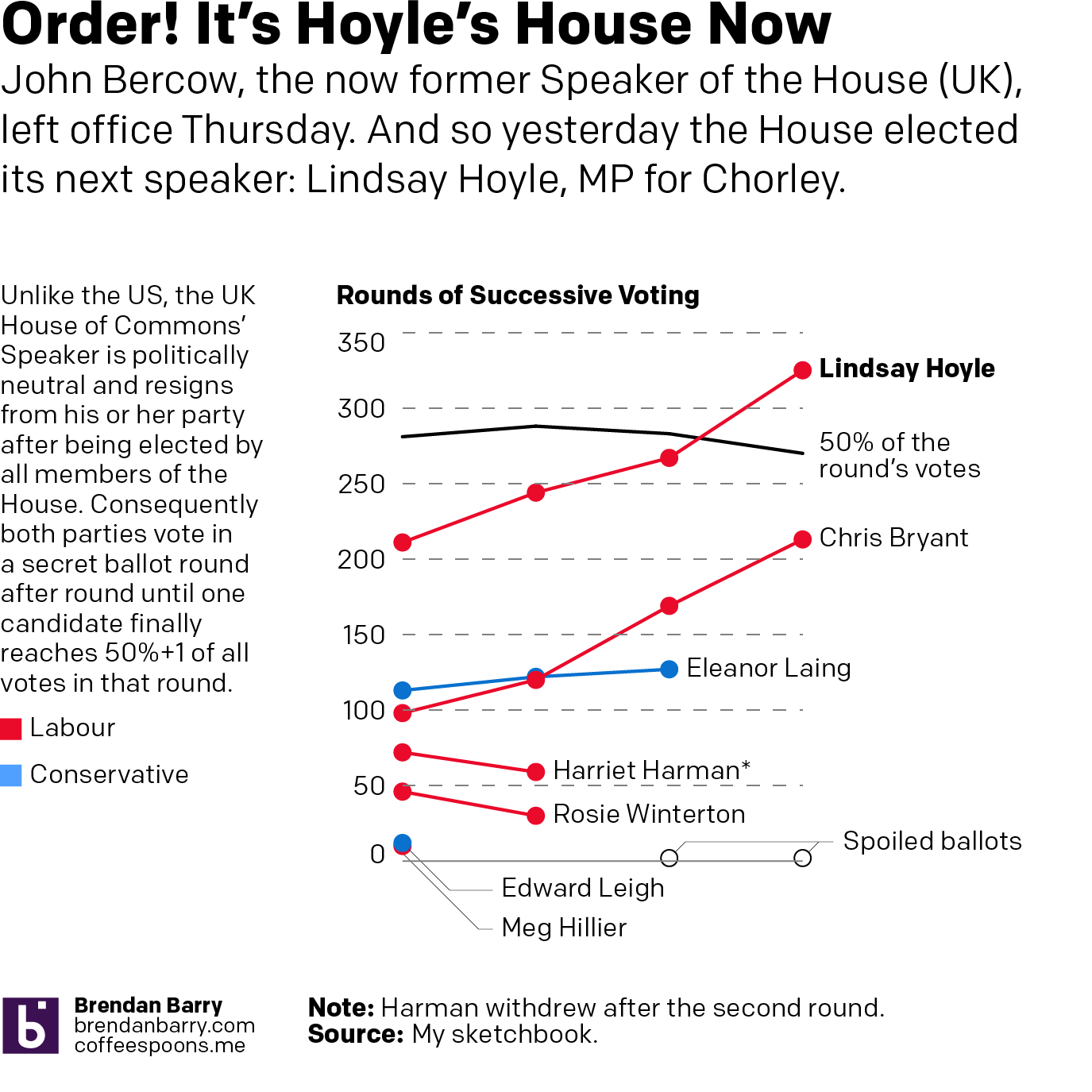
John Bercow is no longer the British Speaker of the House. He left office Thursday. Fun fact: it is illegal for an MP to resign. Instead they are appointed to a royal office, in Bercow’s case the Royal Steward of the Manor of Northstead, that precludes them from being an elected MP. Consequently the House of Commons then had to elect a new Speaker.
For my American audience, despite the same title as Nancy Pelosi, John Bercow had a very different function and came to it in a very different fashion. First, the position is politically neutral. Whoever the House elects resigns from his or her party (along with his or her three deputies) and the political parties abide by a gentlemen’s agreement not to contest the seat in general elections. (The Tories were so displeased with Bercow they were actually contemplating running somebody in the now 12 December election to get rid of him.) Consequently, the Speaker (and his or her deputies) do note vote unless there is a tie. (Bercow actually cast the first deciding vote by a speaker since 1980 back in April.)
Because the position is politically neutral, all MPs vote in the election and debate is chaired by the Father of the House, the longest continuously serving MP in the House. Today that was Ken Clarke, one of the 21 MPs Boris Johnson booted from the Tory party for voting down his No Deal Brexit and who is not standing in the upcoming election. The candidates for Speaker must receive the vote of 50% of the House. And so they are eliminated in successive votes until someone reaches 50% of the total votes cast, though not all MPs cast votes, since some have already started campaigning. (Today there were 562, 575, 565, 540 votes per round.)
Notably, today’s vote occurs just days before Parliament dissolves prior to the 12 December election. Bercow, who chose to retire on 31 October, essentially ensured that the next Parliament will have a Speaker not chosen what could well likely be a pro-No Deal Brexit, one of the things which the Tories have against him.
So all that said, who won? Well I made a graphic for that.
A very different accent will occupy the big green chair.
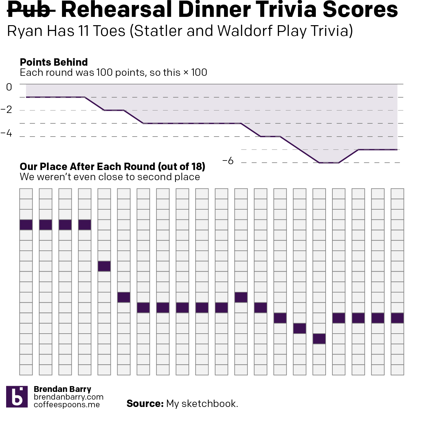
So another Wednesday, another pub trivia night. But two weekends ago, I attended the wedding of a good mate of mine down in Austin, Texas. And at his rehearsal/welcome dinner, he and his now wife had a trivia game. How well did their guests know them?
Turns out my friends and I, not so much. And I can prove it, because I documented our score after every round in my sketchbook.
Somewhere towards the middle we just started picking the most ridiculous answers.