Prorogation of Parliament

If you’re among my British/European audience, you are probably well aware Boris Johnson has prorogued, or suspended, Parliament. He and cabinet ministers stated it was a normal, average-length prorogation to prepare for a Queen’s Speech. (The Queen’s Speech is the formal opening of a new session of Parliament that sets out a new legislative agenda and formally closes/kills any unpassed legislation from the old session.) Except that in documents revealed in a Scottish court case, we now know that the real reason was to shut down Parliament to prevent it from interfering in Boris’ plans for a No Deal Brexit. And just this morning the Scottish High Court did indeed rule that the prorogation is illegal. The case now moves to the UK Supreme Court.

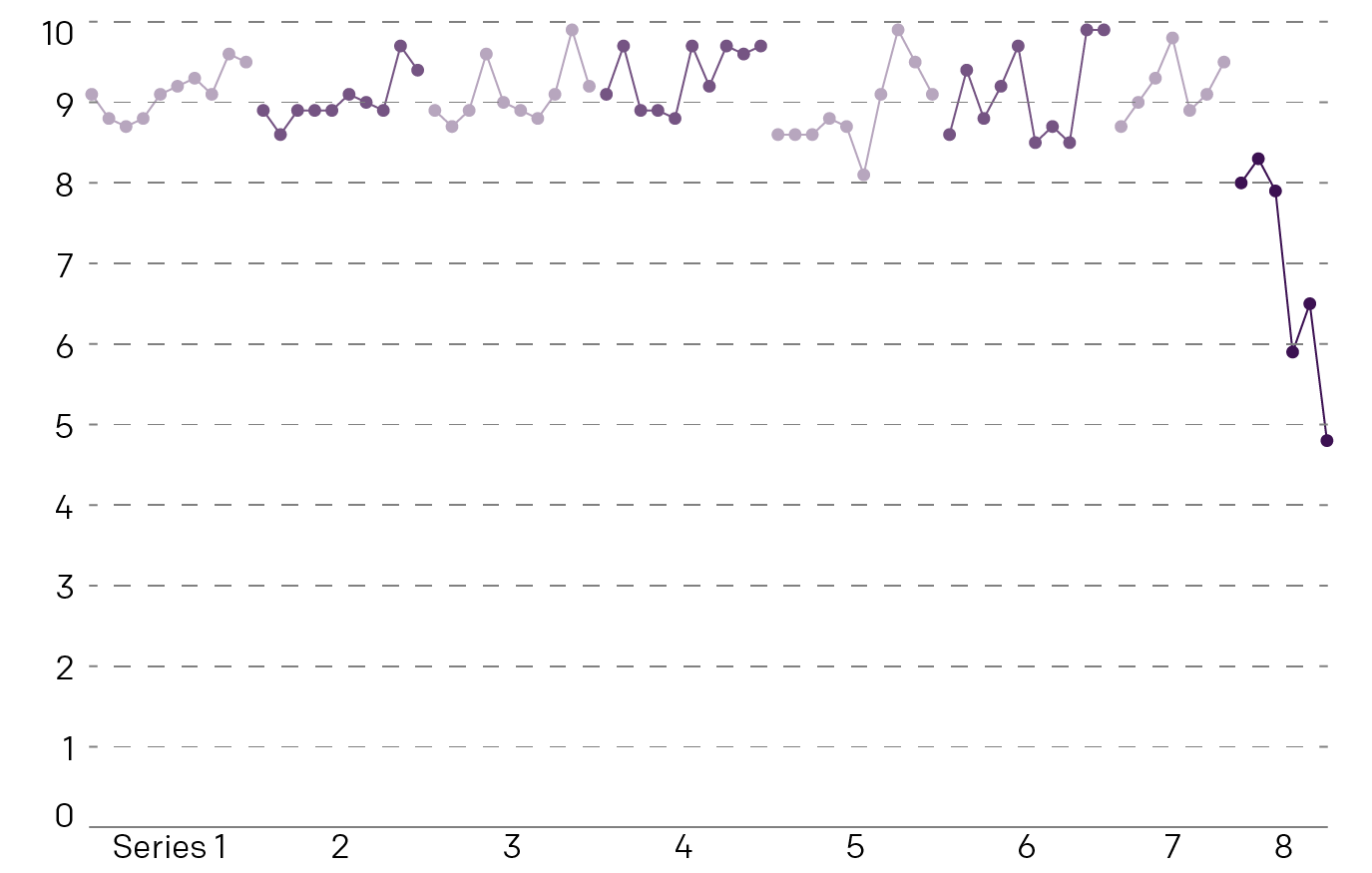
But I want to focus on the other claim, that this is a prorogation of average length. Thankfully instead of having to do a week’s hard slog of data, the House of Lords Library posted the data for me. At least since 1900, and that works well enough for me. And so here we go.

Back to the 1930s?
Back to the 1930s?

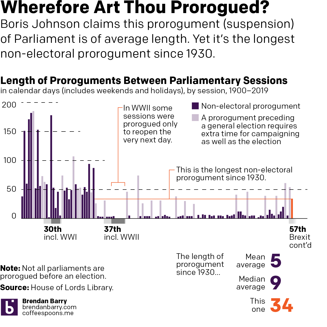
So yeah, this is not an average prorogument. If you look at only proroguments that do not precede a general election—you need time for the campaigning and then hosting the actual election in those cases—this is the longest prorogument since 1930. (Also, a Parliament does not necessarily need to be prorogued before it is dissolved before an election. And that happened quite often in the 1960s, 70s, and 80s.)

And as I point out in the graphic, Parliament was prorogued during the depths of World War II to start new legislative sessions. But in those cases, Parliament opened the very next day, during a time of national crisis. One could certainly make the argument that Brexit is a national crisis. So wherefore the extraordinarily long prorogument? Well, quite simply, Brexit.

Credit for the piece goes to me.

The Trilemma Remains for Boris

This is a repost of sorts, but it is important. Now prime minister, Boris Johnson had an opportunity to seek a more reasonable approach to Brexit. Unfortunately, he is drawing even harder red lines than his predecessor, Theresa May. And that brings us back to my Brexit trilemma graphic from back in March.

Essentially, Johnson wants three things that are mutually—or whatever the word is for three, maybe tri-mutually—semi-exclusive. In other words, of the three red lines, the United Kingdom can only have two, because those two then make the third impossible.

Doing the same thing but expecting results…pick two already, Boris.

I made the first version of this back in March. Sad it still applies.

Credit for the piece goes to me.

Baby, It’ Hot Outside Pt 2

Yesterday we looked at Billy Penn’s graphics about the cooler stations and I mentioned a few ways the graphic could be improved. So last night I created a graphic where I explored the limited scope of the data, but also showing how low the temperatures were, relative to the air temperature outside, using weather data from the National Weather Service, admittedly from Philadelphia International Airport, not quite Centre City, which I would expect to be warmer due to the urban heat bubble effect.

I'd be curious to see data for North Philly
I’d be curious to see data for North Philly

I opted to exclude the Patco Line since the original dataset did not include it either. However a section of it does run through Centre City and could be relevant.

Credit for the piece goes to me, though the data is all from Billy Penn and the National Weather Service.

A Shrinking Illinois

Last week we looked at the data on Pennsylvania from the US Census Bureau and found the Commonwealth’s population is shifting from west of the Appalachians to the southeast of the state. That got me thinking about Illinois, one of three states to have experienced a decline in population. Is there a similar geographic pattern evident in that state’s data? (Plus, I lived there for eight years, so I am curious how the state evolved over a similar time frame.)

A lot more red in this map…

Well, it turns out the pattern is not so self-evident in Illinois as it is in Pennsylvania. Instead, we see small clusters of light blues across a sea of red. In other words, the population decline is widespread, though not necessarily extreme. However, it is notable that in the far south of the state, Alexander County, home to the city of Cairo, has seen the greatest decline in population since 2010, not just in Illinois, but in the entire United States (in percentage terms).

Unlike Pennsylvania, where the state’s primary city of Philadelphia is growing (albeit slowly), in Illinois the primary city of Chicago has seen its population shrink over the last several years. However, the counties south and west of Cook County have grown. Kendall County, where parts of Aurora and Joliet are located along with growing towns like Oswego and Plano, grew at over 11%.

The state’s other growing counties fall across the state from north to south, east to west. In the south the county containing the eastern suburbs of Carbondale has grown modestly. But for real percentage growth, one should look west towards Monroe County, a southern suburb of St. Louis, Missouri located just across the Mississippi River.

Then in the centre of the state we see growth in McLean and Champaign Counties. The former is home to Bloomington and Normal. While Champaign is home to the eponymous city as well as its neighbour, Urbana.

All in all, the pattern that emerges is that of urban/suburban vs. rural. With some notable exceptions, e.g. Cook County, the only growth in Illinois is in counties that have prominent cities or towns. Meanwhile, rural counties shrink—the aforementioned Alexander most notably.

Credit for this piece is mine.

Game of Thrones Ratings

No spoilers here, so don’t worry.

But Game of Thrones ended last night. And I might be in the minority in that I like the overall ending and direction of the plot. But, I will agree that it would have been better…executed (just a Ned Stark reference) if at least the final two series were full, 10-episode series. As it is, we’re left to ourselves to connect the dots between previous character actions and their current actions. It makes sense, but you have to really think about it. It could have been done better over time. Alas, time was the one thing they did not have.

Anyway, a lot of people think the final series was terrible. And the ratings on IMDB say just that.

Ratings dropping faster than a dragon falling out of the sky…

Credit for the piece is mine.

Pennsylvania’s Population Shifts

Last month the US Census Bureau published their first batch of 2018 population estimates for states and counties. Pennsylvania is one of those states that is growing, but rather slowly. It will likely lose out to southern and western states in the 2020 census after which House seats will be reapportioned and electoral college votes subtracted.

From 2018 to 2010, the Commonwealth has grown 0.8%. Like I said, not a whole lot. But unlike some states (Illinois), it is at least growing. But Pennsylvania is a very diverse state. It has very rural agricultural communities and then also one of the densest and largest cities in the entire country with the whole lot in between . Where is the growth happening—or not—throughout the state? Fortunately we have county-level data to look at and here we go.

Some definite geographic patterns here…

The most immediate takeaway is that the bulk of the growth is clearly happening in the southeastern part of the state, that is, broadly along the Keystone Corridor, the Amtrak line linking Harrisburg and Philadelphia. It’s also happening up north of Philadelphia into the exurbs and satellite cities.

We see two growth outliers. The one in the centre of the state is Centre County, home to the main campus of Pennsylvania State University. And then we have Butler County in the west, just north of Pittsburgh.

The lightest of reds are the lowest declines, in percentage terms. And those seem to be clustered around Scranton and Pittsburgh, along with the counties surrounding Centre County.

Everywhere else in the state is shrinking and by not insignificant amounts. Of course this data does not say where people are moving to from these counties. Nor does it say why. But come 2020, if the pattern holds, the state will need to take a look at its future planning. (Regional transit spending, I’m looking at you.)

How Does the UK View Their Political Parties?

The United Kingdom crashes out of the European Union on Friday. That means there is no deal to safeguard continuity of trading arrangements, healthcare, air traffic control, security and intelligence deals, &c. Oh, and it will likely wreck the economy. No big deal, Theresa. But what do UK voters think about their leading political parties in this climate? Thankfully Politico is starting to collect some survey data from areas of marginal constituencies, what Americans might call battleground districts, ahead of the eventual next election.

And it turns out the Tories aren’t doing well. Though it’s not like Labour is performing any better, because polling indicates the public sees Corbyn as an even worse leader than Theresa May. But this post is more to talk about the visualisation of the results.

Of course I naturally wonder the perception of the smaller parties like the Liberal Democrats or Change UK (the Independent Group)

The graphics above are a screenshot where blue represents the Conservatives (Tories) and red Labour. The key thing about these results is that the questions were framed around a 0–10 scale. But look at the axes. Everything looks nice and evenly spread, until you realise the maximum on the y-axis is only six. The minimum is two. It gives the wrong impression that things are spread out neatly around the midpoint, which here appears to be four. But what happens if you plot it on a full axis? Well, the awfulness of the parties becomes more readily apparent.

Neither party looks very good here…

Labour might be scoring around a five on Health, but its score is pretty miserable in these other two categories. And don’t worry, the article has more.  But this quick reimagination goes to show you how important placing an axis’ minimum and maximum values can be.

Credit for the piece goes to the Politico graphics department.

Demanding the Impossible

The key problem in the Brexit deal remains what to do with the Irish border. In essence, the UK faces the same trilemma it has since the beginning. It wants three things it cannot have at the same time: exiting the EU single market and customs union, so it can create a free and independent trade policy; no hard border between Ireland and Northern Ireland, per the Good Friday Agreement that ended the Troubles; and territorial integrity, i.e. no hard border between Northern Ireland and the rest of the UK in the Irish Sea.

Essentially, the UK can choose two of these three options. Below, I have attempted to show how they relate and what the result is once two of the options have been chosen.

Choose two and only two.

Credit for the piece is mine.

Amazon’s Selection for HQ2

Well this week Amazon finally chose not just one city for its HQ2, but two—New York and Washington. Of course Philadelphia had been angling for the site. Alas, it was not to be. So let’s work with that for this Friday post.

No Amazon in Philadelphia

Credit for this one is mine.