This week I covered a lot of Red Sox stuff. (And I received some great feedback from people, so maybe more baseball-related stats things will be forthcoming.) But, since it is Friday, I wanted to keep today late. So over breakfast I worked on a flowchart to help you choose whom to root for in the playoffs now that Boston, Colorado, Arizona, Minnesota, Washington, and Cleveland have all been eliminated.
To be fair, my second choice was good old Terry Francona and the Indians (like last year). But, the Evil Empire is returning.
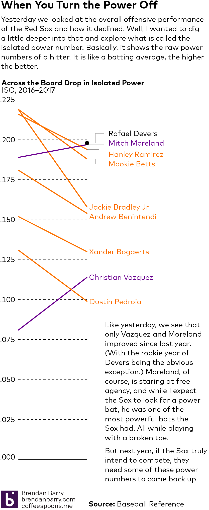
Following on yesterday’s post about the Red Sox offence, I wanted to follow up and look into their power numbers. So here we have a smaller scale graphic. Nothing too fancy, but the data backs what my eyes saw all year. A definite power drain up and down the Red Sox lineup in 2017.
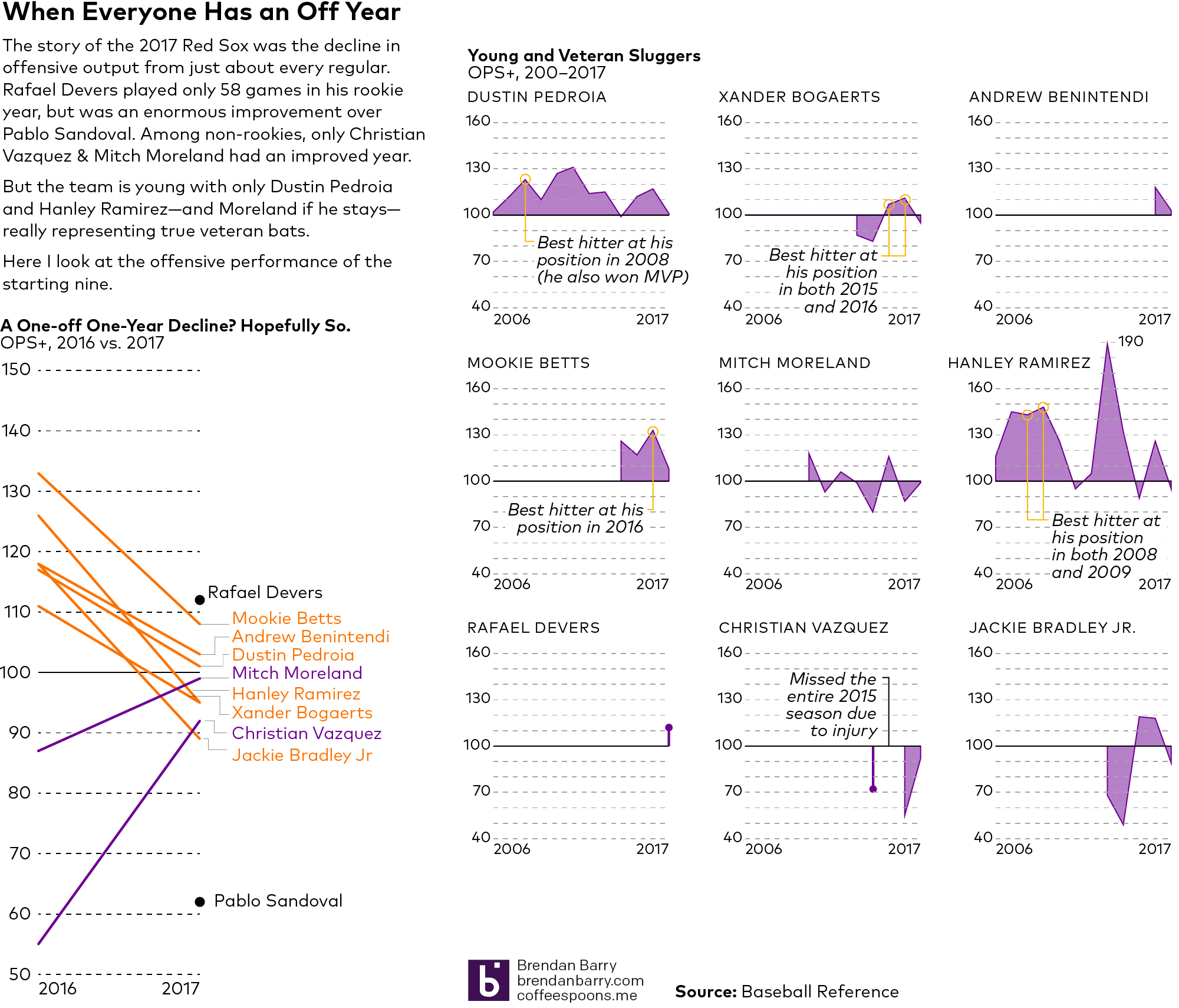
Like I said yesterday, the Red Sox season is over. And the coverage on offseason needs began in the morning papers. But I wanted to follow up on the data from yesterday and delve a bit more deeply into the offence.
Yes, we know it was roughly league average across the team. And we know it took a hit with David Ortiz’s retirement at the end of last year. But what happened? Well, I took those same OPS+ numbers for the starting nine and compared 2017 to 2016. I then looked further back to see how those same players performed throughout their careers (admittedly I skipped Hanley Ramirez’s 2 plate appearances in 2005.)
You should take a look at the full graphic, but the short version, pretty much everyone had an off year. And when everyone has an off year, it is a pretty safe bet the team will have an off year.
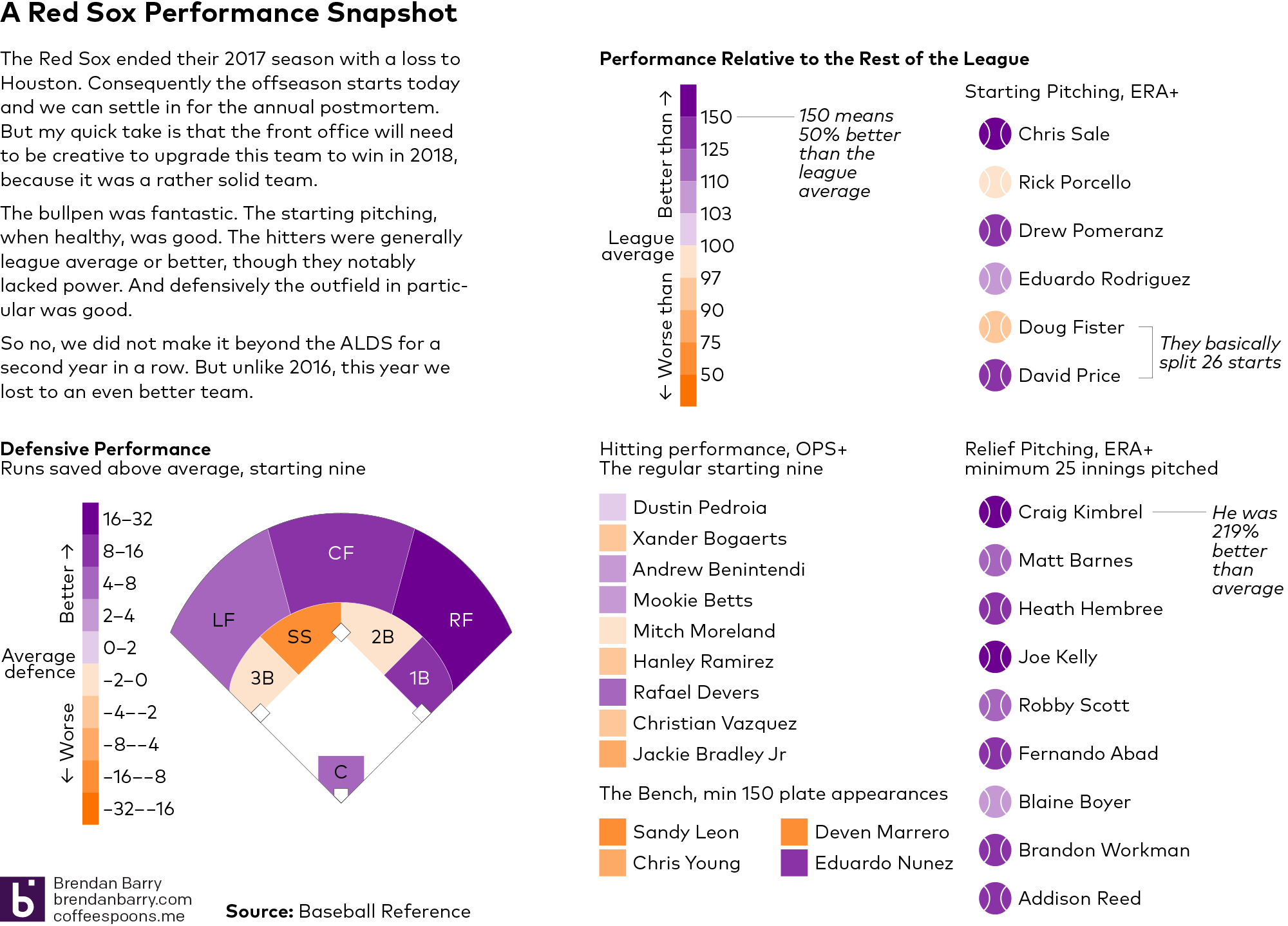
Well the 2017 season ended yesterday afternoon for my Boston Red Sox as we lost 5–4 to the Houston Astros and they took Game 4 of the ALDS. So this morning we will surely see the critiques and hot takes on what to do to improve the team begin to make the internet rounds.
But before we get into all of that, I wanted to take a look at the 2017 season from a data perspective. At least, the regular season. After all, we can see how Sale in Game 1 and Kimbrel in Game 4 just had poorly timed bad days. But what about the other 162 games? After all, we will need to win a lot of them if we want to make it back to the playoffs in 2018.
I just pulled a couple quick stats from Baseball Reference. Now we can quibble about which stats are best another time, but from my experience the more sabremetric datapoints are lost on a general audience. So here we are using OPS, basically a hitter’s average combined with his power/slugging ability, and ERA, the amount of runs a pitcher can be expected to allow every nine innings. I also threw in defensive runs saved above average, i.e. is the player saving more runs than an average player.
You can read the graphic for the details, but the takeaway is that Boston, we need not panic. The 2017 Red Sox were a good team. Far from perfect—here is looking at you lack of middle-of-the-order power—but a solid lineup, good rotation, good defence, and a fantastic bullpen. How can we add without subtracting too much?
C’mon. You knew I was not going to let that one slip by.
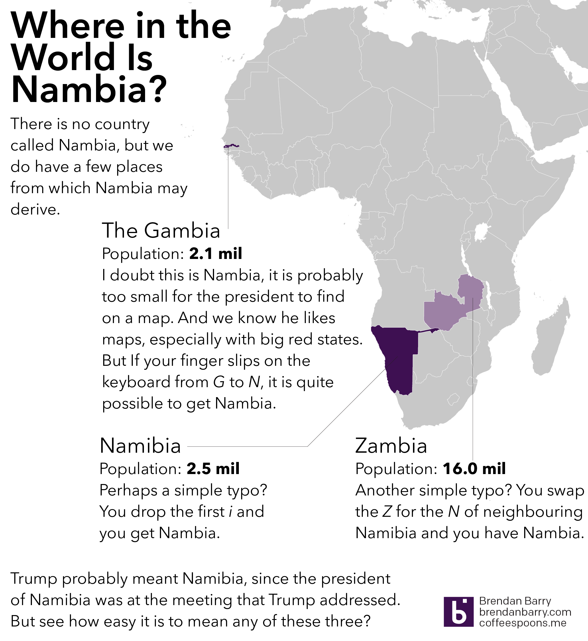
President Trump, in a meeting with African leaders, twice name-dropped Nambia and in one mention held it up as having a nearly self-sufficient healthcare system. Funny thing to mention as the US is on the brink of eviscerating its healthcare system. But I digress. The point is that when you are speaking to the president of a country, you take a minute to learn how to pronounce the country’s name correctly. Even write it phonetically in the text if you have to. (I’ve done that.) So where is Nambia?
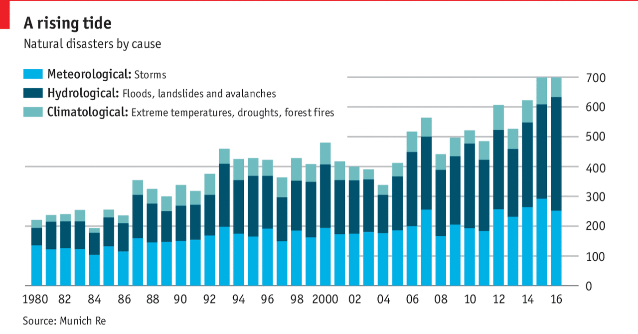
One more day of Harvey-related content. At least I hope. (Who knows? Maybe someone will design a fantastic retrospective graphic?) Today, however, we look at a piece from the Economist about the rising number of weather-related disasters, but thankfully falling numbers of deaths. The piece has all the full suite of graphics: choropleths, line charts, and bar charts (oh my!). But I want to look at the bar chart.
A timeline of disaster causes around the world
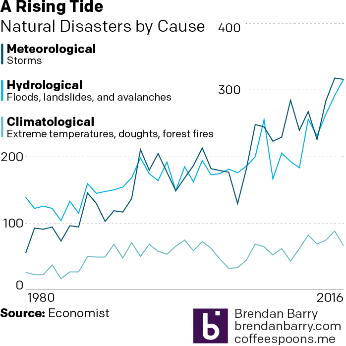
I cannot tell from this chart whether there has been any change in the individual elements, the meteorological, hydrological, or climatological disasters. And unfortunately stacked bar charts do not let us see that kind of detail. They only really allow us to see total magnitude and the changes in the element at the bottom of the stack, i.e. aligned with the baseline. So I took their chart and drew the shapes as lines and realigned everything to get this.
My take
You can begin to see that meteorological might be overtaking hydrological, but it is too early to tell. And that right now, climatological causes are still far behind the other two.
Credit for the piece goes to the Economist Data Team.
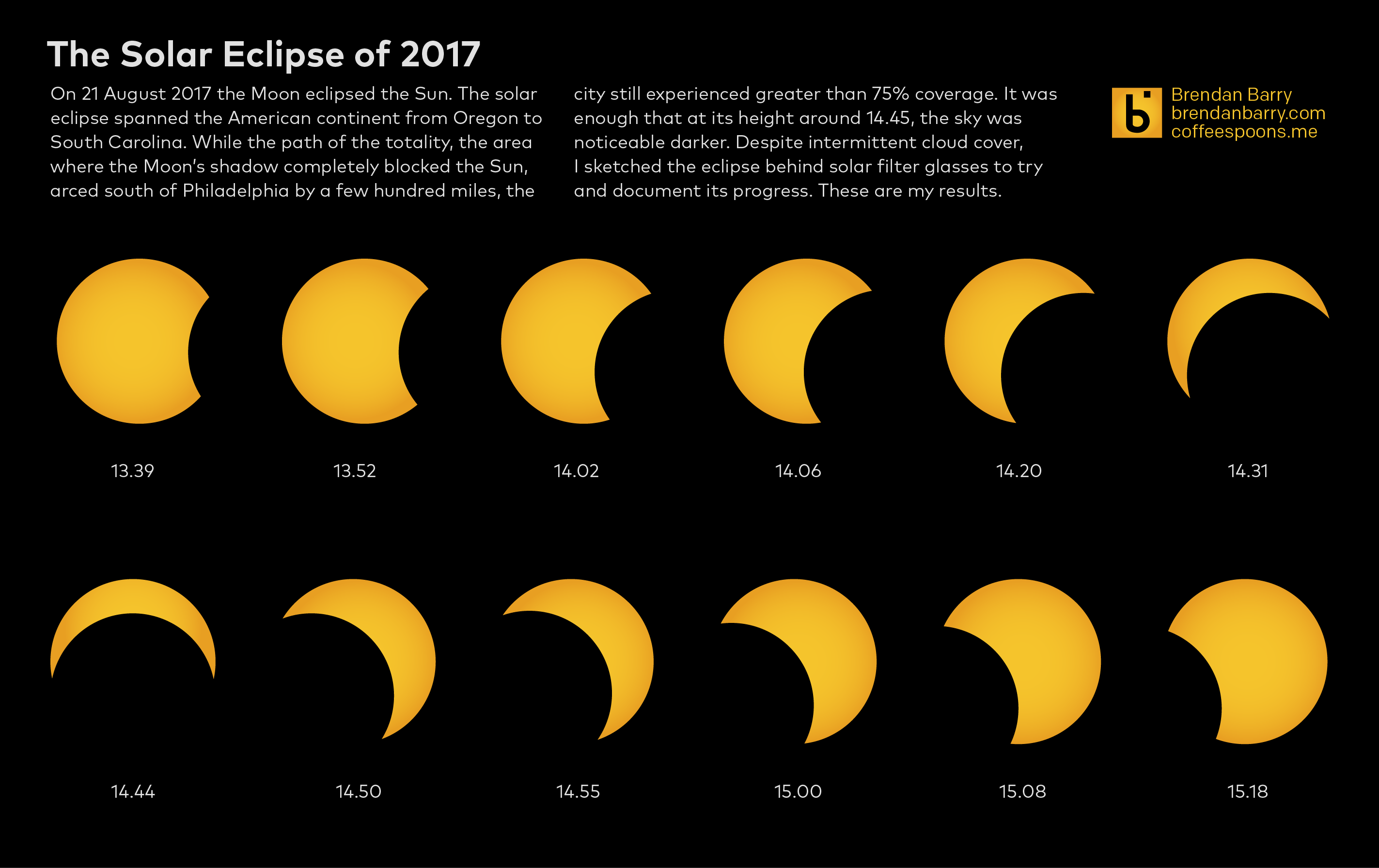
As my last two posts pointed out, yesterday was the Solar Eclipse. It certainly garnered media attention as a news helicopter hovered over my building during the height of the eclipse. Very peaceful indeed. But, knowing that my smartphone would not be able to take the best photos of the eclipse, even with a solar filter, I decided to do what any good designer might do. I sketched out the eclipse.
The task of sketching an eclipse is not easy. You cannot, or at least should not, look directly at the sun. (You’ll burn your eyes out, kid.) But the solar filters make seeing anything but the most intense light sources near impossible and so you have to remove them in order to doodle in a sketchbook. Eventually I found a solution and was able to quickly move from filtered glimpses of the Sun to the sketchbook. (At least when the clouds would permit.)
Last night I digitised those sketches into this simple graphic. The sketches are not entirely accurate as the position of the Moon jumps in a few spots. But it does give you the impression of peak eclipse about 14.45 with just a sliver, or 25% of the Sun remaining visible. And indeed the neighbourhood was visibly darker.
The colour may be too yellow, but since I only saw it through a filter, I cannot say what the exact colour of the Sun was
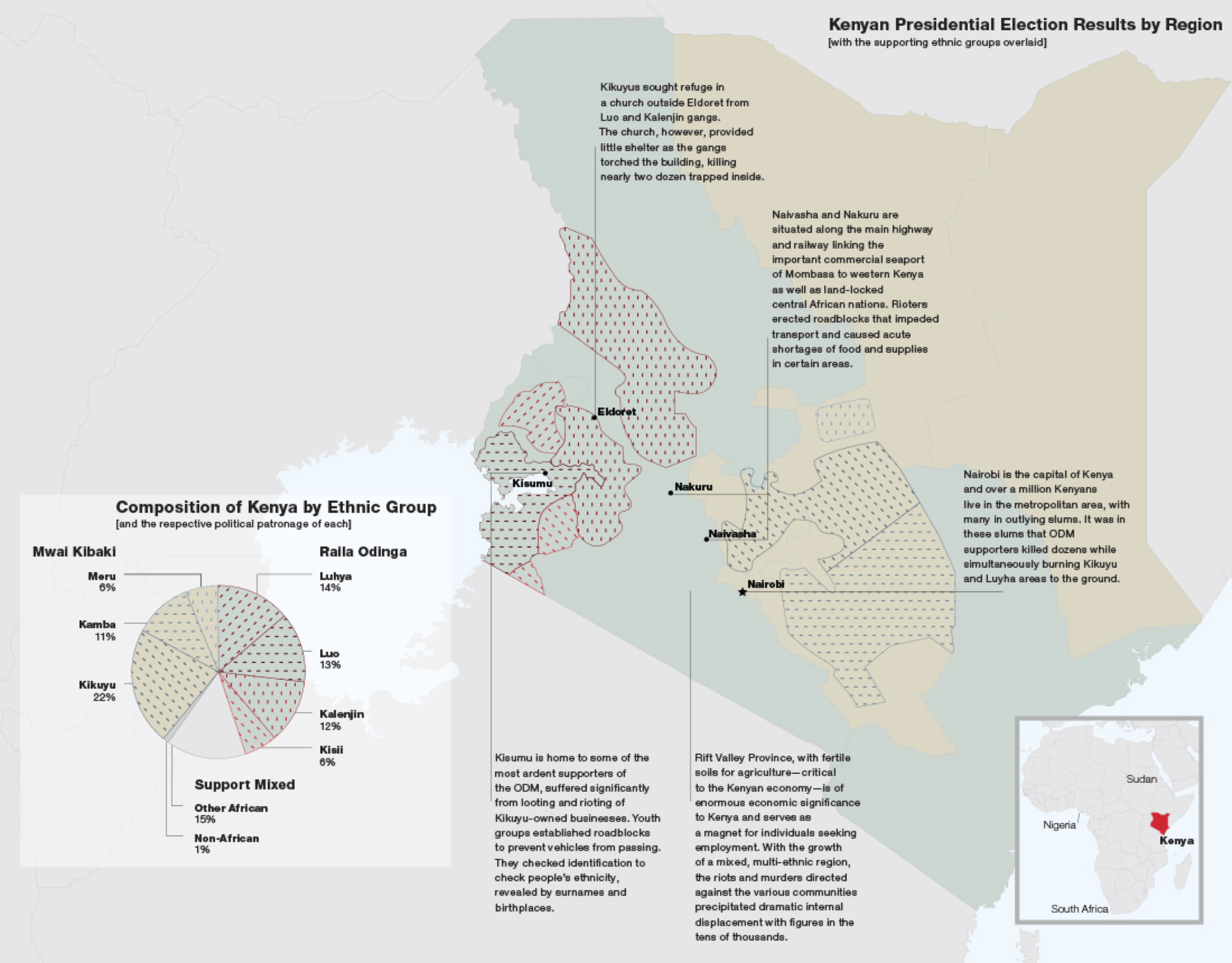
Kenya presently waits for the results of its presidential election, one that pitted incumbent Uhuru Kenyatta against Raila Odinga, a many ran but never won candidate. Now, if you will indulge me, the Kenyan elections have interested me since December 2007, which if you recall provoked sectarian violence to break out across the country.
At the time I had just started working at my undergraduate thesis, a book using Fareed Zakaria’s Future of Freedom as the text (with a parallel narrative from Chinua Achebe’s Things Fall Apart) and I wanted to use specific case studies and data to add to the point of the book. Kenya with its election result data and horrific outcome allowed me to do just that. I juxtaposed awful images of that violence with quiet text and a full-page graphic of the results. I still find it one of the stronger spreads in the book, but as we await the results in Kenya, I am hoping that a ten-year anniversary piece will not be required.
The page of data visualisation
And yes, I have learned a lot since 2007. Including my deep-seated antipathy for pie charts.
Credit for the piece goes to a much less knowledgable me.
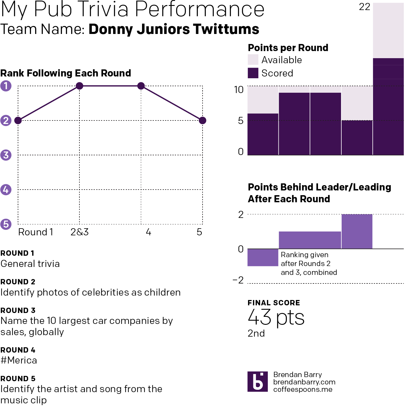
Well after the last two weeks of recording solo trivia performances, I decided that this week I would showcase a team effort.
A non-solo performance
And we finally placed, ending the performance tied for first place. But if you look closely you will see the final score has us at second. Why when we were tied with the same number of points? Because tiebreaker. And after I was selected to represent the team, I needed to respond, within three seconds, with the names of Tom Hanks films in a back-and-forth response.
I could name only Saving Private Ryan and Castaway. My competitor, she named three. They won.
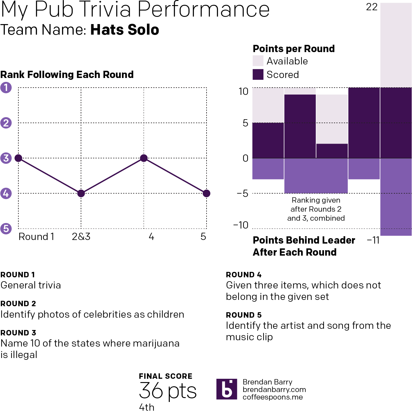
This past Wednesday I once again ended up playing trivia at the pub solo. Once again, I decided over the final pint that I would attempt to visualise my performance.
One thing to keep in mind is that on Wednesday there were fewer teams competing—five instead of nine. And while I never placed higher than tied for third, this week’s bar charts show how I was incredibly competitive until the final music round.
Music and celebrity are clearly not my strong suits
Despite an abysmal performance at naming celebrities as they were as children, my near-perfect second round kept me only five points behind first place. And a perfect fourth round meant heading into that final round I climbed back to being only three points back. Thankfully I knew more of the songs this past week. And enough to not finish last. But, I was close enough that a perfect round would have been enough to still place first.
Super helpful that Lord of the Rings questions appeared a few times.