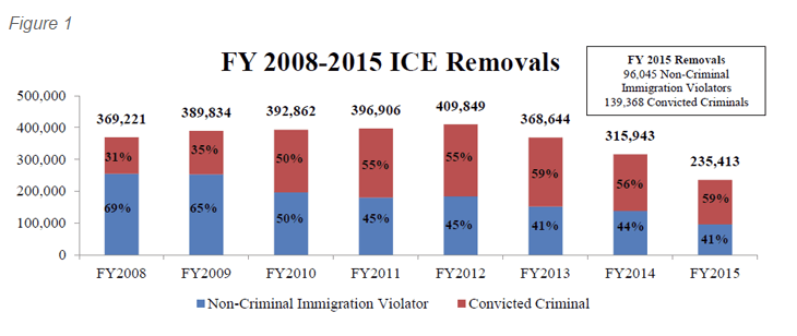
Donald Trump announced how he wants to deport 2–3 million undocumented immigrants that have criminal convictions or that belong to gangs. I read up on the issue at FiveThirtyEight and came across the following graphic from the US Immigration and Customs Enforcement (ICE).
The government’s chart on deportations
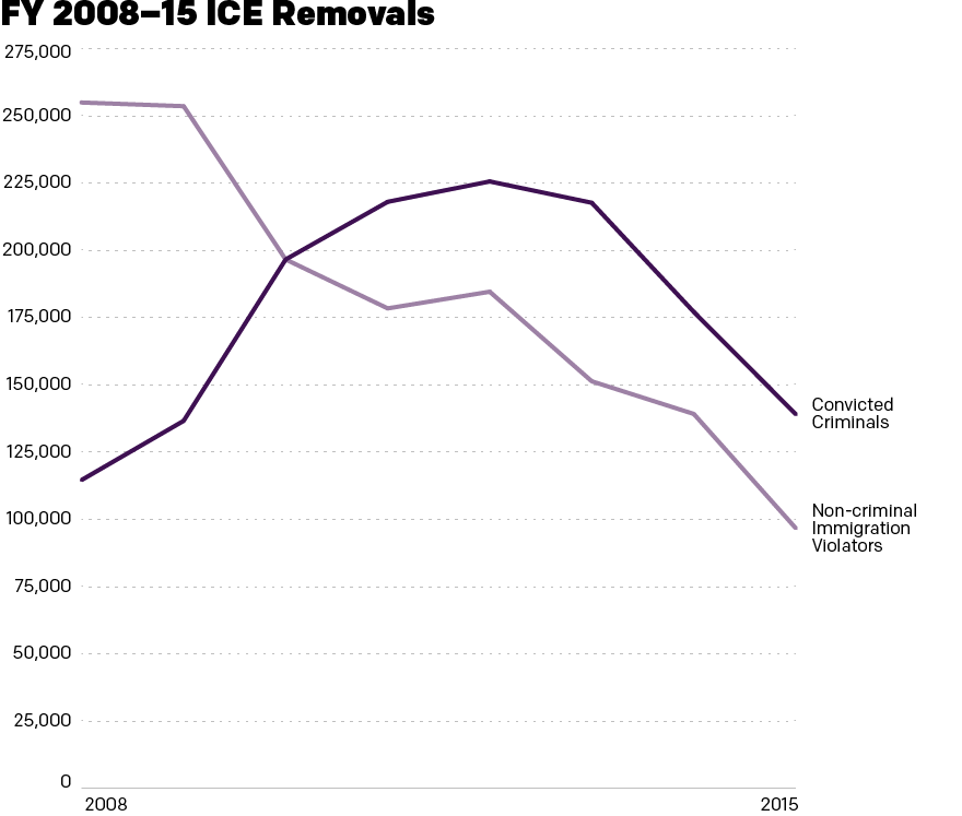
However, when I review the graphic, I found it difficult to understand the FiveThirtyEight article’s point that President Obama has lessened the focus on deportation, but those deported are those convicted of serious criminal offences. So I expanded the size of the y-axis and broke apart the stacked bar chart to show the convicted criminals vs. the non-criminal immigration violators. This graphic more clearly shows the dramatic falloff in deportations, and the emphasis on those with criminal convictions.
A general decline in deportations has also seen a focus on convicted criminals over non-criminal immigration violators
Credit for the original goes to the graphics department of the US Immigration and Customs Enforcement. The other one is mine.
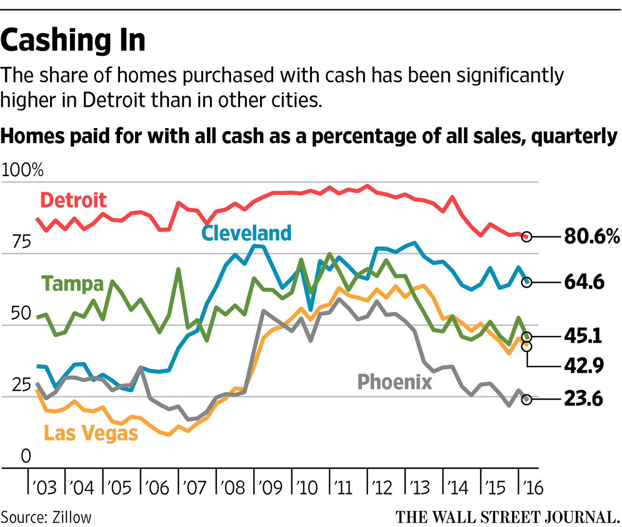
A few weeks ago the Wall Street Journal published a graphic that I thought could use some work. I like line charts, and I think line charts with two or three lines that overlap can be legible. But when I see five in five colours in a small space…well not so much.
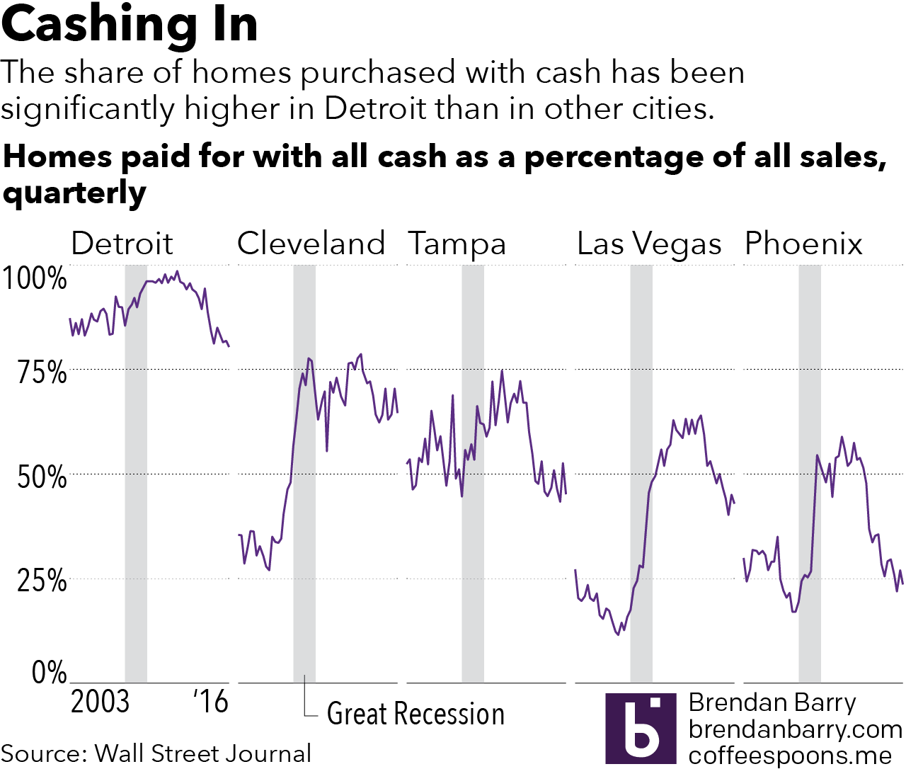
So I spent 45 minutes attempting to rework the graphic. Admittedly, I did not have source data, so I simply traced the lines as they appeared in the graphic. I kept the copy and dimensions and tried to work within those limitations. Clearly I am biased, but I think the work is now a little bit clearer. I also added for context the Great Recession, during which credit tightened, ergo more properties would have been likely purchased with cash. It’s all about the context.
The original:
The original graphic
And my take:
My take on it all
Credit for the original work goes to the Wall Street Journal graphics department.
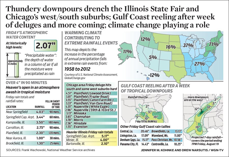
One of the things I like about Chicago’s WGN network is its weather blog. They often include infographic-like content to explain weather trends or stories. But as someone working in the same field of data visualisation and information design, I sometimes find myself truly confused. That happened with this piece last Friday.
Pay attention to the map in the upper-right
The map in the upper-right in particular caught my attention and not in the good way. The overall piece discusses the heavy rainfall in the Chicago area on Thursday and the map looks at the percentage increase in extreme weather rainfall precipitation. All so far so good. But then I look at the map itself. I see blue and thing blue > water > rainfall. The darker/more the blue, the greater the increase. But, no—check out Hawaii. So blue means less rainfall. But also no, look at the Midwest and Southeast. So does green mean anything? Beyond being all positive growth, not that I can tell. As best I can tell, the colour means nothing in terms of rainfall data, but instead delineates the regions of the United States—noting of course they are not the standard US Census Bureau regions.
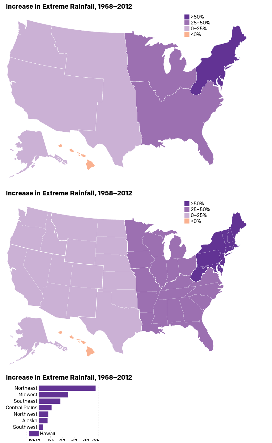
So here is my quick stab at trying to create a map that explains the percentage growth. I have included a version with and without state borders to help readers distinguish between states and regions.
My take on the map
And what is that at the bottom? A bar chart of course. After all, with only eight regions, is a map truly necessary especially when shown at such an aggregate level? You can make the argument that the extreme rainfall has, broadly speaking, benefitted the eastern half of the United States. But, personally speaking, I would prefer a map for a more granular set of data at the state or municipality level.
Credit for the piece goes to Jennifer Kohnke and Drew Narsutis.
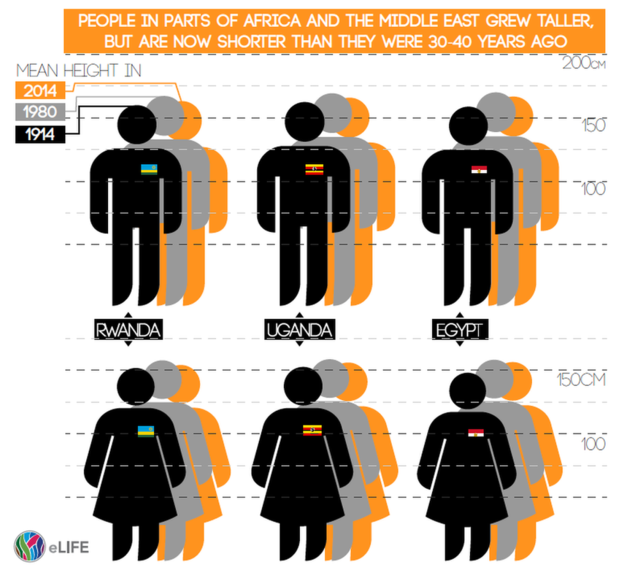
And by this title I am not referencing McKinleys, K2s, or Everests. No, the BBC published this piece on the changing average heights of citizens of various countries. This was the graphic they used from the report’s author.
National heights of people
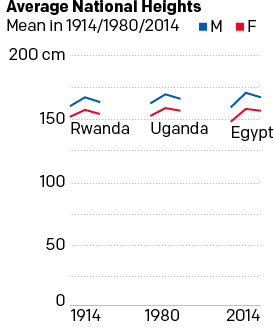
Personally speaking, I do not care for the graphic. It is unclear and puts undue emphasis on the 1914 figure by placing the illustration in the foreground as well as in the darkest colour. I took a thirty-minute stab at re-designing the graphic and have this to offer.
A comparison of the six heights
While I admit that it is far from the sexiest graphic, I think it does a better job of showing the growth than decline of national heights by each sex in each of these three select countries. Plus, we have the advantage of not needing to account for the flag emblems. Note how the black bars of Egypt disappear into the black illustration of the person.
Credit for the piece goes to the eLife graphics department.
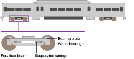
Two weeks ago Philadelphia regional rail commuters, a large group to which I belonged for a number of years, experienced a week from hell. On 2 July a yard inspector for Septa, the Philadelphia region’s transit agency, discovered a Silverliner V railcar tilting. For those not familiar with Septa, the Silverliner Vs have been in service for only three years and have been long touted as the future of the Philadelphia commuter rail service. After inspection Septa discovered the tilting railcar suffered from a fatigue crack on the equaliser beam, specifically where it was welded to connect to the wheel bearings. The beam forms part of the truck, which is what connects the railcar to the rails, and any failure at speed could have resulted in an accident, possibly a derailment. The transit agency then quickly inspected the remainder of its fleet of 120 Silverliner Vs. It found the same fatigue crack in a total of 115 cars. By 4 July, Septa pulled all 120 Silverliner Vs from service.
The equaliser beam connects the wheels to the passenger car
So what happened? At this point, we do not know. Septa continues tests to discover just what happened and just what can be done to repair the cars. Because, with a fleet of approximately 400 cars, the Silverliner Vs represent 1/3 of the fleet. And with fewer seats and fewer trains, commuters attempting to ride into the city, particularly from nearer-in suburbs, find trains bypassing stations because they quickly reach capacity.
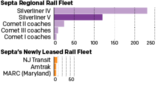
The additional passenger railcars from other regional transit agencies will make little difference
Consequently, Septa has instituted a reduced service—a modification of the Saturday service—with additional service on subways and other high-speed lines. Additionally, Septa has agreed to lease additional trainsets, i.e. locomotives with passenger cars, from other regional transit agencies: Amtrak, New Jersey Transit (NJ Transit), and the Maryland Area Regional Commuter Train Service (MARC).
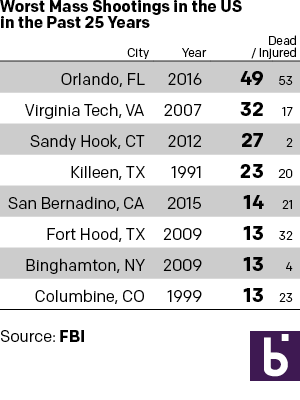
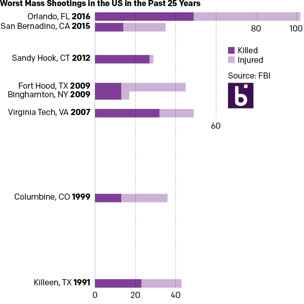
Monday I examined a chart from the BBC that in my mind needlessly added confusing visual components to what could have been a straight table. So here we take a look at some other options that could have been used to tell the same story. The first is the straight forward table approach. Here I emphasised the important number, that of those killed. I opted to de-emphasise the years and the injured in the table. Also, since the bulk of my audience is from the United States, I used the two-letter states codes.
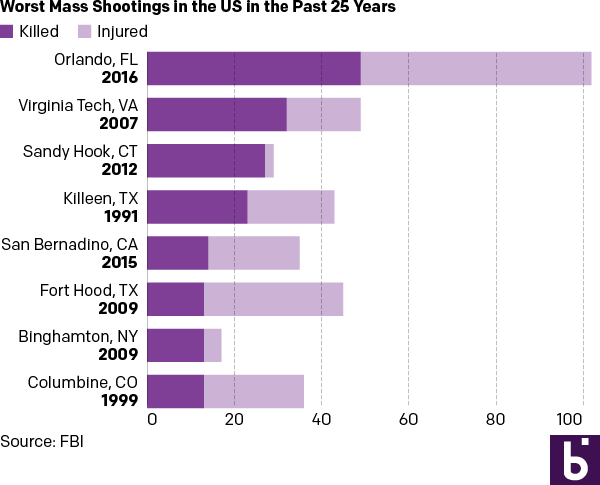
But let us presume we want a graphic because everyone wants everything to be visual and graphic. Here are two different options. The first takes the table/graphic from the BBC and converts it into a straight stacked bar chart, again with emphasis on the dead. I consolidated the list into a single column so one need not split their reading across both the horizontal and vertical.
As a stacked bar chart
And then if you examine the dates, one can find an interesting component of the data. Of the top-eight shootings, all but two occurred within the last ten years. So the second version takes the graphic component of the stacked bars from the first and places them on a timeline.
In a timeline
For those that wonder about the additional effort needed to create three different options from one data set, I limited myself to an hour’s worth of time. A little bit of thought after examining the data set can save a lot of time when trying to design the data display.
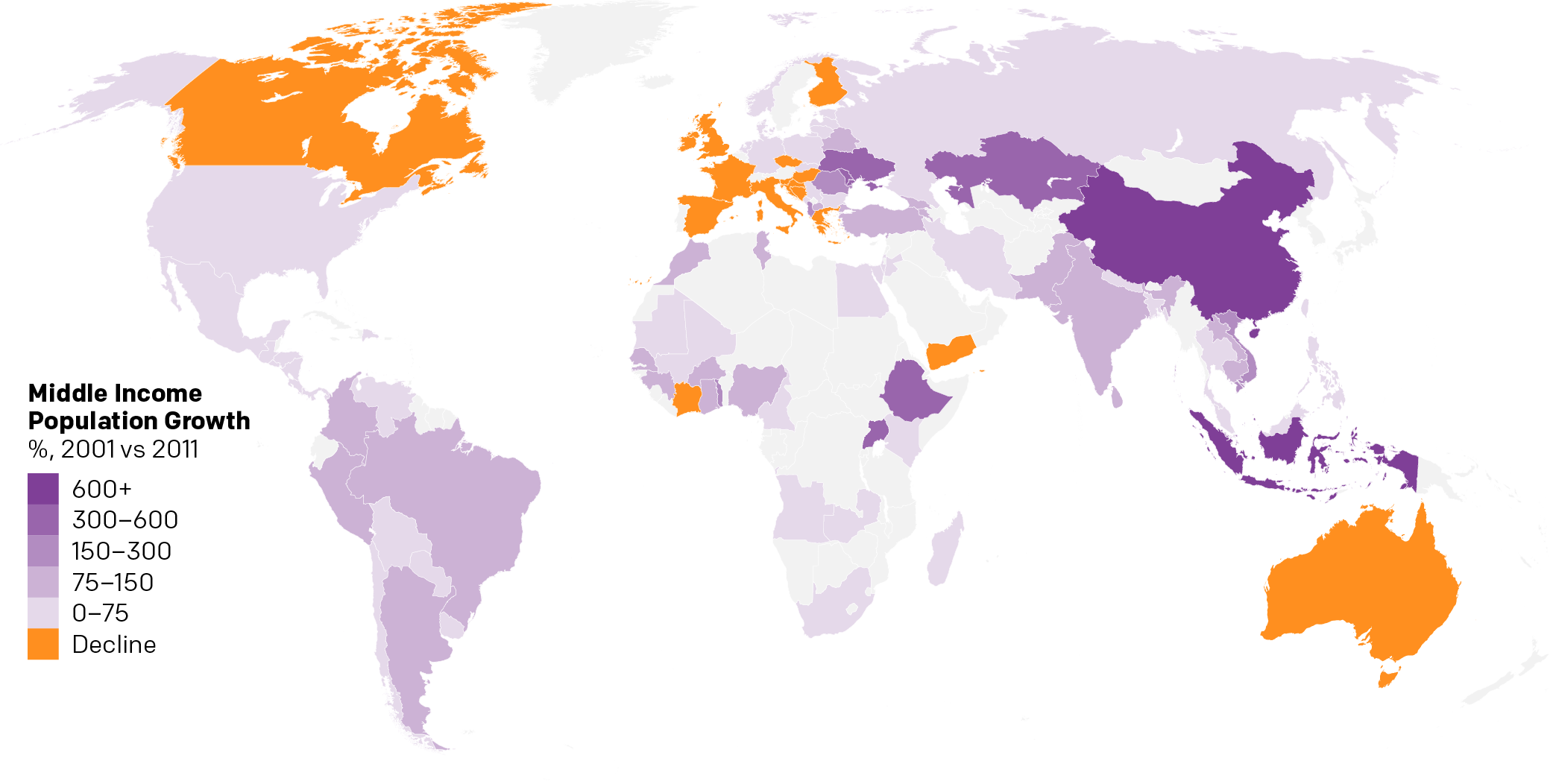
Over the weekend I found myself curious about the notion of a growing global middle class. So I dug up some data from the Pew Research Center and did some analysis. The linked piece here details that analysis.
The growth in middle income populations
I go into more detail than just a map. Hopefully you enjoy the piece and find the analysis informative if not useful.
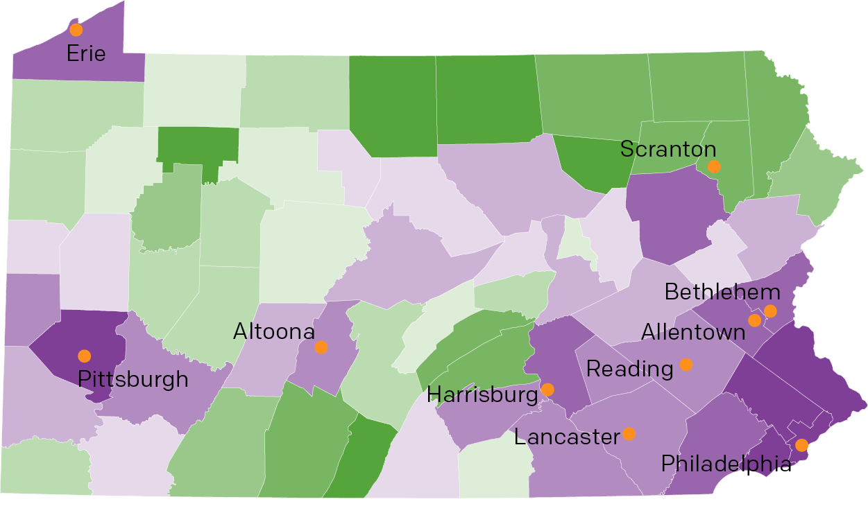
So last week I mentioned Pennsyltucky in my blog post about Pennsylvania’s forthcoming importance in the election. And then on Friday I shared a humourous illustrated map of Pennsylvania that led into an article on Pennsyltucky. But where exactly is it?
Luckily for you, I spent a good chunk of my weekend trying to find some data on Pennsylvania and taking a look at it. You can see and read the results over on a separate page of mine.
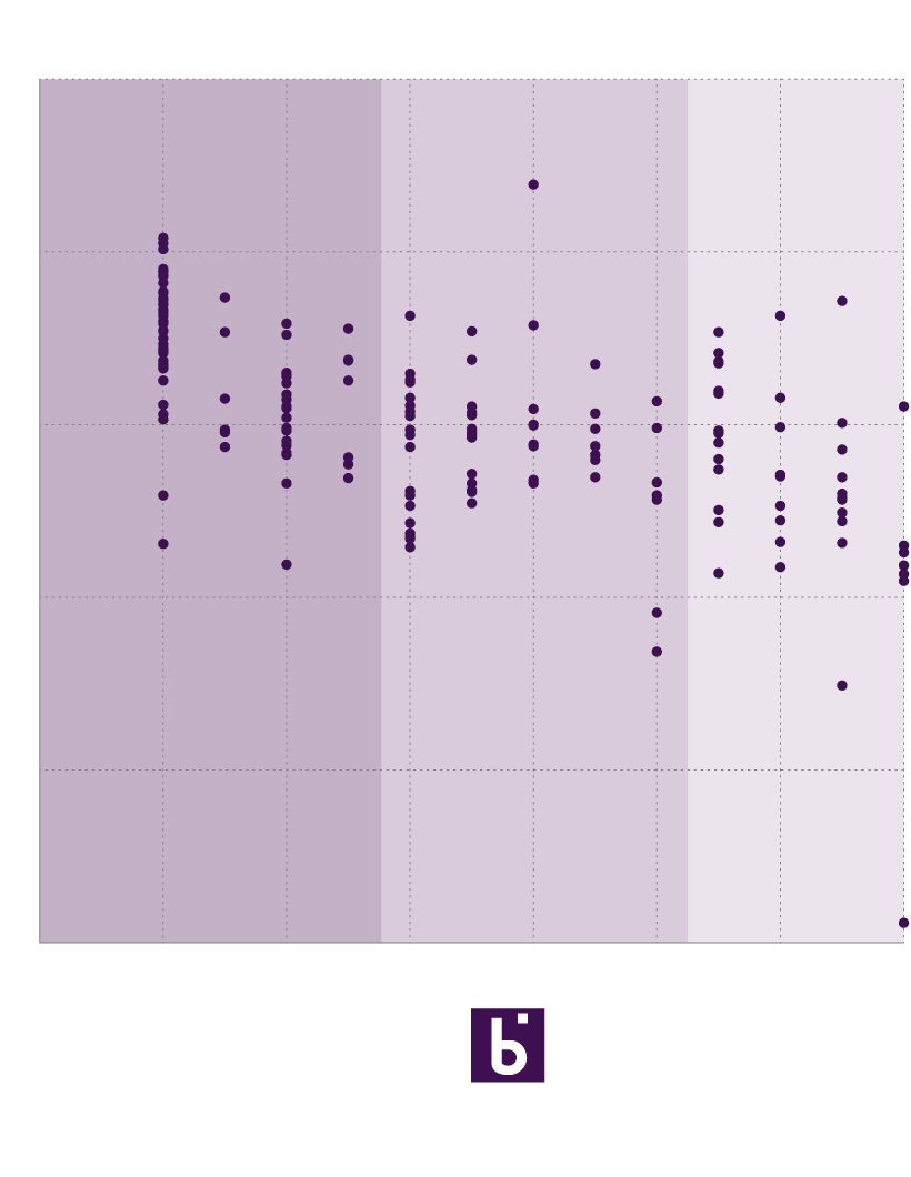
Today’s post is just a little scatter plot today of my own creation. I was interested to see which countries fall outside the mainstream when it comes to economic and political freedom, as measured by the Heritage Foundation and Freedom House, respectively.
Those are certainly not the only indices that I could have chosen, however, they were admittedly the easiest to find and use. Despite the fact the one dataset still contained data on such mythical places as Czechoslovakia, East Germany, and the Soviet Union.
That all said, my apologies for the graphics not quite being super clean. I am working on some new things and so this post is at best only a partially successful experiment.
I spent the weekend in Ganister, Pennsylvania (shameless plug, you can learn more about the town on the website I built for it) where my immediate family gathers for Easter. The Orthodox version was obviously far later than the Catholic version this year. When here I try to do research on the town and the families who lived there. One of my long-standing projects includes researching the history of the church of my ancestors, St. Mary’s Holy Assumption Church. I wanted to understand who were the pastors over the almost 100 years the church was open. In a local library I found copies of a few anniversary service souvenirs and I used that to create this first draft of that timeline.