I meant to publish this yesterday, but this piece also offers a reminder that the hardest part of a data-driven story is usually finding the data. I was unable to find a single source of data for all the numbers I needed by the time I switched on for work. And so this had to wait until last night when I found what I needed.
And of course upon waking up this morning I found a few new articles with the data and more recent figures.
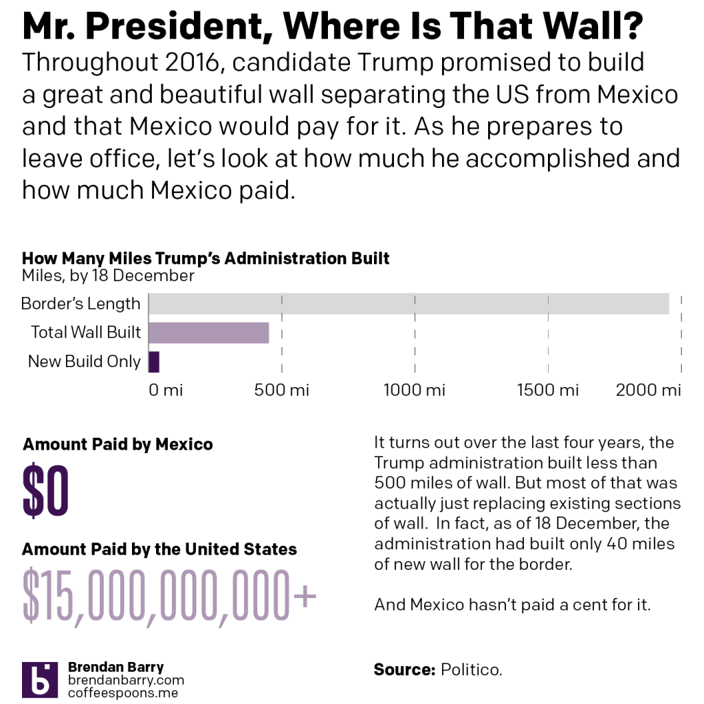
Since 2016, Trump has made building a great, big, beautiful wall on the US-Mexican border his signature policy. Of course, most illegal immigrants cross the border legally at checkpoints and normal ports of entry. A significant number are people who overstay the limits on their visas. So the efficacy of a great, big, beautiful wall is really not that great.
He also claimed that he would make Mexico pay for it.
So as he prepares to leave office, Trump this week is going on something of a victory tour and touting up his administration’s successes. The first stop? Alamo, Texas to highlight his wall.
Let’s look at that wall and how much the administration has accomplished.
For context, the US border with Mexico is nearly 2000 miles long. As of 18 December, the administration had built 452 miles, less than a quarter of the border’s total length.
Crucially, most of that construction merely replaced sections of existing wall and fence scheduled for replacement. The total amount of new wall built, as of 18 December, totals about 40 miles.
The cost of that 452 miles? More than $15 billion.
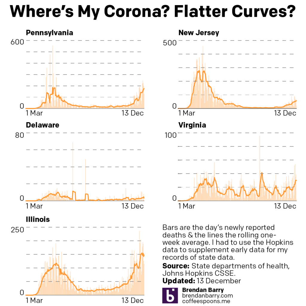
The last time we checked in on Covid-19 in the states of Pennsylvania, New Jersey, Delaware, Virginia, and Illinois, things were peaking across the five states. As I said then:
If you look at the very tippy tip top of the curves in the other four states, we might just be seeing an inflection point.
And in the month since, my highly scientific term of “tippy point” appears to have been correct. New cases did begin to drop and by the start of the Christmas holiday we began to see real improvement. I should point out that deaths continued to rise, however, but we should expect that because deaths lag new cases by sometimes as many as four to six weeks.
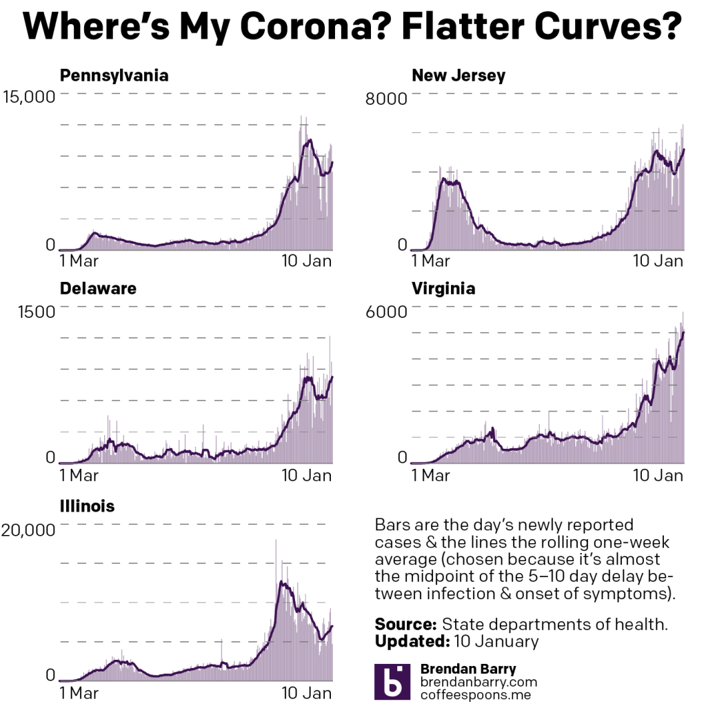
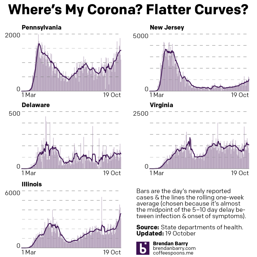
So how are things now, a month hence?
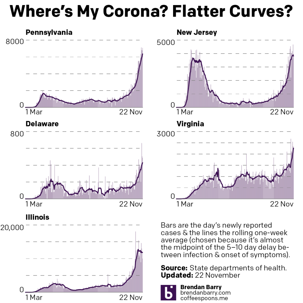
The new case curves for PA, NJ, DE, VA, & IL.
Well as you can see with new cases, not great and getting worse. Pennsylvania, New Jersey, Delaware, and Illinois all bottomed out prior to the holidays, and since then have been rising. It speaks to a surge in new cases likely caused by gatherings centred on the holidays.
The good news—if you can call it that—is that in Pennsylvania and Illinois, whilst cases rebound, they have not yet reached their mid-December peak in Pennsylvania and mid-November peak in Illinois. It’s worth pointing out that Chicago and separately Illinois instituted lockdowns earlier than the other four states prior to the holidays. That may account for the more dramatic reduction in those states.
The bad news is that in New Jersey and Delaware, the rebounds have now surpassed the peaks we saw in mid-December and cases continue to climb with new daily records pointing towards escalation of new cases in those states.
But the really bad news is in Virginia, where the inflection point was there—note the little mini “W” at the top of the chart—but that new cases declined neither significantly long nor in significant numbers such that there was no real holiday decline. Instead, at best we could describe it as numbers paused for two weeks before resuming their upward trends.
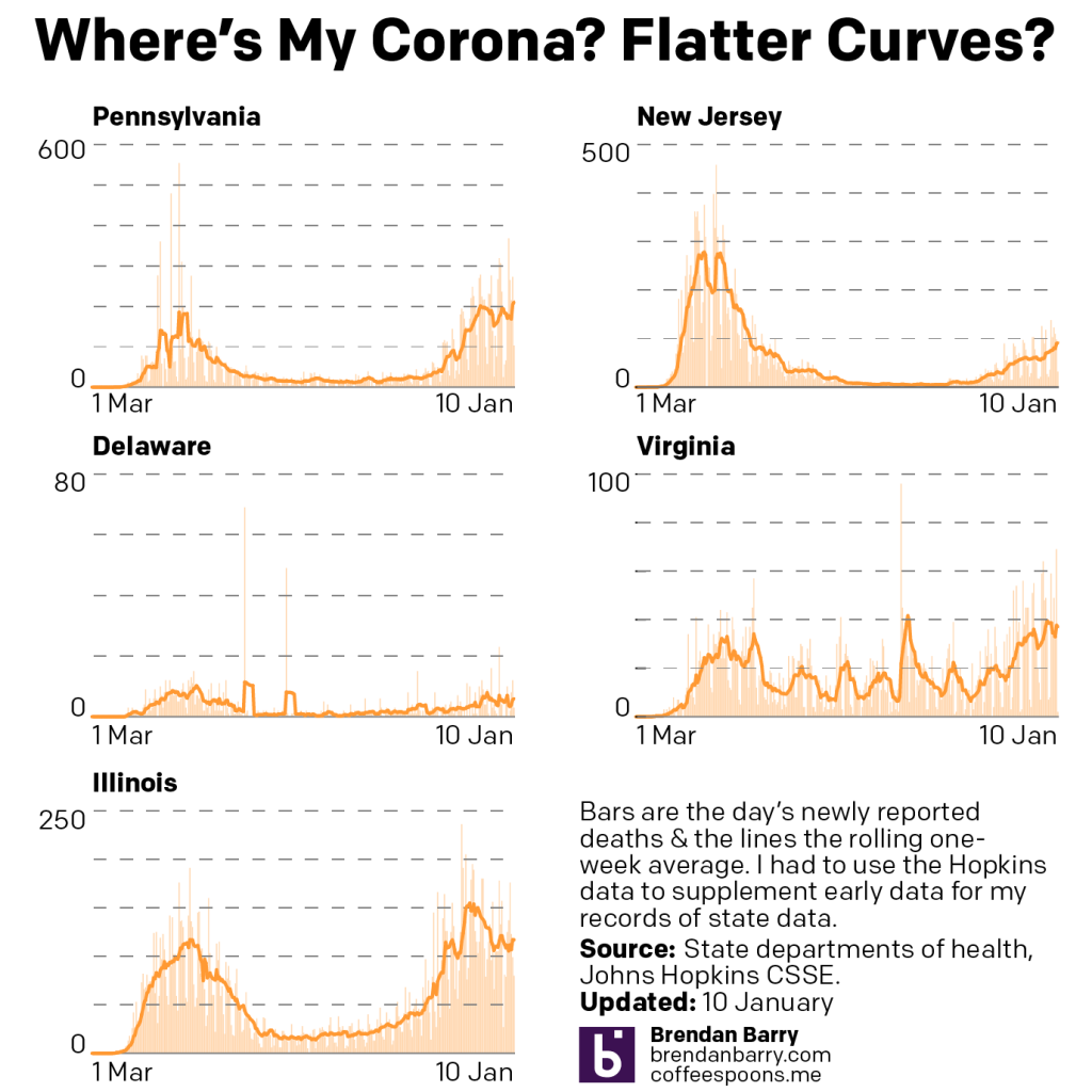
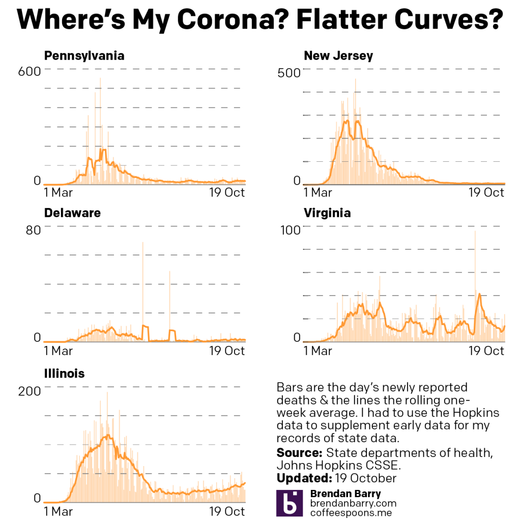
How about deaths?
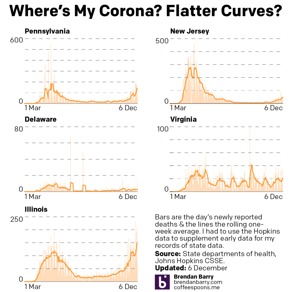
Death curves in PA, NJ, DE, VA, & IL.
Again, fairly grim news here. A month ago we were talking about rising rates of deaths in all but Illinois. And in fact, Illinois is the only state where the death rate is significantly lower than what it was in mid-December.
In New Jersey and Virginia, we see two states where the rising death rate perhaps slowed, but it never really entered into decline. Pennsylvania and Delaware offer perhaps static death rates. In fact, Pennsylvania just yesterday surpassed its mid-December peak level.
But keep in mind that deaths lag new cases by somewhere between two to four weeks, sometimes longer. What this means is that with new cases now rebounding and in fact surpassing their peaks from a month ago, we can expect that the end of January and beginning of February could be particularly deadly.
The situation is dire in the United States and things are going to get worse before they get better.
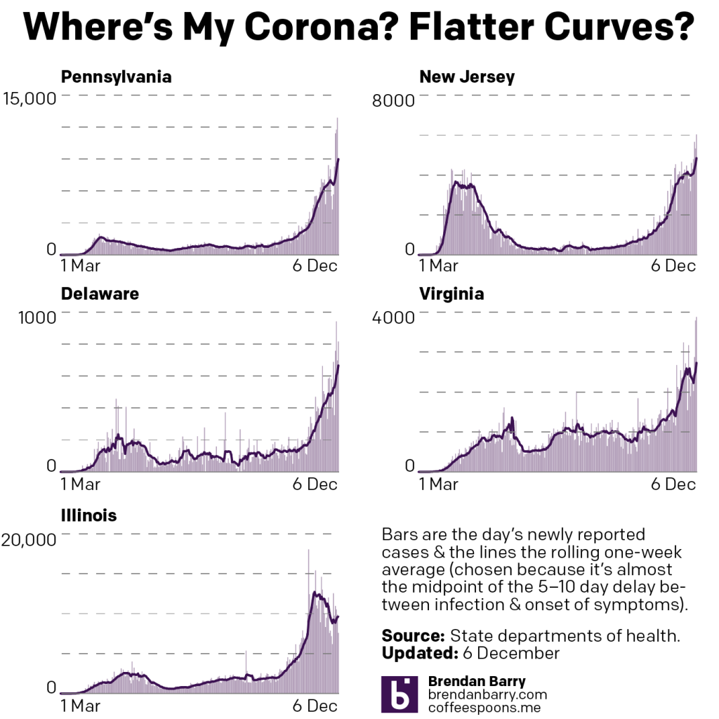
So as begin to head into winter, where are we at with the spread of Covid-19 in the five states of Pennsylvania, New Jersey, Delaware, Virginia, and Illinois?
Nowhere good. Let’s take a look.
New cases curves for PA, NJ, DE, VA, & IL.
If you recall where we were at last week, also not great but better, cases had resumed rising post-Thanksgiving across the board. The data from yesterday indicates that cases have continued to rise everywhere but Illinois, which initiated a lockdown earlier than the other states we cover.
But Philadelphia did eventually institute a lockdown and eventually the rest of the Commonwealth followed, and similar measures—none of course as significant as those from the spring—were enacted in other states.
If you look at the very tippy tip top of the curves in the other four states, we might just be seeing an inflection point. That is, the curve of new cases could be slowing from their near exponential rates of increase. The numbers released today we should expect to be lower than average. Consequently we will want to see the numbers beginning Tuesday through the end of the week to see whether this slowdown is real or a blip.
Regardless of whether or not new cases numbers are slowing down, we have to contend with rising numbers of deaths. Deaths of course lag new cases by weeks, sometimes as many as 4–8. So if we hypothetically hit peak new cases today, we would expect the number of deaths to continue rising and then peak perhaps sometime in mid- to late-January.
So where are we with deaths today? Also nowhere good. Let’s take a look.
Death curves for PA, NJ, DE, VA & IL.
In all five states with the potential exception of Illinois, new deaths continue to rise. Pennsylvania, worryingly, will likely surpass the peak death rate it saw in the spring if current trends continue. I would expect that sometime likely this week.
Illinois remains the one state where we might be seeing some good news. As I just mentioned above, deaths lag new cases by several weeks. And several weeks ago we appear to have peaked there in terms of new cases. It’s possible that we are beginning to or have already seen peak deaths in Illinois and that the next several weeks could be a gradual decline as the state gets its outbreak under control.
In the other four states, if we were to hypothetically peak with new cases this week, again, we would likely see these orange lines continue heading upwards for several weeks to come. And in that case, we’d almost certainly pass the peak death rates of the spring in Pennsylvania, Delaware, and Virginia. New Jersey might be the exception to that, however. And that would be largely due to the fact that so many deaths there happened so early in the pandemic before we had identified the best ways to save lives.
I suspect that the data coming out this week will be important to inform us whether or not we have crested or begun to crest this latest wave of infections.
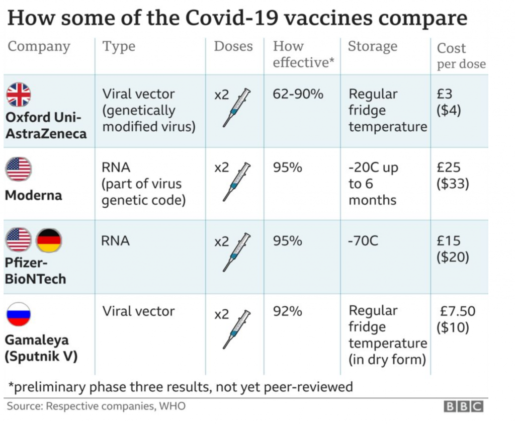
With the rollout of the first vaccination programme in the United Kingdom, the BBC had a helpful comparison table stating the differences between the four primary options. It’s a small piece, but as I often say, we don’t necessarily need large and complex graphics.
A nice little comparison table
Since there are only four vaccines to compare and only a handful of metrics, a table makes a lot of sense.
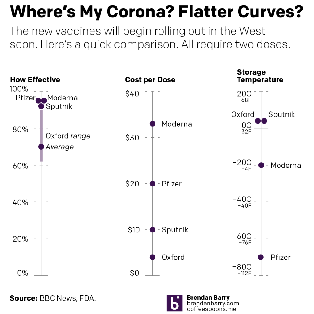
But I wanted to take it a step further and so I threw together a quick piece that showed some of the key differences. In particular I wanted to focus on the effectiveness, storage temperatures (key to distribution in the developing world), and cost.
My quick take
You can pretty quickly see why the United Kingdom’s vaccine developed by Oxford University and produced by AstraZeneca is so crucial to global efforts. The cost is a mere fraction of those of the other players and then for storage temperature, along with Russia’s Sputnik vaccine, it can be stored at common refrigerator temperatures. Both Pfizer’s and Moderna’s need to be kept chilled at temperatures beyond your common freezer.
And in terms of effectiveness, which is what we all really care about, they’re fairly similar, except for the Oxford University version. Oxford’s has an overall effectiveness of 70%. (In)famously, it exhibited a wide range of effectiveness during trials of between just over 60% and 90%.
The 60-odd% effectiveness was achieved when using the recommended dosage. However, in one small group of trial participants, they erroneously were given a half-dosage. And in that case, the dosage was found to be far more effective, approximately 90%. And this is why we would normally have longer, wider-ranging trials, to dial in things like doses. But, you know, pandemic and we’re trying to return to some sense of normalcy in a hurry.
All that said, Oxford’s will be crucial to the developing world, where incomes and government expenditures are lower and cold-storage infrastructure much less, well, developed. And we need to get this coronavirus under control globally, because if we don’t, the virus could persist in reservoirs, mutating for years until the right mutation comes along and the next pandemic sweeps across the globe.
I know we’re presently all fighting about wearing masks, but when we get to having vaccines available to the public, let’s really try to not make that a political issue.
Once more we look at the Covid-19 outbreak in Pennsylvania, New Jersey, Delaware, Virginia, and Illinois. And things are bad getting worse. I skipped last week because I was on holiday for Thanksgiving, but the data was perhaps not the most indicative of the current state of affairs at the time. But we now have a full week’s worth of data since the holiday, and like I said at the top, things are bad. Especially when we compare the charts below to where we were two weeks ago.
New cases curves for PA, NJ, DE, VA, & IL.
We look at new cases and we can see the impact of Thanksgiving on the shape of the curves. Note how in Pennsylvania, New Jersey, and to a lesser extent Delaware, we see a sharp plateau with the average before a sudden resumption of positive results. That’s Thanksgiving for you. You can see a similar, though perhaps more pronounced pattern in Illinois and Virginia where both states actually saw their average rate of new cases per day fall over the holiday.
Illinois, however, had been trending downward before Thanksgiving, and it might be due in part to the lockdown imposed by the city of Chicago. Whilst unpopular, lockdowns are an effective way of tamping down rising rates of new cases—vital to maintain capacity at hospitals and intensive care units (ICUs).
Of course cities and states are slowly implementing their own new lockdowns now. Philadelphia has been in one for two weeks now. Of course, we would want to wait 2–4 weeks to see if the numbers of new cases begin to fall, but the big intervening factor here is that very same Thanksgiving holiday. Did people travel? Anecdotally, I can say that the rooftop deck of my building’s parking garage, which I can see from my flat, was empty but for about five cars including my own. So people definitely travelled and likely visited other households. Not great.
And that could set us back, because new cases lead to new hospitalisations lead to new deaths. I would say that we probably should not expect as many deaths as we saw in the spring, because we are no longer dealing with a new virus. We know how to treat it far more effectively. But we also see that people aren’t taking the most basic preventative measures: wear a mask, and stay isolated.
In Illinois we are seeing death rates in excess of what we saw in the spring. And Pennsylvania isn’t far behind what we saw in March and April.
Death rates in PA, NJ, DE, VA, & IL.
And so I am increasingly worried that we will see more death in the winter than we did in the spring. And it’s depressing because so much of it could be avoided. Wearing a mask isn’t 100% effective. And there’s no guarantee that the few people an isolated household interact with, e.g. the delivery guy, aren’t themselves vectors. But both measures are far more effective than only occasionally wearing a mask at a house party to celebrate the holidays because we won’t let the virus beat us and interfere with our way of life.
The virus doesn’t care and you and I are tired of it. Tired of isolation. Of wearing masks. The virus is out there, spreading, and making people sick. And a fraction of those people are becoming ill enough to warrant hospitalisation. And a fraction of those are dying.
The next several weeks are going to be awful.
But you know that now. And you can brace yourself.
I have been taking and have yet to take a lot of holiday time this year. So apologies for the sporadic posting. But we’re working this week, because travelling to see family this year is a bad idea.
So the last Covid-19 update I posted was about a month ago. A lot has happened in the last month, like an entire election. But you really should go back a month and look at the charts for the five states I cover. At the time I said things were
Bad and getting worse.
I added that
while we are seeing dramatic rises in new cases, we are not yet seeing the rises in deaths that accompanied similar rises in March and April
And so let’s take a look at where we are now. First with cases.
New case curves for PA, NJ, DE, VA, & IL.
And now with those deaths.
Death curves for PA, NJ, DE, VA, & IL.
I mean…
This has all been so obvious for so long. And yet, I had to run two errands yesterday—timed so that I’d be running them whilst most of Philadelphia watched their football team and they must have played poorly from all the people yelling “c’mon” out their windows—and whilst the streets were fairly empty, about half of the people I passed either had their masks down, were doing that idiotic cover-the-mouth-but-not-the-nose thing, or—and this is the kicker—flat out had no mask on at all.
I’ll repeat what I said a month ago, things are bad and getting worse. But, maybe unlike a month ago, people will start taking this seriously. Because a month ago I wrote about how new deaths were not yet at the levels of the spring.
Well take a look at Illinois. They got there in just four weeks.
Pennsylvania? Halfway there.
New Jersey? Starting to rise a little bit faster now.
Virginia? Well Virginia has one of the odder death patterns I’ve seen—partly by their repeated cycling through backlogged data—but it’s clearly on the upswing now.
Delaware? It’s hard to see because the numbers are so small, but it’s also on the rise.
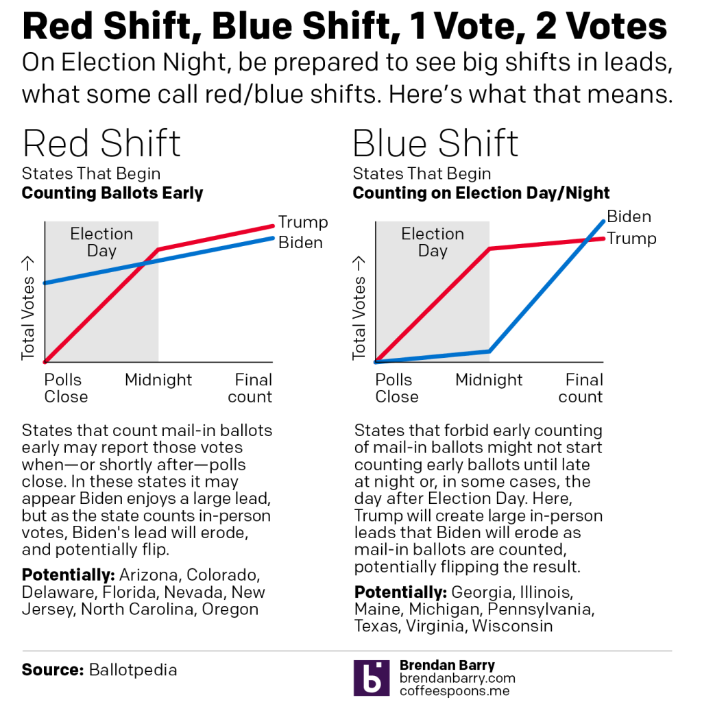
Last night I published a graphic on Instagram that I think people may find helpful if they try to follow Election Day results on Tuesday. I wanted to explain the concept of a red shift or blue shift. (I’ve also seen it described as states having a red mirage or a blue mirage.)
For my non-American readers, it’s important to understand that while this is a national election, the United States’ federal system means that each state runs its own election with its own rules and they can vary some state to state. For example, early or mail-in voting can vary significantly from state to state with some states allowing it only in emergencies (and some of those this cycle will not allow people to cite COVID-19 as an emergency).
Another factor for everyone to consider is that polling indicates President Trump’s fraudulent messaging about, well, voting fraud has shifted a normally split use of early/mail-in voting to a Democratic advantage. In other words, Democrats are far more likely to vote early, either in person or by post. Republicans are far more likely to vote on Election Day.
Combine those two factors and we get Red Shift vs. Blue Shift.
Some states allow election officials to begin counting their early votes prior to Election Day. Other states forbid counting until Election Day morning, or in some cases until after the polls close.
In states where early votes can be counted—the swing states Arizona, Florida, and North Carolina are among this group—it is possible that when the polls close, or shortly thereafter, we will see an instant and enormous lead for Joe Biden. But, as the states begin to count in-person day-of votes, which again favour Republicans, Trump may begin to eat into those margins. The question will be, can Trump’s numbers eat in so much that when the final counts are complete, he can overtake those Biden numbers? This is the Red Shift.
Conversely we have the Blue Shift. In these states—swing states like Georgia, Michigan, Pennsylvania, Texas, and Wisconsin are in this group—election officials cannot begin to count early votes either until the morning or when the polls close. In these states we may see the in-person day-of votes, largely expected to be for Republicans, run up to high totals fairly quickly. At that time, Trump may have a significant lead. Then when officials pivot to counting the early votes, Biden will begin to eat into those margins. And again, the question will be, can Biden eat into those margins sufficiently to shift the outcome after all the votes are counted?
Be prepared to hear about these scenarios Tuesday night.
I’m not working for a good chunk of the next few days. But, I did want to share with my readers an analysis of Pennsylvania’s missing votes. Broadly, Trump needs to win the Commonwealth of Pennsylvania next week—yes, the US election is now one week away. Though, Pennsylvania allows mail-in ballots postmarked on Election Day to arrive within a few days and still be counted. So we may not have final tallies for the state until the weekend or Monday after Election Day.
Pennsylvania, of course, narrowly voted for Donald Trump over Hillary Clinton in 2016 with 44,000+ votes making the difference. In 2020, polling has consistently placed Joe Biden above Donald Trump by 5+ points. But, can Trump again pull off an upset victory?
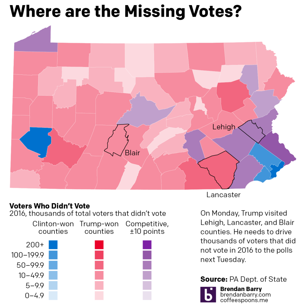
I argue that yes, he can. And fairly easily too. (If you want to see why I think Pennsylvania is really Trumpsylvania, I recommend checking out my longer, more in-depth analysis.) So where would the votes come from? I mapped the 2016 difference between votes cast and registered voters, i.e. people who could have voted, but did not for whatever reason. I then coloured the map by the county’s winner in 2016. Red counties voted for Trump by more than 10 points and blue for Clinton by more than 10 points. The purple counties are those that were competitive, plus or minus 10 points for either candidate.
In the purple counties, both candidates will want to drive out as many voters as possible. But in the blue counties, Biden has reliably Democratic votes and in red Trump has reliably Republican votes. So why on Monday did Trump visit Allentown, Lititz, and Martinsburg? Because that’s where those votes are.
Allentown, in Lehigh County, is competitive. In fact, neighbouring Northampton Co. will be a key swing county next week and one I will be following closely as the returns come in. But Lititz, Lancaster Co., and Martinsburg, Blair Co., are in reliably red counties. (Though in my Trumpsylvania piece I argue Lancaster Co. is undergoing a transition to a competitive, albeit lean Republican county.)
In Lancaster Co., which went to Trump by nearly 20 percentage points in 2016, there were still just short of 100,000 voters who didn’t vote in 2016. Not all of those voters would have voted for Trump, but for sake of argument, just say 50% would have. That makes just short of 50,000 potential Trump votes—more than Trump’s entire state margin.
Blair Co. is in the Pennsyltucky region of the state, relatively rural, but in Blair’s case, its county seat Altoona is the state’s 10th largest city. While the total number of votes—and the total number of non-voting voters—are smaller than in Lancaster Co., add up all the available votes and it’s a large number.
If you add up all those red counties’ missing votes, you get a total of just shy of 840,000 missing votes. Far more than enough to drastically swing the Commonwealth to Trump in 2020.
Of course, Biden’s counting on driving out turnout in Philadelphia and Pittsburgh and their suburbs, along with other cities in the state, like Allentown, Scranton, Harrisburg, and Erie. In those blue counties, there were 927,000 missing votes, so the potential for a Biden win is also there.
But, if Democratic voters don’t vote again in 2016, Trump has plenty of potential votes to pick up across the state.
I took a holiday yesterday. To be honest, I’ll be taking a lot of short holidays as the year winds down on account of not taking any the first three quarters of the year. So expect quite a few quiet Mondays and Fridays in the next few months.
But back to Covid-19. I won’t have a lot to say in this weekly update, because I didn’t write anything last night when I made these. Suffice it to say that things are bad and getting worse. Although, things could also be much worse. And by that I mean, while we are seeing dramatic rises in new cases, we are not yet seeing the rises in deaths that accompanied similar rises in March and April.
Although it should be said that while still low, deaths have been rising. The easiest seen instance of that is in Illinois, below. You can see deaths are rising slowly upwards and the state is approaching 50 deaths per day. While that is still off from the peaks of 100+ earlier this year, that’s still too many people.
New case curves for PA, NJ, DE, VA, and IL.Death curves for PA, NJ, DE, VA, and IL.
After working pretty much non-stop all spring and summer, your humble author finally took a few days off and throw in a bank holiday and you are looking at a five-day weekend. But, because this is 2020 travelling was out of the question and so instead I hunkered down to finish writing/designing an article I have been working on for the last several weeks/few months.
The main write-up—it is a lengthy-ish read so you may want to brew a cup of tea—is over at my data projects site. This is the first project I have really written about for that since spring/summer 2016. Some of my longer-listening readers may recall that the penultimate piece there I wrote about Pennsyltucky was inspired by work I did here at Coffeespoons.
To an extent, so is this piece. I wrote about Trumpsylvania, the political realignment of the state of Pennsylvania. 2016 and the state’s vote for Donald Trump was less an aberration than many think. It was the near-end result of a decades-long transformation of the state’s political geography. And so I looked at the data underlying the shift and how and where it occurred.
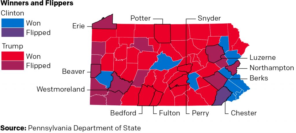
And originally, I had a slightly different conclusion as to how this related to Pennsylvania in the upcoming 2020 election. But, the whole 2020 thing made me shift my thinking slightly. But you’ll have to read the whole thing to understand what I’m talking about. I will leave you with one of the graphics I made for the piece. It looks at who won each county in the state, but also whether or not the candidate was able to flip the county. In other words, was Clinton able to flip a Republican county? Was Trump able to flip a Democratic county?
Who won what? Who flipped what?
Let me know what you think.
And of course, many, many thanks to all the people who suffered my ideas, thoughts, and early drafts over the last several weeks. And even more thanks to those who edited it. Any and all mistakes or errors in the piece are all mine and not theirs.