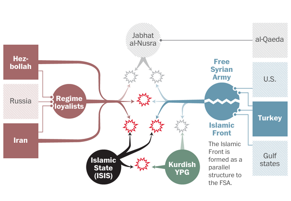
Well, I mean trying to is this piece by the Washington Post. Included are several diagrams at key phases of the conflict that attempt to show how the various parties interacted with each other.
Look at all the actors on stage…
Ultimately the key takeaway is that Syria is a mess and it is not getting any better. So let’s just add some more lines in there, am I right?
Credit for the piece goes to Denise Lu and Gene Thorp.
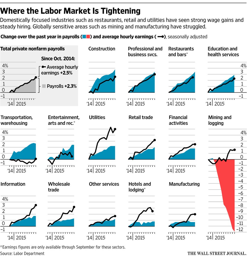
You should all know by now I am sucker for small multiples. So it should come as no surprise to you that I liked this piece from Friday from the Wall Street Journal. It looks at payroll and wage growth across various sectors in the American economy. And what I really like is that they took a space at the beginning to explain how to read the charts.
Mining, not so good
Credit for the piece goes to the Wall Street Journal graphics department.
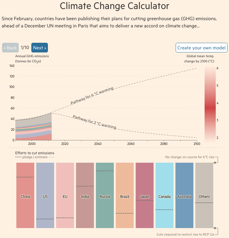
At the end of the month the world will gather in Paris, France for the next round of climate change talks. In advance of the talks, the Financial Times put together this model of how emissions reductions will help—or not—get climate change under control. The piece is two-fold. The first is a ten-step narrative that showcases the tool’s split of the time series into short-, medium-, and long-term impacts and how those work in the best and worst case scenarios. But it then allows the user to jump right on in and create their own scenarios.
Is it getting hot out there?
Credit for the piece goes to John Burn-Murdoch and Pilita Clark.
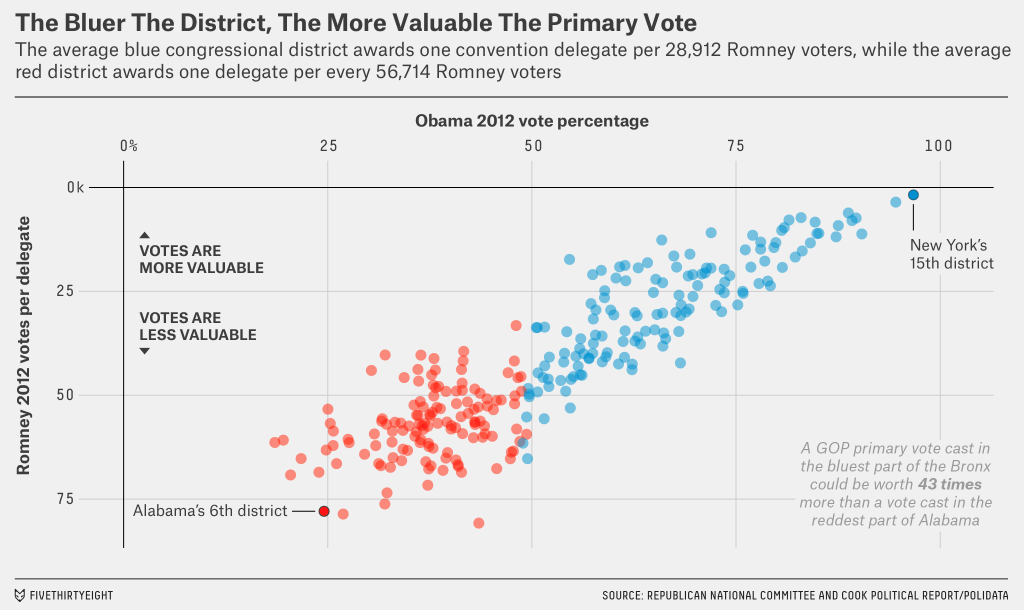
The day after Election Day—no, not that Election Day—we take a look at a nice scatter plot from FiveThirtyEight. They explore how an eventual conservative candidate, whoever that may be, will face a structural challenge. There are slightly more delegates at play in blue states than red. And typically those blue Republicans are “less religious, more moderate and less rural.” The big graphic supporting their argument looks at the value of the primary votes. Surprise, surprise, the higher-value primary votes come from blue states.
The relative value of the votes
Credit for the piece goes to the FiveThirtyEight graphics department.
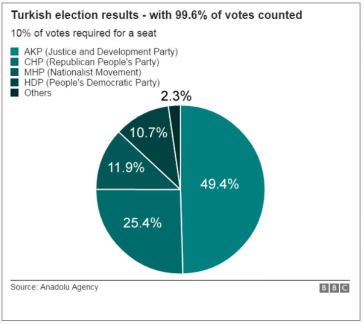
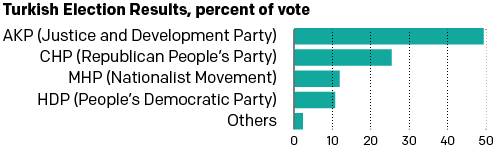
Turkey held its elections over the weekend. And so on the way to work this morning I decided to check the results on the BBC. And I saw this graphic—screenshot from my phone.
The BBC results
So I decided to scrap today’s blog post and instead spend all of five minutes tweaking this to make it a bit clearer. Or, a lot clearer. Simple little tweaks can make all the difference in data clarity. Now you can visually see the scale of difference in the votes. You also don’t need to refer to a legend off to the side with tints of the same colour.
My results with their data
Credit for the original piece goes to the BBC graphics department.
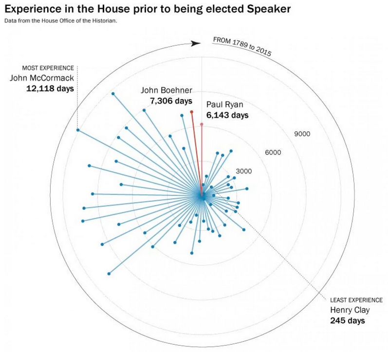
Paul Ryan is about to takeover for John Boehner as Speaker of the House. So the Washington Post put together a nice graphic-featuring article about how Ryan compares to previous speakers—turns out he is fairly young. But the end of the piece uses this graphic to look at the number of days, i.e. experience, each speaker had prior to taking the role.
But try comparing him to someone other than Boehner…
By putting the dots around a circle, the Post has created an interesting graphic. But the format makes it difficult to compare individuals who are not close together.
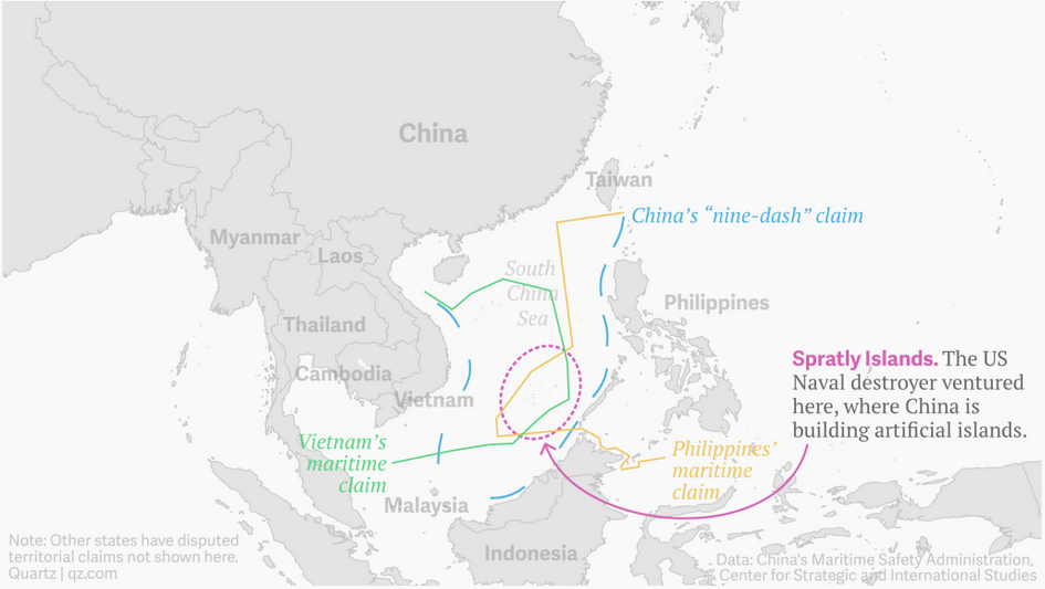
Today the US sent a guided missile destroyer through what China claims—but few recognise as—its sovereign territory, twelve nautical miles off the coast of semi-artificial islands. This piece from Quartz illustrates just some of the overlapping claims of the Spratley Islands. In the end, nothing happened to the destroyer as China did not counter it with ships or aircraft.
Who owns what now?
Credit for the piece goes to the Quartz graphics team.
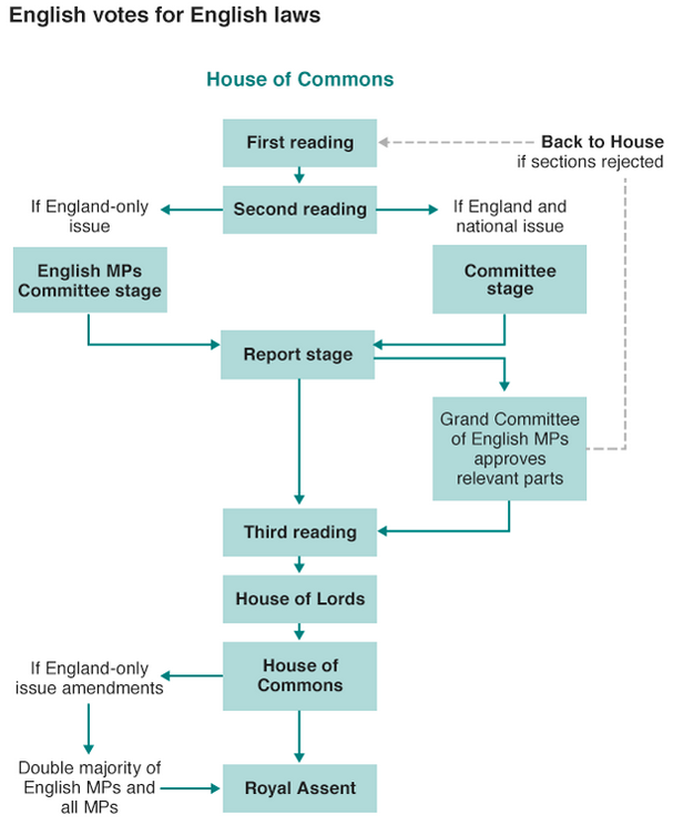
Last week the British government announced plans to solve the West Lothian Question that centres on devolution parity for England. Many legislative powers have been devolved from London and given to the regional parliaments in Scotland, Wales, and Northern Ireland. And on the one hand that is great as the national parliament no longer tells Scottish schools what to do, which is important because of England’s clout in London because England is by far the largest part of the Union. But the on the other hand, Scottish, Welsh, and Northern Irish MPs still get to vote on schools in England. You can begin to see how the English feel that is unfair.
So the BBC put together this graphic trying to explain what was announced, because it is far more complicated than just giving England its own parliament. It’s a tricky and complicated issue that is worth a read. If only because the government apparently did not realise that its plan can be acronymised to EVEL.
It’s EVEL I tell you. Pure EVEL.
Credit for the piece goes to the BBC graphics department.