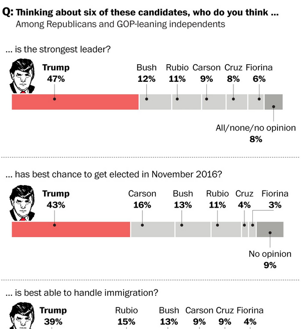
The day after the Canadian elections, let’s turn our gaze back upon the states via this Washington Post piece. How are the Republicans doing in their primaries?
It’s all about the hair
Yep, still the land of I can’t quite believe it.
Credit for the piece goes to the Washington Post graphics department.
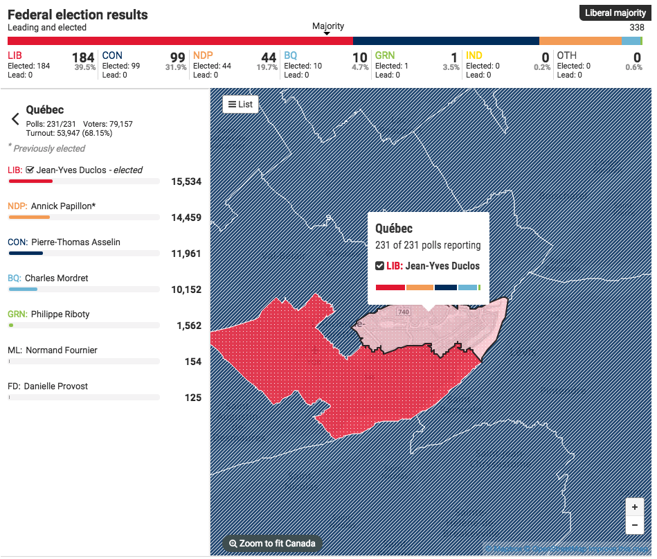
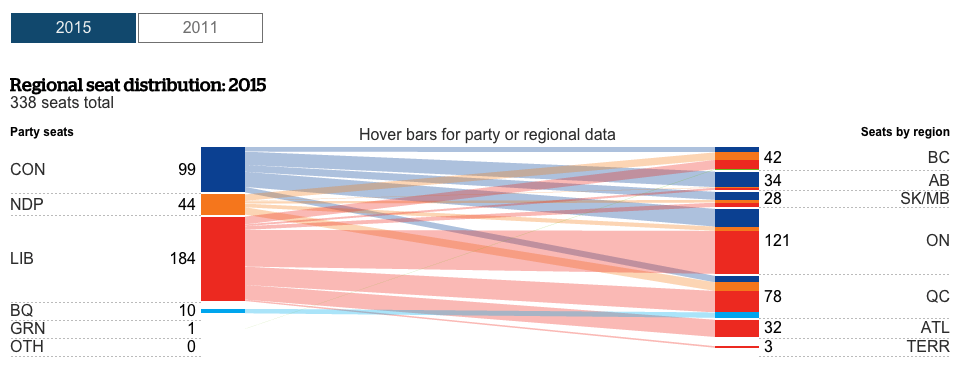
Canada held an election yesterday. For your briefing on it, John Oliver did a great job on Last Week Tonight. But for the serious coverage, we have results.
Here we have the results coverage by the National Post. It’s your standard choropleth coloured by the victor in each riding, or constituency. From a design side, I find the pattern fill interesting and not something I have seen done before for a political map.
I just chose a place I had visited in Canada
But I really like what the CBC did. They built an interactive application to cover the evening’s results as they arrived. This screenshot is for the riding in Fredericton, where my ancestors lived in the 19th century. (I had to have a connection to the ridings somehow.) In particular, I liked the ability to star ridings of interest and have them immediately retrievable. The CBC complemented that with a list of ridings to watch. It was a great resource for the evening.
Fredericton results
But then they also covered the results with an article with interactive graphics. This is more your standard fare with choropleths, bar charts, and line charts. But they flow through the article quite sensibly. Overall, a solid results piece.
Party results per region
Credit for the National Post piece goes to the National Post graphics department.
Credit for the CBC piece goes to the the CBC graphics department.
I don’t know about you, but I have seen a lot of those all-day breakfast bags sitting about the city of Chicago the last few days. (That they are not in waste bins is a different story.) CBS took a look at where the biscuit vs. McMuffin offering is available in the US—hint, not Chicago—and compared that geographic spread to something else. It’s worth a quick look.
Where to go for biscuits
Credit for the piece goes to CBS graphics department.
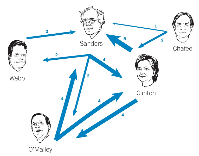
Last month we looked at the Washington Post’s coverage of the second Republican Debate. For those unaware, the first Democratic Debate was held last night. And so it is only fair for us to look at the Post’s coverage of that event.
Who engaged whom
Credit for the piece goes to Samuel Granados, Richard Johnson, Denise Lu, Ted Mellnik, and Kevin Schaul.
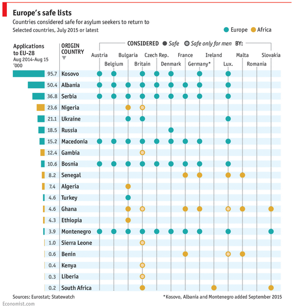
Migrants and refugees continue to reach Europe. But some of those people can be sent back, depending upon their country of origin. The tricky part is that there is no common set of countries as this graphic from the Economist shows.
The safe list
In terms of design, we see nothing too elaborate here. This is really just a table where checks, half-checks, and exes would have sufficed. But, sometimes, a table is really all you need to convey the important data.
Credit for the piece goes to the Economist’s Data Team.
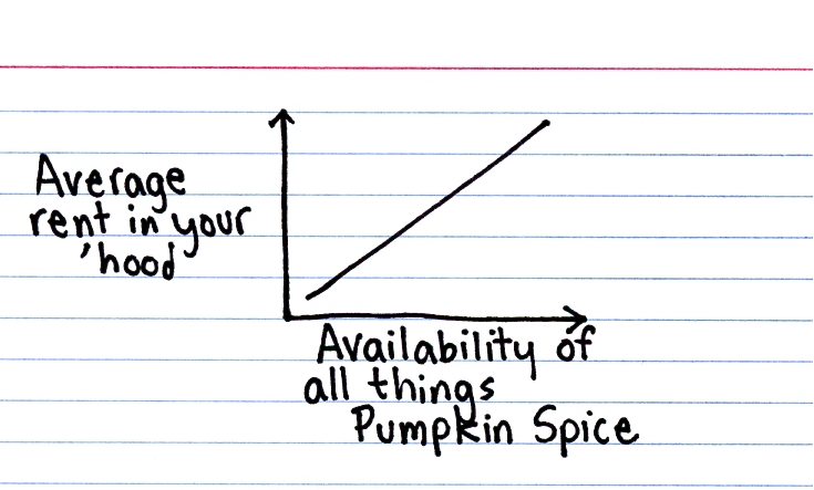
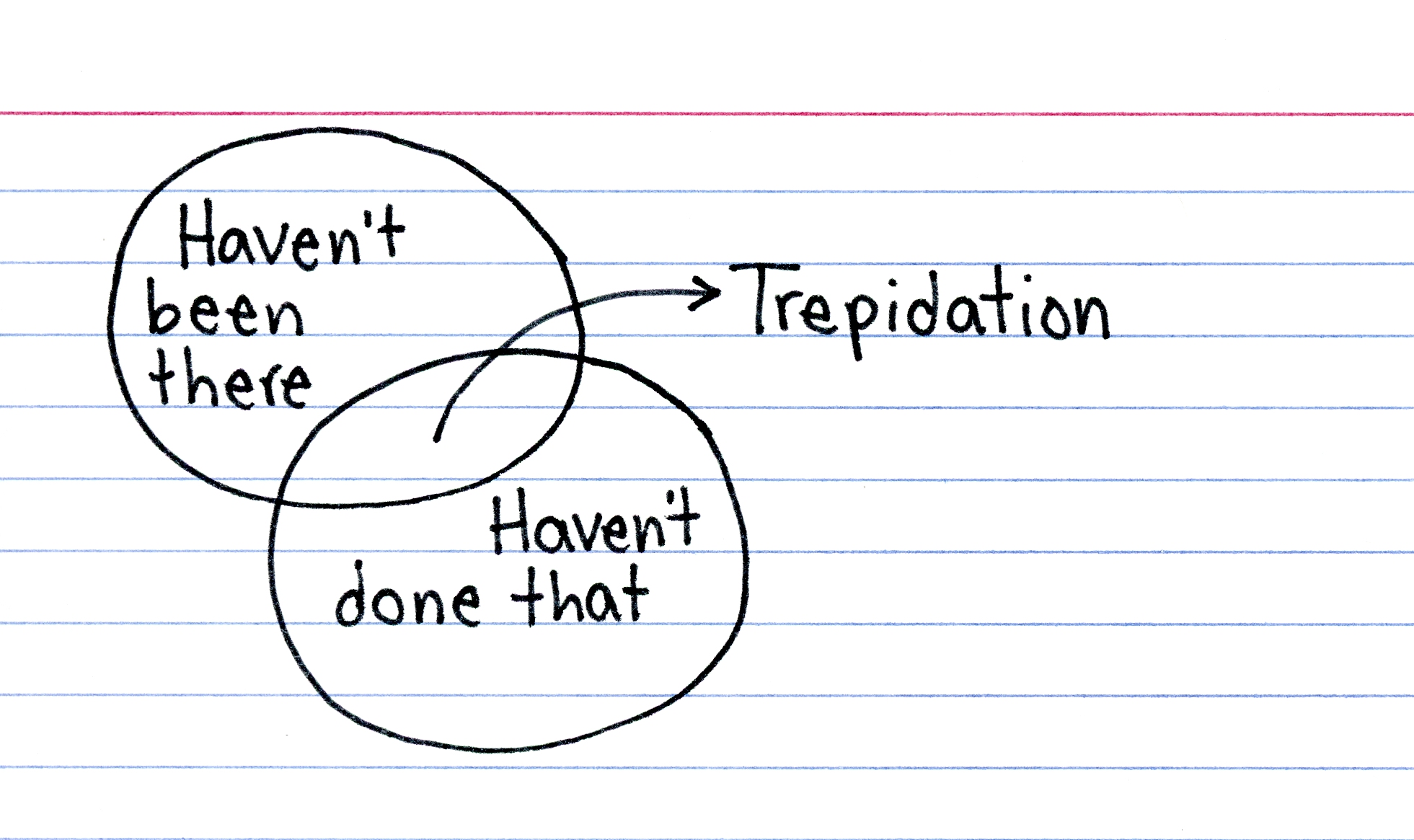
Some of my co-workers are taking me out for a few drinks as I started a new job at my company last month. It’s a lot of work and a lot of learning things I know little about. So this piece from This Is Indexed seems appropriate for this Friday.
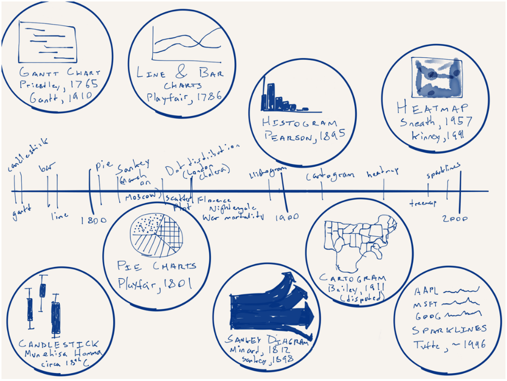
From time to time in my job I hear the desire or want for more different types of charts. But in this piece by Nick Brown over on Medium, we can see that there are really only a few key forms and some are already terrible—here’s looking at you, pie charts. How new are some of these forms? Turns out most are not that new—or very new depending on your history/timeline perspective. Brown illustrated that timeline by hand.
A timeline of chart forms
Worth the read is his thoughts on what is new for data visualisation and what might be next. No spoilers.
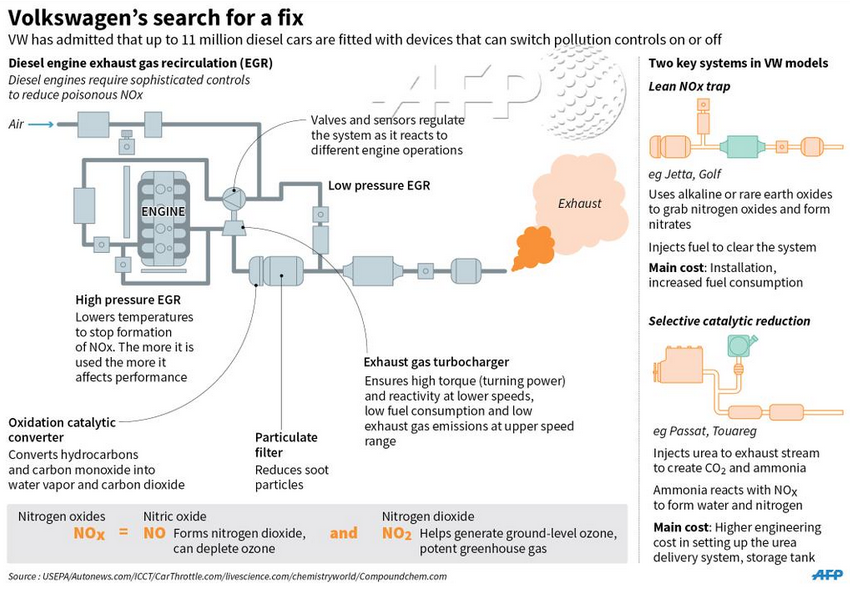
For a little while now I have been wondering about just how the emission cheating system worked for Volkswagen. Thankfully the AFP put together a graphic illustrating how their diesel engine process works. It gets me partially to the level of understanding for which I am looking. But even though I now understand how the diesel engine works, I am confused about where the cheating device fits into the process.
How the diesel engine works
Credit for the piece goes to the AFP graphics team.
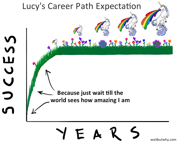
I attended a dinner on Monday where the topic of Millennials arose. While most of the evening is not germane to this post, I did recall Wait But Why’s piece on why Millennials are unhappy on the way back to my flat. So here you go, a look at the Millennials and why we are unhappy. Bonus: we have unicorns and rainbows.