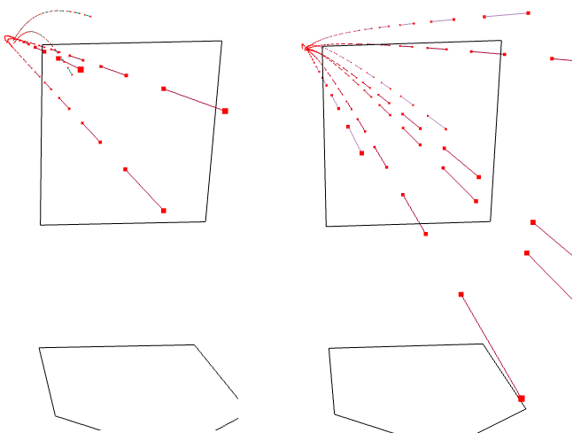
Today marks the final start of the year for Rich Hill of the Boston Red Sox. It’s also only his fourth start of the year. He was signed as depth as attrition left an empty spot in the rotation. In his three starts, however, he has given up only three runs in 23 innings while striking out 30 and walking only two. How does he do it? Over at Baseball Prospectus they took a look at Hill’s curveball and the deception he generates from his arm slot and the location of his fastball. They show this by a comparison graphic. I’ve added the names of the two players, but otherwise the graphic is unaltered.
Hill is on the left
If I am lucky, I can catch this last Hill start at the pub tonight.
But not for the reasons you might think. This video from Vox looks at the notion that expensive wines taste better. And it turns out they do. Sort of. In terms of the design of the piece, it uses some nice charts and motion graphics to make its point. Plus, it includes snippets from Sideways, notably: “I’m not drinking any fucking Merlot.” Classic.
Wine ratings
Credit for the piece goes to Joss Fong, Anand Katakam, Joe Posner, and the Vox.com staff.
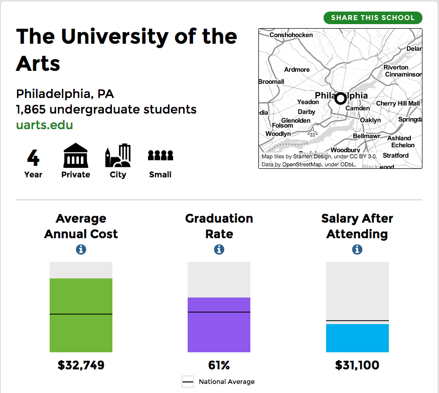
Like the title said, it’s about time I took you all to school…by which I mean university scorecards from the US Department of Education. I used my alma mater, the University of the Arts, to show the design here. Basically you have several sections key to understanding a university from the student body to the financials to the graduates’ prospects.
The scorecard for UArts
Credit for the piece goes to the US Department of Education.
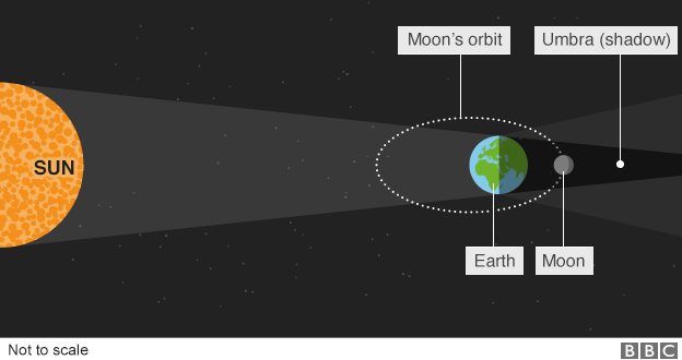
Last night we experienced a total lunar eclipse here in Chicago. Unfortunately, significant cloud cover meant that much of the event went unseen. That was unfortunate, because eclipses are fantastic. To explain it we have this piece from the BBC.
What is a lunar eclipse
And for those were either unable to see it or did not know about it, here is one of the photos I took.
During the eclipse
Credit for the diagram goes to the BBC graphics department.
By now you should all know that I am a sucker for small multiples. They are a great way of separating out noise and letting each object be seen for its own. You should also know that I am a sucker for things industrial, e.g. nuclear power. So when you put the two together like NPR did earlier this month, well, I am going to be a huge fan.
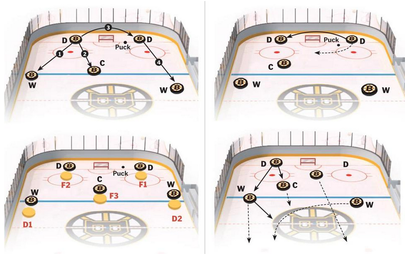
If you guys have not yet figured out, I am a baseball guy. But that is pretty much my only sport. And so maybe you can help explain to me just what is going on in today’s piece from the Boston Globe. I think it is attempting to explain hockey formations for the Boston Bruins.
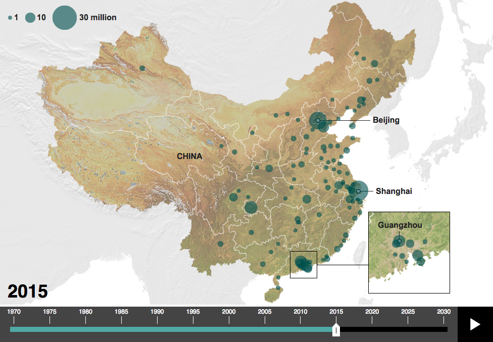
With Xi Jinping visiting the United States the BBC published an article looking at China’s changes over the years. In general, I don’t like the article—why are they using pigs to look at pork consumption? My general dislike aside, they do have a map that plots urban centres with more than one million people and how that map has changed since 1970 and will change out to 2030.
Urban centres with more than a million people
I probably would not have used that terrain map as the background as blue-green circles on the green coast are a bit difficult to read. A lost opportunity of a sort—assuming it is possible at all—is to use a satellite image of China for each year and overlay the circles on that. One can only imagine that China’s urbanisation has gone together with drastic changes to the landscape.
Credit for the piece goes to the BBC graphics department.
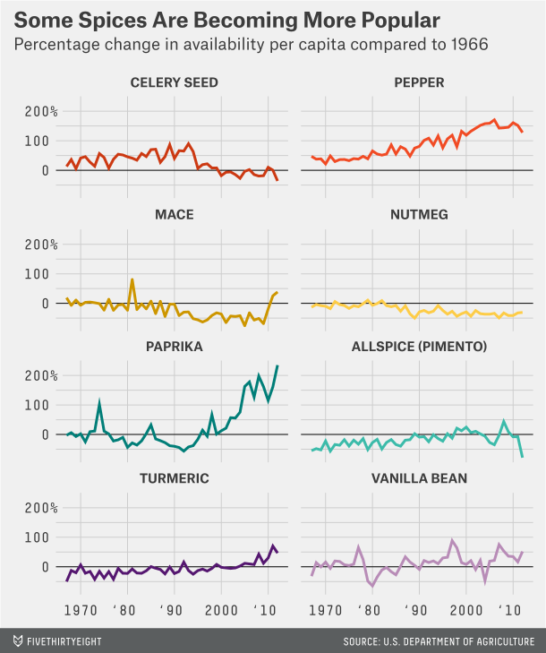
Here is a post for all you cooks and bakers out there: spices. Over the weekend I came upon a piece FiveThirtyEight ran earlier this year about American spice consumption. They use spice availability as a proxy for consumption, because no such data exists—and unfortunately the standard for reporting changed in 2012 so data is only available until then. But the piece uses some nice small multiples and a combined line chart to show some changes. Of note is the decision not to include ginger in the first, most likely because its scale would distort the rest of the chart. Anyway, if you are hungry, probably a good idea not to check this out.
How some spices have changed
Credit for the piece goes to the FiveThirtyEight graphics department.
11 candidates. 9 authors. (That would be the sub-title if my blog had sub-titles.)
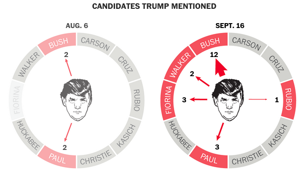
I do not have cable and so watching the debate live was not an option. Instead, I rely upon post-debate coverage to understand who said what and to whom. Usually that means an article with some video clips. But this piece from the Washington Post looks at the debate by the numbers.
The Wheel of Trump
What is worth pointing out is not Trump’s hair, but the credit list below. That is nine people who had to contribute to one article, which relies both on reporting and data, on text and images, and none of it is interactive. That list is not all reporters, you have a mixture of reporters, designers, and illustrators working together to produce some quality content. And while the piece was planned—how could it not have been—it still went live within probably hours of the debate as its publish date was the same date as the debate. Sometimes people think that smart, clear graphics are simple and easy to produce. Well, not always.
The graphic itself has two nice features worth mentioning specifically. One, the use of HTML text in the graphic. That makes the text searchable and more importantly rendered by the browser on the page instead of relying upon image export quality. The second is that this piece relies on two colours: black and red. Tints of both allow the entirety of the story to be told. Each candidate is represented by the same red without need for ROYGBIV+.
Credit for the piece goes to Bonnie Berkowitz, Kat Downs, Samuel Granados, Richard Johnson, Ted Mellnik, Katie Park, Kevin Schaul, Shelly Tan, and Kevin Uhrmacher.